
Choice Architecture
The arrangement, order, defaults, labels and timing around a decision can change what people notice, understand and choose.
Public evidence overview
One checked source, with its limits.
This preview is not the complete evidence base. Use it as a question to investigate in your own product, not as a prediction of what an individual will do.
Nudging against consent is effective but lowers welfare
Research-assisted source review
- What it supports
- Donation amounts and opt-out rates did not meaningfully differ by prior consent, but people whose refusal was ignored reported more resentment and regret and less happiness and support.
- Where it may not transfer
- Consent was self-selected rather than randomised, the decision involved an indicative charity donation in a survey and several welfare outcomes were self-reported. The study does not show that advance nudge consent is practical or sufficient for every product decision.
See how sources and limitations are checked in our editorial method.
Member depth
Continue into the complete evidence and application.
Practitioner includes the complete checked source set, study context and practical takeaways for this ingredient. The public overview above remains available without upgrading.
Seen in real products
How teams put it to work.
Examples identified in our interface teardowns, linked back to the full product journey.
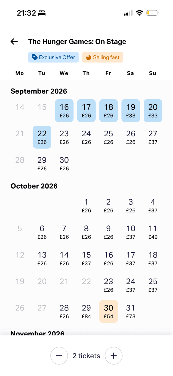
A calendar exposes available dates and starting prices while ticket quantity stays visible. This makes date and quantity the first constrained decisions in the booking path.
View Make seat choice feel safe →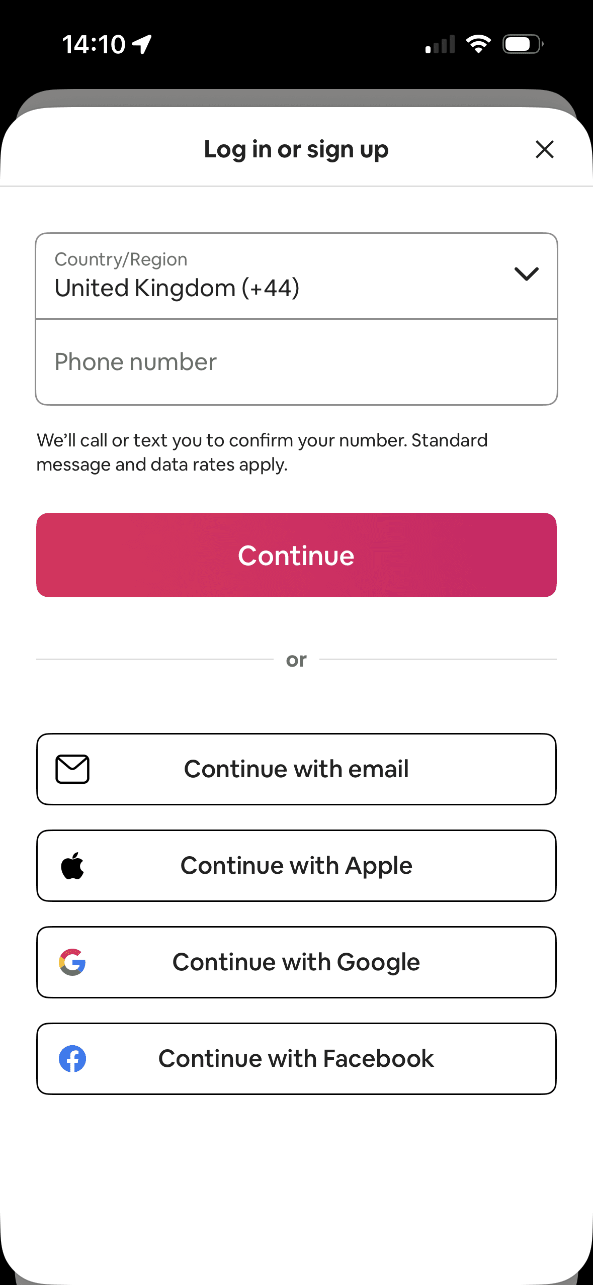
Phone entry and its bright Continue button occupy the first and most prominent area; email and third-party methods remain visible below. This shows hierarchy and option arrangement, not whether the layout changed sign-up behaviour.
View Separate account setup choices →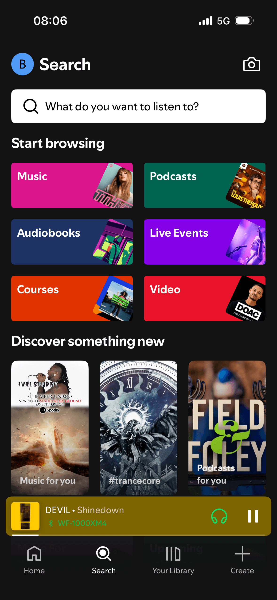
The screen turns the query, suggestions and result controls into explicit options rather than asking people to recall a hidden command or category.
View Help people narrow mixed results →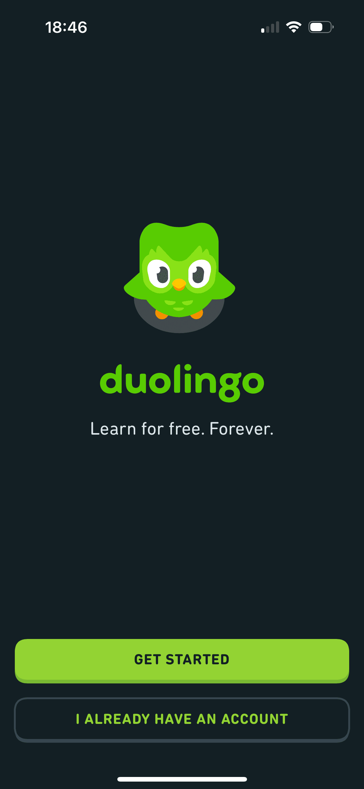
Get started is the prominent filled action while the existing-account route is outlined. This is visible choice architecture; neither route is preselected and the screenshot does not show a quicker decision or registration.
View Build momentum without pressure →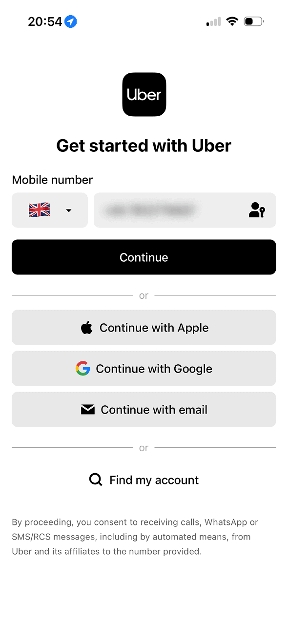
The screen keeps several account routes available in the same decision area. That is a useful choice structure because people can compare methods without leaving the flow.
View Make data choices feel informed →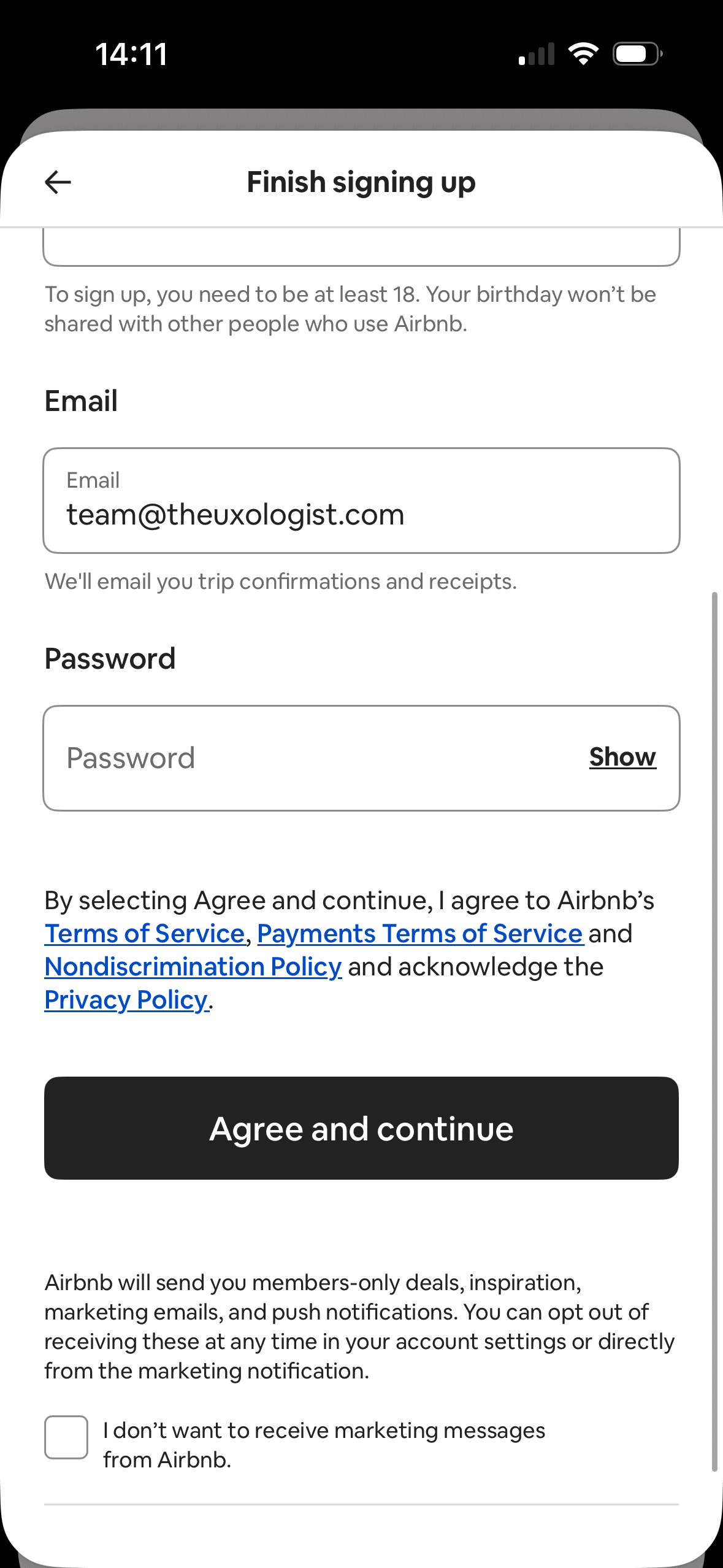
Marketing messages are enabled unless the person selects the checkbox labelled “I don’t want to receive marketing messages”. Refusal therefore requires noticing and acting on a negatively worded opt-out; the screenshot does not show its effect on consent rates.
View Separate account setup choices →