
Framing Effect
Equivalent facts can lead to different choices when they are presented as gains, losses, survival or mortality.
In one sentence
The framing effect occurs when different descriptions of the same or equivalent outcomes change judgments or choices. A gain frame can make a certain option feel safer, while an equivalent loss frame can make risk feel more acceptable. Not every wording difference is truly equivalent, and effects vary by task. The design responsibility is to make material consequences comparable—not choose the frame that steers the preferred response.
Try this in practice
Make the idea useful.
Use these as hypotheses to test in your own product and context—not as predictions about what people will do.
- When benefits and harms are material, show equivalent frames together—for example, both how many people are helped and how many are not—using the same denominator, baseline and time period.
- Use comparable absolute numbers, explain uncertainty and provide the source. Do not rely on a relative percentage, selected benchmark or emotionally loaded label that hides the underlying outcome.
- Test understanding and choice consistency, not only conversion. Ask people to explain the options in their own words, and stop if the presentation changes preference without improving comprehension or disadvantages people with lower numeracy or literacy.
- Use it when
- Helps teams notice when presentation may be shaping a decision and design clearer comparisons that expose equivalent benefits, harms and uncertainty.
- Watch for
- A selective frame can steer people while still sounding factual, especially when it hides a baseline, denominator, time period or an equivalent description of harm.
Seen in real products
How teams put it to work.
Examples identified in our interface teardowns, linked back to the full product journey.

“Get started with Uber” frames account creation as a beginning rather than describing the full sequence. The screen also bundles automated calls or messages into proceeding; it does not show that the wording reduced resistance.
View Make data choices feel informed →
The headline pairs “Millions of songs” with “Free on Spotify”, framing catalog scale and price together. The screenshot does not show how people interpret “free” or whether the wording changes sign-up.
View Show value before more setup →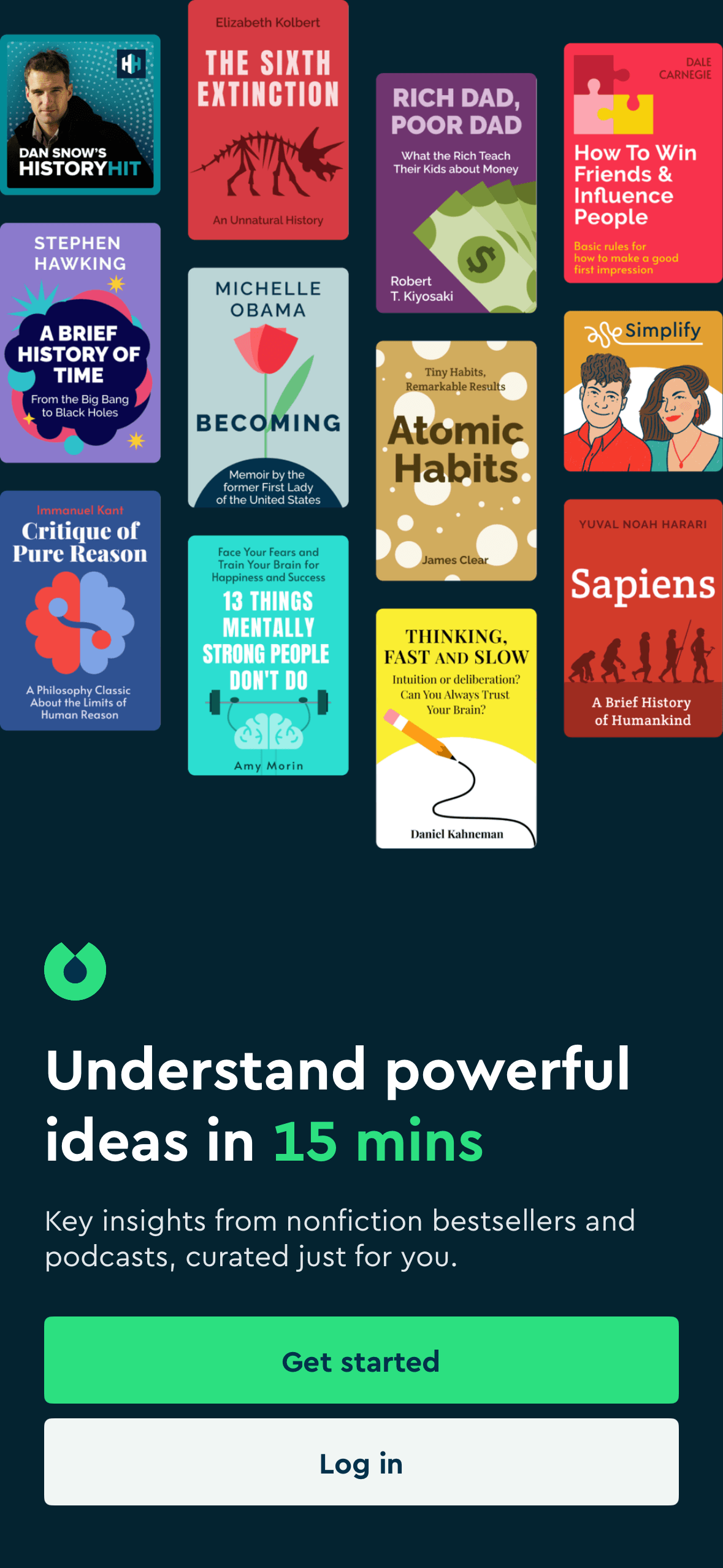
“Understand powerful ideas in 15 mins” frames Blinkist around speed and personal value before Get started. The time claim is visible, but the screenshot does not show positive emotion, understanding or engagement.
View Personalise before asking for payment →
The heading “4 stars and above deals for you” frames the row around a rating threshold and a personalised deal claim. The screenshot does not state a minimum review count or show increased confidence or purchase.
View Explain why products appear →
The question explicitly asks what was not enjoyed and presents a set of problem categories. This frames the task around faults while preserving a neutral Nothing route.
View Ask for feedback without overreaching →
“Support for all of life’s moments” frames Headspace as broadly relevant before Create an account and Log in. This is an explicit benefit frame; the screenshot does not define the scope of support or show that the wording causes continuation.
View Keep wellbeing and selling separate →Current interpretation
What this may help explain.
In a 1981 classroom study, 152 students considered an outbreak expected to kill 600 people. In the gain-framed version, they chose between a program that would certainly save 200 people and one with a one-third chance of saving all 600. A separate group of 155 students saw the same outcomes described as deaths: a program in which 400 people would certainly die or one with a one-third chance that nobody would die. The numerical outcomes were equivalent; only the frame changed.
In the gain frame, 72% chose the certain program and 28% chose the risky one. In the loss frame, only 22% chose the certain outcome while 78% chose the risky program. The wording shifted the majority preference even though the expected outcomes were equivalent. This does not mean every positive or negative phrase produces the same effect. A 1998 meta-analysis of 230 effect sizes from 136 papers and nearly 30,000 participants found a reliable but small-to-moderate overall effect, with large differences by task and research design. A 1982 medical study also found survival-versus-mortality framing changed hypothetical lung-cancer treatment preferences among patients, graduate students and physicians.
Use this as a starting point for a hypothesis, then check it with your own users and context.
Source check
What this guidance is based on.
3 sources have been checked by The UXologist. Findings and limitations are shown together so you can judge how well they fit your situation.
The Influence of Framing on Risky Decisions: A Meta-Analysis
Research-assisted source review
- What it supports
- The overall framing effect was small to moderate and reliable, but effect sizes differed substantially across research designs and task features.
- Who or what was studied
- A meta-analysis of 230 effect sizes from 136 empirical papers involving nearly 30,000 participants.
- Study setting
- Synthesised risky-choice problems described as gains or losses and coded features including reference-point versus outcome-salience manipulation, response mode, risk structure, wording, study design and problem domain.
- Where it may not transfer
- The review concerns risky-choice framing rather than every form of product copy. It combines varied tasks and methods, and the strong role of procedural features means an average effect cannot predict how a specific interface or user population will respond.
On the Elicitation of Preferences for Alternative Therapies
Research-assisted source review
- What it supports
- Across patients, students and physicians, surgery was relatively more attractive when outcomes were framed as survival rather than mortality. Treatment labels and the statistical format also changed preferences.
- Who or what was studied
- Two hundred and thirty-eight ambulatory patients with chronic conditions, 491 graduate students and 424 physicians.
- Study setting
- Participants imagined having lung cancer and chose between surgery and radiation using outcomes presented as cumulative probabilities or life expectancy, with treatment labels present or absent and outcomes framed as survival or mortality.
- Where it may not transfer
- The choices were hypothetical, based on lung-cancer treatment information available at the time, and did not test real treatment decisions or later outcomes. Multiple presentation features varied across conditions, so the results do not supply a single best frame for every decision.
The Framing of Decisions and the Psychology of Choice
Research-assisted source review
- What it supports
- With the gain frame, 72% chose the certain option and 28% the risky option. With the loss frame, 22% chose the certain option and 78% the risky option, reversing the majority preference under numerically equivalent descriptions.
- Who or what was studied
- Students at Stanford University and the University of British Columbia completed classroom questionnaires. The well-known disease problem used separate groups of 152 and 155 students.
- Study setting
- Respondents chose between certain and probabilistic responses to an outbreak expected to kill 600 people. One group saw outcomes as lives saved; the other saw the equivalent outcomes as lives lost.
- Where it may not transfer
- The disease task was hypothetical, used student classroom samples and compared different groups. The paper presents several demonstrations rather than a universal wording rule, and later research distinguishes different forms of framing and questions whether all common formulations are psychologically equivalent.