
How Duolingo guides a long first-use journey
A screen-by-screen review of Duolingo onboarding: expectation setting, constrained choices, immediate feedback, habit language and upgrade framing.
- Captured
- Capture date not recorded
- Published
- Last updated
- 35
- Screens
- 31
- Ingredients
- 140
- Applications

Common contexts
Method visible
From screen observation to testable claim.
The reviewed studies concern specific layered interfaces; they do not establish a general onboarding benefit.
Preferences are collected in short, separate steps.
Adjacent evidence
Scope awareness, errors, refusal, time and later surprise.
What works
What the captured flow does well.
- The opening distinguishes Get started from an existing-account route and states that free learning is available.
- The setup sequence has a visible progress indicator and Back control, while the initial introduction says how many questions to expect.
- Language level, reason, daily goal and starting point are separated into focused choices, and Find my level is described rather than silently preselected.
- The widget request includes Not now, and the following screen confirms it can be added later.
What could improve
What deserves closer review.
- “7 quick questions” understates the overall journey: the captured flow contains more setup messages, a widget offer, a lesson, streak choices, profile fields, marketing, an upgrade and social steps before the course map.
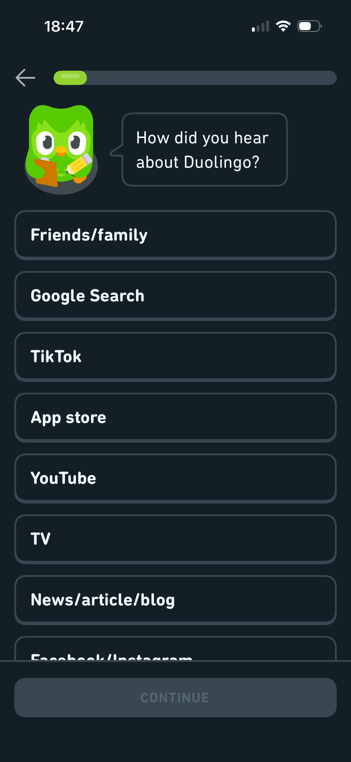
- The acquisition-source question appears required but does not explain its purpose or provide Skip or Prefer not to say.
- Daily time options are labelled Casual, Regular, Serious and Intense, turning a scheduling choice into a judgement about commitment.
- “50 words in your first week” and the three-month outcomes do not state assumptions, calculation, proficiency measure or uncertainty; “develop a learning habit” is presented as an outcome rather than a support Duolingo can offer.
Screen-by-screen breakdown
Follow the journey.
Each observation shows what works or what could improve, on this screen or across the wider flow. The opportunity turns one or two principles into a testable hypothesis.

Screen 01
Opening free-learning and account routes
Visual hierarchy gives prices, savings or time-based offer language a clear point of entry. Important secondary information still needs enough prominence to be found before commitment.
Get started is the prominent filled action while the existing-account route is outlined. This is visible choice architecture; neither route is preselected and the screenshot does not show a quicker decision or registration.
“Learn for free. Forever.” frames Duolingo around lasting free access. The statement is visible but does not describe ads, energy limits or paid features, and the screenshot does not show registration or later expectations.
Show 1 more principleShow fewer principles
Items placed first or at the top receive an attention advantage before people inspect the rest. The first position should reflect the person’s task rather than an unexplained commercial priority.
If Duolingo were to keep Get started and the existing-account route distinct, then people should understand the next decision more clearly because its purpose and consequences are visible before they act. This would apply Salience Effect and Choice Architecture.

Screen 02
Duo welcome message
The introductory message prepares people for the kind of task or benefit that follows. It is a flow-level cue because its effect depends on whether the next screens match that expectation.
The opening language defines how the journey should be interpreted before evidence or terms appear. Aspirational wording should not overstate the outcome or conceal later effort and cost.
The flow introduces one idea before moving to the next decision, reducing how much new information appears at once. Skip, back and reduced-motion routes determine whether that pacing stays supportive.
Show 1 more principleShow fewer principles
The arrangement of the introductory message and single next action determines which action is easiest to see and take. The screen should keep alternatives, refusal and correction proportionate to their importance.
If Duolingo were to keep the Back control and brief introduction, but provide Skip introduction and reduced-motion alternatives, then people should understand the next decision more clearly because its purpose and consequences are visible before they act. This would apply Priming and Framing Effect.

Screen 03
Seven-question setup promise
Visual hierarchy gives the main controls, supporting information and available actions a clear point of entry. Important secondary information still needs enough prominence to be found before commitment.
“Just 7 quick questions before we start your first lesson” frames setup as short and finite. The captured journey contains later widget, lesson, streak, profile, upgrade and social steps, so the scope needs to be distinguished clearly.
The immediate task stays focused on one decision before the wider journey continues. That sequencing reduces simultaneous choices when later steps remain predictable and reversible.
Show 1 more principleShow fewer principles
The arrangement of the main controls, supporting information and available actions determines which action is easiest to see and take. The screen should keep alternatives, refusal and correction proportionate to their importance.
If Duolingo were to make the scope accurate: distinguish the seven course questions from the later lesson, streak, profile, marketing, upgrade and social steps, then people should make a more informed data choice because purpose, optionality and future use are clear before agreement. This would apply Salience Effect and Framing Effect.
Screen 04
Choose a course
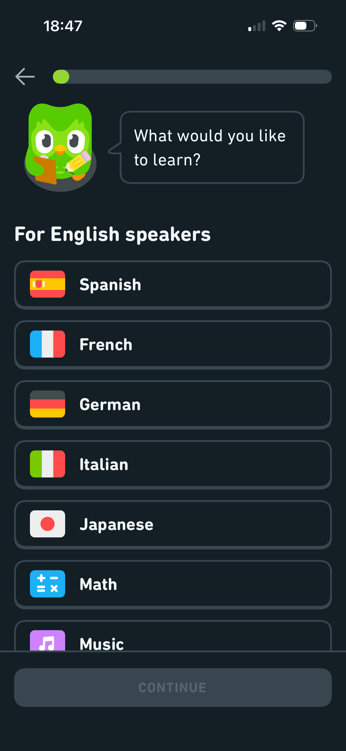
A scrollable course list is grouped “For English speakers”, and Continue is unavailable until one item is selected. This is visible choice architecture; the screenshot does not establish popularity ordering, overload or a default.
The number, order or overlap of options can still make comparison demanding. Search, grouping, a clear reset and an explanation of what changes would reduce avoidable cognitive load.
Labels, rows or chips group the labelled options and their selected states into recognisable units, helping people scan a larger set without reading it as one block.
Show 1 more principleShow fewer principles
Names, icons, artwork or previous queries let people recognise a likely option instead of reconstructing it from memory. The cue still needs a text label and clear source.
If Duolingo were to keep search, language labels and a visible selection state for the long list, and explain why courses are ordered as shown, then people should narrow the available options with less effort because the source, type and effect of each control are explicit. This would apply Choice Architecture and Cognitive Load.
Screen 05
Optional acquisition-source question
Visual hierarchy gives the available choices and selected state a clear point of entry. Important secondary information still needs enough prominence to be found before commitment.
The immediate task stays focused on one decision before the wider journey continues. That sequencing reduces simultaneous choices when later steps remain predictable and reversible.
The acquisition-source question presents a long required-looking list and no visible Skip or Prefer not to say. This is a constrained choice; channel names do not establish credibility, social proof or course relevance.
Show 1 more principleShow fewer principles
The screen asks people to interpret the main controls, supporting information and available actions without showing every relevant consequence nearby. Clearer grouping and concise support would reduce avoidable mental effort.
If Duolingo were to explain that the answer is for attribution rather than course personalisation, add Skip and Prefer not to say and keep Other available, then people should make a more informed data choice because purpose, optionality and future use are clear before agreement. This would apply Salience Effect and Choice Architecture.
Screen 06
Choose current Italian experience
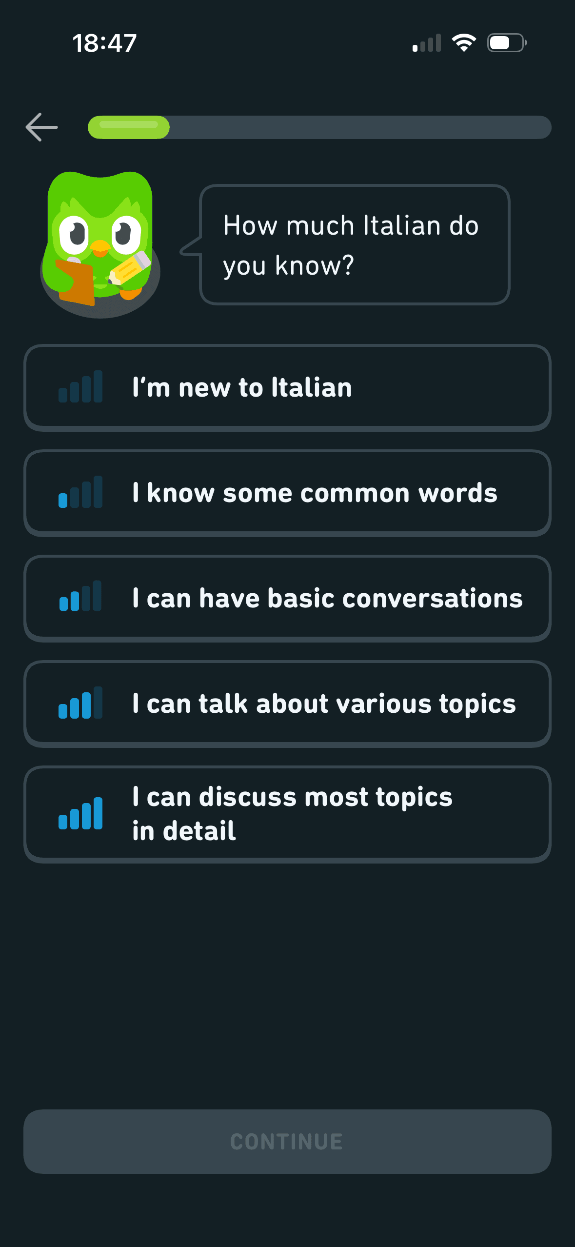
Five ordered self-descriptions represent increasing Italian experience. This is a visible choice structure; whether it reduces ambiguity or correctly places the learner requires later assessment evidence.
The screen asks people to interpret the main controls, supporting information and available actions without showing every relevant consequence nearby. Clearer grouping and concise support would reduce avoidable mental effort.
Visual hierarchy gives the available choices and selected state a clear point of entry. Important secondary information still needs enough prominence to be found before commitment.
Show 1 more principleShow fewer principles
The immediate task stays focused on one decision before the wider journey continues. That sequencing reduces simultaneous choices when later steps remain predictable and reversible.
If Duolingo were to keep the ordered descriptions, but explain how the answer changes the starting level and allow reassessment later, then people should make a more informed data choice because purpose, optionality and future use are clear before agreement. This would apply Choice Architecture and Cognitive Load.

Screen 07
Response to experience choice
The arrangement of the main controls, supporting information and available actions determines which action is easiest to see and take. The screen should keep alternatives, refusal and correction proportionate to their importance.
Visual hierarchy gives the main controls, supporting information and available actions a clear point of entry. Important secondary information still needs enough prominence to be found before commitment.
After the experience answer, “we’ll build on what you know” responds to the prior choice. This is system feedback, but the screen does not show what changes or whether the resulting course is personalised.
Show 1 more principleShow fewer principles
The immediate task stays focused on one decision before the wider journey continues. That sequencing reduces simultaneous choices when later steps remain predictable and reversible.
If Duolingo were to state the selected level and what “build on what you know” changes, with Edit available, then people should make a more informed data choice because purpose, optionality and future use are clear before agreement. This would apply Feedback Loop and Choice Architecture.
Screen 08
Choose reasons for learning
Visual hierarchy gives the available choices and selected state a clear point of entry. Important secondary information still needs enough prominence to be found before commitment.
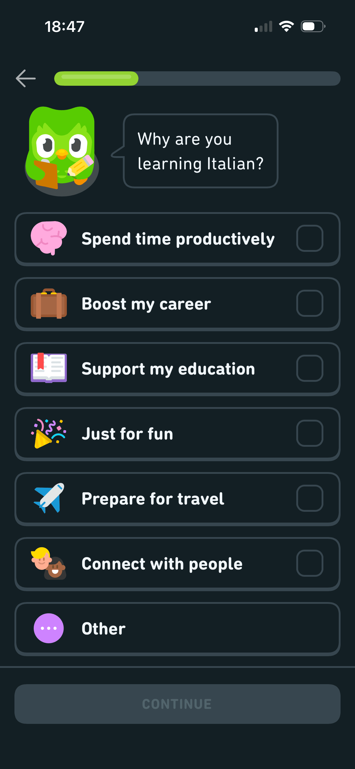
Reasons such as “Spend time productively”, “Boost my career” and “Just for fun” frame motives in value-laden ways. The screenshot does not show how answers affect content or motivation.
The immediate task stays focused on one decision before the wider journey continues. That sequencing reduces simultaneous choices when later steps remain predictable and reversible.
Show 1 more principleShow fewer principles
The arrangement of the labelled options and their selected states determines which action is easiest to see and take. The screen should keep alternatives, refusal and correction proportionate to their importance.
If Duolingo were to explain whether several reasons can be selected, whether this changes lessons and where answers can be edited, then people should understand the next decision more clearly because its purpose and consequences are visible before they act. This would apply Salience Effect and Framing Effect.

Screen 09
Transition to a daily routine question
Naming a target as a commitment can make revising it feel like failure. The flow should keep pause, change and no-goal options visible after the initial choice.
“Let’s set up a learning routine” introduces the next decision while a progress bar shows the wider setup sequence. This is staged disclosure; it does not establish ownership, investment or completion.
A concrete target and visible progress can make the next small step easier to locate. It remains supportive only when the endpoint is accurate and optional.
Show 1 more principleShow fewer principles
Streaks, saved progress or “don’t lose” language can make stopping feel like forfeiting something already earned. Missing a day or leaving should not erase learning or block access.
If Duolingo were to name the next decision and keep Back or Skip available instead of using an unexplained interstitial, then people should continue without unnecessary pressure because progress remains useful, flexible and easy to revise. This would apply Progressive Disclosure and Commitment Bias.
Screen 10
Choose an optional daily time target
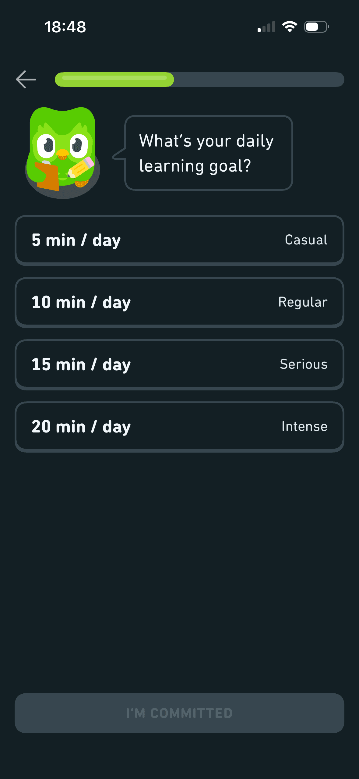
Five minutes is the first numerical reference in an ordered set up to twenty minutes. It is a possible anchor; only comparative data can show whether it changes target selection.
A concrete target and visible progress can make the next small step easier to locate. It remains supportive only when the endpoint is accurate and optional.
Daily targets are paired with Casual, Regular, Serious and Intense. This frames choosing more time as greater seriousness, but the screenshot does not show which option people select or whether the labels improve learning.
Show 1 more principleShow fewer principles
Naming a target as a commitment can make revising it feel like failure. The flow should keep pause, change and no-goal options visible after the initial choice.
If Duolingo were to replace Casual, Regular, Serious and Intense with neutral time labels, include No daily target and explain reminders and later editing, then people should continue without unnecessary pressure because progress remains useful, flexible and easy to revise. This would apply Goal Gradient Effect and Anchoring Bias.

Screen 11
First-week vocabulary forecast
Visual hierarchy gives the main controls, supporting information and available actions a clear point of entry. Important secondary information still needs enough prominence to be found before commitment.
After a daily-time choice, Duolingo forecasts “50 words in your first week”. This is outcome feedback about the choice, but its calculation, definition, uncertainty and achieved learning are not shown.
Items placed first or at the top receive an attention advantage before people inspect the rest. The first position should reflect the person’s task rather than an unexplained commercial priority.
Show 1 more principleShow fewer principles
The arrangement of the main controls, supporting information and available actions determines which action is easiest to see and take. The screen should keep alternatives, refusal and correction proportionate to their importance.
If Duolingo were to show how 50 words is calculated from the selected time, define what “word” and “first week” mean and present a range with assumptions, then people should understand the next decision more clearly because its purpose and consequences are visible before they act. This would apply Salience Effect and Feedback Loop.
Screen 12
Optional home-screen widget
The content is divided into labelled rows or sections, which makes a long feed easier to scan by purpose or source.
Artwork, thumbnails and familiar titles support rapid recognition while browsing. They help identify content, but do not demonstrate relevance or quality by themselves.
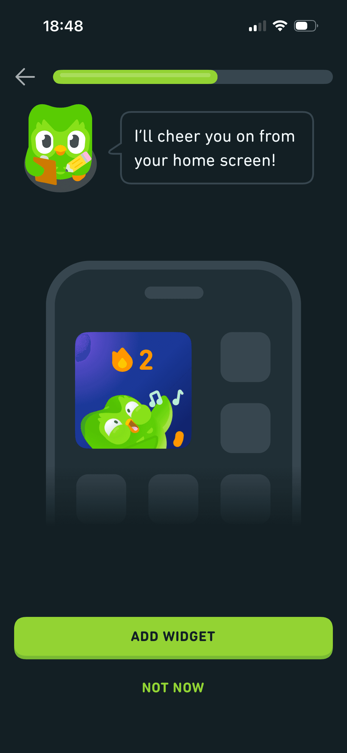
Add widget is a large filled action while Not now is a smaller text action. This is visible choice architecture with a refusal route; the screenshot does not show cognitive dissonance, commitment or later use.
Show 1 more principleShow fewer principles
Several dense rows compete for attention at once. Stronger task-based grouping and fewer simultaneous promotional labels would make the next choice easier to parse.
If Duolingo were to keep Not now visible and explain exactly what the widget displays, how often it changes and whether it exposes activity on a shared device, then people should understand the next decision more clearly because its purpose and consequences are visible before they act. This would apply Chunking and Choice Architecture.

Screen 13
Widget refusal confirmation
The screen confirms the outcome of the preceding action and keeps a next action visible. That closes the immediate interaction loop.
The arrangement of the completion state and next action determines which action is easiest to see and take. The screen should keep alternatives, refusal and correction proportionate to their importance.
The result or completion message receives the strongest hierarchy, so the state change is easy to locate. It also needs a non-colour status cue.
Show 1 more principleShow fewer principles
The journey ends with a clear completion state and next action, giving the flow a distinct final moment. That ending should confirm what changed rather than manufacture praise.
If Duolingo were to keep the neutral confirmation and say where the widget can be added later, then people should continue without unnecessary pressure because progress remains useful, flexible and easy to revise. This would apply Feedback Loop and Choice Architecture.

Screen 14
Three-month learning forecast
Visual hierarchy gives the main controls, supporting information and available actions a clear point of entry. Important secondary information still needs enough prominence to be found before commitment.
“Here’s what you can achieve in 3 months” frames conversation, vocabulary and a learning habit as attainable outcomes. No assumptions, proficiency measures or uncertainty are shown, so these are product promises rather than demonstrated results.
The immediate task stays focused on one decision before the wider journey continues. That sequencing reduces simultaneous choices when later steps remain predictable and reversible.
Show 1 more principleShow fewer principles
The arrangement of the main controls, supporting information and available actions determines which action is easiest to see and take. The screen should keep alternatives, refusal and correction proportionate to their importance.
If Duolingo were to label each outcome as a forecast, state the assumed course, starting level, minutes and practice frequency and link evidence and uncertainty, then people should narrow the available options with less effort because the source, type and effect of each control are explicit. This would apply Salience Effect and Framing Effect.

Screen 15
Choose a starting level
Visual hierarchy gives the available choices and selected state a clear point of entry. Important secondary information still needs enough prominence to be found before commitment.
Find my level carries a prominent Recommended badge attributed to Duo. This is an authority cue; no expertise, method or evidence for the recommendation is provided, and the option is not preselected.
The immediate task stays focused on one decision before the wider journey continues. That sequencing reduces simultaneous choices when later steps remain predictable and reversible.
Show 1 more principleShow fewer principles
The arrangement of the main controls, supporting information and available actions determines which action is easiest to see and take. The screen should keep alternatives, refusal and correction proportionate to their importance.
If Duolingo were to explain how Find my level works, its duration, data and error recovery, and why it is Recommended, then people should recover from interruption with less effort because progress, failure and the next available action remain clear. This would apply Salience Effect and Authority Bias.

Screen 16
Optional first lesson
The task keeps the prompt, response state and next action close together, making it easier to understand whether an answer or action was accepted.
The activity is broken into a short, bounded step rather than presenting the whole lesson or exercise at once.
“2 minute lesson” provides a numerical reference for expected duration before the lesson. This is a possible effort anchor, not evidence that the person finds the lesson easy or continues.
Show 1 more principleShow fewer principles
Hints, controls and task content can compete within a small viewport. Keeping help dismissible and preserving accessible alternatives would reduce unnecessary load.
If Duolingo were to keep the duration and Back control, but explain sound, microphone and accessibility requirements before starting and allow the person to enter the course map without the lesson, then people should understand the next decision more clearly because its purpose and consequences are visible before they act. This would apply Feedback Loop and Anchoring Bias.
Screen 17
Match a word to an image
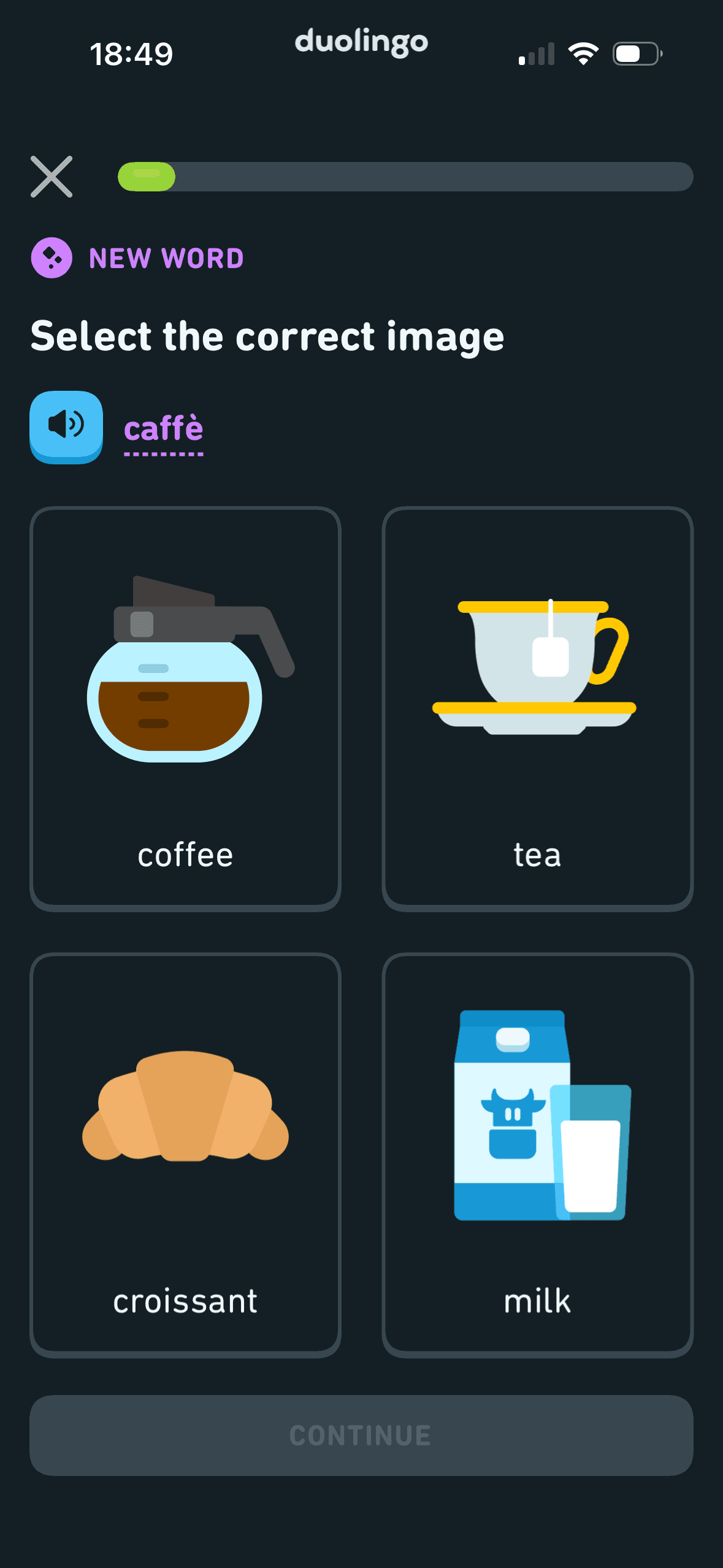
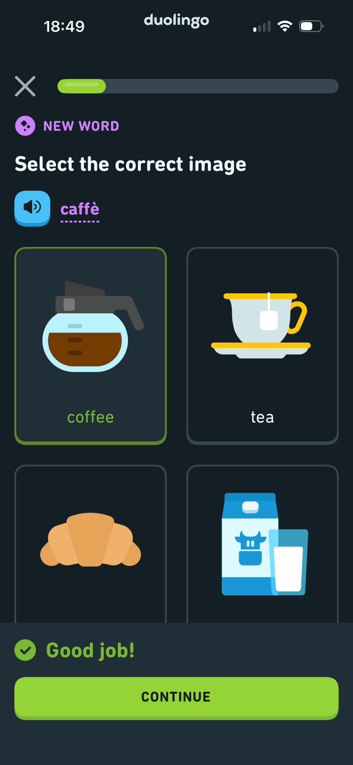
The first task presents one spoken and written word with four labelled image choices and keeps Continue unavailable before selection. This is a task choice structure; the screenshot does not demonstrate reduced cognitive load, recall or fluency.
Hints, controls and task content can compete within a small viewport. Keeping help dismissible and preserving accessible alternatives would reduce unnecessary load.
The task keeps the prompt, response state and next action close together, making it easier to understand whether an answer or action was accepted.
Show 1 more principleShow fewer principles
The activity is broken into a short, bounded step rather than presenting the whole lesson or exercise at once.
If Duolingo were to keep the written word, replayable audio and four labelled image choices, with accessible text alternatives and no colour-only state, then people should understand the next decision more clearly because its purpose and consequences are visible before they act. This would apply Choice Architecture and Cognitive Load.
Screen 18
Correct-answer feedback
After a correct image choice, the selected answer remains visible and “Good job!” appears with Continue. This is observable outcome feedback; the screenshot does not show whether praise improves learning or engagement.
Ordering and naming the rows shapes which path is easiest to take. The screen does not always explain why an item appears or provide nearby controls to correct the recommendation.
The content is divided into labelled rows or sections, which makes a long feed easier to scan by purpose or source.
Show 1 more principleShow fewer principles
The result or completion message receives the strongest hierarchy, so the state change is easy to locate. It also needs a non-colour status cue.
If Duolingo were to keep the selected answer visible and pair praise with the correct word, translation and pronunciation replay, then people should continue without unnecessary pressure because progress remains useful, flexible and easy to revise. This would apply Feedback Loop and Choice Architecture.
Screen 19
Tap a word for meaning
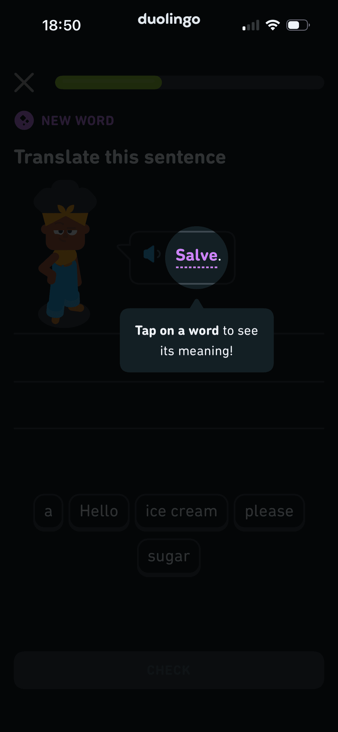
A contextual overlay explains that tapping a word reveals its meaning. This discloses help at the moment it becomes relevant; whether it reduces effort or frustration requires usability evidence and accessible alternatives.
Hints, controls and task content can compete within a small viewport. Keeping help dismissible and preserving accessible alternatives would reduce unnecessary load.
The task keeps the prompt, response state and next action close together, making it easier to understand whether an answer or action was accepted.
Show 1 more principleShow fewer principles
The activity is broken into a short, bounded step rather than presenting the whole lesson or exercise at once.
If Duolingo were to keep the contextual tip, make it dismissible and available later and provide an equivalent keyboard and screen-reader action, then people should understand the next decision more clearly because its purpose and consequences are visible before they act. This would apply Progressive Disclosure and Cognitive Load.

Screen 20
Notice before a harder exercise
“You’re ready for hard mode! Let’s gooo!” frames increased difficulty as an achievement. The screenshot does not explain the change or show that the framing boosts motivation, and no normal-mode choice is visible.
The task keeps the prompt, response state and next action close together, making it easier to understand whether an answer or action was accepted.
The activity is broken into a short, bounded step rather than presenting the whole lesson or exercise at once.
Show 1 more principleShow fewer principles
Hints, controls and task content can compete within a small viewport. Keeping help dismissible and preserving accessible alternatives would reduce unnecessary load.
If Duolingo were to explain what Hard mode changes, why the person is being moved there and how to choose normal difficulty or request a hint, then people should make a more informed data choice because purpose, optionality and future use are clear before agreement. This would apply Feedback Loop and Framing Effect.
Screen 21
Build a translated sentence
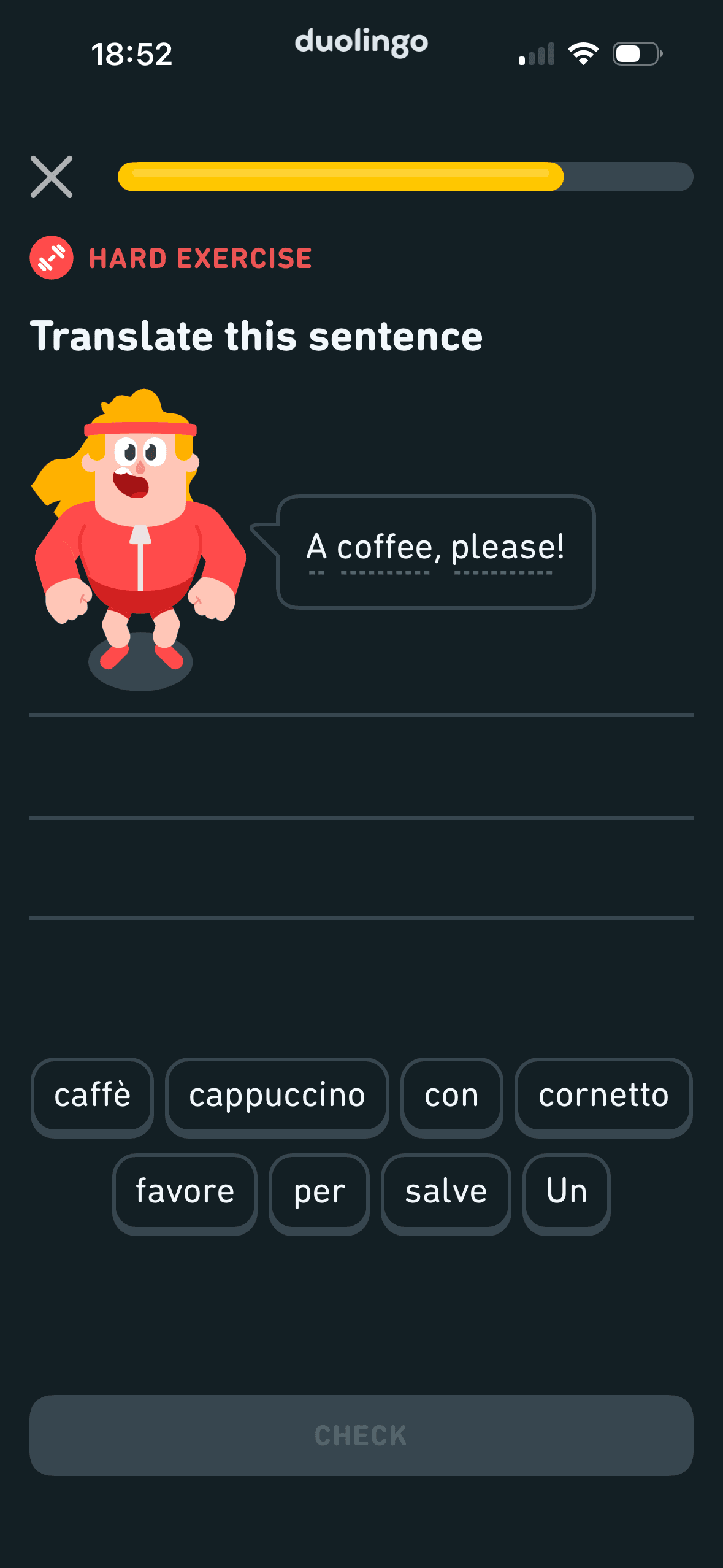
The task keeps the prompt, response state and next action close together, making it easier to understand whether an answer or action was accepted.
Hints, controls and task content can compete within a small viewport. Keeping help dismissible and preserving accessible alternatives would reduce unnecessary load.
The activity is broken into a short, bounded step rather than presenting the whole lesson or exercise at once.
Show 1 more principleShow fewer principles
The arrangement of the task prompt, response choices and feedback state determines which action is easiest to see and take. The screen should keep alternatives, refusal and correction proportionate to their importance.
If Duolingo were to keep the task label, source sentence, available words, progress and exit route accessible, then people should compare the offer more accurately because price, eligibility and future cost are shown on the same basis. This would apply Feedback Loop and Cognitive Load.
Screen 22
Hard-exercise answer feedback
Ordering and naming the rows shapes which path is easiest to take. The screen does not always explain why an item appears or provide nearby controls to correct the recommendation.
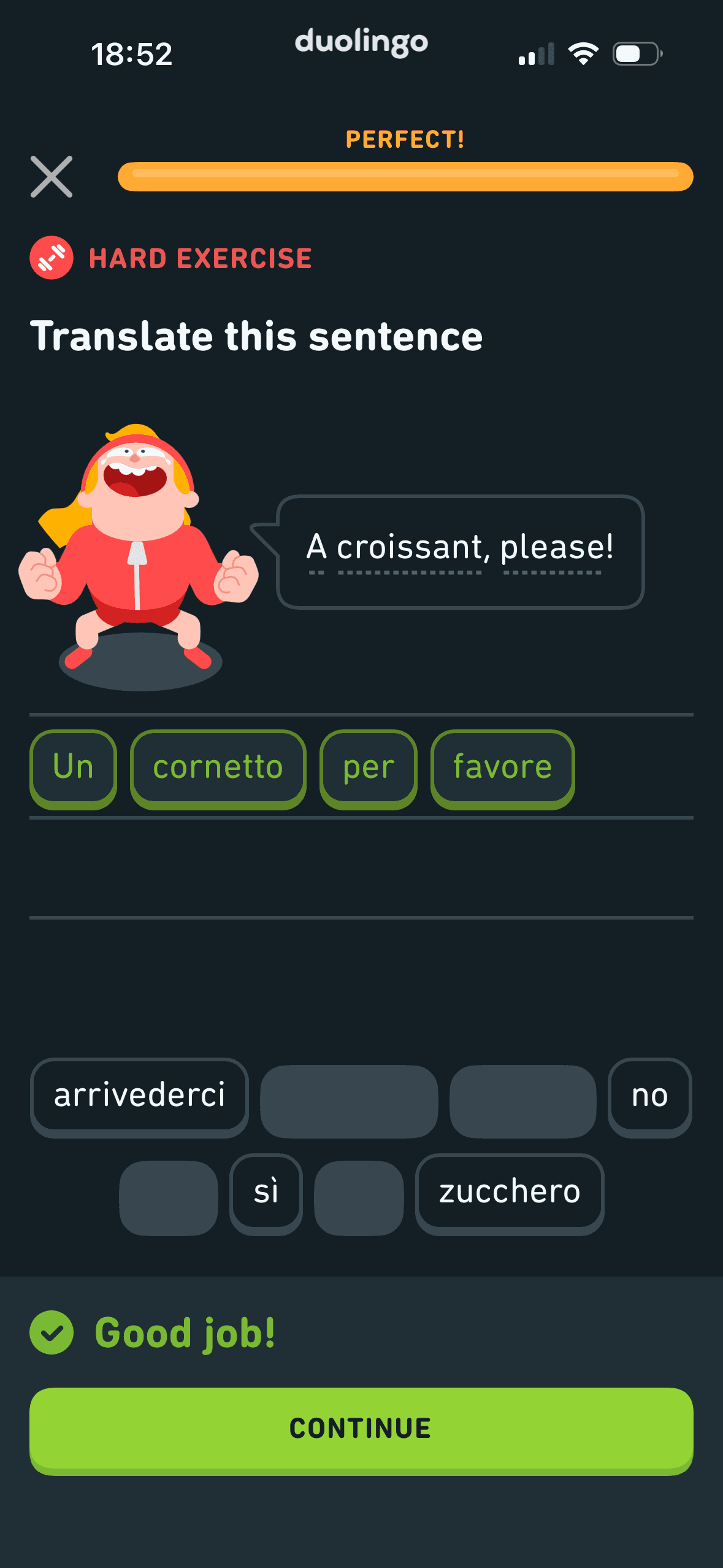
The completed hard exercise shows Perfect, a full progress bar, the constructed answer and Good job. This is result feedback; it does not prove effort justification, ownership or future participation.
The content is divided into labelled rows or sections, which makes a long feed easier to scan by purpose or source.
Show 1 more principleShow fewer principles
The result or completion message receives the strongest hierarchy, so the state change is easy to locate. It also needs a non-colour status cue.
If Duolingo were to keep Perfect, the completed answer and Good job visible, but explain any remaining unused words and allow review before continuing, then people should understand the next decision more clearly because its purpose and consequences are visible before they act. This would apply Feedback Loop and Choice Architecture.

Screen 23
Lesson results
The number, order or overlap of options can still make comparison demanding. Search, grouping, a clear reset and an explanation of what changes would reduce avoidable cognitive load.
Lesson completion reports 25 XP, 100% accuracy and 2:20 time before Claim 25 XP. These are concrete performance and reward signals; the screenshot does not show ownership, motivation or later learning.
The screen turns the completion state and next action into explicit options rather than asking people to recall a hidden command or category.
Show 1 more principleShow fewer principles
Labels, rows or chips group the completion state and next action into recognisable units, helping people scan a larger set without reading it as one block.
If Duolingo were to keep the three result measures and explain how XP is used and whether speed affects anything, then people should narrow the available options with less effort because the source, type and effect of each control are explicit. This would apply Feedback Loop and Cognitive Load.
Screen 24
Daily-practice introduction
The introductory message prepares people for the kind of task or benefit that follows. It is a flow-level cue because its effect depends on whether the next screens match that expectation.
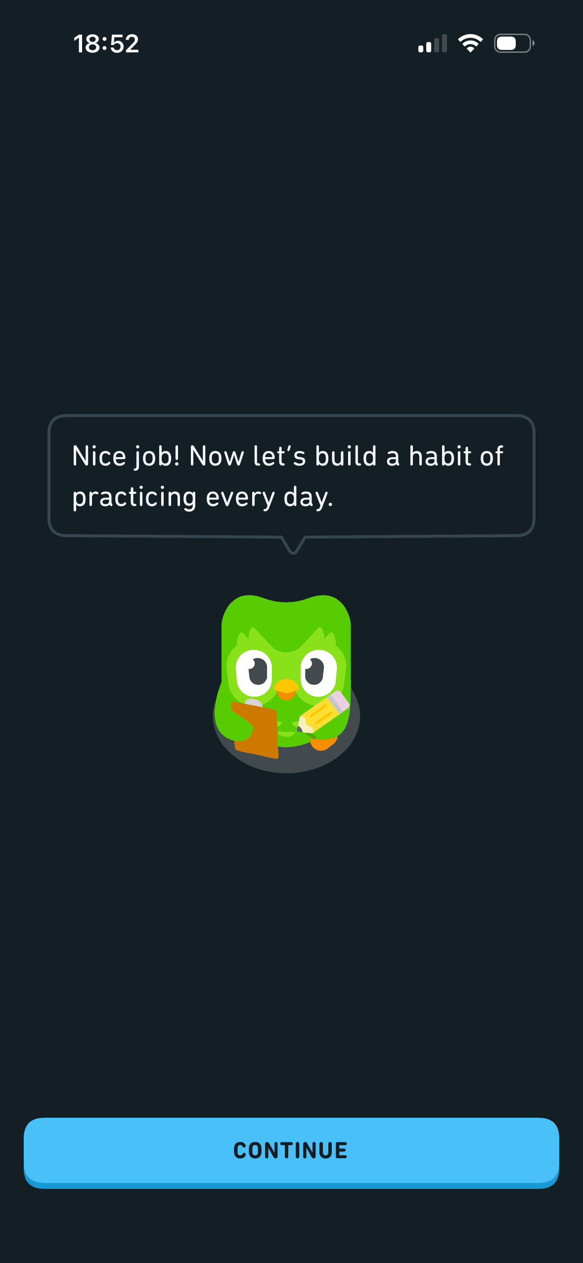
“Now let’s build a habit of practicing every day” reframes one completed lesson as the start of daily practice. This is explicit framing, but one lesson does not establish a habit and a no-plan option is not shown.
A concrete target and visible progress can make the next small step easier to locate. It remains supportive only when the endpoint is accurate and optional.
Show 1 more principleShow fewer principles
Naming a target as a commitment can make revising it feel like failure. The flow should keep pause, change and no-goal options visible after the initial choice.
If Duolingo were to replace “build a habit” with a choice to set reminders, a flexible practice plan or no plan, then people should continue without unnecessary pressure because progress remains useful, flexible and easy to revise. This would apply Priming and Framing Effect.
Screen 25
One-day streak explanation
A concrete target and visible progress can make the next small step easier to locate. It remains supportive only when the endpoint is accurate and optional.
The offer foregrounds benefits or savings while renewal, eligibility or refusal receives less emphasis. That framing makes the attractive interpretation easier to process than the full commercial decision.
Naming a target as a commitment can make revising it feel like failure. The flow should keep pause, change and no-goal options visible after the initial choice.
Show 1 more principleShow fewer principles
The first price, percentage, crossed-out amount or weekly equivalent can become the comparison anchor. Total cost and renewal terms need equal visibility so the reference point is not misleading.
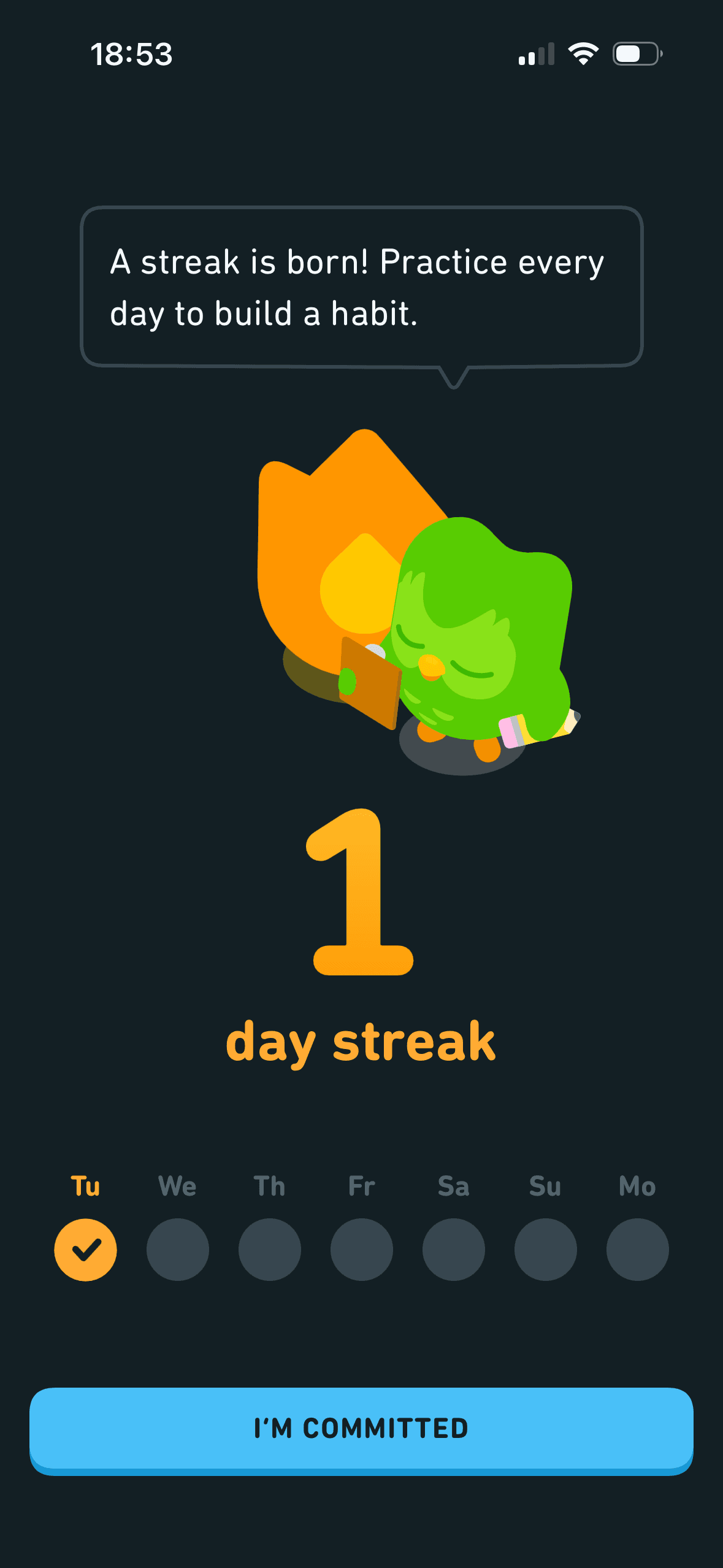
If Duolingo were to describe a streak as a count of consecutive practice days, not a habit, then people should continue without unnecessary pressure because progress remains useful, flexible and easy to revise. This would apply Goal Gradient Effect and Framing Effect.
Screen 26
Choose an optional streak goal
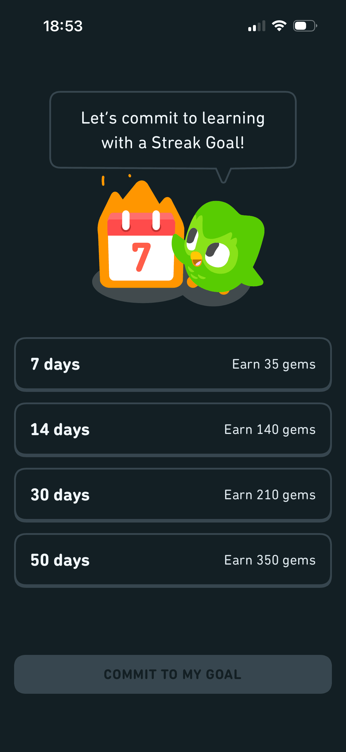
The streak-goal screen offers 7, 14, 30 and 50 days with increasing gem rewards, then enables Commit to my goal after selection. This is reward-linked choice architecture; it is not evidence of loss aversion or consistent behaviour.
Naming a target as a commitment can make revising it feel like failure. The flow should keep pause, change and no-goal options visible after the initial choice.
A concrete target and visible progress can make the next small step easier to locate. It remains supportive only when the endpoint is accurate and optional.
Show 1 more principleShow fewer principles
Streaks, saved progress or “don’t lose” language can make stopping feel like forfeiting something already earned. Missing a day or leaving should not erase learning or block access.
If Duolingo were to make 7, 14, 30 and 50-day targets optional, explain gems and what happens after a missed day and offer a flexible weekly goal, then people should compare the offer more accurately because price, eligibility and future cost are shown on the same basis. This would apply Choice Architecture and Commitment Bias.
Screen 28
Profile creation after the lesson
The task keeps the prompt, response state and next action close together, making it easier to understand whether an answer or action was accepted.
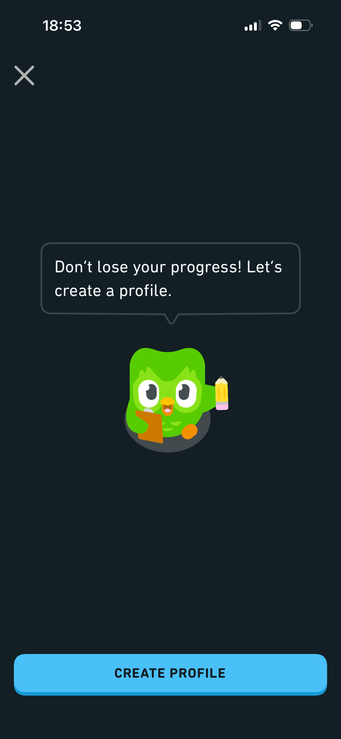
After a completed lesson, Duolingo asks for profile creation and frames it as preventing loss of progress. This is an escalation from trial use to an account request; the close route remains visible, but earlier expectation-setting and neutral storage information are needed.
“Don’t lose your progress” explicitly frames profile creation around a possible loss. This is observable loss wording, not evidence that loss aversion caused sign-up. State what progress is at risk, when and why, offer a recovery route without an account where feasible, and test comprehension, pressure and regret—not conversion alone.
Show 1 more principleShow fewer principles
The screen asks for personal information without always making purpose, retention and later editability equally visible. Short explanatory copy would let people interpret the request more accurately.
If Duolingo were to preview account requirements before the lesson, then people should continue without unnecessary pressure because progress remains useful, flexible and easy to revise. This would apply Feedback Loop and Foot-in-the-Door Technique.
Screen 29
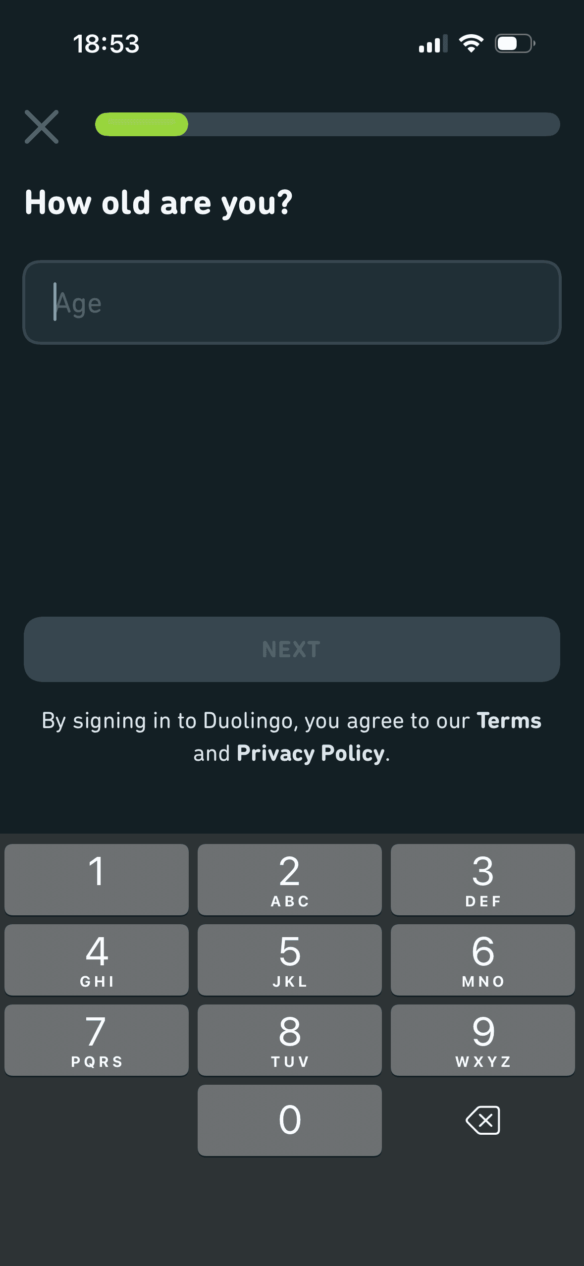
Age entry, terms and privacy
Profile information is requested in a bounded step rather than inside the first access decision. That pacing is useful when every field is necessary and the remaining journey is accurately represented.
The relative emphasis given to accept, refuse and manage choices can make one route feel easier than another. Button weight, wording and placement should support a voluntary decision.
The screen asks for personal information without always making purpose, retention and later editability equally visible. Short explanatory copy would let people interpret the request more accurately.
Show 1 more principleShow fewer principles
A preselected state, completed-state message or negative opt-out would make inaction count as agreement. Optional communication and data use should begin unselected.
If Duolingo were to explain why exact age is required, how it changes privacy, social and advertising features, retention and guardian handling, then people should make a more informed data choice because purpose, optionality and future use are clear before agreement. This would apply Progressive Disclosure and Choice Architecture.
Screen 30
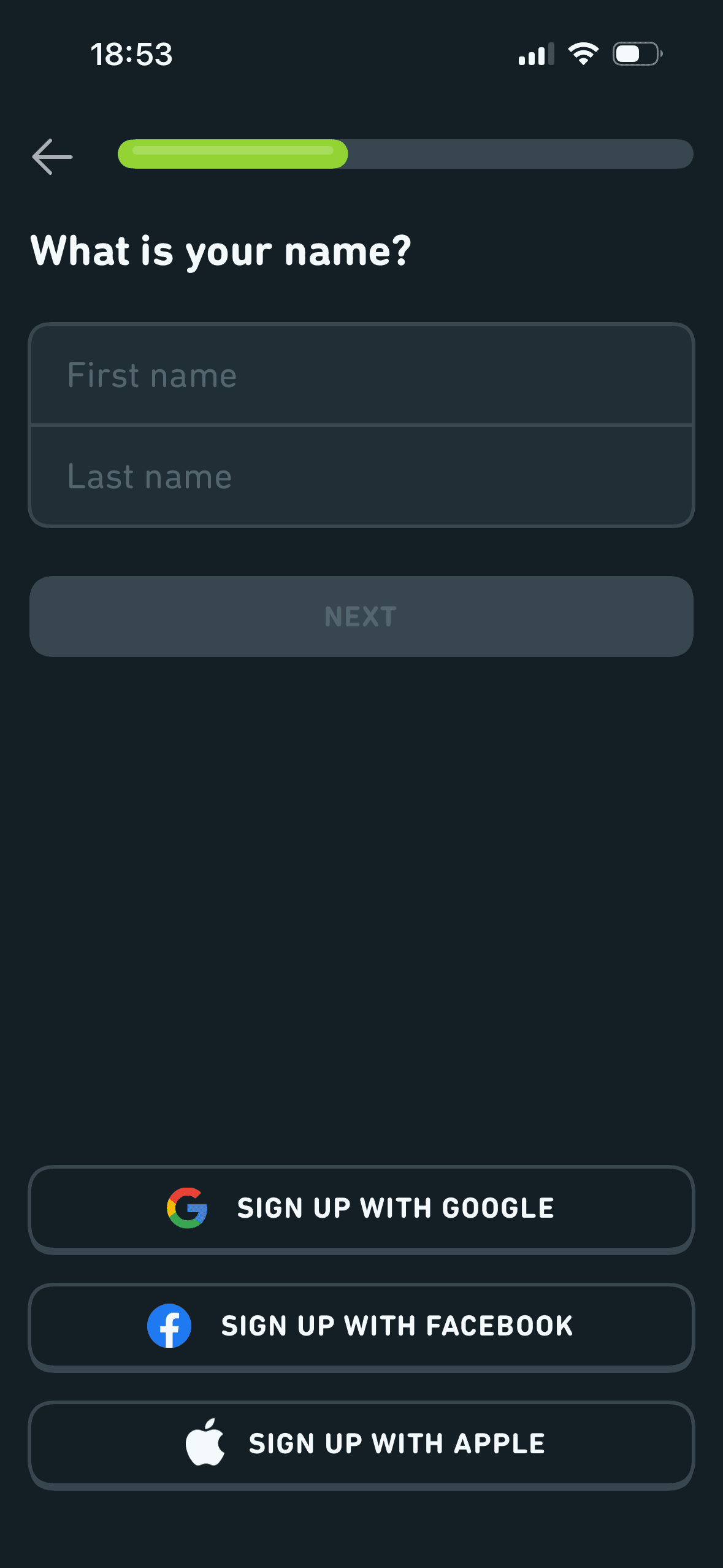
Name fields and account-provider options
The name step combines manual first and last name fields with Google, Facebook and Apple routes below. This is visible choice architecture; no route is preselected, and the relationship between provider data and manual fields is unclear.
Profile information is requested in a bounded step rather than inside the first access decision. That pacing is useful when every field is necessary and the remaining journey is accurately represented.
Provider names and familiar logos make the available account routes easier to recognise. They support identification, but they are not evidence that a provider is safer or more trustworthy.
Show 1 more principleShow fewer principles
The screen asks for personal information without always making purpose, retention and later editability equally visible. Short explanatory copy would let people interpret the request more accurately.
If Duolingo were to clarify whether names are required when using Google, Facebook or Apple, what each provider shares and whether a display name can be changed, then people should recover from interruption with less effort because progress, failure and the next available action remain clear. This would apply Progressive Disclosure and Choice Architecture.

Screen 31
Choose promotional email
Asking for this choice separately from basic account access can support informed consent, provided the full purpose is visible before the person acts.
“Don’t miss out!” frames promotional email refusal as a loss before explaining inbox promotions. This is explicit marketing framing; unsubscribe availability does not establish voluntary consent or value.
Yes, please is a large filled action while No thanks is a smaller text action. This is choice architecture with no preselected option, but the hierarchy favours marketing consent and the imported description of an unchecked box was incorrect.
Show 1 more principleShow fewer principles
A preselected state, completed-state message or negative opt-out would make inaction count as agreement. Optional communication and data use should begin unselected.
If Duolingo were to replace “Don’t miss out” with message topics and expected frequency, keep No thanks as prominent as Yes, please and state how to change preferences, then people should make a more informed data choice because purpose, optionality and future use are clear before agreement. This would apply Progressive Disclosure and Framing Effect.
Screen 32
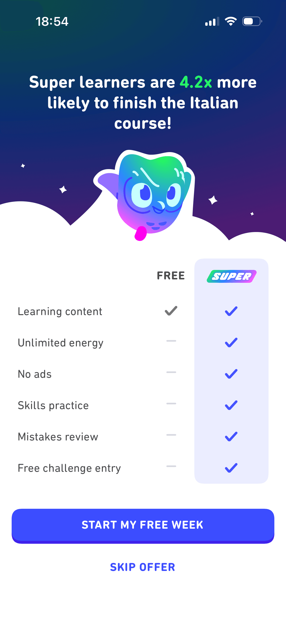
Super trial comparison and completion claim
A visible close, skip or alternative plan can preserve autonomy within the offer. Its prominence should be compared with the purchase action rather than judged by presence alone.
The table frames Super as the complete version by placing six checkmarks against one free feature. The comparison is visible, but it does not make Super a default and material trial renewal terms are absent.
The first price, percentage, crossed-out amount or weekly equivalent can become the comparison anchor. Total cost and renewal terms need equal visibility so the reference point is not misleading.
Show 1 more principleShow fewer principles
Duolingo states that Super learners are 4.2× more likely to finish the Italian course. This uses subscriber outcomes to support upgrading, but no sample, period, base rate or adjustment for pre-existing motivation is provided; it is not evidence that paying causes completion.
If Duolingo were to keep Skip offer visible, but state the trial renewal price, billing cadence, charge date, cancellation route and Restore Purchase, then people should compare the offer more accurately because price, eligibility and future cost are shown on the same basis. This would apply Choice Architecture and Framing Effect.
Screen 33
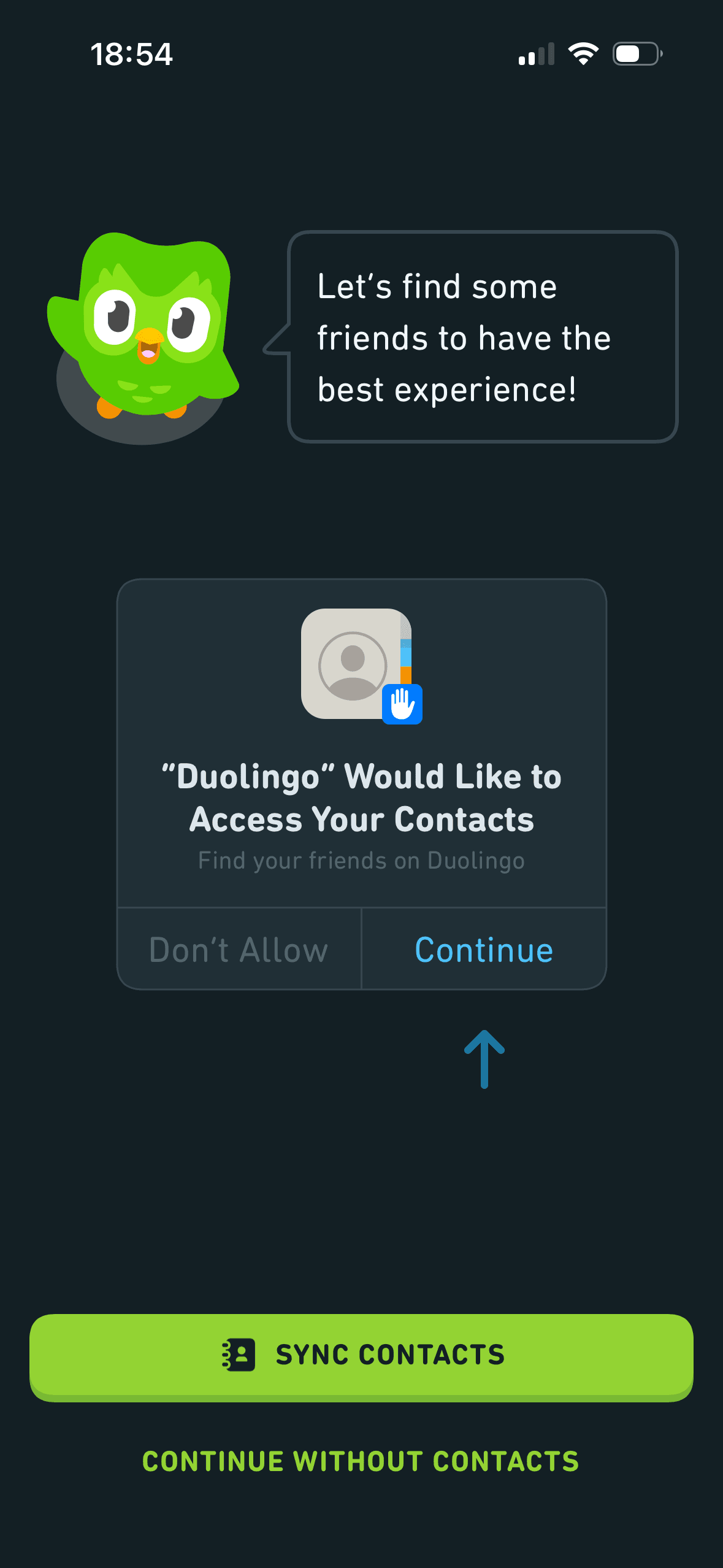
Optional contacts permission
A separate explanation before the operating-system permission can make the request more understandable, provided the next system choices are previewed accurately.
Sync contacts is the large filled action and Continue without contacts is secondary, alongside an illustrated system prompt. This is permission choice architecture; purpose and data handling are underexplained, while refusal remains available.
The social request arrives after earlier setup or progress, when continuing may feel easier than reconsidering a new permission. It should be introduced as a fresh optional decision.
Show 1 more principleShow fewer principles
Benefit-led, loss-led or negatively phrased copy changes the way people interpret the choice. The purpose, frequency and consequence should be clear without making refusal sound irresponsible.
If Duolingo were to before the system prompt, explain which contact fields are uploaded, matching, invitations, retention, deletion and whether non-users are affected, then people should understand the next decision more clearly because its purpose and consequences are visible before they act. This would apply Progressive Disclosure and Choice Architecture.

Screen 34
Review a matched contact before following
A separate explanation before the operating-system permission can make the request more understandable, provided the next system choices are previewed accurately.
Ratings, review counts or popularity labels provide social evidence, but the screen does not always define the audience, time window or sample behind them. Popularity should not be read as universal quality or fit.
The social request arrives after earlier setup or progress, when continuing may feel easier than reconsidering a new permission. It should be introduced as a fresh optional decision.
Show 1 more principleShow fewer principles
Syncing, inviting or sharing is presented beside a less prominent refusal route. Equal hierarchy and a clear explanation of access would better preserve autonomy.
If Duolingo were to do not preselect a person or claim that adding them makes learning faster without evidence, then people should make a more informed data choice because purpose, optionality and future use are clear before agreement. This would apply Progressive Disclosure and Social Proof.

Screen 35
Profile-created confirmation
The screen confirms the outcome of the preceding action and keeps a next action visible. That closes the immediate interaction loop.
The screen asks for personal information without always making purpose, retention and later editability equally visible. Short explanatory copy would let people interpret the request more accurately.
Profile information is requested in a bounded step rather than inside the first access decision. That pacing is useful when every field is necessary and the remaining journey is accurately represented.
Show 1 more principleShow fewer principles
The result or completion message receives the strongest hierarchy, so the state change is easy to locate. It also needs a non-colour status cue.
If Duolingo were to confirm which profile and settings were created, link Edit and privacy controls and state the next destination, then people should make a more informed data choice because purpose, optionality and future use are clear before agreement. This would apply Feedback Loop and Framing Effect.
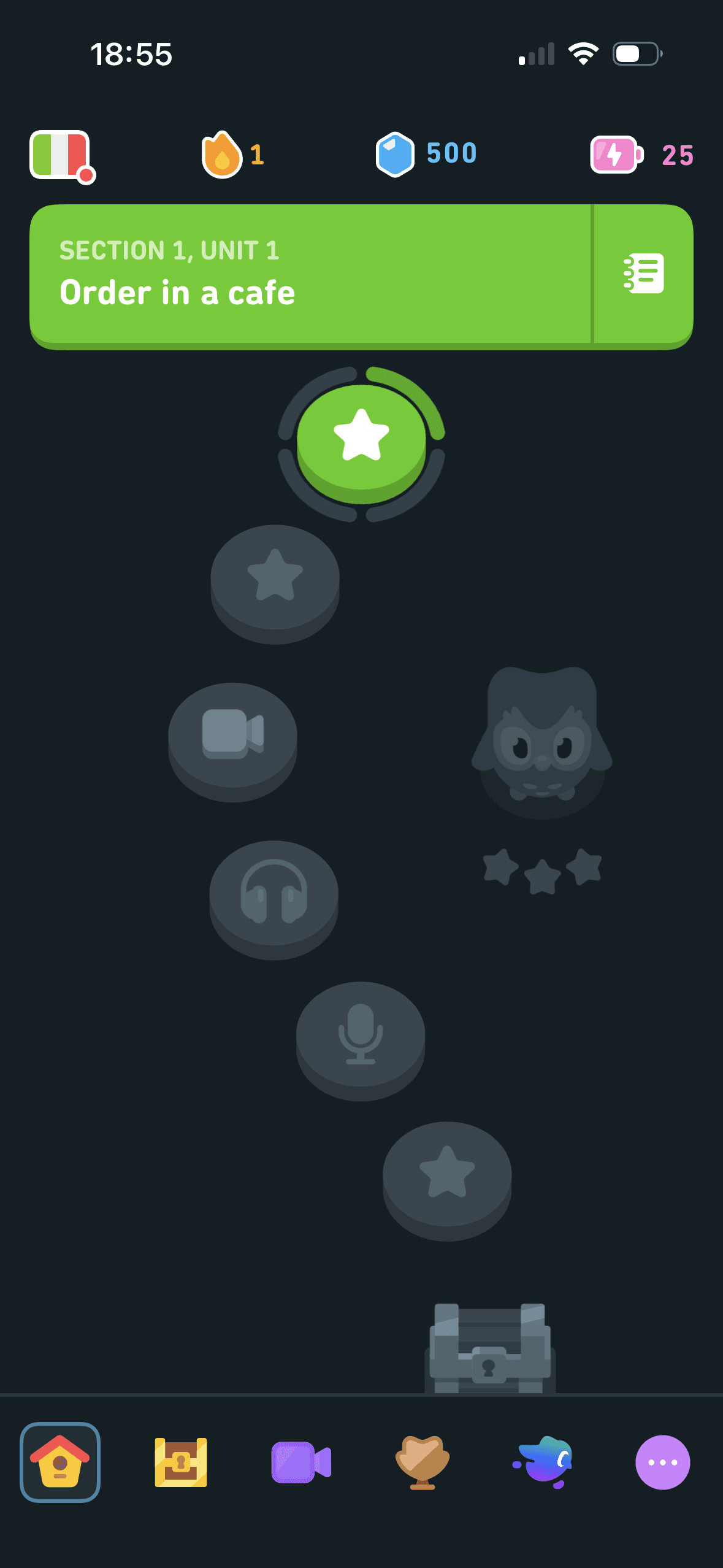
Screen 36
Course map
The course overview reports the current unit plus streak, gems and energy and distinguishes the available lesson from locked future activities. This is visible state feedback; the screenshot does not establish scarcity, desire or continued use.
Overlapping markers and competing map and card detail increase visual search effort. A list-only route and stable selection would make comparison easier.
The screen turns the labelled options and their selected states into explicit options rather than asking people to recall a hidden command or category.
Show 1 more principleShow fewer principles
Price markers and the selected listing create a clear visual relationship between place and option. The selected state should remain visible without relying on colour alone.
If Duolingo were to explain current unit, lesson types, locked content, streak, gems and energy in plain language, including free and paid conditions, then people should continue without unnecessary pressure because progress remains useful, flexible and easy to revise. This would apply Feedback Loop and Cognitive Load.
Conclusion
What this journey teaches us.
Duolingo is strongest inside the lesson. Focused tasks, immediate answer feedback and a clear results screen help people understand what happened and what comes next.
The journey becomes less balanced when forecasts, streak loss, profile creation, payment and social access accumulate. Flexible goals, attributable claims and clearer refusal would protect momentum without turning it into obligation.