
How Headspace introduces calm—and commitment
A screen-by-screen review of Headspace onboarding: account creation, wellbeing claims, trial framing, permissions and the route to a first exercise.
- Captured
- Capture date not recorded
- Published
- Last updated
- 21
- Screens
- 27
- Ingredients
- 86
- Applications

Common contexts
Business goals
Method visible
From screen observation to testable claim.
Order effects vary with task, delay, complexity and response method; the screenshots do not show an outcome.
Benefit and audience claims appear before the trial decision.
Limited transfer
Claim source recall, trial-term comprehension and ability to continue without subscribing.
What works
What the captured flow does well.
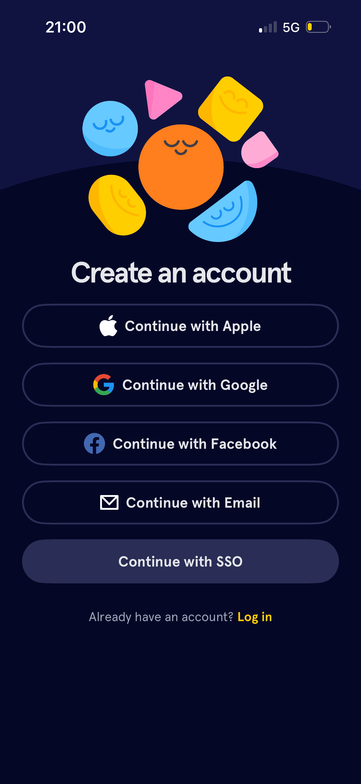
- Create account and Log in are distinct, and account creation supports Apple, Google, Facebook, email and single sign-on.
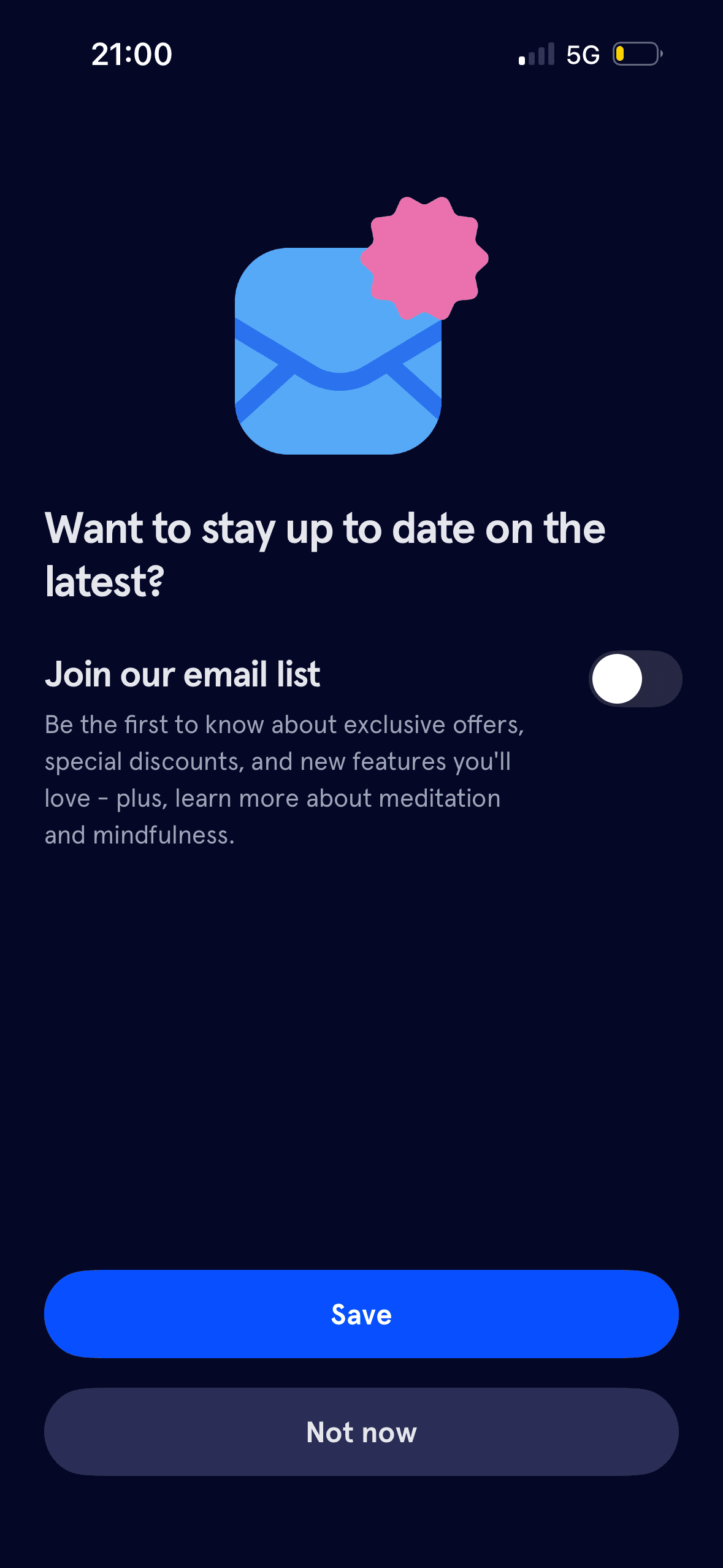
- Email marketing is off initially, its topic is described and a visible Not now action is available.
- The goal question includes Something else rather than forcing every person into a prewritten wellbeing label.
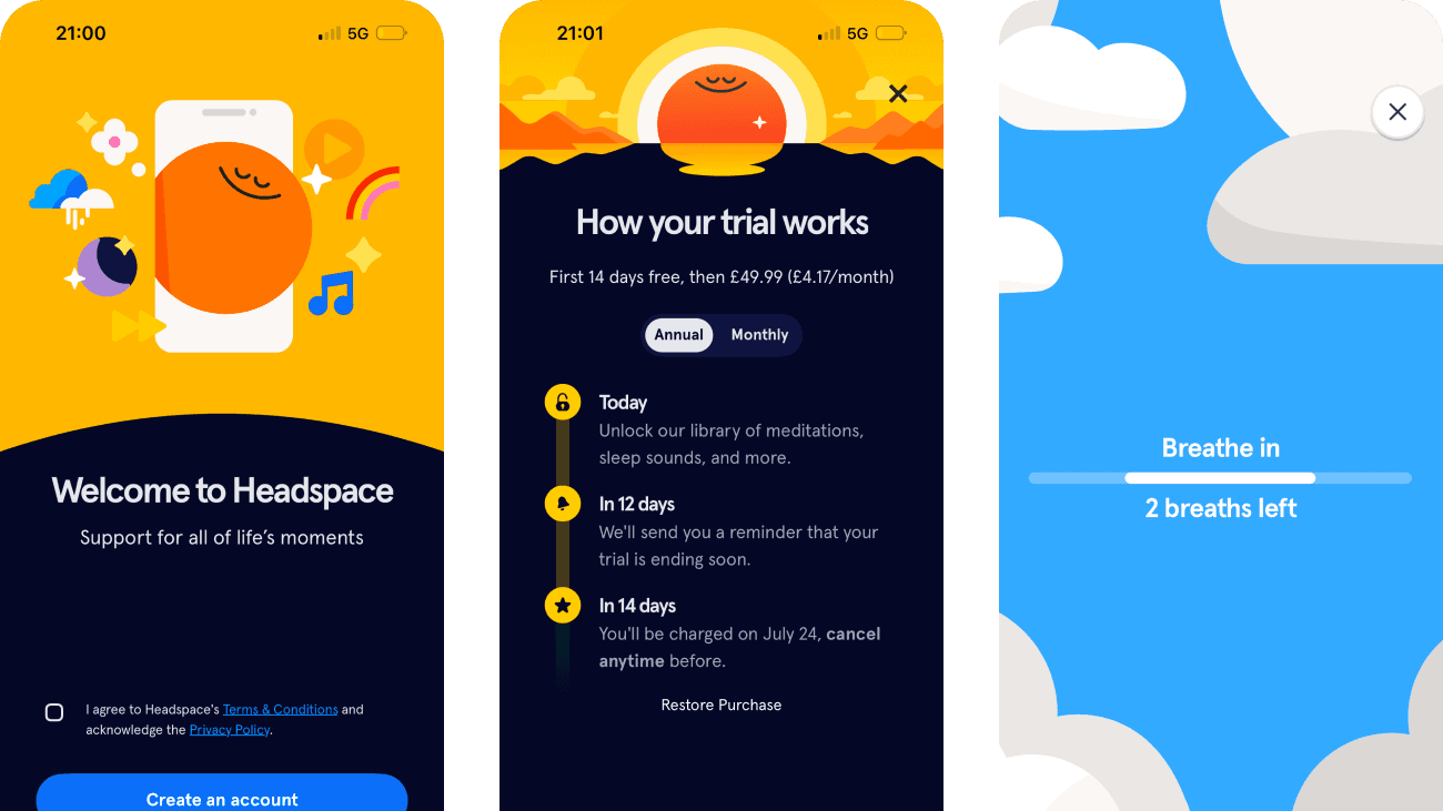
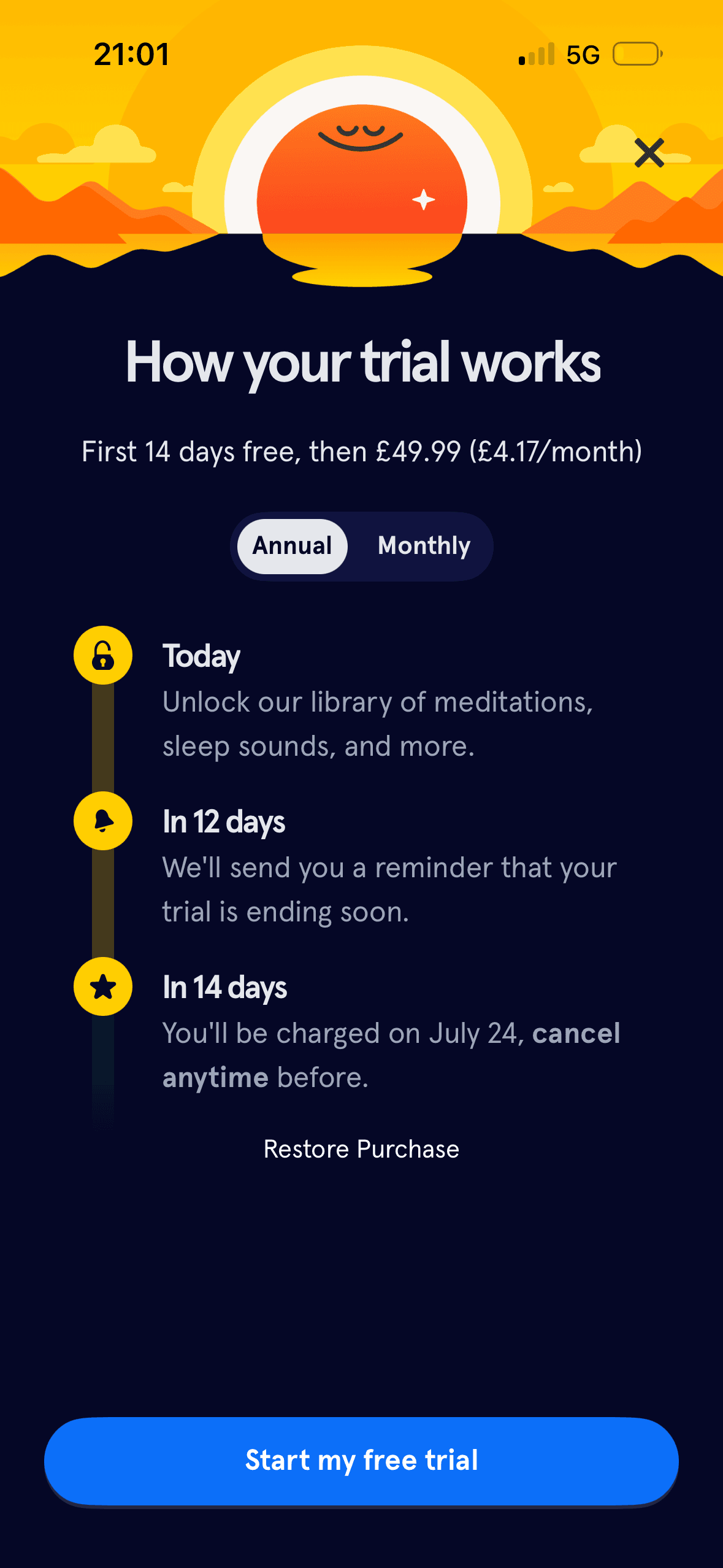
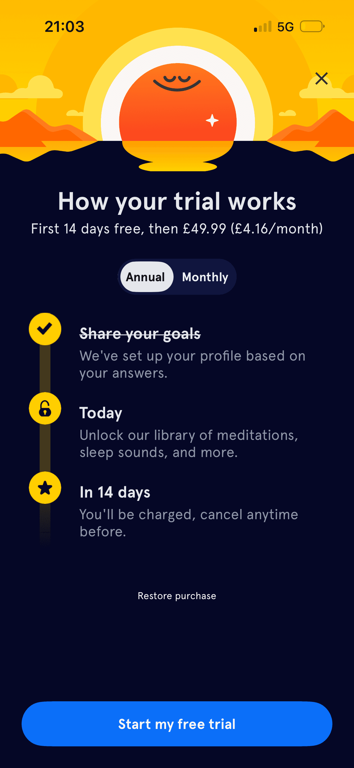
- The first trial screen states the free period, annual charge, approximate monthly equivalent, reminder timing, charge date, cancellation route, monthly alternative, close control and Restore Purchase.
What could improve
What deserves closer review.
- Broad promises such as “support for all of life’s moments” and “a happier, healthier life” are not scoped, and the “increase happiness by 16%” slide gives no source, population, outcome definition or uncertainty.
- The three benefit slides have no visible Skip action, while the goal question does not explain how answers affect recommendations or where they can be changed.
- Annual is preselected on both trial screens; monthly price and terms remain hidden until selected, and the two annual equivalents are shown as £4.17 and £4.16 per month for the same £49.99 price.
- A “today only” 30% offer appears immediately after the breathing exercise, links reflection on how the person feels to purchase and provides no expiry time or eligibility terms.
Screen-by-screen breakdown
Follow the journey.
Each observation shows what works or what could improve, on this screen or across the wider flow. The opportunity turns one or two principles into a testable hypothesis.

Screen 01
Headspace splash
The introductory message prepares people for the kind of task or benefit that follows. It is a flow-level cue because its effect depends on whether the next screens match that expectation.
The relative emphasis given to accept, refuse and manage choices can make one route feel easier than another. Button weight, wording and placement should support a voluntary decision.
The flow introduces one idea before moving to the next decision, reducing how much new information appears at once. Skip, back and reduced-motion routes determine whether that pacing stays supportive.
Show 1 more principleShow fewer principles
Benefit-led, loss-led or negatively phrased copy changes the way people interpret the choice. The purpose, frequency and consequence should be clear without making refusal sound irresponsible.
If Headspace were to keep the splash brief and respect reduced-motion settings, then people should understand the next decision more clearly because its purpose and consequences are visible before they act. This would apply Priming and Choice Architecture.

Screen 02
Breathe in
The introductory message prepares people for the kind of task or benefit that follows. It is a flow-level cue because its effect depends on whether the next screens match that expectation.
The opening language defines how the journey should be interpreted before evidence or terms appear. Aspirational wording should not overstate the outcome or conceal later effort and cost.
The task keeps the prompt, response state and next action close together, making it easier to understand whether an answer or action was accepted.
Show 2 more principlesShow fewer principles
The flow introduces one idea before moving to the next decision, reducing how much new information appears at once. Skip, back and reduced-motion routes determine whether that pacing stays supportive.
The activity is broken into a short, bounded step rather than presenting the whole lesson or exercise at once.
If Headspace were to explain that an optional breathing prompt is beginning, provide Skip and reduced-motion alternatives and avoid assuming that every person will find the animation calming or safe, then people should understand the next decision more clearly because its purpose and consequences are visible before they act. This would apply Priming and Framing Effect.

Screen 03
Breathe out
The introductory message prepares people for the kind of task or benefit that follows. It is a flow-level cue because its effect depends on whether the next screens match that expectation.
The opening language defines how the journey should be interpreted before evidence or terms appear. Aspirational wording should not overstate the outcome or conceal later effort and cost.
The task keeps the prompt, response state and next action close together, making it easier to understand whether an answer or action was accepted.
Show 2 more principlesShow fewer principles
The flow introduces one idea before moving to the next decision, reducing how much new information appears at once. Skip, back and reduced-motion routes determine whether that pacing stays supportive.
The activity is broken into a short, bounded step rather than presenting the whole lesson or exercise at once.
If Headspace were to keep breathing instructions clear, but add Skip, pause and replay controls and a non-animated alternative, then people should continue without unnecessary pressure because progress remains useful, flexible and easy to revise. This would apply Priming and Framing Effect.
Screen 04
Welcome, terms and account choice
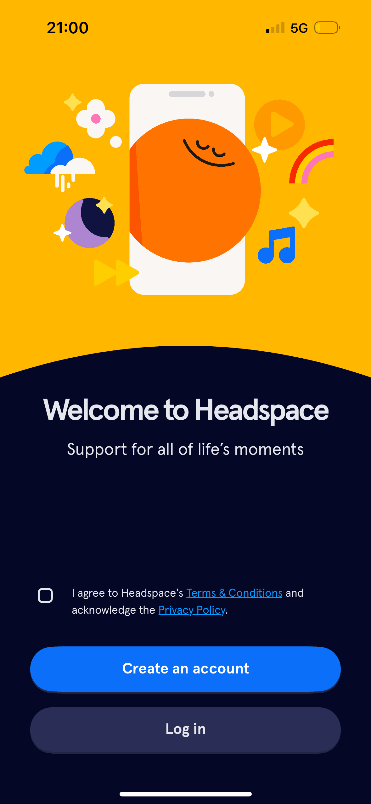
“Support for all of life’s moments” frames Headspace as broadly relevant before Create an account and Log in. This is an explicit benefit frame; the screenshot does not define the scope of support or show that the wording causes continuation.
The introductory message prepares people for the kind of task or benefit that follows. It is a flow-level cue because its effect depends on whether the next screens match that expectation.
Create an account is a bright primary button while Log in is secondary and a terms checkbox appears above both. This is visible choice architecture; neither account route is preselected and the screenshot does not establish a default effect.
Show 1 more principleShow fewer principles
The flow introduces one idea before moving to the next decision, reducing how much new information appears at once. Skip, back and reduced-motion routes determine whether that pacing stays supportive.
If Headspace were to keep Create an account and Log in distinct, then people should understand the next decision more clearly because its purpose and consequences are visible before they act. This would apply Priming and Framing Effect.
Screen 05
Choose an account method
One account route receives the strongest visual emphasis. That salience can steer selection before Headspace explains any meaningful privacy, recovery or data-sharing difference.
Headspace presents Apple, Google, Facebook, email and single sign-on as separate account routes, with Log in below. This is a visible set of choices; familiar provider logos are not defaults and do not prove trust or lower effort.
Provider names and familiar logos make the available account routes easier to recognise. They support identification, but they are not evidence that a provider is safer or more trustworthy.
Show 1 more principleShow fewer principles
The immediate task stays focused on one decision before the wider journey continues. That sequencing reduces simultaneous choices when later steps remain predictable and reversible.
If Headspace were to explain what data Apple, Google and Facebook share, keep email and single sign-on equally understandable and provide provider-specific error recovery, then people should recover from interruption with less effort because progress, failure and the next available action remain clear. This would apply Choice Architecture and Salience Effect.
Screen 06
Choose email updates
The email-list copy frames messages as being first to know about exclusive offers, discounts and new features “you’ll love”. The switch is off and Not now is visible; the screenshot does not show that immediate offers outweigh later value.
Asking for this choice separately from basic account access can support informed consent, provided the full purpose is visible before the person acts.
The relative emphasis given to accept, refuse and manage choices can make one route feel easier than another. Button weight, wording and placement should support a voluntary decision.
Show 1 more principleShow fewer principles
A preselected state, completed-state message or negative opt-out would make inaction count as agreement. Optional communication and data use should begin unselected.
If Headspace were to keep the email-list switch off and Not now visible, then people should understand the next decision more clearly because its purpose and consequences are visible before they act. This would apply Progressive Disclosure and Framing Effect.
Screen 07
Mindfulness for different needs
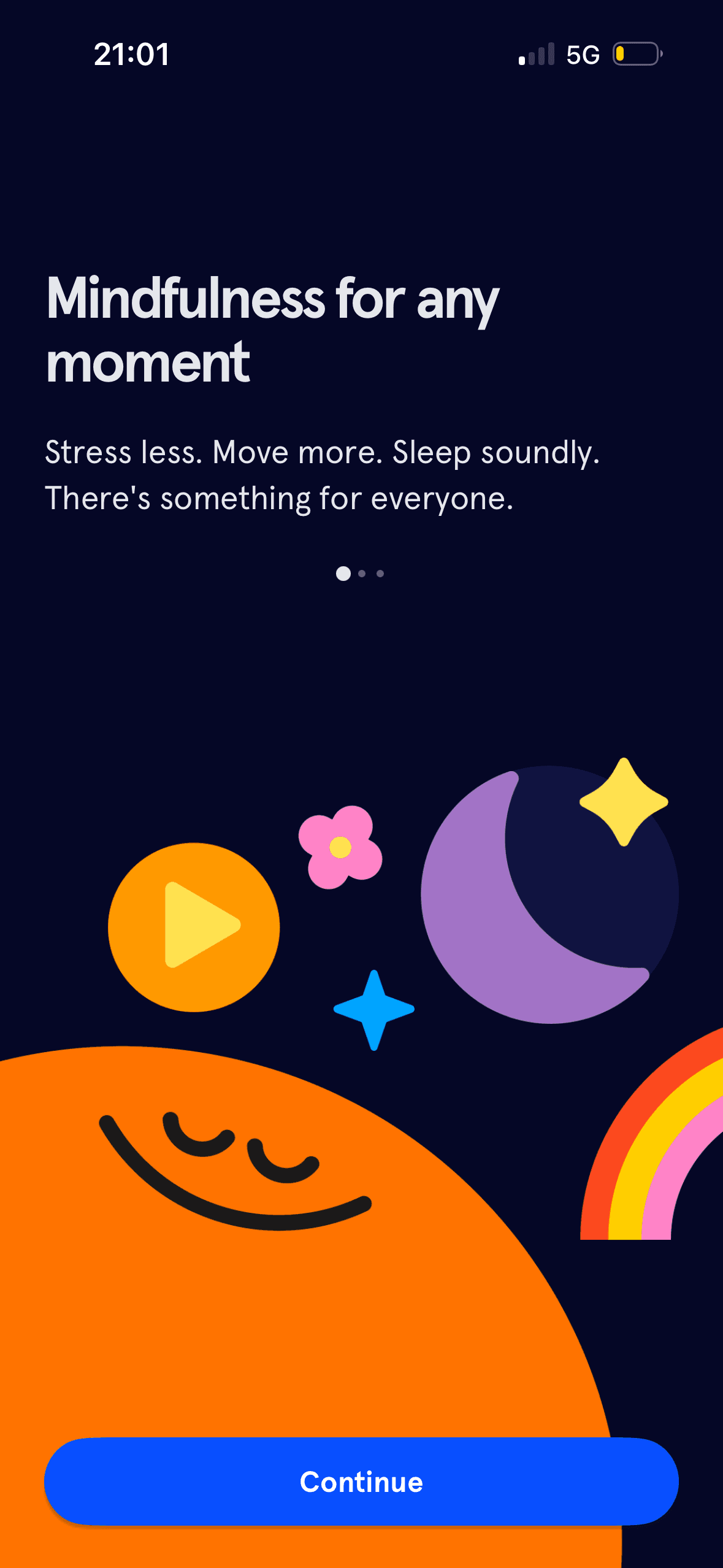
“Mindfulness for any moment” and the sequence “Stress less. Move more. Sleep soundly” frame Headspace around broad desired outcomes. The screen does not define eligibility, evidence or whether those outcomes occur.
Visual hierarchy gives the main controls, supporting information and available actions a clear point of entry. Important secondary information still needs enough prominence to be found before commitment.
The immediate task stays focused on one decision before the wider journey continues. That sequencing reduces simultaneous choices when later steps remain predictable and reversible.
Show 1 more principleShow fewer principles
The arrangement of the main controls, supporting information and available actions determines which action is easiest to see and take. The screen should keep alternatives, refusal and correction proportionate to their importance.
If Headspace were to treat Stress less, Move more and Sleep soundly as product categories, not promised outcomes, then people should narrow the available options with less effort because the source, type and effect of each control are explicit. This would apply Salience Effect and Framing Effect.

Screen 08
Audience-size slide
Visual hierarchy gives the main controls, supporting information and available actions a clear point of entry. Important secondary information still needs enough prominence to be found before commitment.
The immediate task stays focused on one decision before the wider journey continues. That sequencing reduces simultaneous choices when later steps remain predictable and reversible.
The arrangement of the main controls, supporting information and available actions determines which action is easiest to see and take. The screen should keep alternatives, refusal and correction proportionate to their importance.
Show 1 more principleShow fewer principles
Headspace says the person is joining “millions of people caring for their minds”. This is explicit audience-size information that may normalise use, but the count is undefined and does not establish effectiveness or individual fit.
If Headspace were to state what “millions” counts, over what period and whether it means accounts, downloads or active members, then people should understand the next decision more clearly because its purpose and consequences are visible before they act. This would apply Salience Effect and Social Proof.
Screen 09
Wellbeing evidence claim
A nearby route to criteria or supporting evidence would let the main screen stay concise while making the claim inspectable.
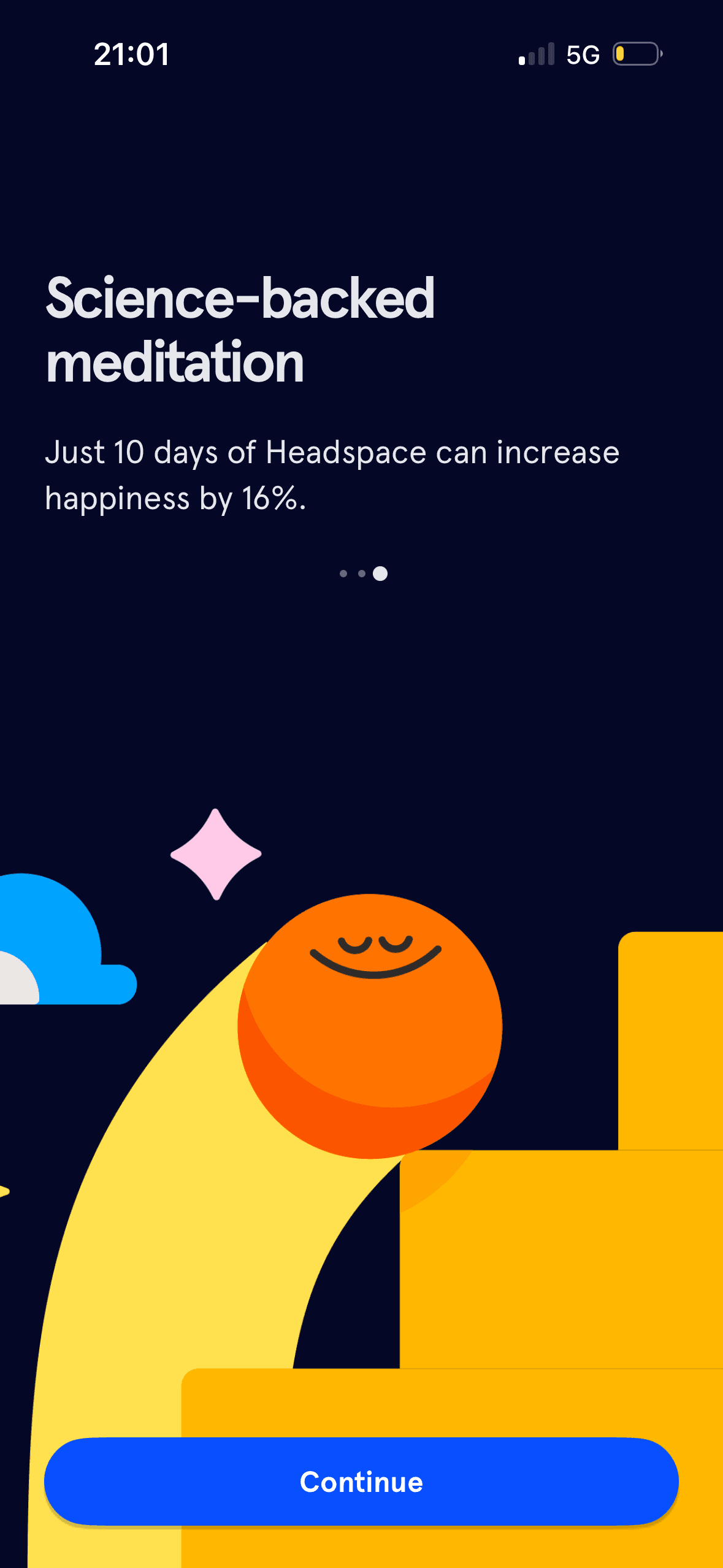
“Science-backed meditation” and the 16% figure invoke scientific evidence as an authority cue. The screenshot gives no citation or limitations; the linked randomized trial reported increased positive affect in a self-selecting sample, not a universal 16% increase in happiness.
Visual hierarchy gives the main controls, supporting information and available actions a clear point of entry. Important secondary information still needs enough prominence to be found before commitment.
Show 1 more principleShow fewer principles
The arrangement of the main controls, supporting information and available actions determines which action is easiest to see and take. The screen should keep alternatives, refusal and correction proportionate to their importance.
If Headspace were to link the 16% figure directly to the study and say that it measured positive affect in a self-selecting 121-person sample, then people should understand the next decision more clearly because its purpose and consequences are visible before they act. This would apply Progressive Disclosure and Authority Bias.
Screen 10
Choose a wellbeing goal
A concrete target and visible progress can make the next small step easier to locate. It remains supportive only when the endpoint is accurate and optional.
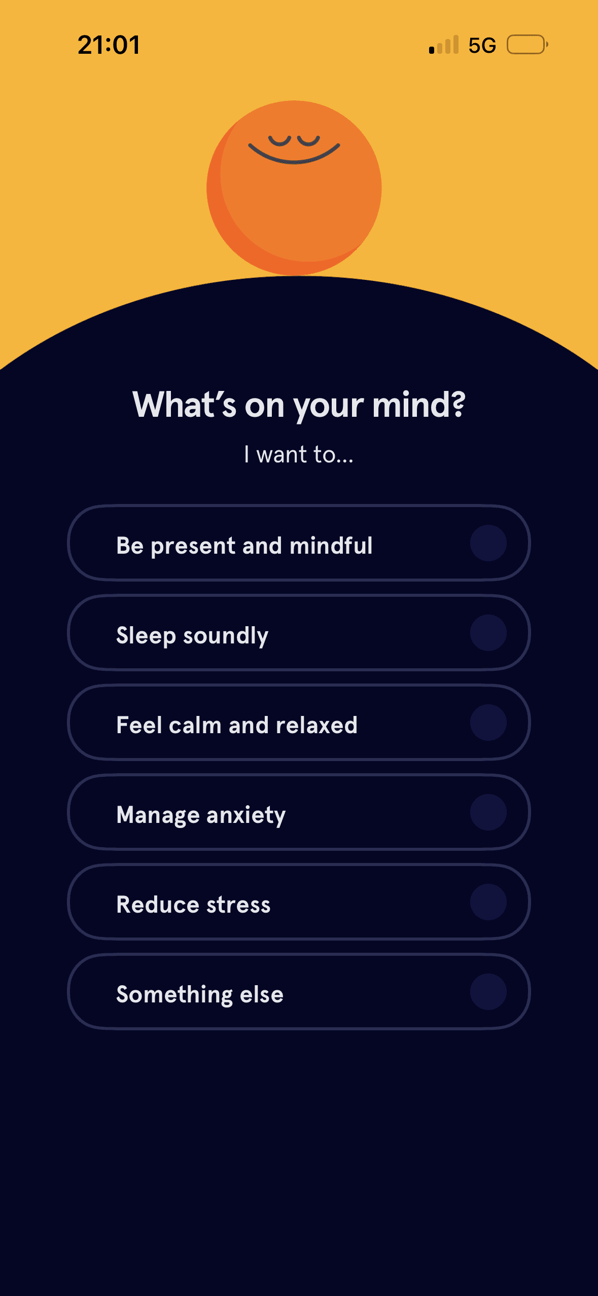
Headspace presents one wellbeing-goal question with six radio options, including Something else, on a focused step. This is staged disclosure; the screenshot does not explain how the answer is used, whether it is optional or whether the sequence reduces effort.
Naming a target as a commitment can make revising it feel like failure. The flow should keep pause, change and no-goal options visible after the initial choice.
Show 1 more principleShow fewer principles
Streaks, saved progress or “don’t lose” language can make stopping feel like forfeiting something already earned. Missing a day or leaving should not erase learning or block access.
If Headspace were to explain whether one goal can be selected, how it changes recommendations and where it can be edited, then people should narrow the available options with less effort because the source, type and effect of each control are explicit. This would apply Goal Gradient Effect and Progressive Disclosure.
Screen 11
What Headspace includes
Asking for this choice separately from basic account access can support informed consent, provided the full purpose is visible before the person acts.
The relative emphasis given to accept, refuse and manage choices can make one route feel easier than another. Button weight, wording and placement should support a voluntary decision.
Benefit-led, loss-led or negatively phrased copy changes the way people interpret the choice. The purpose, frequency and consequence should be clear without making refusal sound irresponsible.
Show 1 more principleShow fewer principles
A preselected state, completed-state message or negative opt-out would make inaction count as agreement. Optional communication and data use should begin unselected.
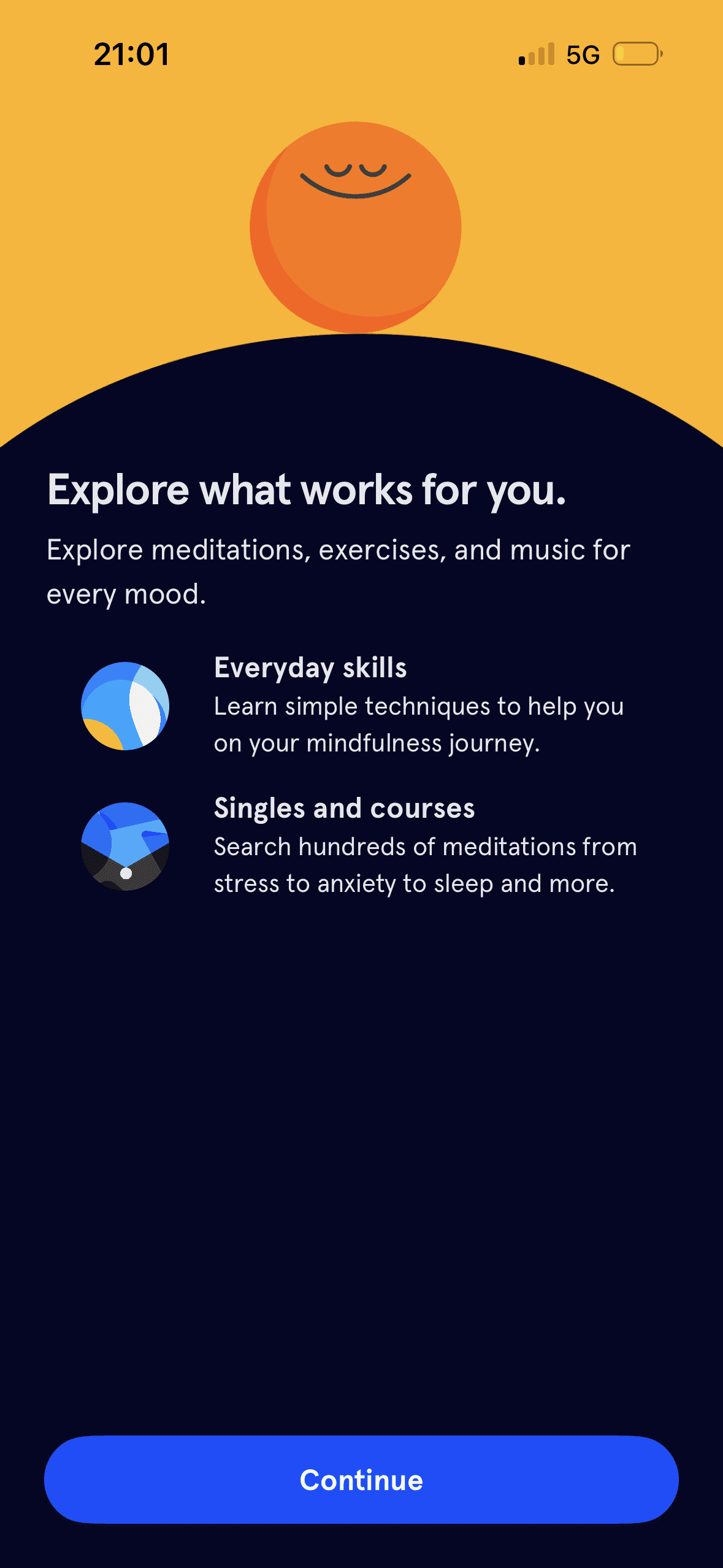
If Headspace were to replace the vague “explore what works for you” promise with a short, skippable account of the next step and free versus paid access, then people should understand the next decision more clearly because its purpose and consequences are visible before they act. This would apply Progressive Disclosure and Choice Architecture.
Screen 12
Trial terms and plan choice
A visible close, skip or alternative plan can preserve autonomy within the offer. Its prominence should be compared with the purchase action rather than judged by presence alone.
Annual is visibly selected before the person acts, while Monthly is available but its price is hidden. This is an actual interface default; the screenshot does not show acceptance, and informed choice requires both plans and renewal terms to be equally comparable.
The offer foregrounds benefits or savings while renewal, eligibility or refusal receives less emphasis. That framing makes the attractive interpretation easier to process than the full commercial decision.
Show 1 more principleShow fewer principles
The first price, percentage, crossed-out amount or weekly equivalent can become the comparison anchor. Total cost and renewal terms need equal visibility so the reference point is not misleading.
If Headspace were to keep the close control, reminder timing, charge date and Restore Purchase, then people should compare the offer more accurately because price, eligibility and future cost are shown on the same basis. This would apply Choice Architecture and Default Effect.
Screen 13
Onboarding transition
Visual hierarchy gives the main controls, supporting information and available actions a clear point of entry. Important secondary information still needs enough prominence to be found before commitment.
The arrangement of the main controls, supporting information and available actions determines which action is easiest to see and take. The screen should keep alternatives, refusal and correction proportionate to their importance.
The immediate task stays focused on one decision before the wider journey continues. That sequencing reduces simultaneous choices when later steps remain predictable and reversible.
Show 1 more principleShow fewer principles
The screen asks people to interpret the main controls, supporting information and available actions without showing every relevant consequence nearby. Clearer grouping and concise support would reduce avoidable mental effort.
If Headspace were to replace “almost there” with an accurate step count or the name of the next decision, and provide a route back or out, then people should continue without unnecessary pressure because progress remains useful, flexible and easy to revise. This would apply Salience Effect and Choice Architecture.
Screen 14
Choose notification types
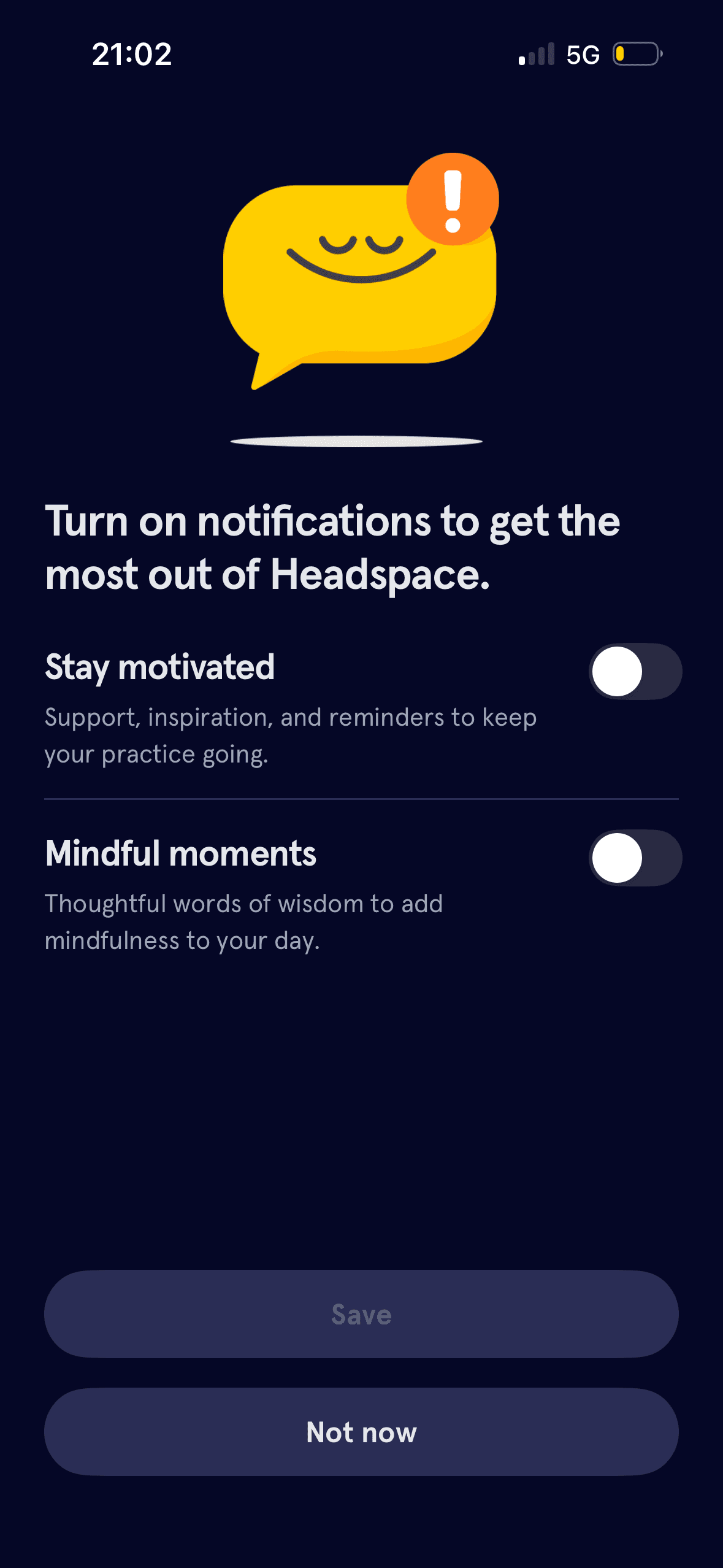
Both notification categories start off, Save is unavailable until a choice changes and Not now remains visible. These are observable defaults that preserve non-subscription; the screenshot does not show whether people keep or later change them.
The arrangement of the main controls, supporting information and available actions determines which action is easiest to see and take. The screen should keep alternatives, refusal and correction proportionate to their importance.
Visual hierarchy gives the available choices and selected state a clear point of entry. Important secondary information still needs enough prominence to be found before commitment.
Show 1 more principleShow fewer principles
The immediate task stays focused on one decision before the wider journey continues. That sequencing reduces simultaneous choices when later steps remain predictable and reversible.
If Headspace were to keep both notification types off and Not now available, then people should make a more informed data choice because purpose, optionality and future use are clear before agreement. This would apply Default Effect and Choice Architecture.
Screen 15
Optional first exercise
The task keeps the prompt, response state and next action close together, making it easier to understand whether an answer or action was accepted.
Hints, controls and task content can compete within a small viewport. Keeping help dismissible and preserving accessible alternatives would reduce unnecessary load.
The activity is broken into a short, bounded step rather than presenting the whole lesson or exercise at once.
Show 1 more principleShow fewer principles
Items placed first or at the top receive an attention advantage before people inspect the rest. The first position should reflect the person’s task rather than an unexplained commercial priority.
If Headspace were to state the exercise duration, whether it uses sound or haptics and what the person can expect, then people should understand the next decision more clearly because its purpose and consequences are visible before they act. This would apply Feedback Loop and Cognitive Load.
Screen 16
Begin the short exercise
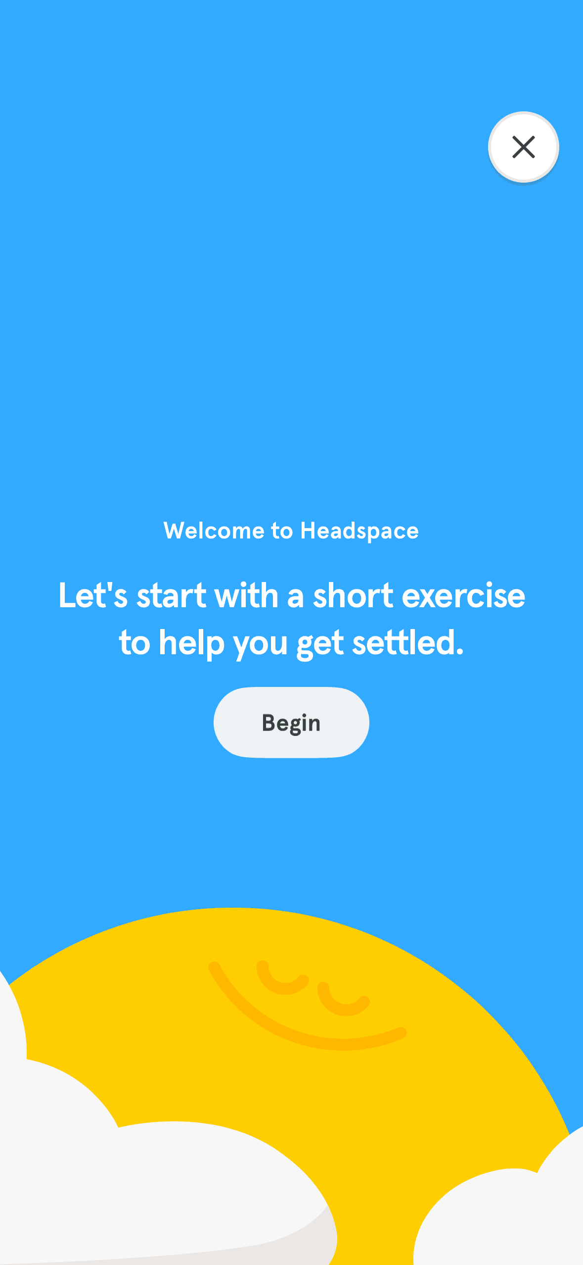
The screen introduces one short exercise with Begin and a close control before showing its steps. This is staged disclosure with an exit route; duration, accessibility options and the effect of completing the exercise are not shown.
Hints, controls and task content can compete within a small viewport. Keeping help dismissible and preserving accessible alternatives would reduce unnecessary load.
The task keeps the prompt, response state and next action close together, making it easier to understand whether an answer or action was accepted.
Show 1 more principleShow fewer principles
The activity is broken into a short, bounded step rather than presenting the whole lesson or exercise at once.
If Headspace were to keep a clear Begin action and close route, but add the duration, pause behaviour and audio or haptic controls before starting, then people should understand the next decision more clearly because its purpose and consequences are visible before they act. This would apply Progressive Disclosure and Cognitive Load.

Screen 17
Guided breathing progress
During the exercise, Headspace shows the current instruction, a progress bar and “2 breaths left”. This is visible system feedback about a timed sequence; it does not detect breathing, wellbeing or habit formation.
Visible progress can increase momentum as the apparent finish approaches. It becomes misleading if optional or commercial steps appear after the progress indicator suggests the journey is complete.
The activity is broken into a short, bounded step rather than presenting the whole lesson or exercise at once.
Show 1 more principleShow fewer principles
Hints, controls and task content can compete within a small viewport. Keeping help dismissible and preserving accessible alternatives would reduce unnecessary load.
If Headspace were to keep the current instruction, progress and breaths remaining in sync and accessible, then people should continue without unnecessary pressure because progress remains useful, flexible and easy to revise. This would apply Feedback Loop and Goal Gradient Effect.

Screen 18
Post-exercise discount offer
The task keeps the prompt, response state and next action close together, making it easier to understand whether an answer or action was accepted.
The discount is labelled “today only”, creating a stated time limit immediately after the exercise. The screenshot provides no exact expiry time or eligibility, so the deadline needs verification and must not interrupt a reflective moment.
“Take a moment to reflect on how you feel. Then, keep exploring” connects the completed exercise to a 30% annual-membership offer. This is an explicit continuation frame; the screenshot does not measure relief or justify turning reflection into a sales cue.
Show 1 more principleShow fewer principles
The first price, percentage, crossed-out amount or weekly equivalent can become the comparison anchor. Total cost and renewal terms need equal visibility so the reference point is not misleading.
If Headspace were to separate reflection from purchase: let people record or dismiss how they feel before showing a commercial offer, then people should compare the offer more accurately because price, eligibility and future cost are shown on the same basis. This would apply Feedback Loop and Scarcity Principle.
Screen 19
Trial terms after the exercise
The later trial screen again preselects Annual and pairs immediate free access with a future £49.99 charge. The visible default is supportable; the screenshot does not establish temporal discounting and does not reconcile the earlier 30% offer.
The task keeps the prompt, response state and next action close together, making it easier to understand whether an answer or action was accepted.
The offer foregrounds benefits or savings while renewal, eligibility or refusal receives less emphasis. That framing makes the attractive interpretation easier to process than the full commercial decision.
Show 1 more principleShow fewer principles
The relative emphasis given to accept, refuse and manage choices can make one route feel easier than another. Button weight, wording and placement should support a voluntary decision.
If Headspace were to reconcile the promised 30% discount with the amount shown, use one consistent monthly equivalent and restore the exact reminder and charge-date details, then people should compare the offer more accurately because price, eligibility and future cost are shown on the same basis. This would apply Feedback Loop and Default Effect.
Screen 20
Home feed with sharing tooltip
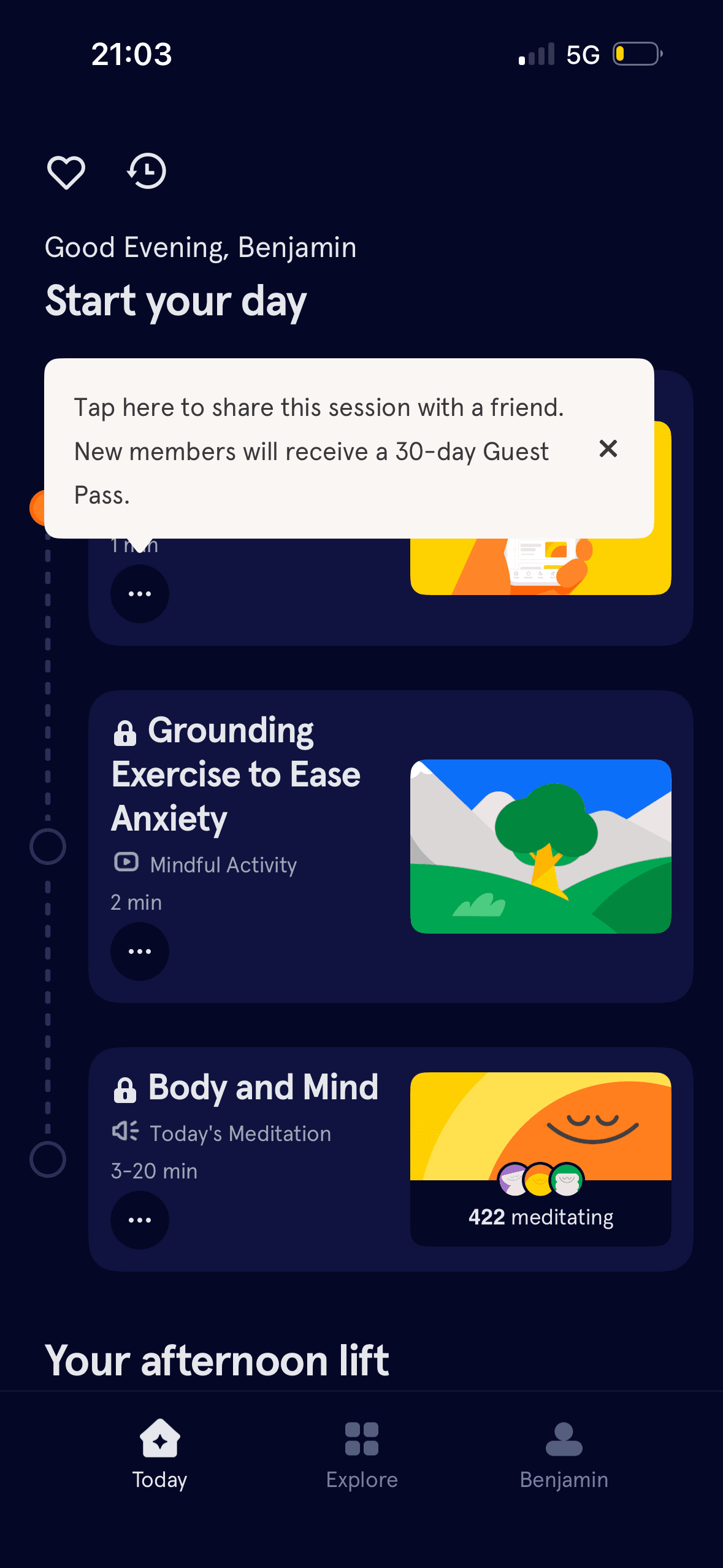
A home-feed card shows “422 meditating” with small avatars. This is an explicit activity-count cue; its time window, geography and method are not defined, and simultaneous use does not establish that the content suits this person.
The content is divided into labelled rows or sections, which makes a long feed easier to scan by purpose or source.
A large tooltip overlays the initial home feed and directs the person to share a session for a 30-day Guest Pass. Its visual prominence is observable and it can be dismissed; whether it captures attention or changes sharing requires testing.
Show 1 more principleShow fewer principles
Ordering and naming the rows shapes which path is easiest to take. The screen does not always explain why an item appears or provide nearby controls to correct the recommendation.
If Headspace were to delay the Guest Pass tooltip until the person chooses sharing or has oriented to the home feed, while keeping it dismissible, then people should narrow the available options with less effort because the source, type and effect of each control are explicit. This would apply Chunking and Social Proof.
Screen 21
Getting-started video
Visual hierarchy gives the main controls, supporting information and available actions a clear point of entry. Important secondary information still needs enough prominence to be found before commitment.
The arrangement of the main controls, supporting information and available actions determines which action is easiest to see and take. The screen should keep alternatives, refusal and correction proportionate to their importance.
The immediate task stays focused on one decision before the wider journey continues. That sequencing reduces simultaneous choices when later steps remain predictable and reversible.
Show 1 more principleShow fewer principles
The screen asks people to interpret the main controls, supporting information and available actions without showing every relevant consequence nearby. Clearer grouping and concise support would reduce avoidable mental effort.
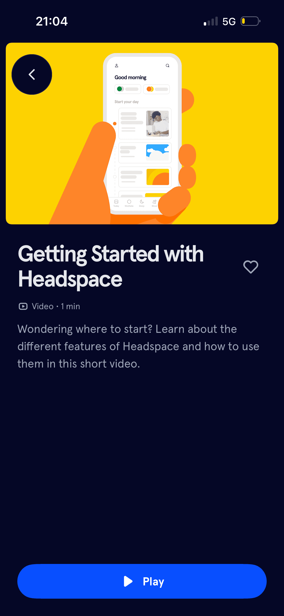
If Headspace were to keep the one-minute duration and clear Play action, add captions and a transcript and preserve the back route, then people should continue without unnecessary pressure because progress remains useful, flexible and easy to revise. This would apply Salience Effect and Choice Architecture.
Conclusion
What this journey teaches us.
Headspace communicates trial timing, notification choices and exercise progress more clearly than many onboarding flows. Close and refusal routes remain visible in important places.
The larger opportunity is to separate care from conversion. Better evidence, consistent plan information and breathing room after a reflective exercise would make the commercial journey feel more responsible.