
Salience Effect
Features that stand out can attract attention or receive disproportionate weight, depending on a person’s goal and context.
Public evidence overview
One checked source, with its limits.
This preview is not the complete evidence base. Use it as a question to investigate in your own product, not as a prediction of what an individual will do.
Five factors that guide attention in visual search
Research-assisted source review
- What it supports
- Attention can be guided by bottom-up feature salience, top-down target features, the structure and meaning of a scene, previous search episodes and the relative value of targets or locations. Bottom-up salience is one influence, not a complete account.
- Where it may not transfer
- The paper reviews controlled visual-search research and does not prescribe interface hierarchy or estimate effects on comprehension, consent or product outcomes. Which guide dominates depends on the task, stimulus and prior experience.
See how sources and limitations are checked in our editorial method.
Member depth
Continue into the complete evidence and application.
Practitioner includes the complete checked source set, study context and practical takeaways for this ingredient. The public overview above remains available without upgrading.
Seen in real products
How teams put it to work.
Examples identified in our interface teardowns, linked back to the full product journey.

Visual hierarchy gives prices, savings or time-based offer language a clear point of entry. Important secondary information still needs enough prominence to be found before commitment.
View Build momentum without pressure →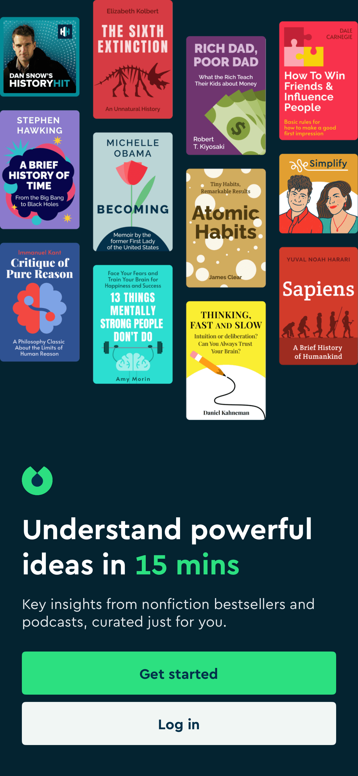
Visual hierarchy gives the available choices and selected state a clear point of entry. Important secondary information still needs enough prominence to be found before commitment.
View Personalise before asking for payment →
Visual hierarchy gives the main controls, supporting information and available actions a clear point of entry. Important secondary information still needs enough prominence to be found before commitment.
View Personalise before asking for payment →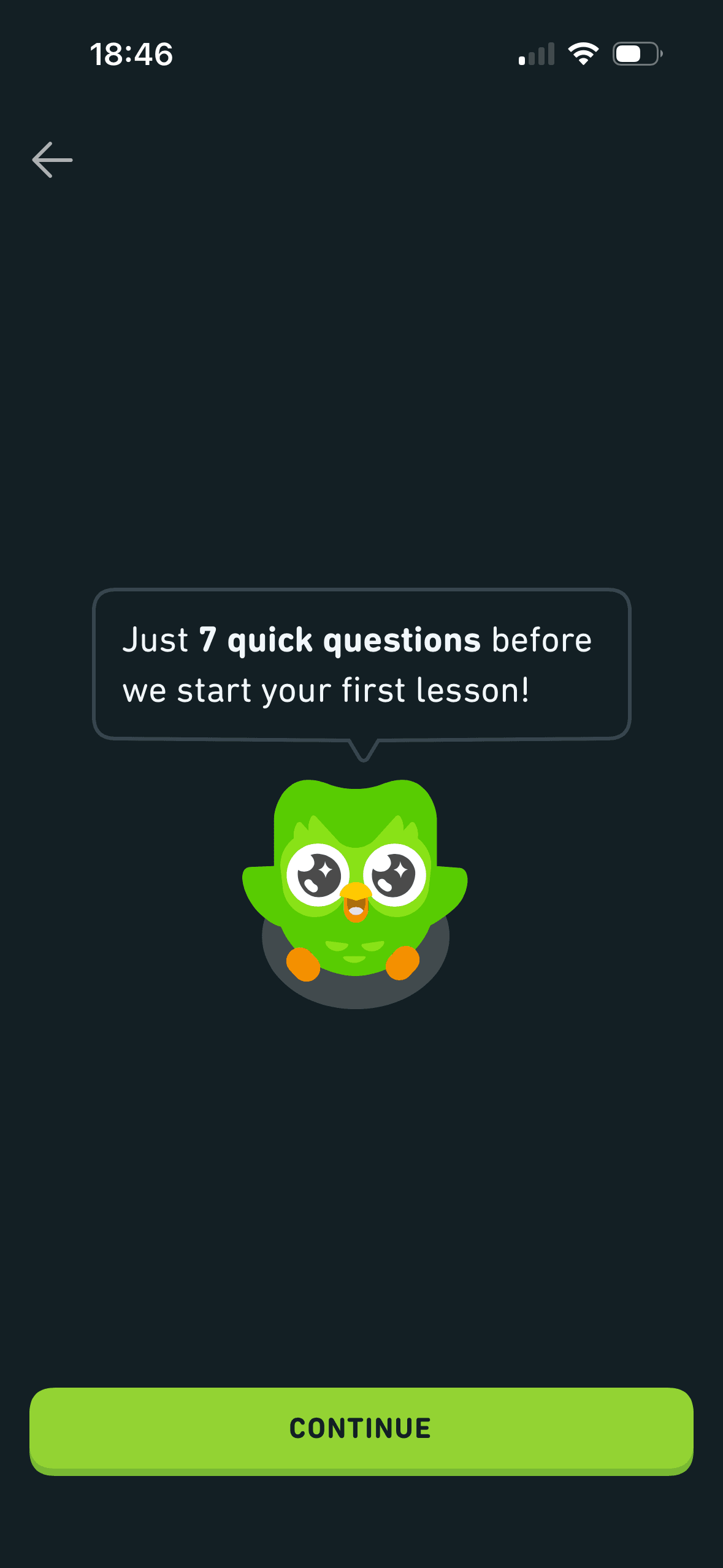
Visual hierarchy gives the main controls, supporting information and available actions a clear point of entry. Important secondary information still needs enough prominence to be found before commitment.
View Build momentum without pressure →
Visual hierarchy gives the main controls, supporting information and available actions a clear point of entry. Important secondary information still needs enough prominence to be found before commitment.
View Personalise before asking for payment →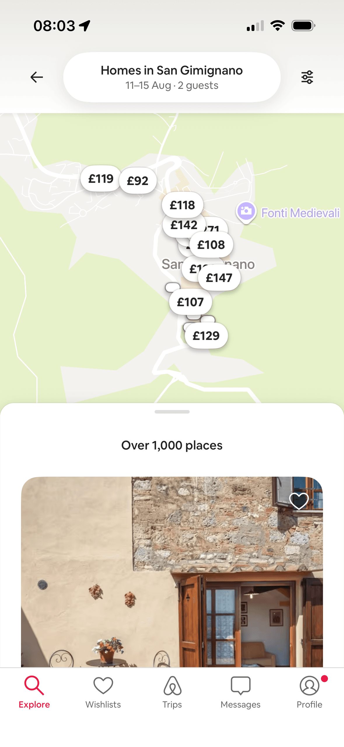
Price markers and the selected listing create a clear visual relationship between place and option. The selected state should remain visible without relying on colour alone.
View Keep recommendations explainable →