
Personalise before asking for payment
I followed Blinkist from its product introduction through goals, interests and an example title before reaching recommendations, trial pricing and account creation. The preference steps promise a more relevant experience, but repeated offers arrive before the captured journey proves much of that value.
What interested me was the exchange between effort and reward. If people provide several preferences, the product should show clearly how those answers improve what they see before using urgency or a discount to ask for commitment.
- Captured
- Capture date not recorded
- Published
- Last updated
- 21
- Screens
- 25
- Ingredients
- 84
- Applications

Common contexts
Business goals
What works
What the captured flow does well.
- The opening screen distinguishes Get started from Log in and explains the core read-or-listen proposition before requesting data.
- The four introductory slides use a visible 1-of-4 indicator, and the preference questions use a separate 4-step indicator.
- The first goal screen says answers can be updated, while the example-title step provides both Skip and like or dislike controls.
- The trial timeline states the free period, reminder date, renewal date, annual charge, cancellation availability and App Store billing.
What could improve
What deserves closer review.
- The product slides repeat “be a better you” and require Tell us your interests with no visible Skip; the driving example should explicitly say audio only and hands-free rather than normalising screen interaction while driving.
- The first three preference steps have no visible skip or back route, do not explain why each answer is needed and only the first says where answers can be changed.
- The “87%” positive-change claim is based on an internal customer survey, but the screen omits the sample, date, question wording, response rate and limits of self-report; the five-star testimonial also lacks source context.
- “Now let’s get to your learning style” is misleading because the next screen only prepares recommendations and does not assess a validated learning style.
Screen-by-screen breakdown
Follow the journey.
Each observation shows what works or what could improve, on this screen or across the wider flow. The opportunity turns one or two principles into a testable hypothesis.
Screen 01
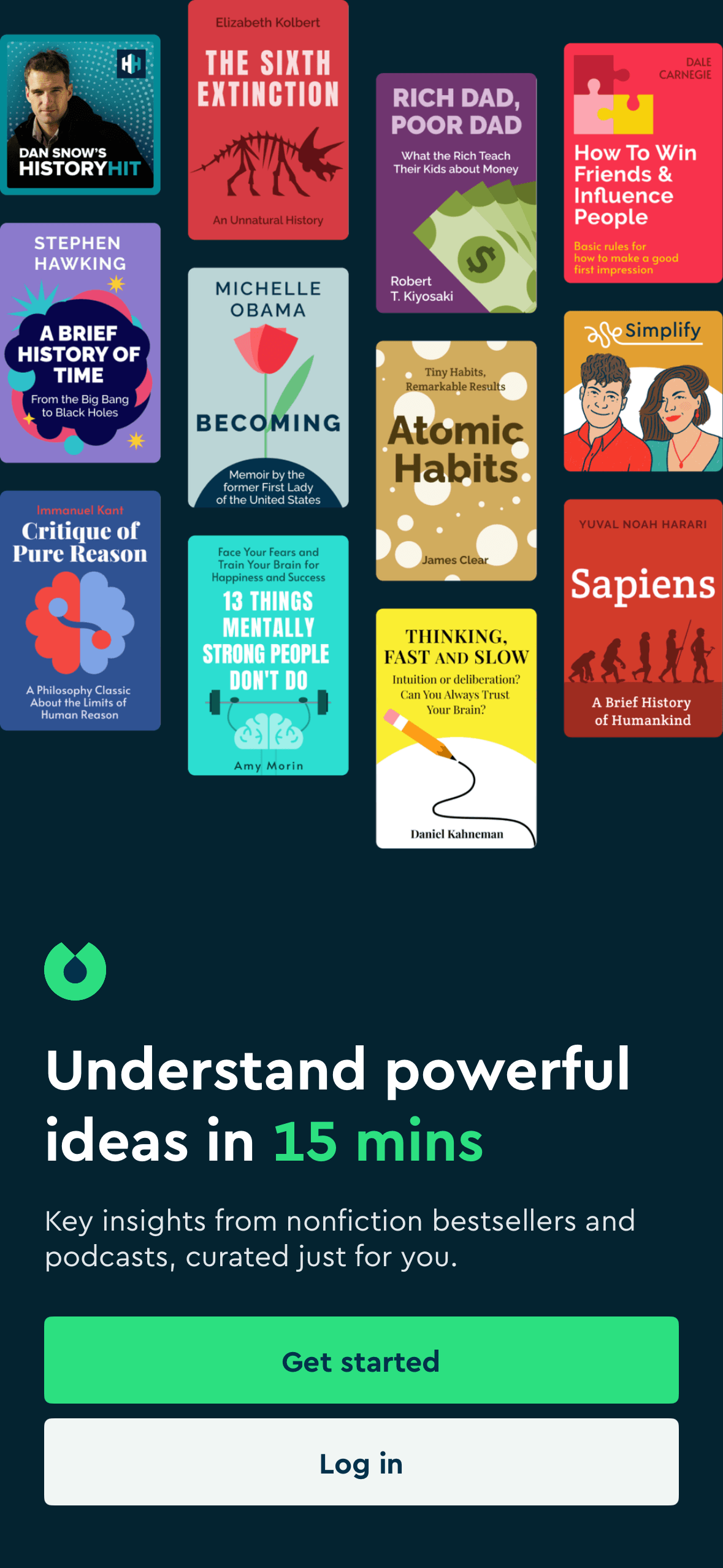
Opening value proposition and account routes
Visual hierarchy gives the available choices and selected state a clear point of entry. Important secondary information still needs enough prominence to be found before commitment.
“Understand powerful ideas in 15 mins” frames Blinkist around speed and personal value before Get started. The time claim is visible, but the screenshot does not show positive emotion, understanding or engagement.
Items placed first or at the top receive an attention advantage before people inspect the rest. The first position should reflect the person’s task rather than an unexplained commercial priority.
Show 1 more principleShow fewer principles
The arrangement of the main controls, supporting information and available actions determines which action is easiest to see and take. The screen should keep alternatives, refusal and correction proportionate to their importance.
If Blinkist were to keep the read-or-listen proposition and Log in route visible, then people should understand the next decision more clearly because its purpose and consequences are visible before they act. This would apply Salience Effect and Framing Effect.

Screen 02
Learning while running
Visual hierarchy gives the main controls, supporting information and available actions a clear point of entry. Important secondary information still needs enough prominence to be found before commitment.
The introduction shows one contextual example at a time with a visible 1-of-4 indicator. This is staged disclosure, but there is no visible Skip or Back action and the screenshot does not show that the sequence reduces effort or increases completion.
The arrangement of the main controls, supporting information and available actions determines which action is easiest to see and take. The screen should keep alternatives, refusal and correction proportionate to their importance.
Show 1 more principleShow fewer principles
The screen asks people to interpret the main controls, supporting information and available actions without showing every relevant consequence nearby. Clearer grouping and concise support would reduce avoidable mental effort.
If Blinkist were to keep the numbered position, add Skip and Back and distinguish listening from reading, then people should narrow the available options with less effort because the source, type and effect of each control are explicit. This would apply Salience Effect and Progressive Disclosure.

Screen 03
Learning while relaxing
Visual hierarchy gives the main controls, supporting information and available actions a clear point of entry. Important secondary information still needs enough prominence to be found before commitment.
The arrangement of the main controls, supporting information and available actions determines which action is easiest to see and take. The screen should keep alternatives, refusal and correction proportionate to their importance.
The immediate task stays focused on one decision before the wider journey continues. That sequencing reduces simultaneous choices when later steps remain predictable and reversible.
Show 1 more principleShow fewer principles
The screen asks people to interpret the main controls, supporting information and available actions without showing every relevant consequence nearby. Clearer grouping and concise support would reduce avoidable mental effort.
If Blinkist were to avoid repeating the same promise across four compulsory slides, then people should make a more informed data choice because purpose, optionality and future use are clear before agreement. This would apply Salience Effect and Choice Architecture.

Screen 04
Listening while driving
The content is divided into labelled rows or sections, which makes a long feed easier to scan by purpose or source.
“While driving” frames listening as a way to use travel time, alongside a phone illustration and “Tell us your interests”. The efficiency frame is explicit, but safe guidance should say audio only, hands-free and set up before driving.
Artwork, thumbnails and familiar titles support rapid recognition while browsing. They help identify content, but do not demonstrate relevance or quality by themselves.
Show 1 more principleShow fewer principles
Ordering and naming the rows shapes which path is easiest to take. The screen does not always explain why an item appears or provide nearby controls to correct the recommendation.
If Blinkist were to explicitly say audio only, set up before driving and use hands-free vehicle controls; never encourage reading or tapping while a vehicle is moving, then people should understand the next decision more clearly because its purpose and consequences are visible before they act. This would apply Chunking and Framing Effect.

Screen 05
Learning while waiting
Visual hierarchy gives the main controls, supporting information and available actions a clear point of entry. Important secondary information still needs enough prominence to be found before commitment.
The arrangement of the main controls, supporting information and available actions determines which action is easiest to see and take. The screen should keep alternatives, refusal and correction proportionate to their importance.
The immediate task stays focused on one decision before the wider journey continues. That sequencing reduces simultaneous choices when later steps remain predictable and reversible.
Show 1 more principleShow fewer principles
The screen asks people to interpret the main controls, supporting information and available actions without showing every relevant consequence nearby. Clearer grouping and concise support would reduce avoidable mental effort.
If Blinkist were to conclude with a factual account of the next four preference steps, their purpose and whether they can be skipped, then people should understand the next decision more clearly because its purpose and consequences are visible before they act. This would apply Salience Effect and Choice Architecture.
Screen 06
Choose current goals
A concrete target and visible progress can make the next small step easier to locate. It remains supportive only when the endpoint is accurate and optional.
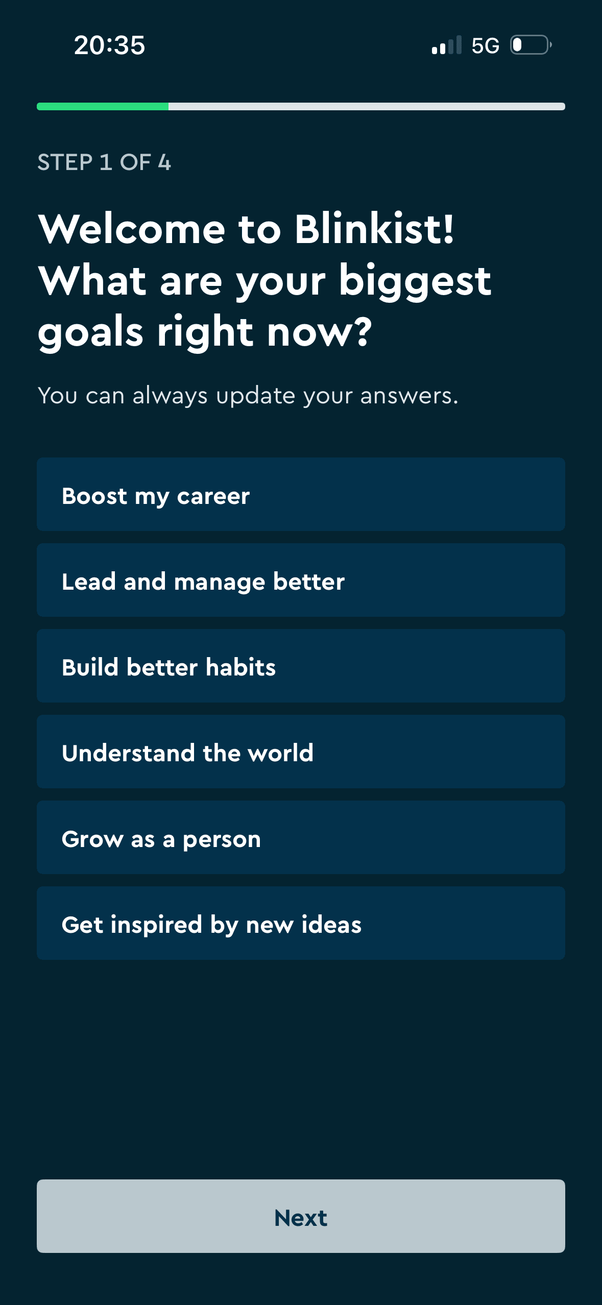
Blinkist requires at least one of six goal choices before Next becomes available and provides no visible Skip or Back. This is observable choice architecture; the screenshot does not show commitment, consistency or later behaviour.
Naming a target as a commitment can make revising it feel like failure. The flow should keep pause, change and no-goal options visible after the initial choice.
Show 1 more principleShow fewer principles
Streaks, saved progress or “don’t lose” language can make stopping feel like forfeiting something already earned. Missing a day or leaving should not erase learning or block access.
If Blinkist were to explain why at least one goal is required, how selections change recommendations and where they can be edited, then people should narrow the available options with less effort because the source, type and effect of each control are explicit. This would apply Goal Gradient Effect and Choice Architecture.
Screen 07
Internal survey claim and testimonial
Prominent labels and counts help people notice socially relevant information while scanning. Pairing them with the underlying count keeps that emphasis more interpretable.
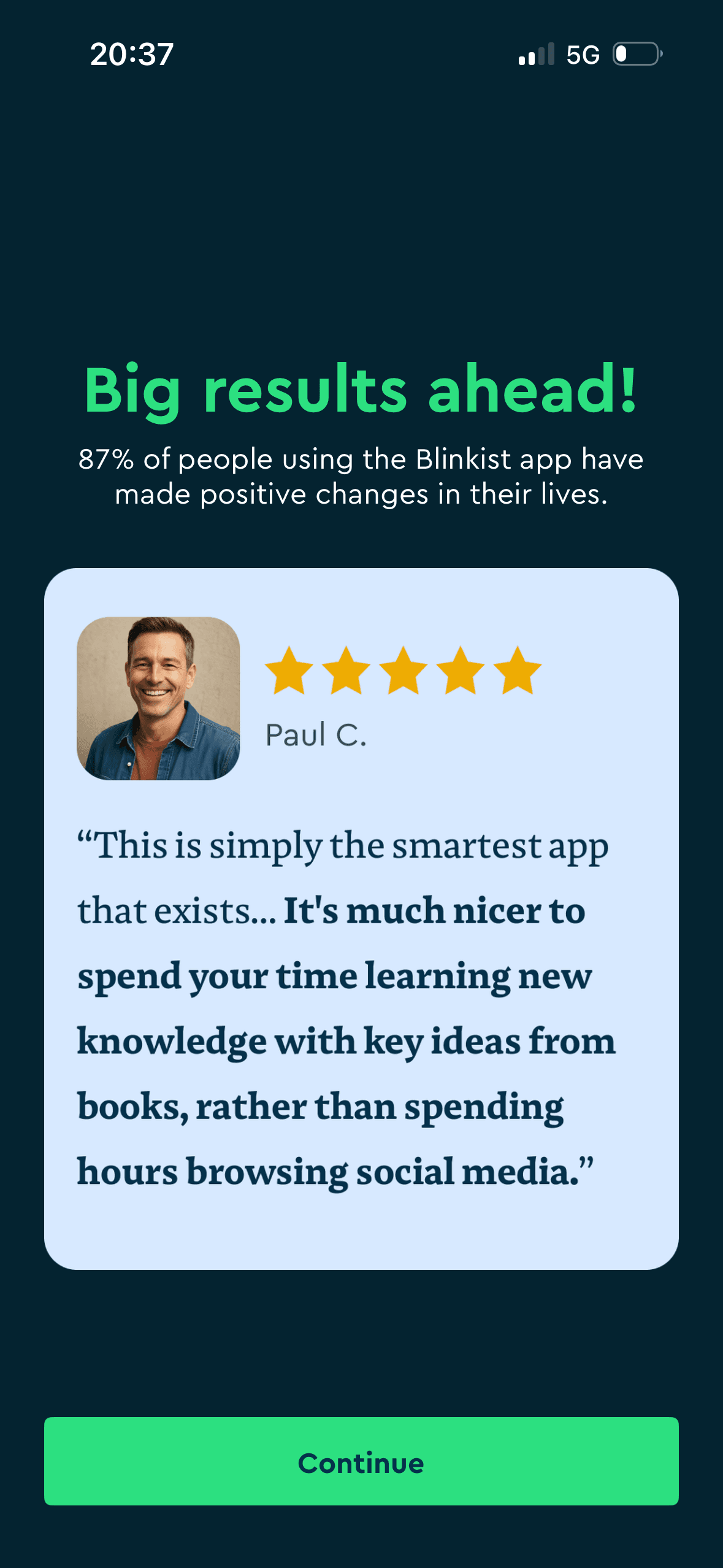
The testimonial contrasts Blinkist with time spent on social media and frames it as the more worthwhile use of attention. This is explicit comparative framing; one selected review does not establish representative value or behaviour change.
Blinkist pairs an “87% of people” positive-change statement with a named five-star testimonial. These are social-evidence cues, but the internal survey method and review source are absent and neither establishes that Blinkist caused the reported outcome.
Show 1 more principleShow fewer principles
Quality-sounding labels can borrow authority from the platform that assigned them. The criteria and reviewer need to be available before the label is treated as proof.
If Blinkist were to label 87% as an internal customer-survey result and disclose the sample, date, response rate, exact question and self-selection limits beside it, then people should narrow the available options with less effort because the source, type and effect of each control are explicit. This would apply Salience Effect and Social Proof.
Screen 08
Choose topics for recommendations
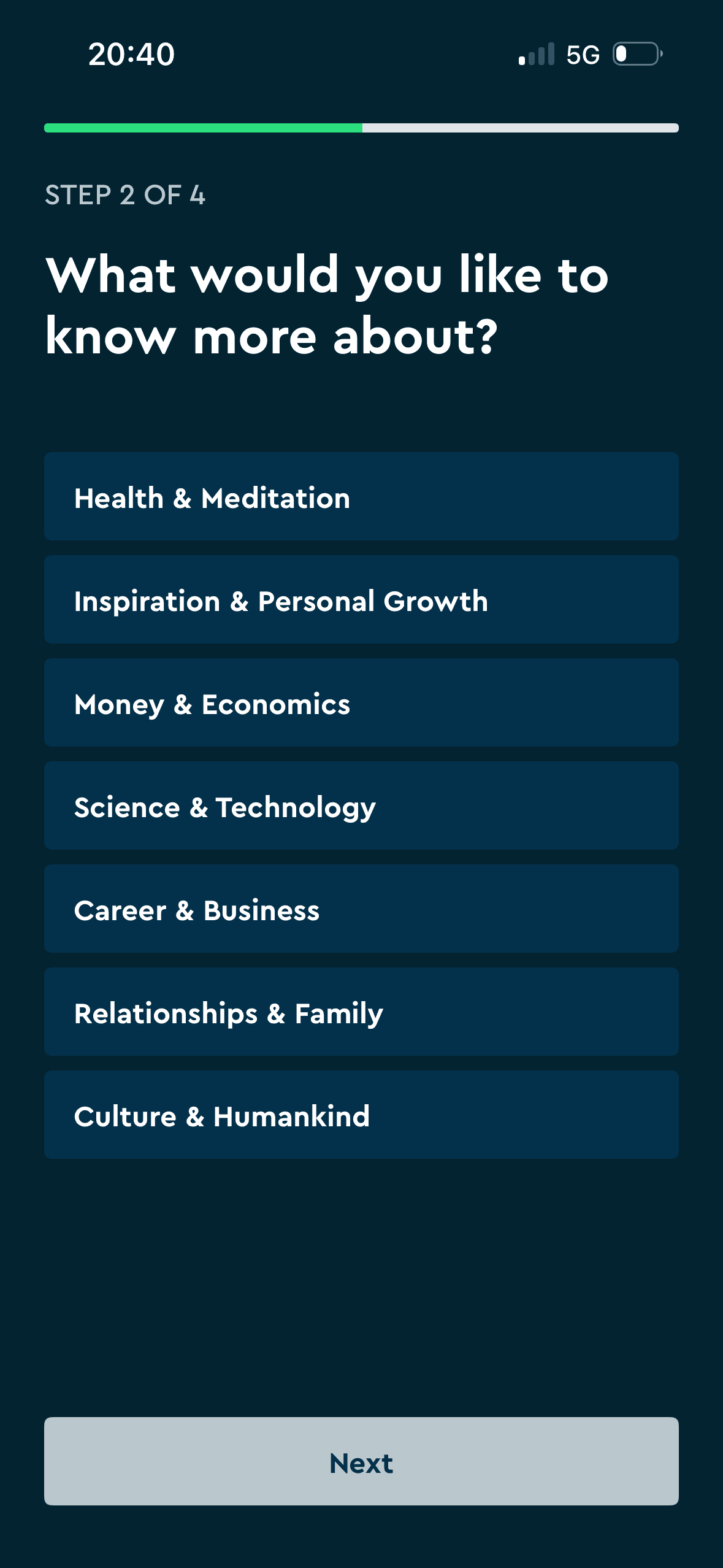
The content is divided into labelled rows or sections, which makes a long feed easier to scan by purpose or source.
Seven topic options are presented and Next remains unavailable until a choice is made, with no visible Skip or Back. This is a constrained choice set; clear wording alone does not establish lower mental effort or comfort.
Artwork, thumbnails and familiar titles support rapid recognition while browsing. They help identify content, but do not demonstrate relevance or quality by themselves.
Show 1 more principleShow fewer principles
The number, order or overlap of options can still make comparison demanding. Search, grouping, a clear reset and an explanation of what changes would reduce avoidable cognitive load.
If Blinkist were to say whether one or several topics are required, how they affect the feed and where to change them, then people should understand the next decision more clearly because its purpose and consequences are visible before they act. This would apply Chunking and Choice Architecture.
Screen 09
Choose content categories
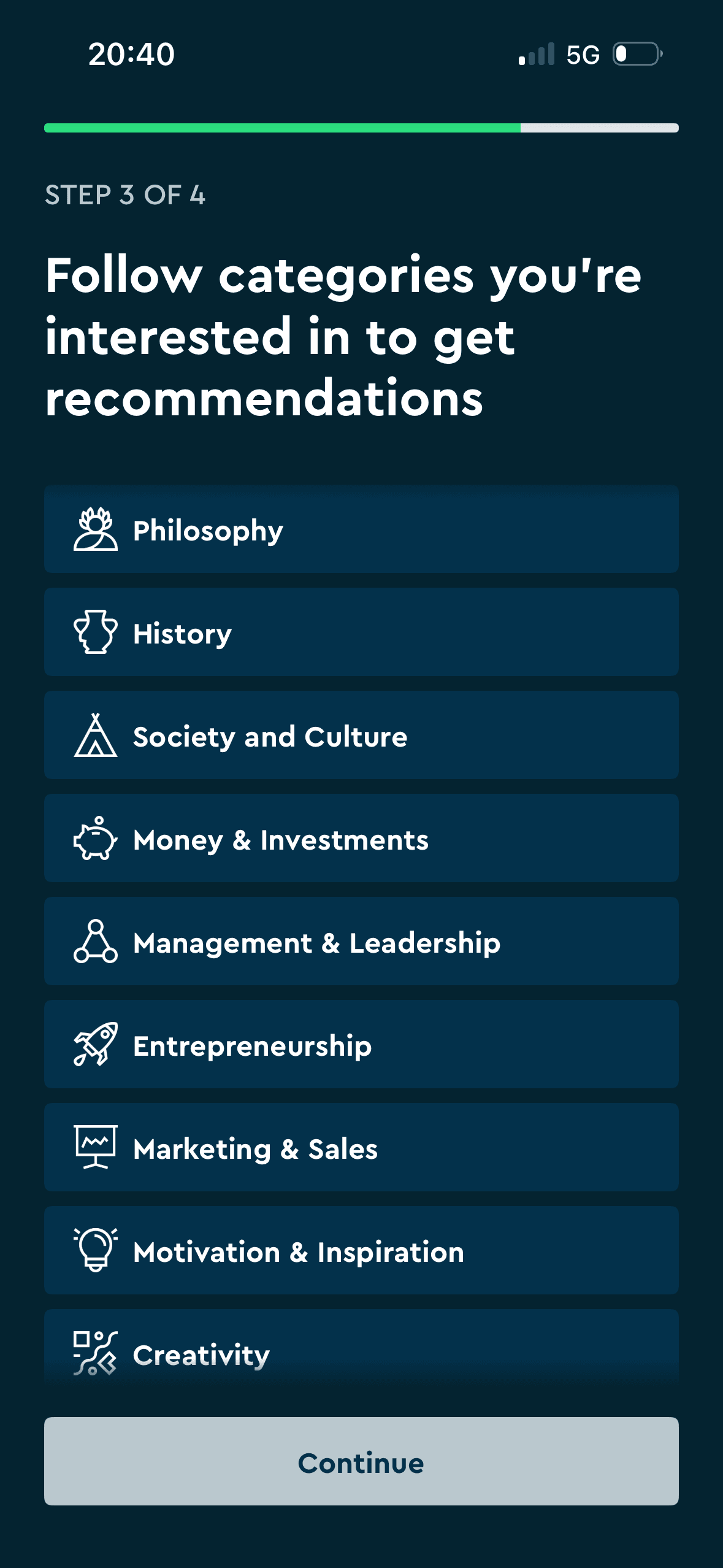
A long, scrollable category list uses selectable rows and keeps Continue unavailable before a choice. This is visible choice architecture; icons do not prove that the number, overlap or ordering of categories is easy to evaluate.
The number, order or overlap of options can still make comparison demanding. Search, grouping, a clear reset and an explanation of what changes would reduce avoidable cognitive load.
Labels, rows or chips group the labelled options and their selected states into recognisable units, helping people scan a larger set without reading it as one block.
Show 1 more principleShow fewer principles
Names, icons, artwork or previous queries let people recognise a likely option instead of reconstructing it from memory. The cue still needs a text label and clear source.
If Blinkist were to state the minimum and maximum selections before interaction, show the full list length, keep selection state accessible and explain how categories affect recommendations, then people should narrow the available options with less effort because the source, type and effect of each control are explicit. This would apply Choice Architecture and Cognitive Load.
Screen 10
Rate an example title
The screen asks people to interpret the main controls, supporting information and available actions without showing every relevant consequence nearby. Clearer grouping and concise support would reduce avoidable mental effort.
Visual hierarchy gives the main controls, supporting information and available actions a clear point of entry. Important secondary information still needs enough prominence to be found before commitment.
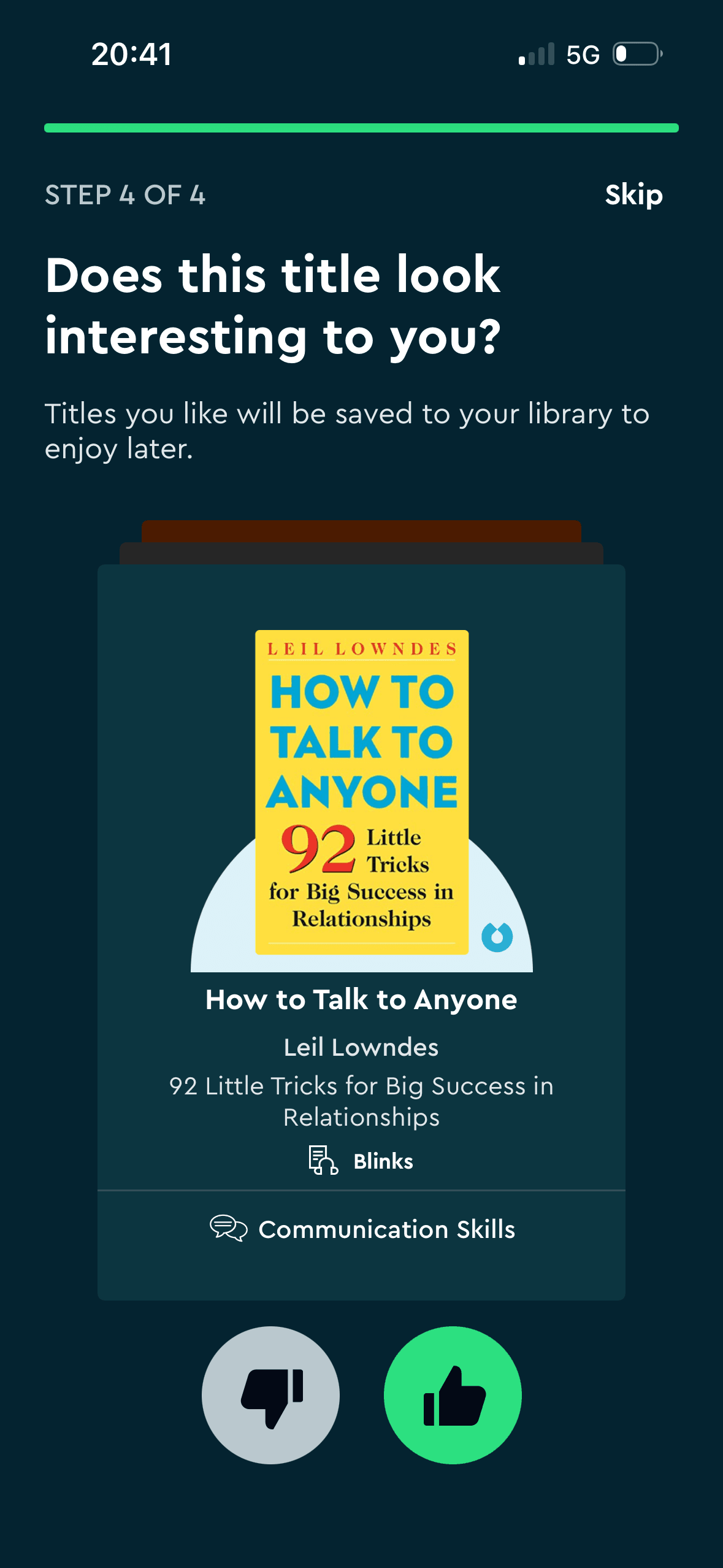
One title is presented with Dislike, Like and Skip controls while the copy explains that liked titles are saved. This is an explicit response structure; the screenshot does not demonstrate choice justification, familiarity or future preference.
Show 1 more principleShow fewer principles
The immediate task stays focused on one decision before the wider journey continues. That sequencing reduces simultaneous choices when later steps remain predictable and reversible.
If Blinkist were to keep Skip, Like and Dislike equally understandable, explain whether the response saves the title or trains recommendations and provide Undo, then people should narrow the available options with less effort because the source, type and effect of each control are explicit. This would apply Choice Architecture and Cognitive Load.
Screen 11
Preference confirmation before recommendations
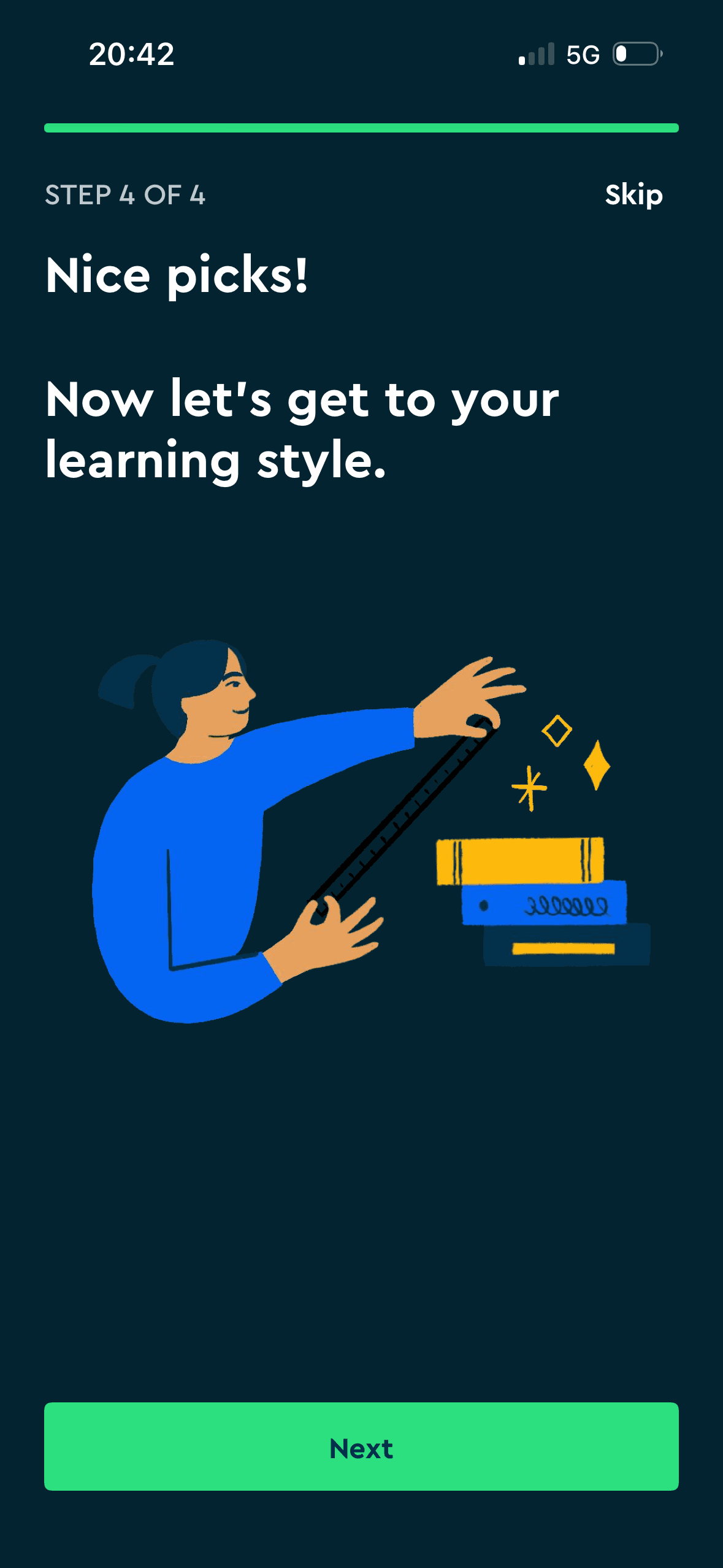
“Nice picks!” acknowledges the prior title choice before continuing. This is simple system feedback, but the unexplained “learning style” label is inaccurate and the screen does not show stronger memory or follow-through.
Ordering and naming the rows shapes which path is easiest to take. The screen does not always explain why an item appears or provide nearby controls to correct the recommendation.
The content is divided into labelled rows or sections, which makes a long feed easier to scan by purpose or source.
Show 1 more principleShow fewer principles
The result or completion message receives the strongest hierarchy, so the state change is easy to locate. It also needs a non-colour status cue.
If Blinkist were to replace “learning style” with “content preferences” and name the next action accurately, then people should understand the next decision more clearly because its purpose and consequences are visible before they act. This would apply Feedback Loop and Choice Architecture.

Screen 12
Recommendation preparation status
A 100% status and three checked rows report that titles are being saved and recommendations prepared. These are visible completion signals; the screenshot does not establish endowed progress, ownership or motivation and needs a recoverable stalled state.
Ordering and naming the rows shapes which path is easiest to take. The screen does not always explain why an item appears or provide nearby controls to correct the recommendation.
The content is divided into labelled rows or sections, which makes a long feed easier to scan by purpose or source.
Show 1 more principleShow fewer principles
Artwork, thumbnails and familiar titles support rapid recognition while browsing. They help identify content, but do not demonstrate relevance or quality by themselves.
If Blinkist were to use grammatically correct labels, announce status changes accessibly and move on automatically when complete, then people should recover from interruption with less effort because progress, failure and the next available action remain clear. This would apply Feedback Loop and Choice Architecture.
Screen 13
Annual Pro and Premium plan comparison
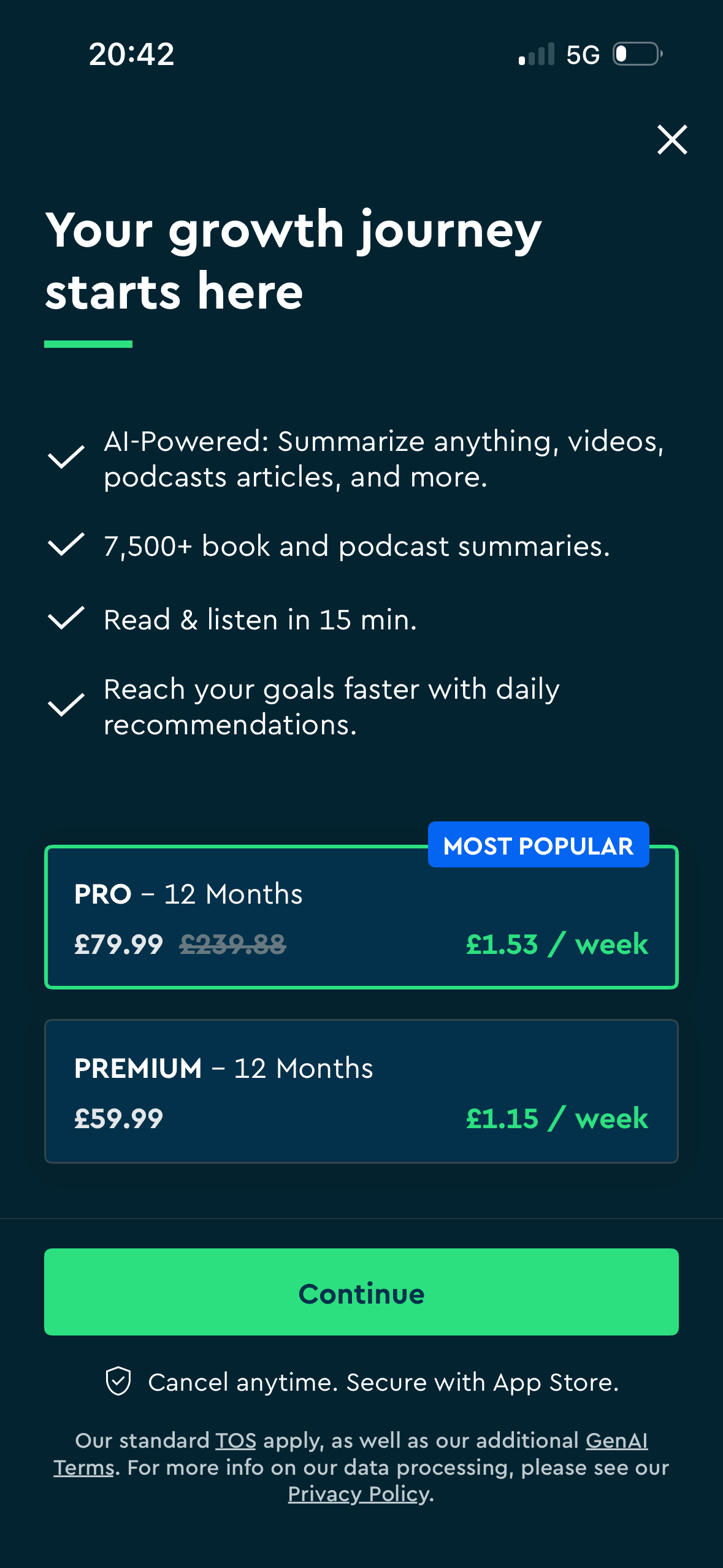
Annual prices are translated into smaller weekly equivalents while the annual total remains visible. This is explicit price framing; £79.99 per year rounds to about £1.54 per week, not the displayed £1.53.
A visible close, skip or alternative plan can preserve autonomy within the offer. Its prominence should be compared with the purchase action rather than judged by presence alone.
The first price, percentage, crossed-out amount or weekly equivalent can become the comparison anchor. Total cost and renewal terms need equal visibility so the reference point is not misleading.
Show 1 more principleShow fewer principles
Immediate free access or an instant saving is shown before a later charge. This can favour the near-term reward unless the future cost and cancellation timing remain equally concrete.
If Blinkist were to explain the exact differences between Pro and Premium, give criteria for “Most popular” or remove it and show annual totals as prominently as weekly equivalents, then people should compare the offer more accurately because price, eligibility and future cost are shown on the same basis. This would apply Choice Architecture and Framing Effect.
Screen 14
Seven-day Pro trial and annual renewal
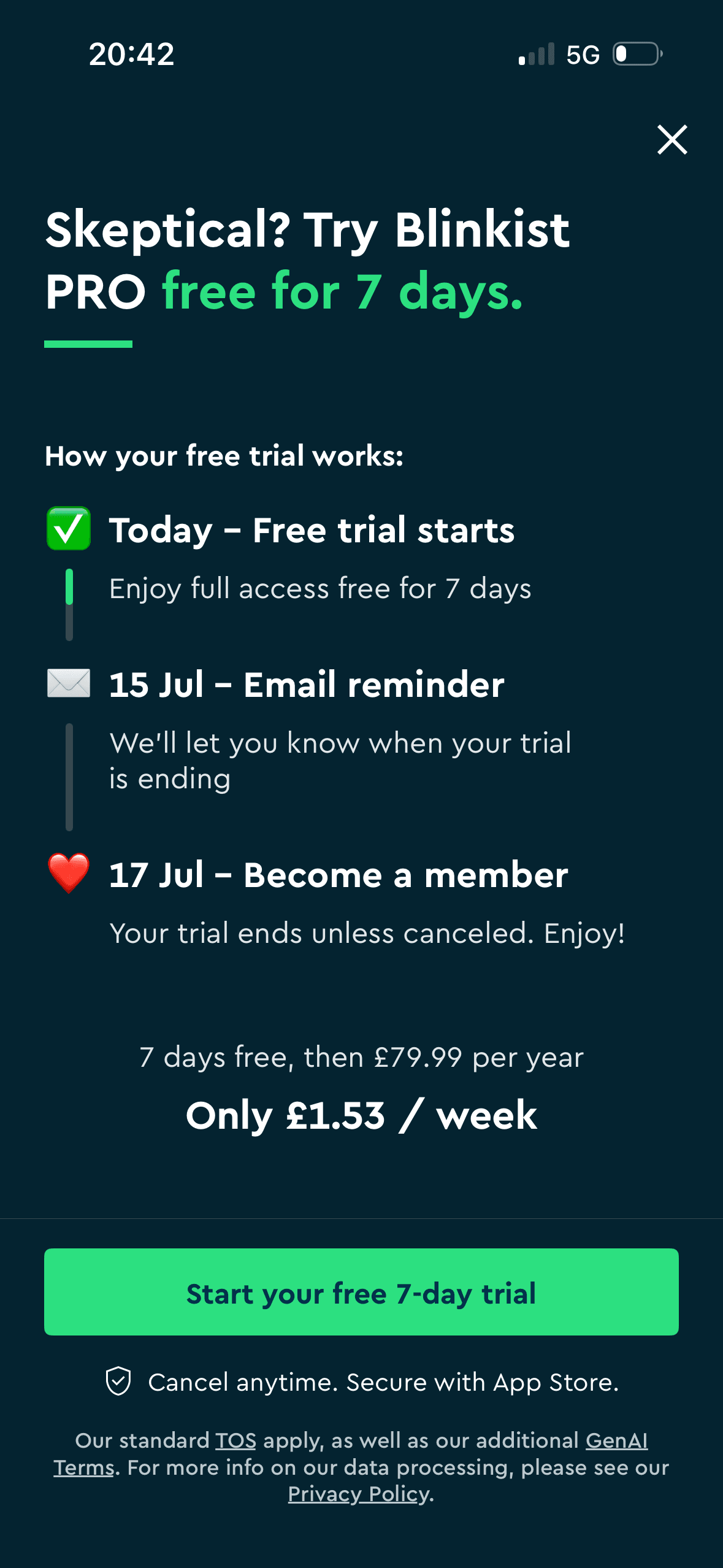
The seven-day free period is placed before the later £79.99 annual charge in a dated timeline. This makes an immediate benefit and delayed cost explicit; it does not prove temporal discounting or acceptance, and the renewal event should be named plainly.
A visible close, skip or alternative plan can preserve autonomy within the offer. Its prominence should be compared with the purchase action rather than judged by presence alone.
The offer foregrounds benefits or savings while renewal, eligibility or refusal receives less emphasis. That framing makes the attractive interpretation easier to process than the full commercial decision.
Show 1 more principleShow fewer principles
The first price, percentage, crossed-out amount or weekly equivalent can become the comparison anchor. Total cost and renewal terms need equal visibility so the reference point is not misleading.
If Blinkist were to keep the dated timeline, reminder, close action and cancellation statement, then people should understand the next decision more clearly because its purpose and consequences are visible before they act. This would apply Choice Architecture and Temporal Discounting.
Screen 15
First home feed
The content is divided into labelled rows or sections, which makes a long feed easier to scan by purpose or source.
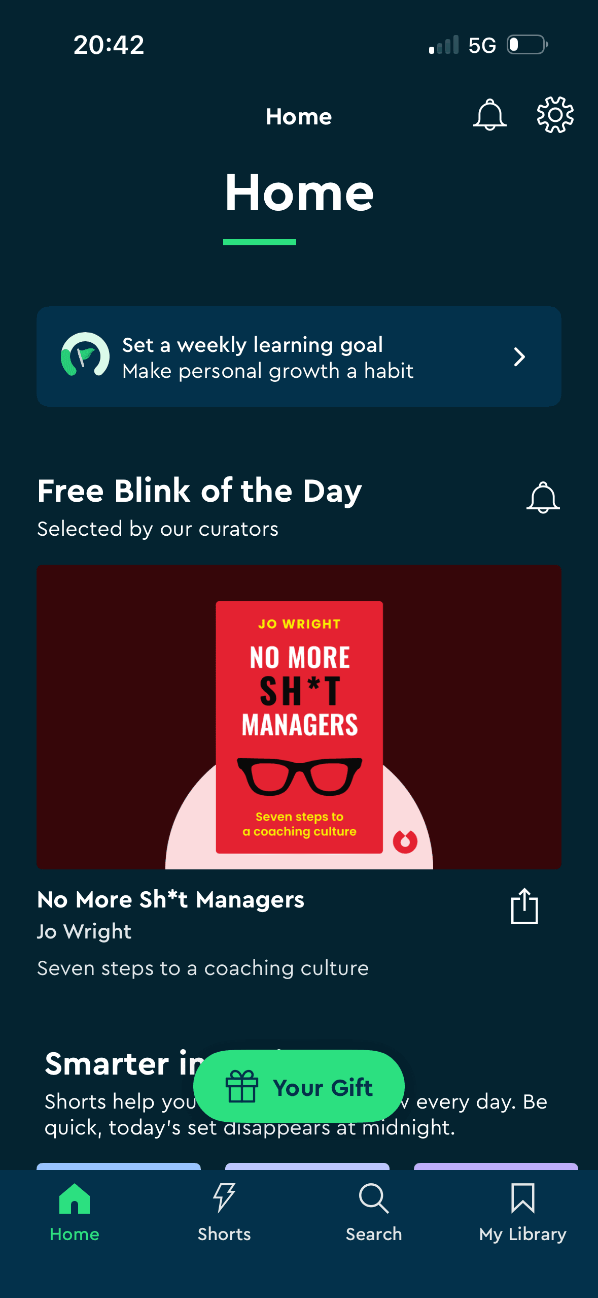
A floating “Your Gift” button and prominent Free Blink of the Day label stand out in the first home view. Their visual prominence is observable; the screenshot does not show attention, gratitude, continued use or a reciprocal obligation.
Naming a target as a commitment can make revising it feel like failure. The flow should keep pause, change and no-goal options visible after the initial choice.
Show 1 more principleShow fewer principles
Ordering and naming the rows shapes which path is easiest to take. The screen does not always explain why an item appears or provide nearby controls to correct the recommendation.
If Blinkist were to let the person orient to the free item before showing promotions, then people should narrow the available options with less effort because the source, type and effect of each control are explicit. This would apply Chunking and Salience Effect.

Screen 16
One-hour 40%-off overlay
A “Limited time offer” overlay shows 40% off and a countdown at 00:59:57 over the initial home feed. This is a concrete scarcity cue; its deadline, eligibility, reference price and behaviour after zero require verification.
Visual hierarchy gives the main controls, supporting information and available actions a clear point of entry. Important secondary information still needs enough prominence to be found before commitment.
The immediate task stays focused on one decision before the wider journey continues. That sequencing reduces simultaneous choices when later steps remain predictable and reversible.
Show 1 more principleShow fewer principles
The arrangement of the main controls, supporting information and available actions determines which action is easiest to see and take. The screen should keep alternatives, refusal and correction proportionate to their importance.
If Blinkist were to do not interrupt the first home view with a countdown, then people should compare the offer more accurately because price, eligibility and future cost are shown on the same basis. This would apply Salience Effect and Scarcity Principle.
Screen 17
Set an optional weekly content goal
A concrete target and visible progress can make the next small step easier to locate. It remains supportive only when the endpoint is accurate and optional.
Naming a target as a commitment can make revising it feel like failure. The flow should keep pause, change and no-goal options visible after the initial choice.
Streaks, saved progress or “don’t lose” language can make stopping feel like forfeiting something already earned. Missing a day or leaving should not erase learning or block access.
Show 1 more principleShow fewer principles
Labels such as Casual, Serious, Intense or Committed attach identity and judgement to a practical scheduling choice. Neutral time labels would support a more accurate decision.
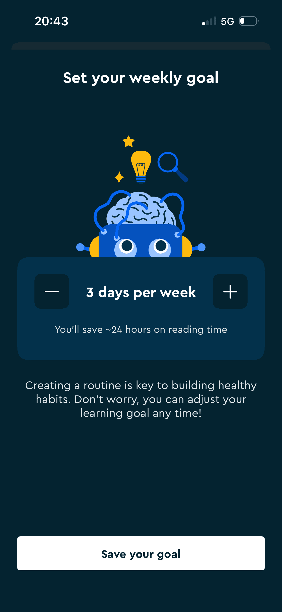
If Blinkist were to make goal setting optional, explain what counts as a day and how reminders work and show how the “~24 hours” estimate is calculated, then people should continue without unnecessary pressure because progress remains useful, flexible and easy to revise. This would apply Goal Gradient Effect and Commitment Bias.
Screen 18
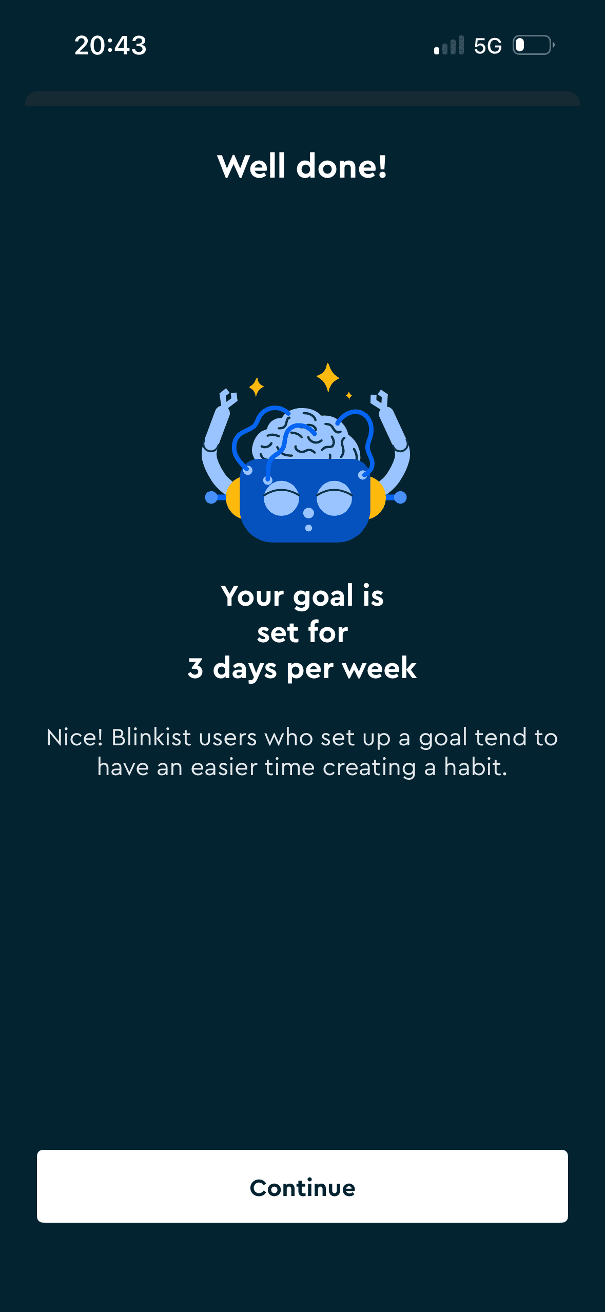
Weekly goal confirmation and habit claim
The screen confirms the outcome of the preceding action and keeps a next action visible. That closes the immediate interaction loop.
Blinkist says users who set a goal “tend to have an easier time creating a habit.” This invokes other users' outcomes to validate the choice, but the screen gives no source, comparison, effect size or evidence that goal setting caused the difference.
A concrete target and visible progress can make the next small step easier to locate. It remains supportive only when the endpoint is accurate and optional.
Show 1 more principleShow fewer principles
Naming a target as a commitment can make revising it feel like failure. The flow should keep pause, change and no-goal options visible after the initial choice.
If Blinkist were to confirm the chosen target and provide Edit or Undo, then people should continue without unnecessary pressure because progress remains useful, flexible and easy to revise. This would apply Feedback Loop and Social Proof.
Screen 19
Second 40%-off annual-plan offer
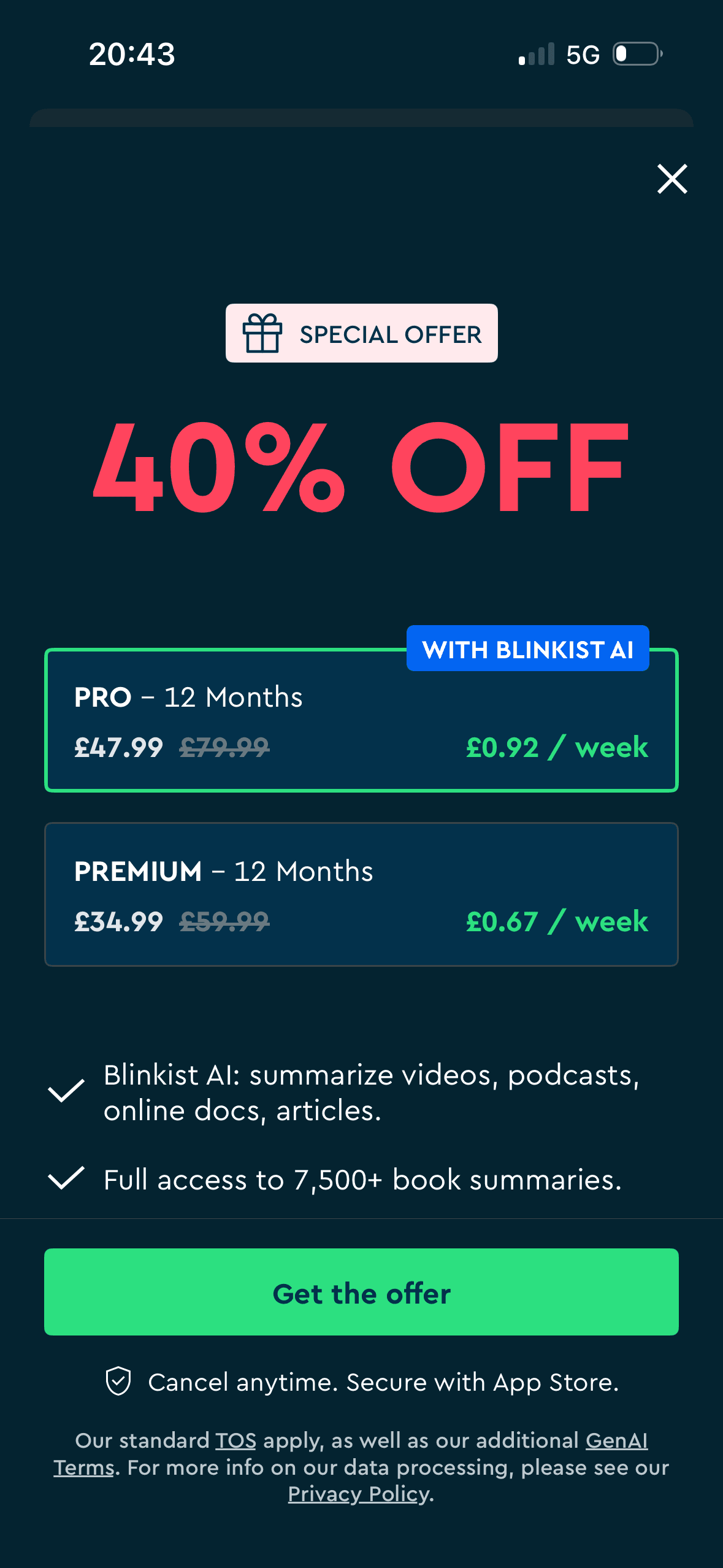
The second offer uses “Special offer” and “40% off” with crossed-out annual prices. This is a stated discount and scarcity cue; no exact deadline, reference-price history or reconciliation with the earlier countdown is visible.
A visible close, skip or alternative plan can preserve autonomy within the offer. Its prominence should be compared with the purchase action rather than judged by presence alone.
The annual totals are paired with £0.92 and £0.67 weekly equivalents, making the recurring cost unit visually prominent. This is price framing; it does not establish short-term preference and the screen must still explain plan differences and reference prices.
Show 1 more principleShow fewer principles
The first price, percentage, crossed-out amount or weekly equivalent can become the comparison anchor. Total cost and renewal terms need equal visibility so the reference point is not misleading.
If Blinkist were to reconcile these £47.99 and £34.99 prices with the earlier £79.99 and £59.99 plans and the one-hour offer, then people should compare the offer more accurately because price, eligibility and future cost are shown on the same basis. This would apply Choice Architecture and Scarcity Principle.
Screen 20
Account creation after free exploration
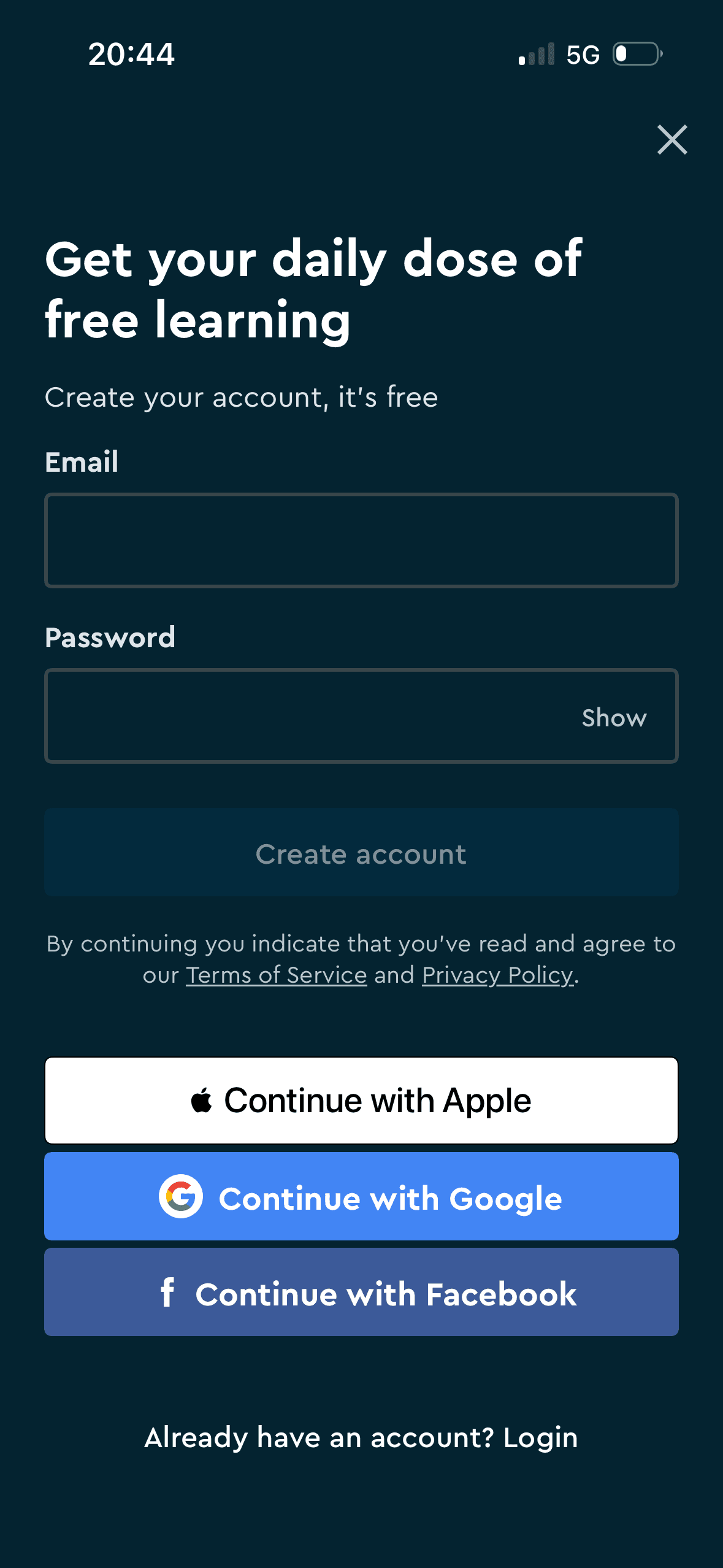
Account creation offers email and password plus Apple, Google and Facebook, with Log in and a close control. This is visible choice architecture after free-content exploration; it does not show endowment, and provider data sharing should be explained.
The screen asks people to interpret the main controls, supporting information and available actions without showing every relevant consequence nearby. Clearer grouping and concise support would reduce avoidable mental effort.
Visual hierarchy gives prices, savings or time-based offer language a clear point of entry. Important secondary information still needs enough prominence to be found before commitment.
Show 1 more principleShow fewer principles
The immediate task stays focused on one decision before the wider journey continues. That sequencing reduces simultaneous choices when later steps remain predictable and reversible.
If Blinkist were to state earlier when an account will become required and what preferences, library items and goal data will be saved, then people should recover from interruption with less effort because progress, failure and the next available action remain clear. This would apply Choice Architecture and Cognitive Load.
Screen 21
Audio controls tip
The task keeps the prompt, response state and next action close together, making it easier to understand whether an answer or action was accepted.
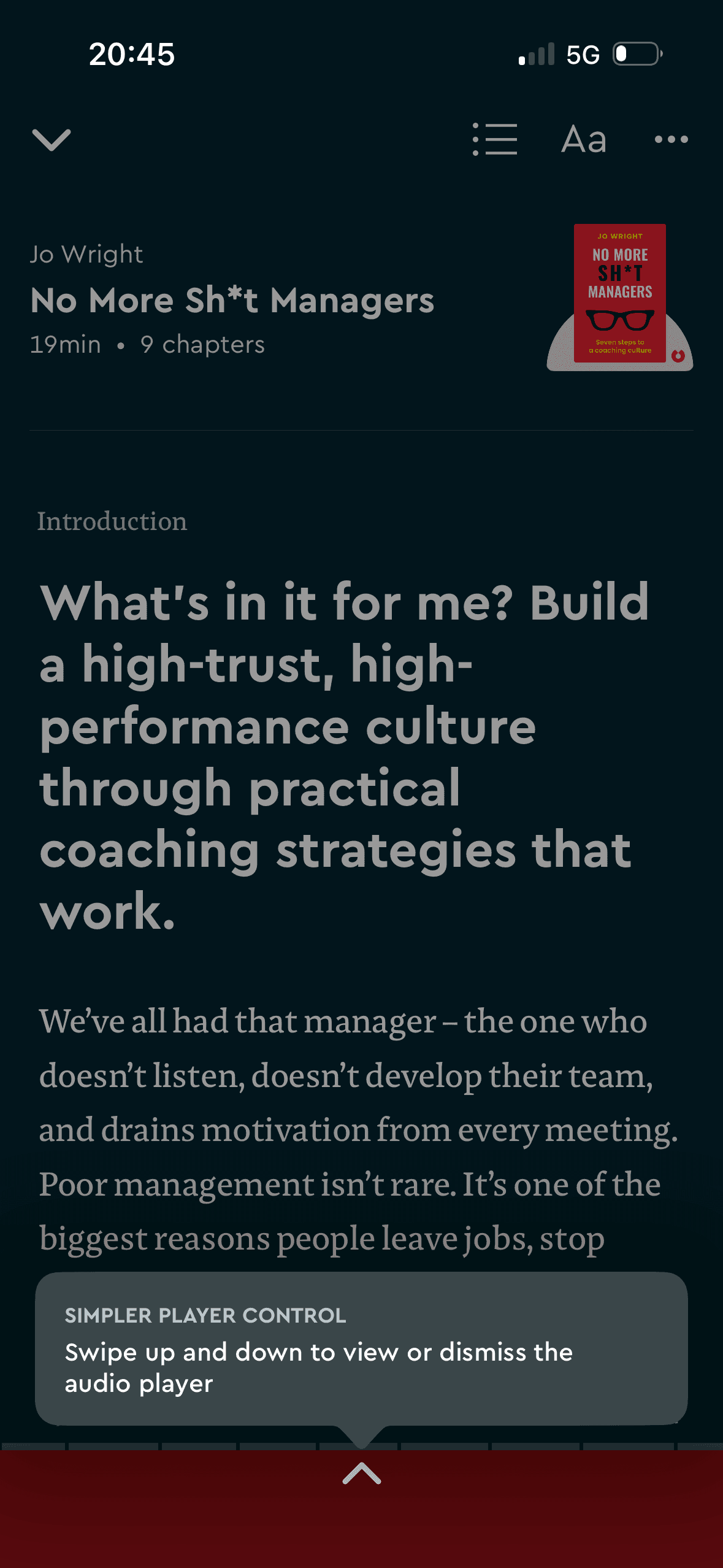
A high-contrast tooltip points to the audio-player control and explains a swipe gesture. Its prominence and location are observable; whether people notice it or find the player easier requires testing and an equivalent labelled control.
The activity is broken into a short, bounded step rather than presenting the whole lesson or exercise at once.
Show 1 more principleShow fewer principles
Hints, controls and task content can compete within a small viewport. Keeping help dismissible and preserving accessible alternatives would reduce unnecessary load.
If Blinkist were to keep the tip anchored to the affected control, dismissible and available later in Help, then people should understand the next decision more clearly because its purpose and consequences are visible before they act. This would apply Feedback Loop and Salience Effect.
Conclusion
What this journey teaches us.
Blinkist gives people understandable preference controls and provides useful detail about trial timing and renewal. Optional routes remain visible in several commercial steps.
The experience would be stronger if it demonstrated the recommendation result before repeating plan offers. Consistent pricing, attributable claims and a less pressured first session would make personalisation feel earned.
Keep exploring