
Help people narrow mixed results
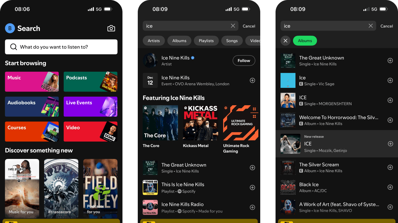
I searched Spotify from its browse landing page through recent history, suggestions, mixed results and format filters. The query stays visible and the interface offers several useful ways to narrow the catalogue.
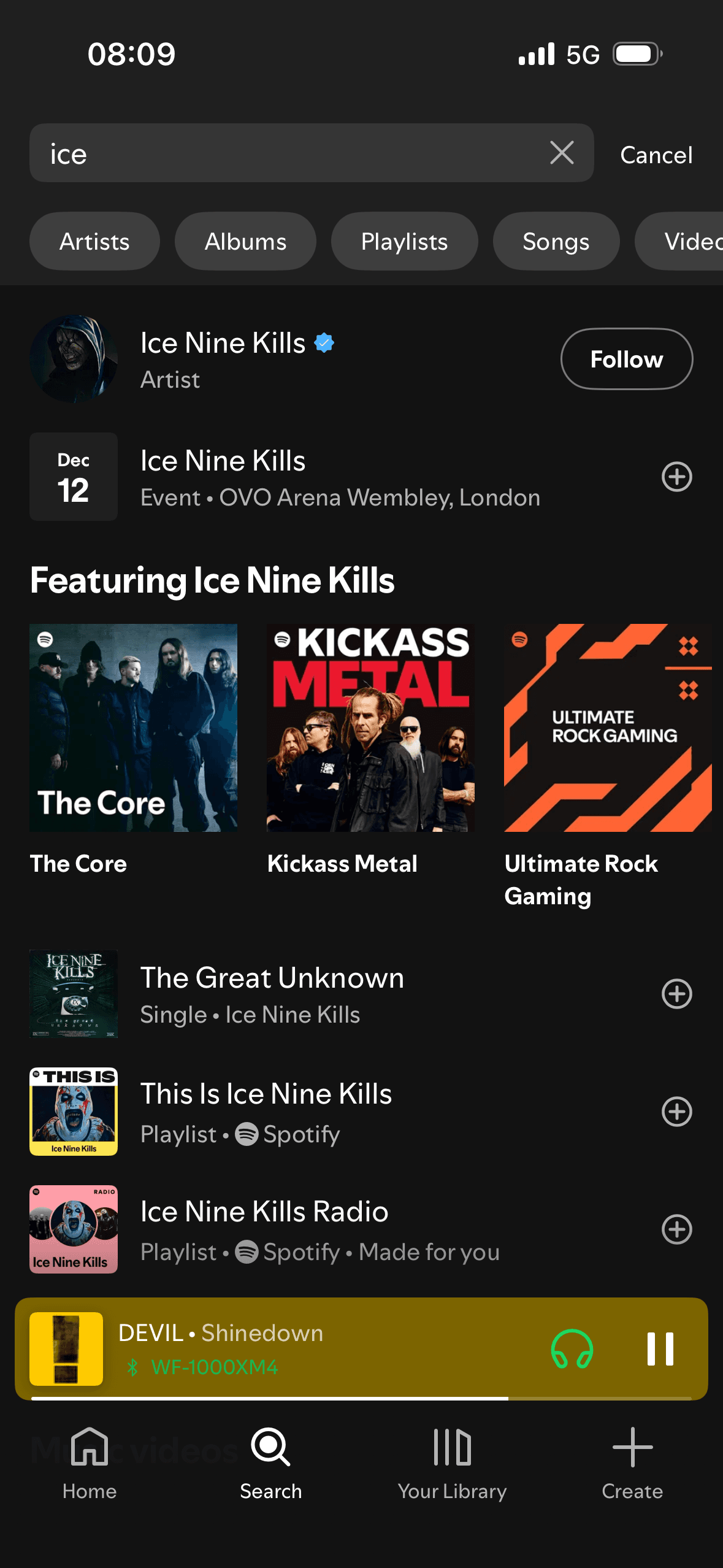
The difficult part is understanding why unlike things appear together. Artists, events, songs, playlists, videos and audiobooks need strong type and ranking cues so people can correct the search without starting again.
- Captured
- Capture date not recorded
- Published
- Last updated
- 10
- Screens
- 14
- Ingredients
- 40
- Applications

Common contexts
Business goals
What works
What the captured flow does well.
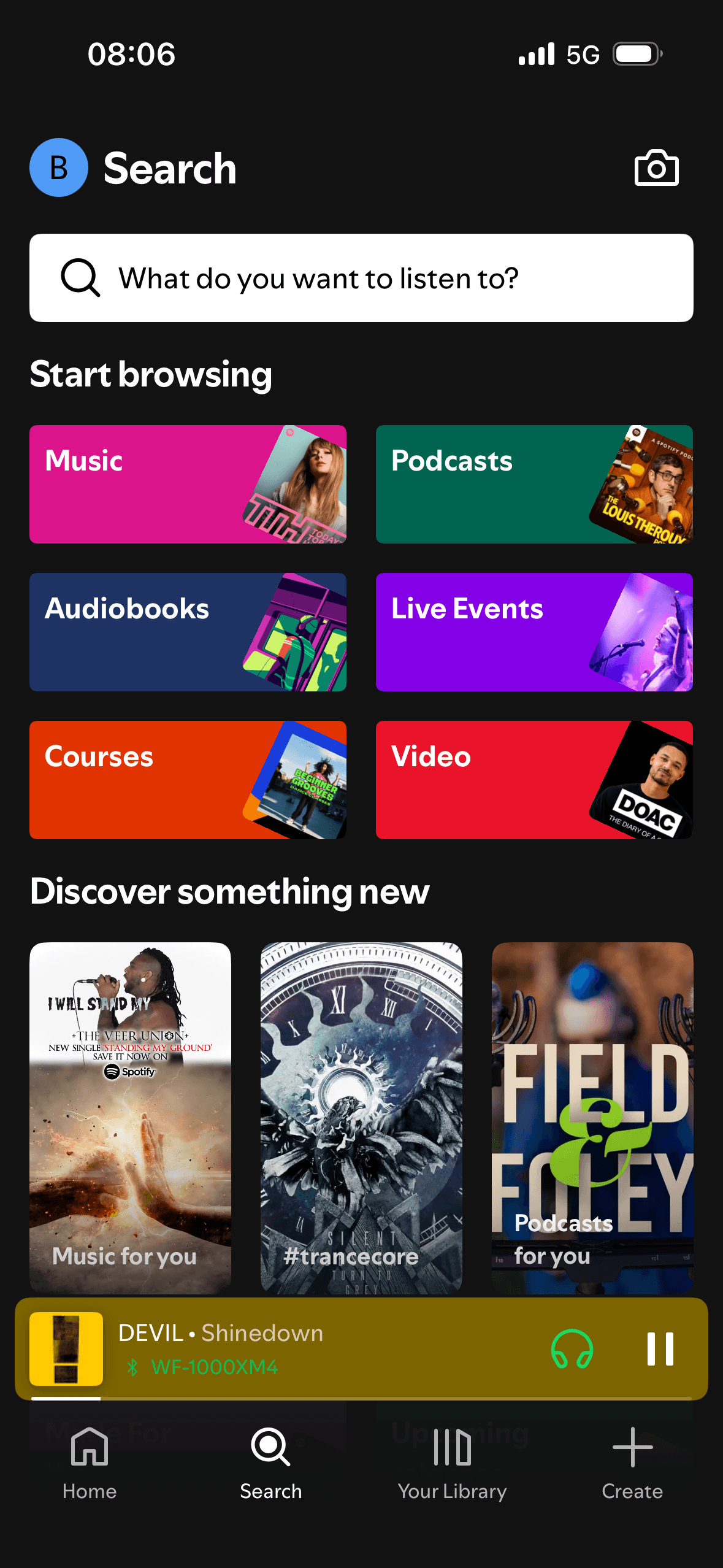
- The landing page provides a direct search field, camera control and labelled starting categories for browsing.
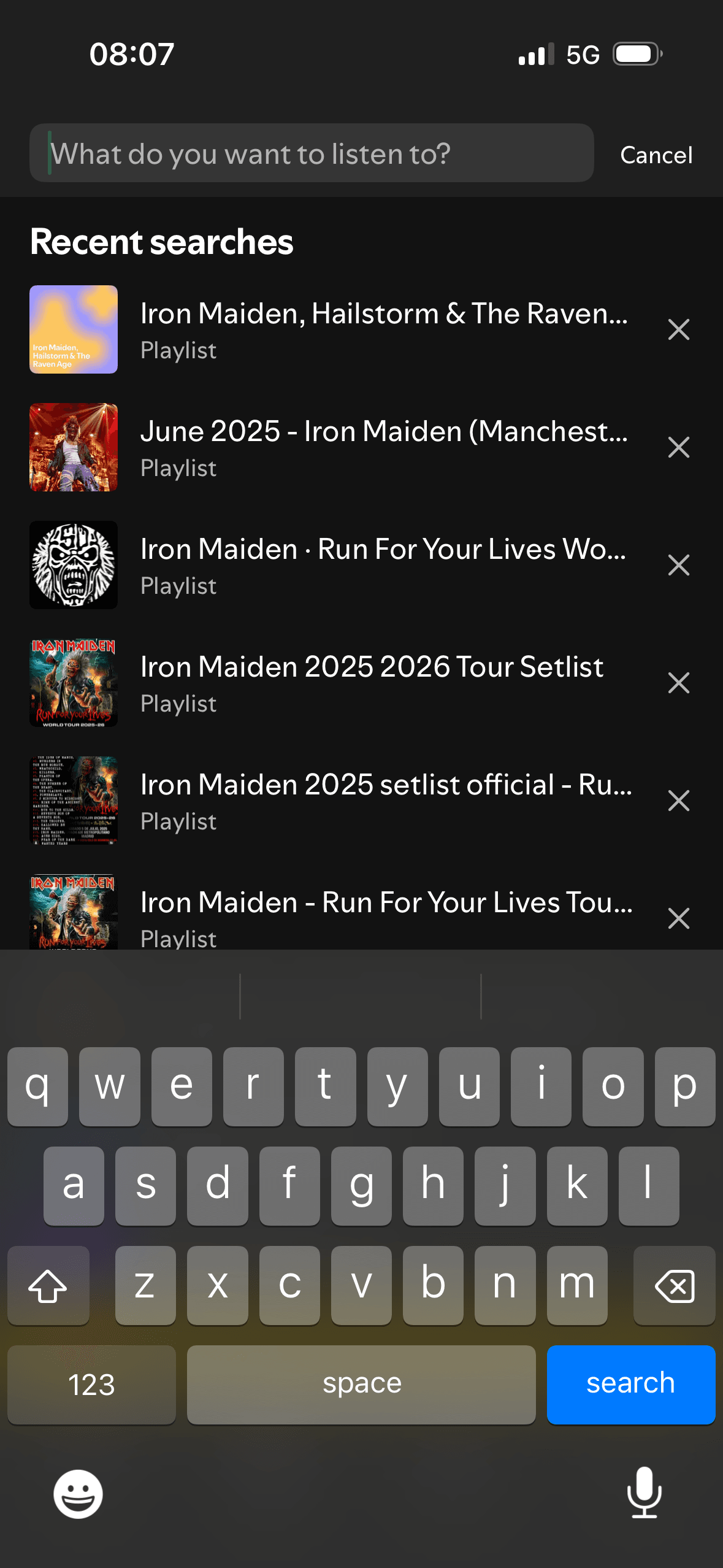
- Recent searches include artwork, a content-type label and an individual removal control.
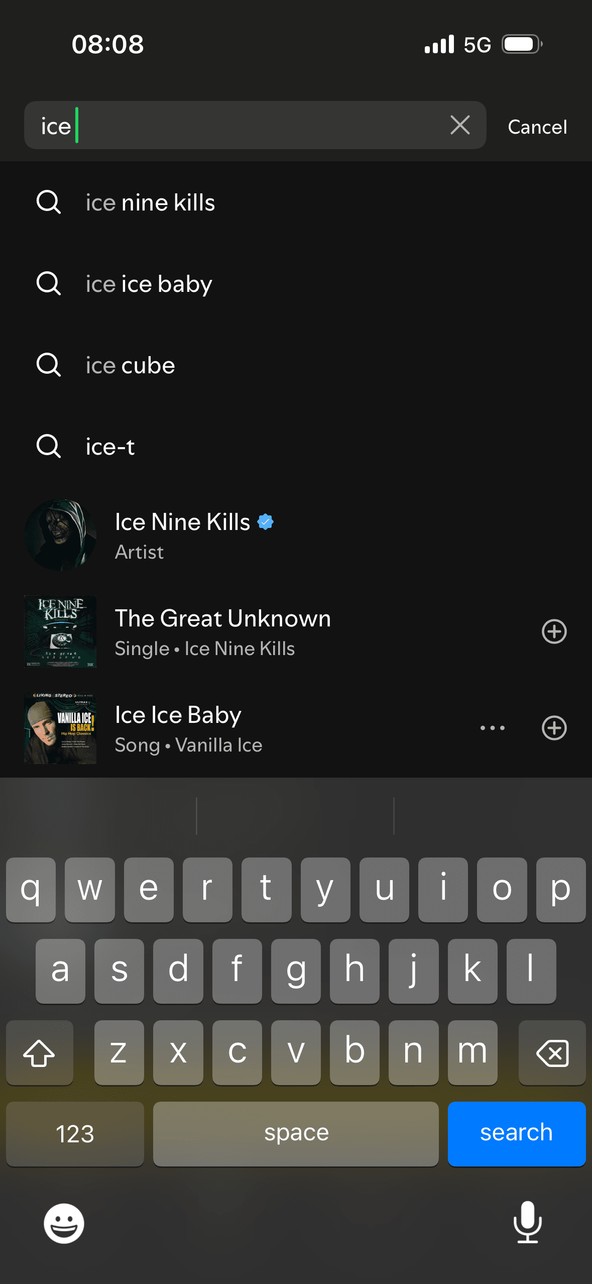
- Typed suggestions preserve the entered query and combine query completions with named result types.
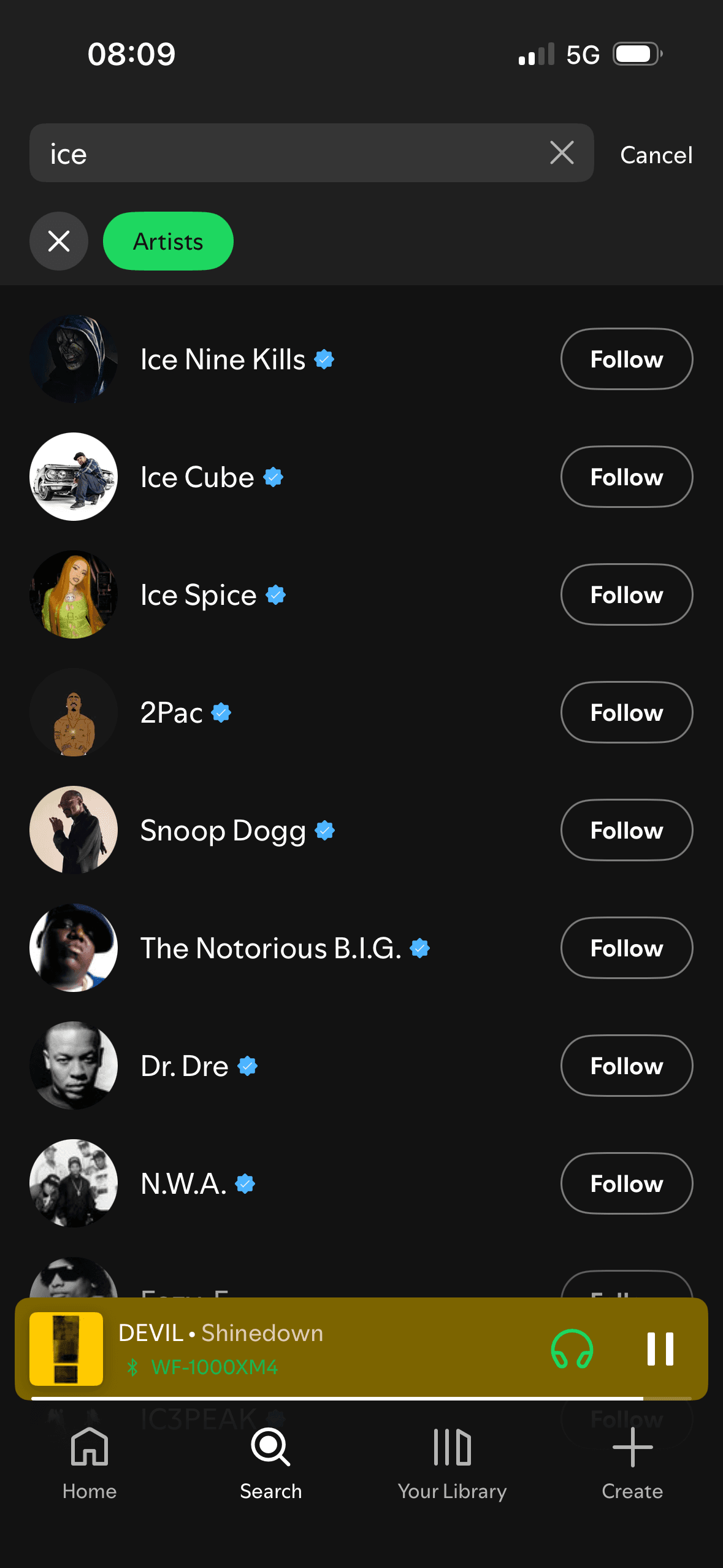
- Result pages keep the query visible and provide horizontally scrollable format filters with a clear selected state.
What could improve
What deserves closer review.
- The landing page does not explain how browse categories and “Discover something new” recommendations are ordered or personalised, or what the camera search will capture.
- Recent-history management is limited to removing one row at a time; no clear-all, retention or history-setting route is visible.
- Query suggestions and direct content results share one list without explaining which are completions, which are personalised and why they are ranked.
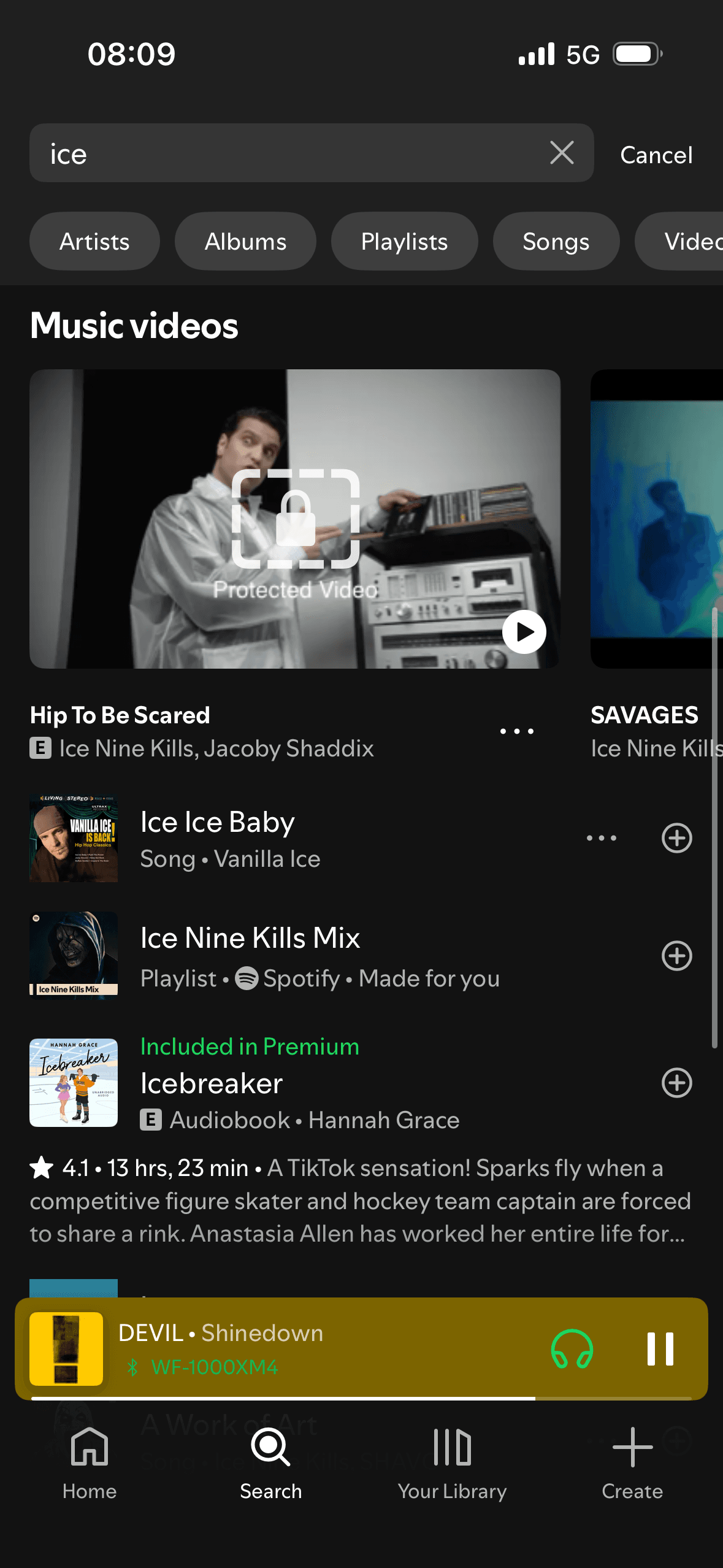
- The mixed result page spans many formats while filter chips extend beyond the viewport, making the full set easy to miss.
Screen-by-screen breakdown
Follow the journey.
Each observation shows what works or what could improve, on this screen or across the wider flow. The opportunity turns one or two principles into a testable hypothesis.
Screen 01
Search landing
The screen turns the query, suggestions and result controls into explicit options rather than asking people to recall a hidden command or category.
The number, order or overlap of options can still make comparison demanding. Search, grouping, a clear reset and an explanation of what changes would reduce avoidable cognitive load.
Labels, rows or chips group the query, suggestions and result controls into recognisable units, helping people scan a larger set without reading it as one block.
Show 1 more principleShow fewer principles
Names, icons, artwork or previous queries let people recognise a likely option instead of reconstructing it from memory. The cue still needs a text label and clear source.
If Spotify were to keep the search field and category labels prominent, but explain what camera search captures before requesting permission, then people should make a more informed data choice because purpose, optionality and future use are clear before agreement. This would apply Choice Architecture and Cognitive Load.
Screen 02
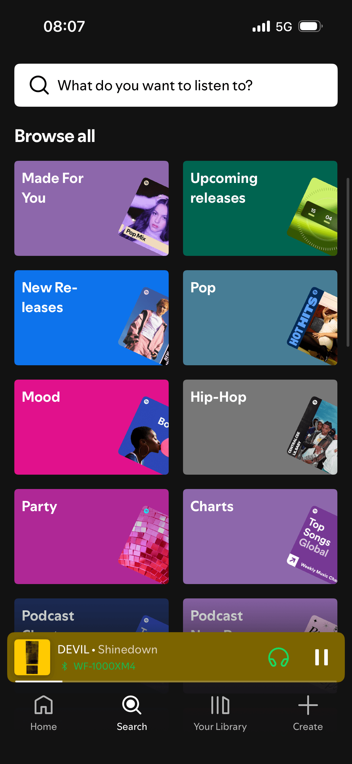
Search landing categories
Spotify presents browsing categories as labelled visual blocks. The grouping may support scanning when the labels match how people think about the content; the screenshot does not show improved recognition, recall or decision speed.
The number, order or overlap of options can still make comparison demanding. Search, grouping, a clear reset and an explanation of what changes would reduce avoidable cognitive load.
The screen turns the query, suggestions and result controls into explicit options rather than asking people to recall a hidden command or category.
Show 1 more principleShow fewer principles
Names, icons, artwork or previous queries let people recognise a likely option instead of reconstructing it from memory. The cue still needs a text label and clear source.
If Spotify were to group a long category list under plain, meaningful headings and test whether people can find a known category, then people should make a more informed data choice because purpose, optionality and future use are clear before agreement. This would apply Chunking and Cognitive Load.
Screen 03
Recent searches
Activating search places focus in the field and opens the keyboard. This is the default input state for text entry; the screenshot does not show whether it improves task speed or excludes another preferred input method.
The number, order or overlap of options can still make comparison demanding. Search, grouping, a clear reset and an explanation of what changes would reduce avoidable cognitive load.
A “Recent searches” heading sits above large rows with artwork, content-type labels and repeated removal controls. This is an observable hierarchy for history; the screenshot cannot show what attracts attention or whether reuse improves search success.
Show 1 more principleShow fewer principles
Bringing the previous activity brought back into view back into view makes an unfinished or previously considered task easy to resume. This is a continuation cue, not evidence that the person still intends to finish it.
If Spotify were to keep the visible content-type labels and individual removal controls, then people should narrow the available options with less effort because the source, type and effect of each control are explicit. This would apply Default Effect and Cognitive Load.
Screen 04
Search suggestions
The screen turns the query, suggestions and result controls into explicit options rather than asking people to recall a hidden command or category.
The number, order or overlap of options can still make comparison demanding. Search, grouping, a clear reset and an explanation of what changes would reduce avoidable cognitive load.
The content is divided into labelled rows or sections, which makes a long feed easier to scan by purpose or source.
Show 1 more principleShow fewer principles
Artwork, thumbnails and familiar titles support rapid recognition while browsing. They help identify content, but do not demonstrate relevance or quality by themselves.
If Spotify were to distinguish query completions from direct artist, song, album or playlist results, then people should make a more informed data choice because purpose, optionality and future use are clear before agreement. This would apply Choice Architecture and Cognitive Load.
Screen 05
Mixed search results
“Included in Premium” appears in green above an audiobook result within the mixed list. This frames access as part of the paid tier; the screenshot does not show entitlement details, perceived value or conversion.
The screen turns the query, suggestions and result controls into explicit options rather than asking people to recall a hidden command or category.
Labels, rows or chips group the query, suggestions and result controls into recognisable units, helping people scan a larger set without reading it as one block.
Show 1 more principleShow fewer principles
The number, order or overlap of options can still make comparison demanding. Search, grouping, a clear reset and an explanation of what changes would reduce avoidable cognitive load.
If Spotify were to explain verification badges and ranking without equating them with quality, then people should narrow the available options with less effort because the source, type and effect of each control are explicit. This would apply Choice Architecture and Framing Effect.
Screen 06
All search results
The screen turns the query, suggestions and result controls into explicit options rather than asking people to recall a hidden command or category.
The number, order or overlap of options can still make comparison demanding. Search, grouping, a clear reset and an explanation of what changes would reduce avoidable cognitive load.
Labels, rows or chips group the query, suggestions and result controls into recognisable units, helping people scan a larger set without reading it as one block.
Show 1 more principleShow fewer principles
Names, icons, artwork or previous queries let people recognise a likely option instead of reconstructing it from memory. The cue still needs a text label and clear source.
If Spotify were to use descriptive section headings for each visible format, show language and access conditions where relevant and preserve the query and active filters while scrolling, then people should narrow the available options with less effort because the source, type and effect of each control are explicit. This would apply Choice Architecture and Cognitive Load.
Screen 07
Artist results
The screen turns the filters, selected states and result controls into explicit options rather than asking people to recall a hidden command or category.
The number, order or overlap of options can still make comparison demanding. Search, grouping, a clear reset and an explanation of what changes would reduce avoidable cognitive load.
Labels, rows or chips group the filters, selected states and result controls into recognisable units, helping people scan a larger set without reading it as one block.
Show 1 more principleShow fewer principles
Names, icons, artwork or previous queries let people recognise a likely option instead of reconstructing it from memory. The cue still needs a text label and clear source.
If Spotify were to explain what the verification badge confirms and keep Follow separate from result selection, then people should make a more informed data choice because purpose, optionality and future use are clear before agreement. This would apply Choice Architecture and Cognitive Load.
Screen 08
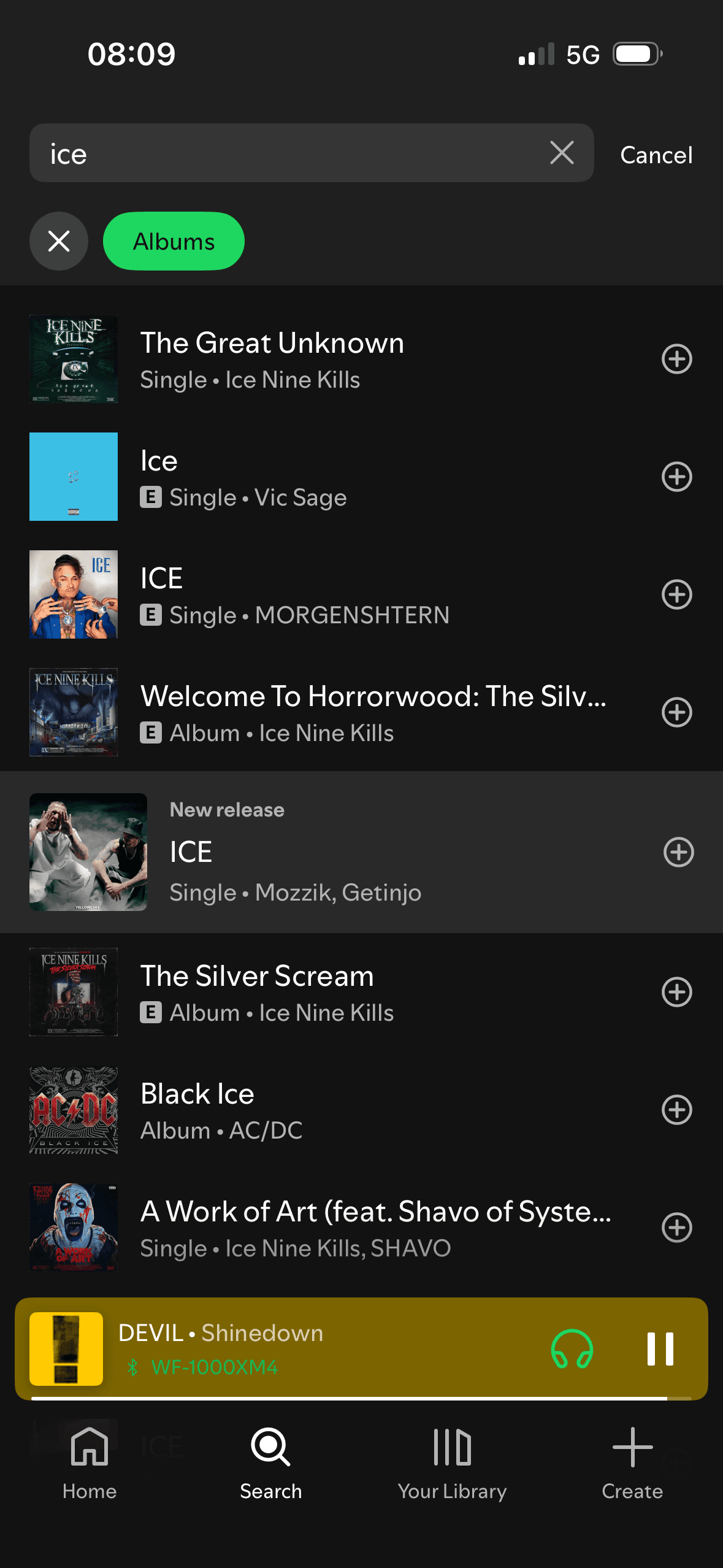
Album results
The screen turns the filters, selected states and result controls into explicit options rather than asking people to recall a hidden command or category.
The number, order or overlap of options can still make comparison demanding. Search, grouping, a clear reset and an explanation of what changes would reduce avoidable cognitive load.
Labels, rows or chips group the filters, selected states and result controls into recognisable units, helping people scan a larger set without reading it as one block.
Show 1 more principleShow fewer principles
Names, icons, artwork or previous queries let people recognise a likely option instead of reconstructing it from memory. The cue still needs a text label and clear source.
If Spotify were to clarify that the Albums filter also returns singles, or rename the filter to match its contents, then people should recover from interruption with less effort because progress, failure and the next available action remain clear. This would apply Choice Architecture and Cognitive Load.
Screen 09
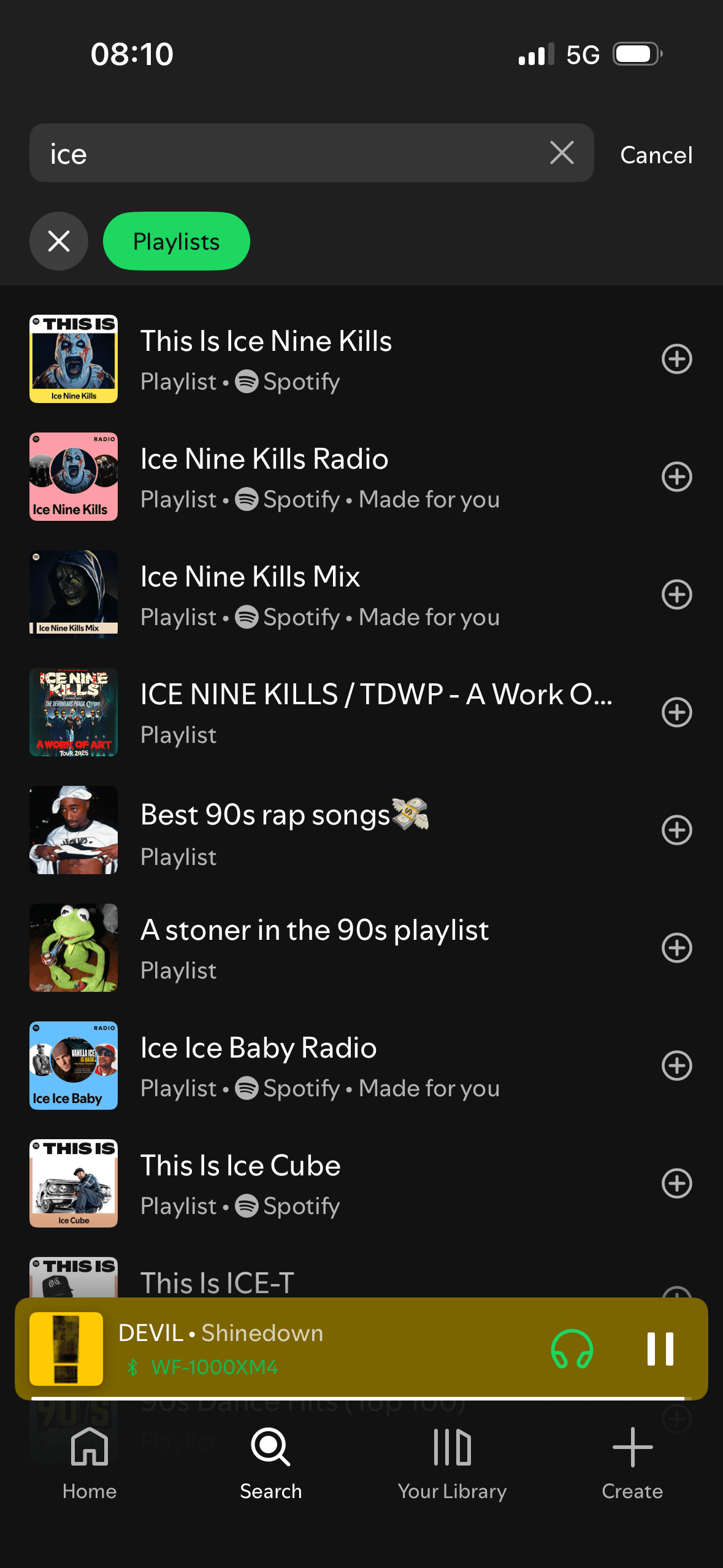
Playlist results
The screen turns the filters, selected states and result controls into explicit options rather than asking people to recall a hidden command or category.
The number, order or overlap of options can still make comparison demanding. Search, grouping, a clear reset and an explanation of what changes would reduce avoidable cognitive load.
The content is divided into labelled rows or sections, which makes a long feed easier to scan by purpose or source.
Show 1 more principleShow fewer principles
Artwork, thumbnails and familiar titles support rapid recognition while browsing. They help identify content, but do not demonstrate relevance or quality by themselves.
If Spotify were to distinguish Spotify-authored, personalised and user-created playlists and explain why each ranks for the query, then people should understand the next decision more clearly because its purpose and consequences are visible before they act. This would apply Choice Architecture and Cognitive Load.
Screen 10
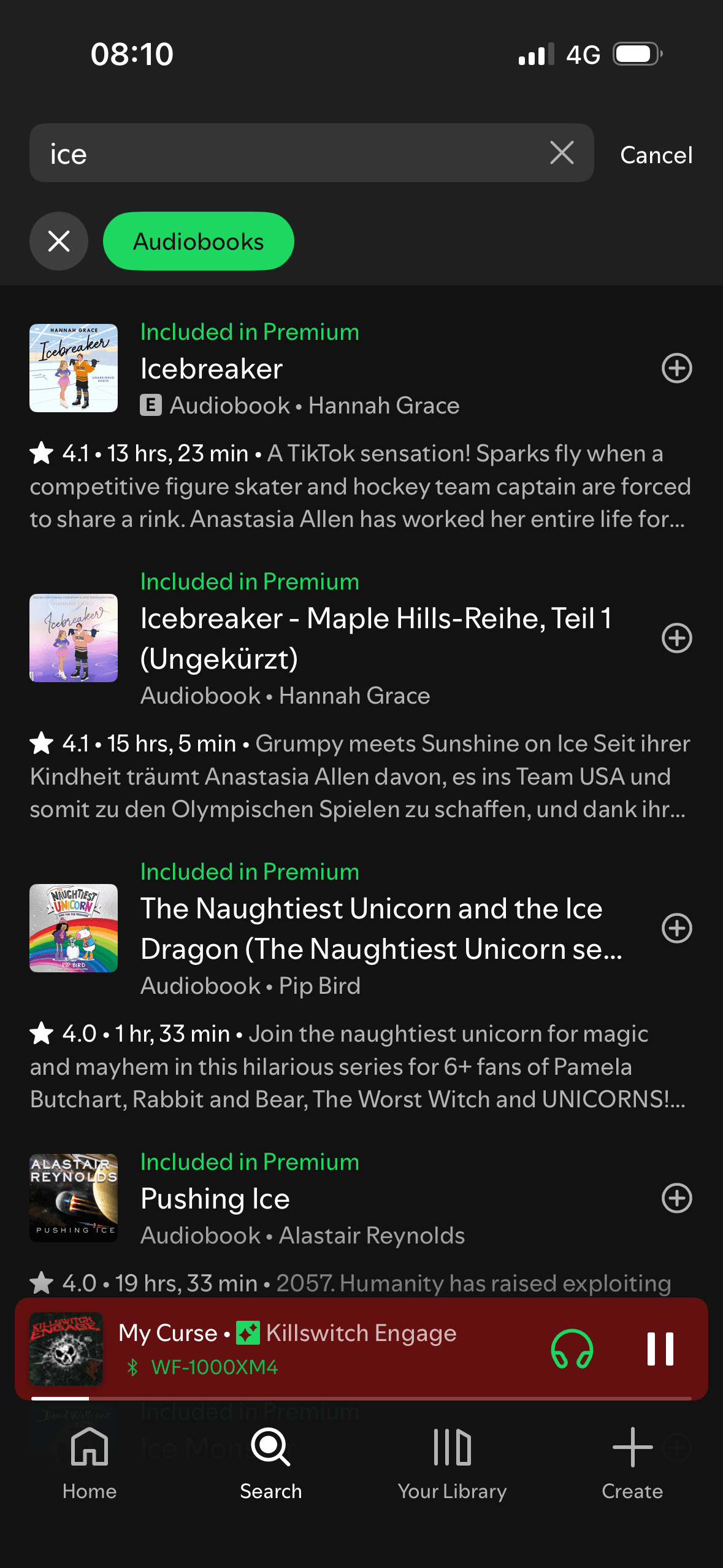
Audiobook and podcast results
The screen turns the filters, selected states and result controls into explicit options rather than asking people to recall a hidden command or category.
Each audiobook row begins with the green label “Included in Premium”. The repeated label frames access as a subscription benefit; the screenshot does not establish purchase intent or explain listening limits and other conditions.
Labels, rows or chips group the filters, selected states and result controls into recognisable units, helping people scan a larger set without reading it as one block.
Show 1 more principleShow fewer principles
The number, order or overlap of options can still make comparison demanding. Search, grouping, a clear reset and an explanation of what changes would reduce avoidable cognitive load.
If Spotify were to offer language and format controls, keep description expansion optional and explain Premium inclusion, listening limits or separate purchase before Add, then people should compare the offer more accurately because price, eligibility and future cost are shown on the same basis. This would apply Choice Architecture and Framing Effect.
Conclusion
What this journey teaches us.
Spotify supports both open browsing and known-item search, and its format filters make a broad result set easier to reduce. Recent items and selected states also preserve useful context.
The wider lesson is that recognition is only helpful when the destination remains clear. Stronger type labels, ranking explanations and history controls would make mixed results easier to trust and manage.
Keep exploring