
Bring people back without nagging
Saved shows and useful alerts can remove real effort from planning a night out. I looked at what happens after someone follows a collection: the Updates feed, rewards progress, viewing history, notification settings, watchlists and Rush alerts.
These features can help people return to something they care about, but they also give the product many reasons to interrupt them. The most interesting design question is how TodayTix can make each return feel chosen, relevant and easy to control rather than simply increasing the number of reminders.
- Captured
- Capture date not recorded
- Published
- Last updated
- Product version
- TodayTix iOS app; version not recorded
- Source
- View reference ↗
- 10
- Screens
- 17
- Ingredients
- 40
- Applications
Common contexts
Business goals
What works
What the captured flow does well.
- Saving gives immediate feedback and a persistent state.
- Alert settings are separated by topic and channel.
- Watchlists and Rush alerts can be changed item by item.
- Rewards show current benefits as well as future progress.
What could improve
What deserves closer review.
- The Updates feed mixes very different reasons to return.
- Rewards progress is hard to interpret at a glance.
- Locked benefits can make extra spending feel like progress.
- Collapsed settings hide current channel choices.
Screen-by-screen breakdown
Follow the journey.
Each observation shows what works or what could improve, on this screen or across the wider flow. The opportunity turns one or two principles into a testable hypothesis.
Screen 01
Collection saved
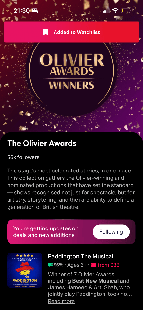
An Added to Watchlist banner confirms the action and the button changes to Following. This provides immediate and persistent evidence that the save worked.
Following turns a passing collection visit into a stored preference that can guide later updates, but the future contact attached to that commitment is not explained here.
The bright confirmation banner briefly dominates the page. It makes success hard to miss, but the type and frequency of resulting updates remain unspecified.
Show 1 more principleShow fewer principles
The saved state prepares people to recognise collection-based items when they later appear in Updates, connecting the action with its future result.
If TodayTix combines feedback with transparent commitment by explaining what following will send and how to stop it, then people should save collections with clearer expectations because the future effect is visible.
Screen 02
Loading updates
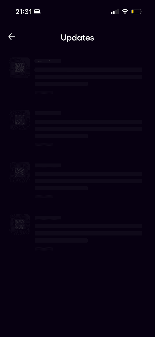
Skeleton rows indicate that the Updates feed is loading rather than empty. The state lacks visible error, retry or timing information in the captured frame.
Content structure is suggested before real notifications appear. This staged placeholder should not imply a fixed amount or type of update before data is known.
Repeated simple placeholders keep the state visually quiet. Accessible status text is still needed so understanding does not depend on recognising a skeleton pattern.
Show 1 more principleShow fewer principles
The loading state offers no alternative route, making waiting the only apparent option even if the feed stalls or is not the reason someone opened the account area.
If TodayTix uses feedback and progressive disclosure to add accessible status, timeout and retry information, then people should recover more easily because loading never looks like an unexplained empty feed.
Screen 03
Updates
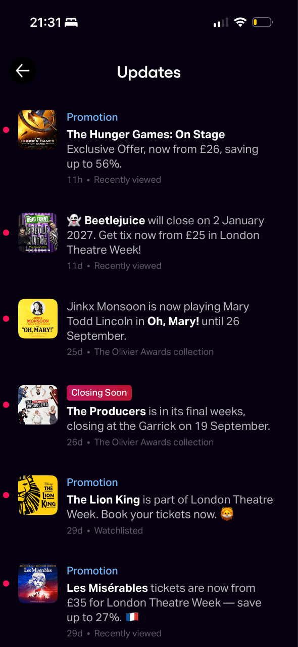
Coloured dots, labels and show artwork help individual updates stand out in a dense list. The hierarchy does not clearly separate operational, followed and promotional content.
Recently viewed and watchlisted shows reappear throughout the feed, increasing their familiarity and prominence even when no new user need has been expressed.
The feed combines promotions, closing dates, collection news and watchlist alerts in one stream. Without filters, the product controls the mix and order of reasons to return.
Show 1 more principleShow fewer principles
Labels such as Promotion, Closing Soon and Recently viewed frame very different messages as equally useful updates, without showing why each deserves attention.
If TodayTix uses choice architecture and salience to separate operational, followed, activity-based and promotional updates, then people should find useful messages faster because different reasons to return no longer compete in one stream.
Screen 04
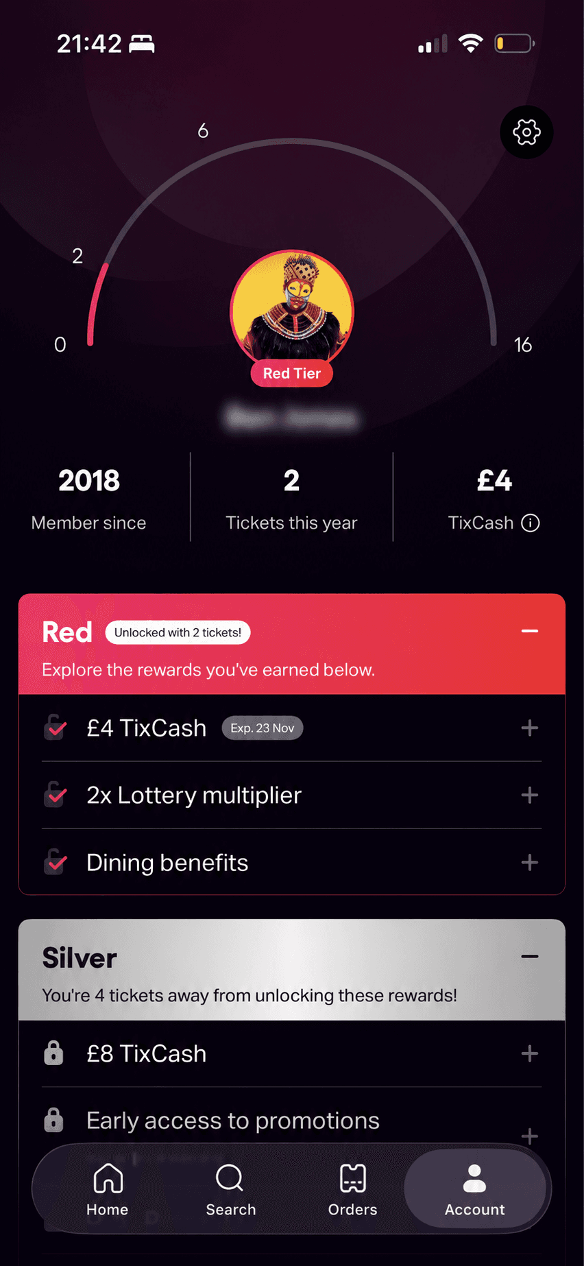
Rewards progress
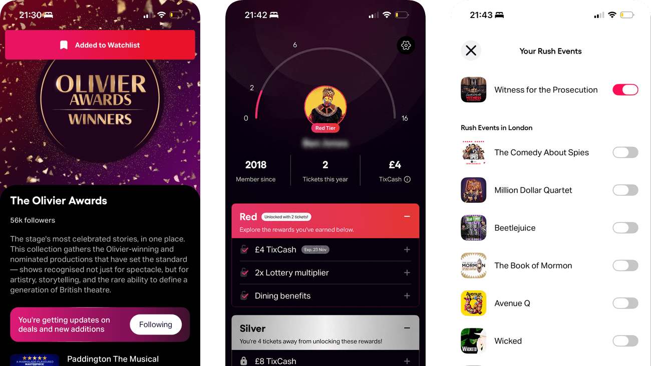
The gauge and tickets-away message turn the distance to the next tier into a clear, visible goal that becomes more concrete as progress increases.
The large progress gauge makes current tier and movement toward the next one the dominant information on the rewards profile.
Unlocked rewards and a balance can make existing benefits feel owned and worth preserving. Expiry, qualification and downgrade rules need equal visibility.
Show 1 more principleShow fewer principles
A named current tier can become the member’s reference state, making a future downgrade or missed threshold feel like losing status rather than simply changing benefits.
If TodayTix uses the goal-gradient effect and loss aversion with explicit thresholds, time windows and benefit terms, then people should judge rewards progress more accurately because advancement and expiry are equally clear.
Screen 05
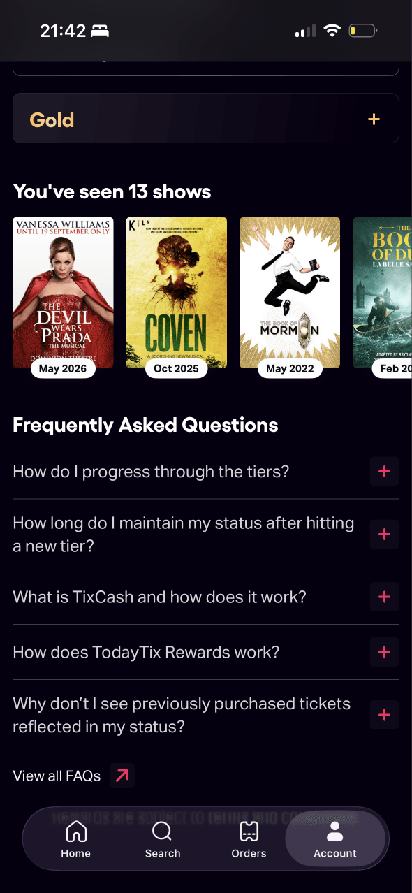
Shows seen and FAQs
A personal record of thirteen seen shows turns past purchases into a visible collection associated with the member’s account and rewards identity.
Frequently asked questions are collapsed below the viewing history and open when needed. This keeps explanation available without dominating the main account view.
The seen-show count reflects accumulated activity back to the member. A correction route is important if an eligible order is missing or counted incorrectly.
Show 1 more principleShow fewer principles
Show artwork and dates make past visits easy to recognise, reducing the need to remember order numbers or search for each production again.
If TodayTix combines the endowment effect with a feedback loop that explains reward counting and correction, then people should trust their history more because accumulated value can be verified.
Screen 06
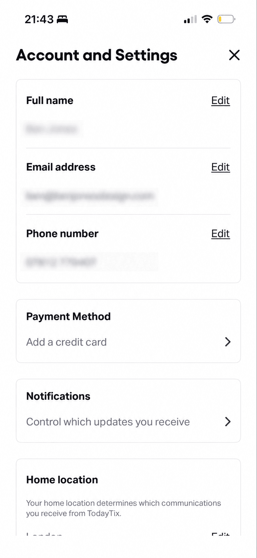
Account settings
Personal details, payment, notifications and home location are separated into distinct destinations. Their grouping creates a clear account-management structure.
Summary rows defer detailed editing until a destination is opened. Current notification and payment states are not equally visible from this overview.
Home location is described through the communications a person receives from TodayTix. The wording should distinguish service relevance from optional marketing use.
Show 1 more principleShow fewer principles
The overview does not show which optional notification or payment settings are already active, allowing existing choices to continue without being reconsidered.
If TodayTix uses choice architecture and progressive disclosure to show the current state and purpose of each setting, then people should manage the account more confidently because every destination has a predictable consequence.
Screen 07
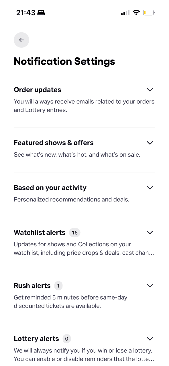
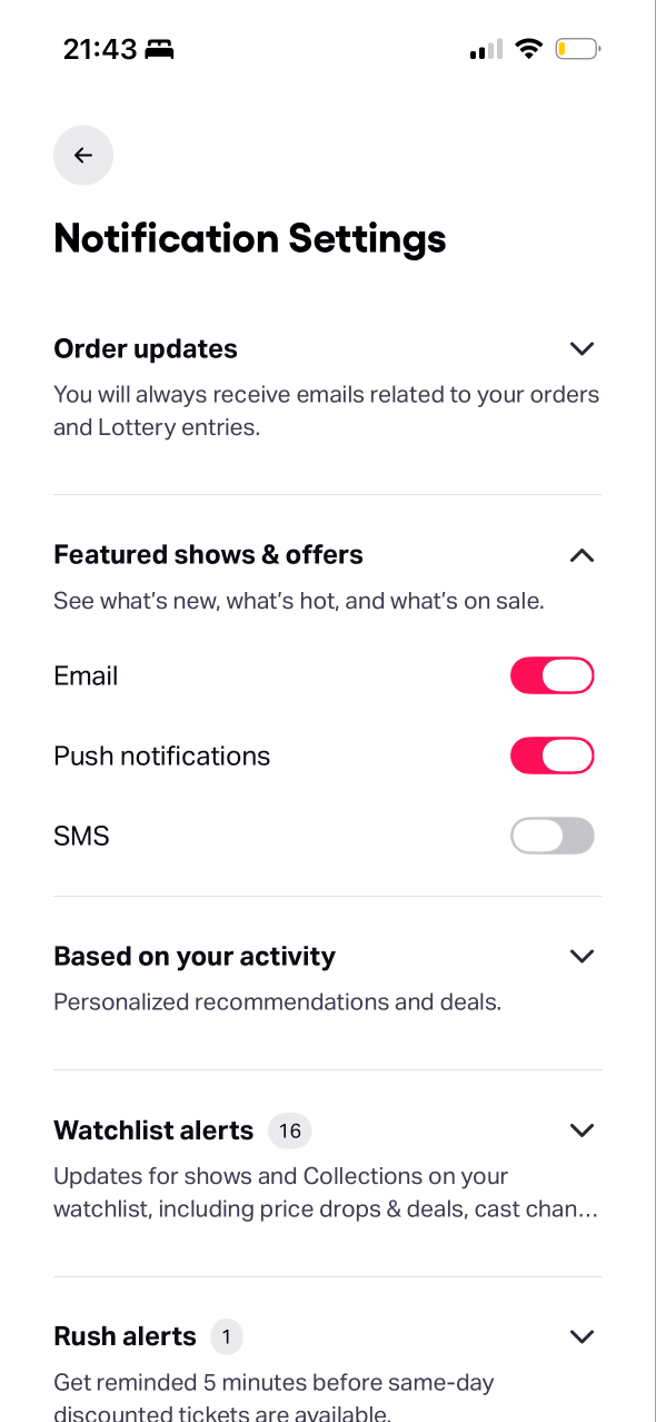
Notification settings
Notification purposes are collapsed into separate rows and expand for detail. This reduces visible complexity while hiding the current channel state.
Order, offer, activity, watchlist, Rush and lottery messages are presented as separate categories. That supports granular control rather than one all-or-nothing choice.
The overview does not reveal which optional channels are currently enabled. Hidden defaults can persist unless the current state is easy to inspect and change.
Show 1 more principleShow fewer principles
Featured shows & offers and Based on your activity frame marketing contact as useful product content, while expected frequency and commercial purpose remain hidden.
If TodayTix combines progressive disclosure with visible default states for every category and channel, then people should assess their contact choices quickly because enabled permissions are clear before expansion.
Screen 08
Notification channels
Email and push appear enabled while SMS is off for featured shows and offers. Existing switch states can persist when people accept the current configuration.
Independent channel switches allow a granular choice within one notification purpose. The design should not treat permission for one category as permission for another.
Switch movement can provide immediate visual confirmation of a change. Accessible announcements and a durable consent record are needed beyond the visible toggle state.
Show 1 more principleShow fewer principles
Enabled channels carry a past permission into future campaigns, so the interface should make ongoing commitment easy to review rather than only easy to switch on.
If TodayTix uses choice architecture and feedback to explain purpose, frequency and saved state for email, push and SMS, then people should control contact more confidently because each permission has a clear scope.
Screen 09
Watchlist
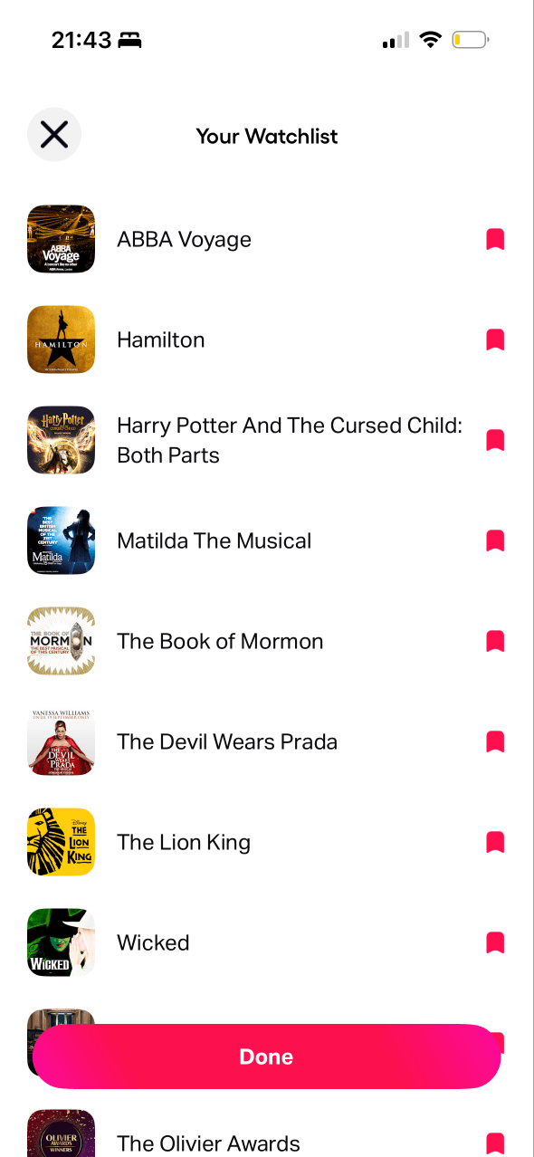
Gathering saved shows into a named personal watchlist gives the collection a sense of ownership and makes it more meaningful than isolated bookmark states.
Filled bookmark icons show which shows are saved and provide an apparent removal control. A confirmation or Undo state is not visible in the capture.
Artwork and show names make saved items easy to recognise when returning. Accessible action names are needed so the bookmark meaning is not carried by icon shape alone.
Show 1 more principleShow fewer principles
Each saved show can continue shaping alerts and recommendations, but the list does not summarise which future messages are attached to that commitment.
If TodayTix combines the endowment effect with reversible feedback for removing shows, then people should curate the watchlist with fewer mistakes because saved value is acknowledged without making deletion difficult.
Screen 10
Rush alerts
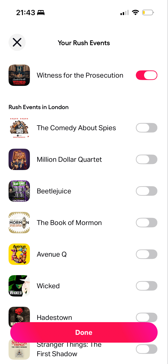
Rush is described as limited same-day discounted availability, making time and quantity relevant. Alerts should reflect genuine inventory rather than manufacture urgency.
Each show has an independent switch and the page offers a Done action. This supports item-level selection while a global pause is not visible.
One show is enabled and the rest are off in the captured state. Clear saved-state feedback matters because existing switch choices may otherwise continue unnoticed.
Show 1 more principleShow fewer principles
Same-day availability and five-minute warnings can make missing a Rush ticket feel especially costly, increasing the pressure to keep alerts active across many shows.
If TodayTix balances scarcity with choice architecture by stating alert timing, channel, frequency and a global pause, then people should enable only useful reminders because urgency remains specific and controllable.
Conclusion
What this journey teaches us.
TodayTix already gives people more control than a single marketing switch. The watchlist, Rush choices and channel settings recognise that different updates have different value.
The next step is to carry that clarity into the Updates feed and rewards experience. Showing why each message appears, what progress actually means and how to pause non-essential contact would make retention feel like a service rather than a demand for attention.
Keep exploring