
Make seat choice feel safe
Booking is the point where browsing turns into commitment. I followed the flow from choosing a performance to finding seats, checking restrictions, considering Ticket Protection and reviewing the final payment.
The app keeps a lot of useful information close to the decision, but it also brings together limited availability, savings, a reservation timer and an add-on. None of those cues is automatically a problem. The design challenge is to help people act before seats disappear without making a rushed choice they later regret.
- Captured
- Capture date not recorded
- Published
- Last updated
- Product version
- TodayTix iOS app; version not recorded
- Source
- View reference ↗
- 12
- Screens
- 13
- Ingredients
- 49
- Applications
Business goals
What works
What the captured flow does well.
- Prices are visible before a performance is chosen.
- Seat details and restrictions stay close to the selection.
- The order summary separates the ticket and add-on costs.
- People can decline protection and leave checkout.
What could improve
What deserves closer review.
- Urgency cues accumulate without enough inventory context.
- The seat map relies heavily on colour and small targets.
- Protection benefits are clearer than its exclusions.
- The exit actions hide their outcome behind Yes and No.
Screen-by-screen breakdown
Follow the journey.
Each observation shows what works or what could improve, on this screen or across the wider flow. The opportunity turns one or two principles into a testable hypothesis.
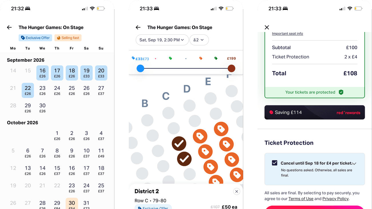
Screen 01
Choose a date
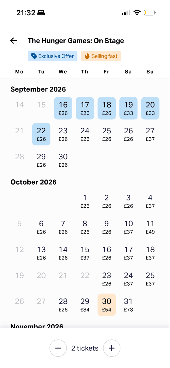
A calendar exposes available dates and starting prices while ticket quantity stays visible. This makes date and quantity the first constrained decisions in the booking path.
Daily starting prices establish a comparison range before a performance is chosen, which can make cheaper dates especially attractive even though seat quality is still unknown.
Dates, availability, ticket quantity and price are combined in one view. Clear disabled and selected states are essential if that information is to remain manageable.
Show 1 more principleShow fewer principles
The journey asks for date and quantity before revealing the seat map, reducing the number of variables people need to handle at the same time.
If TodayTix uses choice architecture and anchoring to explain disabled dates and daily starting prices, then people should choose a performance with fewer errors because availability and price comparisons have a clear meaning.
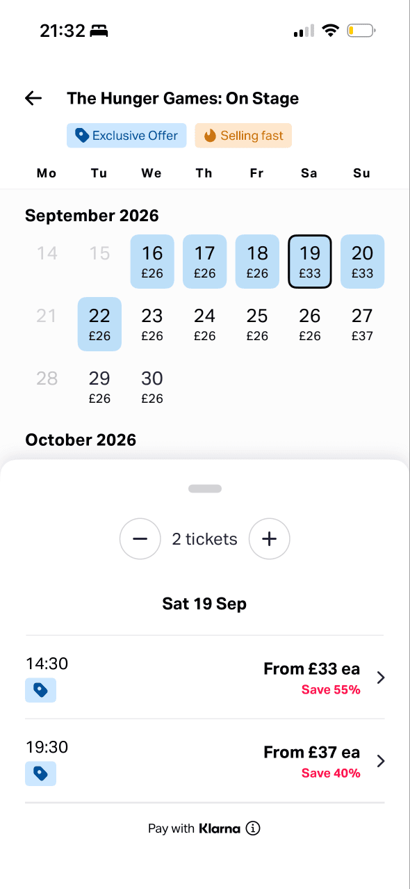
Screen 02
Choose a performance
The selected date and available times are visually stronger than surrounding calendar dates. This directs the next step without showing whether the hierarchy prevents mistakes.
The chosen day narrows the flow to two time-and-price rows. This staged reduction makes the next choice explicit and preserves a way back to other dates.
Each performance pairs a current price with a saving, making direct comparison easy while leaving the original price and saving method underexplained.
Show 2 more principlesShow fewer principles
Exclusive Offer and Selling fast remain beside the performance choice, layering value and urgency onto a decision already shaped by date and price.
The chosen date becomes a focused list of times and prices, giving immediate confirmation that the previous calendar selection changed the available performances.
If TodayTix combines salience with a feedback loop that repeats date, time, quantity and price basis, then people should confirm the intended performance more confidently because the result of the previous choice stays visible.

Screen 03
Loading the seat map
A spinner and Finding you the best deals message acknowledge that the app is working. The state does not say how long loading may take or what happens if it fails.
The phrase best deals frames the loading task as optimisation on the person’s behalf. The screen does not define best or explain whether ranking considers price, location or availability.
The seat map is withheld until data is ready, leaving one status message on screen. A useful staged state still needs accessible status and error recovery.
Show 1 more principleShow fewer principles
Finding you the best deals becomes the only prominent message between performance and seat choice, giving an undefined value claim more attention than reservation status.
If TodayTix uses feedback and progressive disclosure to explain what is loading, how long it may take and what remains held, then people should wait with more confidence because progress and consequences are clear.
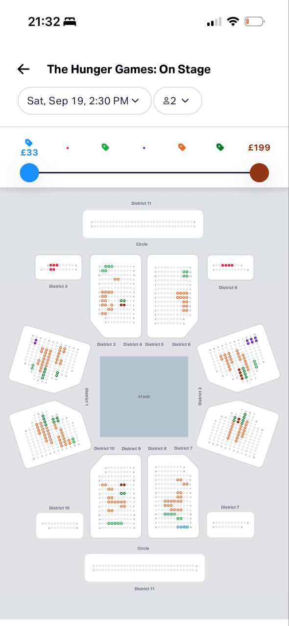
Screen 04
Seat map
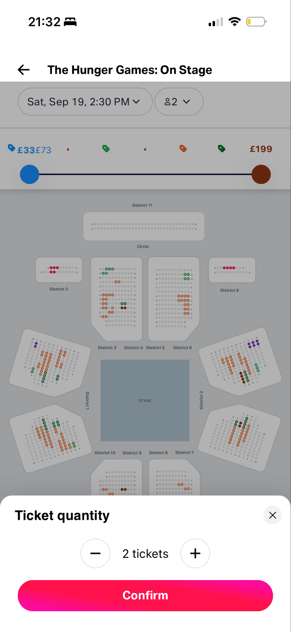
The map combines sections, individual seats, a viewport and a price range. Comparing those elements can require substantial visual and spatial effort.
The price slider and visible map region determine which seats are immediately available for consideration. Alternative list and filter routes are not visible.
Bright seat colours stand out against the muted plan and make availability prominent. Colour alone cannot communicate price or status accessibly.
Show 1 more principleShow fewer principles
The £33–£199 slider establishes the visible price range before a seat is inspected, which can shape what feels cheap or expensive across the map.
If TodayTix uses cognitive-load reduction and choice architecture to add a list alternative with labelled price, availability and restrictions, then more people should compare seats successfully because colour and precise pointing are no longer required.
Screen 05
Change ticket quantity
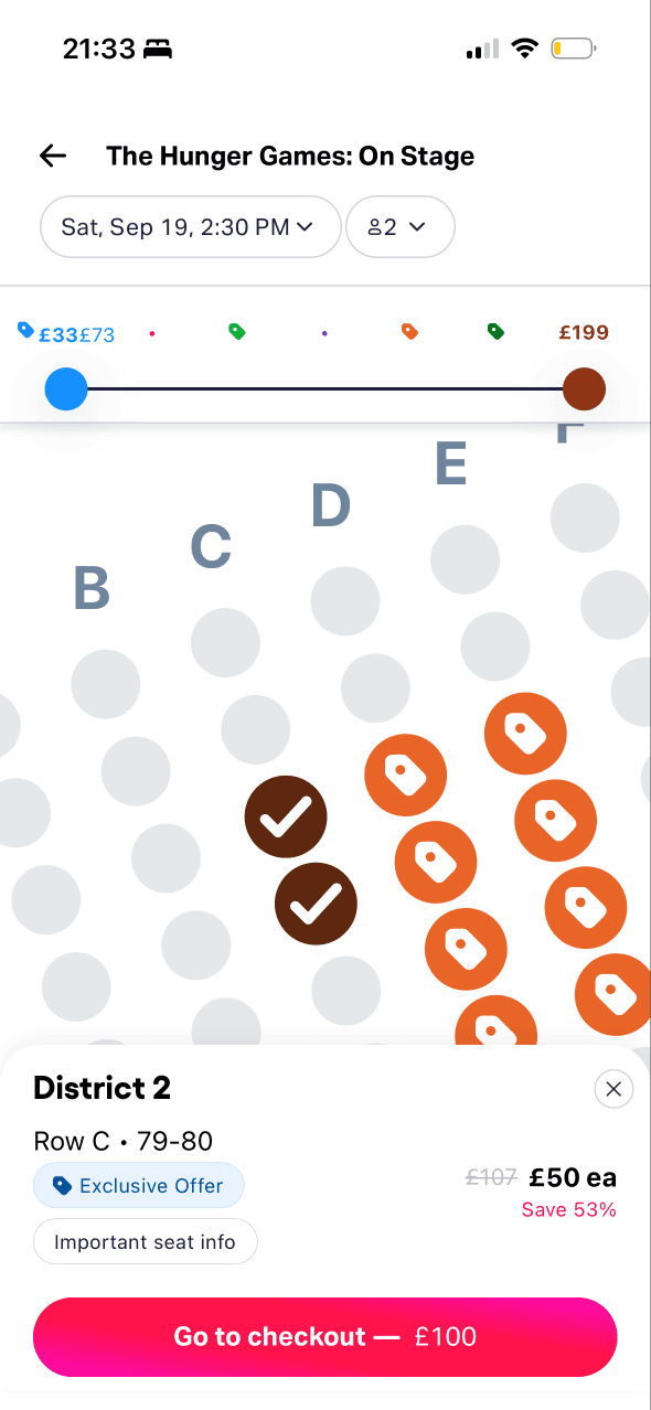
Ticket quantity opens in a focused bottom sheet over the map. This keeps the adjustment local while the wider seat context remains visible behind it.
The current quantity sits between minus and plus controls and Confirm completes the change, giving a clear response structure for this focused adjustment.
Increment controls constrain the available quantities instead of asking for free input. The permitted range and effect on any existing seat selection need to be clear.
Show 1 more principleShow fewer principles
Opening quantity over the seat map preserves context, but it also asks people to predict whether changing the number will remove seats they already considered.
If TodayTix pairs progressive disclosure with immediate feedback about lost seats and price changes, then people should adjust quantity with fewer surprises because the consequence is visible before confirmation.
Screen 06
Selected seats
Selected seats change appearance and are repeated in a bottom summary with row, seat and total. This gives immediate confirmation of the action.
A crossed reference price and Save 53% sit beside the current price. They create a value comparison without explaining the reference date, inventory or eligibility.
The checkout total is placed in a high-contrast action at the bottom of the screen. This makes commitment prominent while seat restrictions remain less visually strong.
Show 1 more principleShow fewer principles
The selected-seat summary introduces row, numbers, price and a restriction link before checkout, bringing more detail forward as commitment increases.
If TodayTix combines feedback with transparent anchoring for the reference price, then people should assess the selected seats more accurately because confirmation, total and saving basis are available together.
Screen 07
Seat restrictions
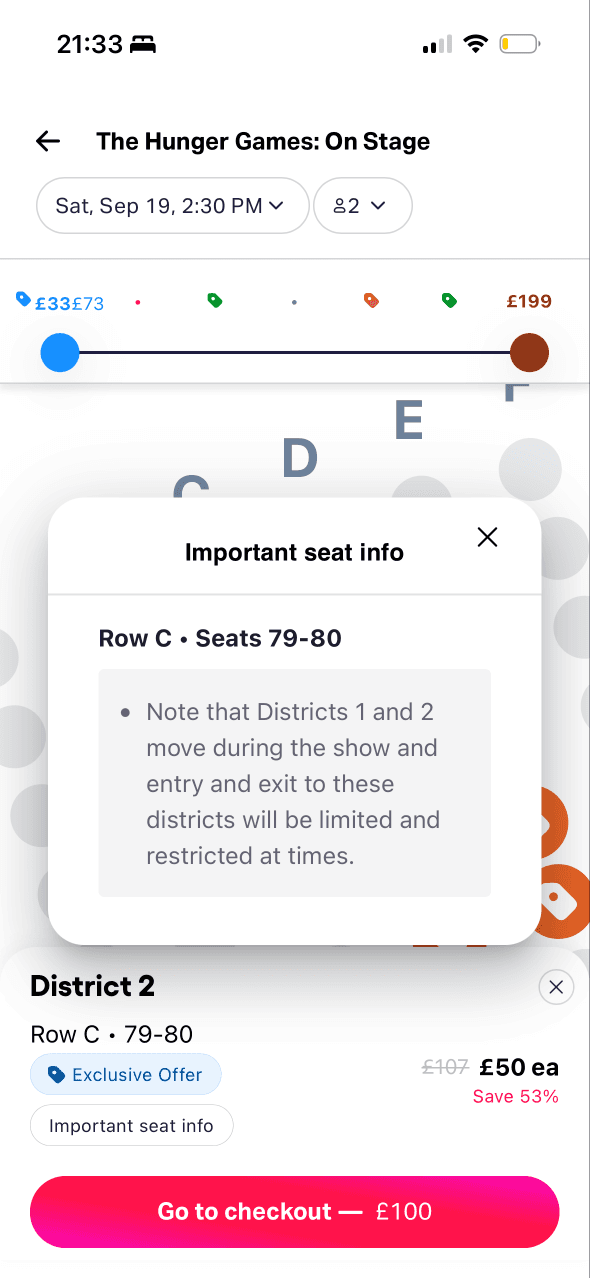
Important seat information opens in a dialog attached to the selected seats. This reveals consequential detail before purchase rather than hiding it in general terms.
The modal temporarily dominates the seat map and labels the information as important. That prominence is appropriate only if focus, dismissal and later recall are handled well.
Extra detail about limited views and movement is useful for judging suitability. Requiring acknowledgement should depend on consequence, not an assumption that more information is always better.
Show 1 more principleShow fewer principles
Showing movement and view limits before payment helps people consider a poor future experience while they can still change seats without financial consequence.
If TodayTix uses progressive disclosure and salience to repeat material restrictions beside the seat and in checkout, then people should make fewer unsuitable purchases because the warning stays attached to the choice.
Screen 08
Add ticket protection
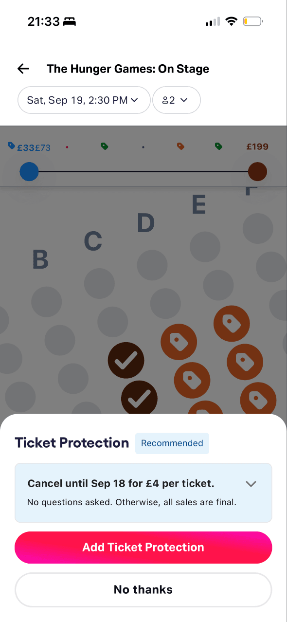
Recommended, Cancel until and No questions asked frame protection around reassurance and flexibility. Exclusions and claim conditions receive less emphasis in the captured view.
Protection is not preselected and a visible No thanks route preserves refusal, although the brighter add action still receives more visual weight.
Protection is presented immediately after seat selection, when losing the purchase may be easy to imagine. The screenshot cannot show whether anticipated regret changes take-up.
Show 1 more principleShow fewer principles
Protection appears immediately after seats feel chosen, framing the add-on around avoiding the loss of a valued booking rather than only its practical cover.
If TodayTix uses framing and choice architecture to give protection benefits, exclusions, price and refusal equal weight, then people should make a more informed add-on choice because both outcomes are easy to compare.
Screen 09
Contact and payment
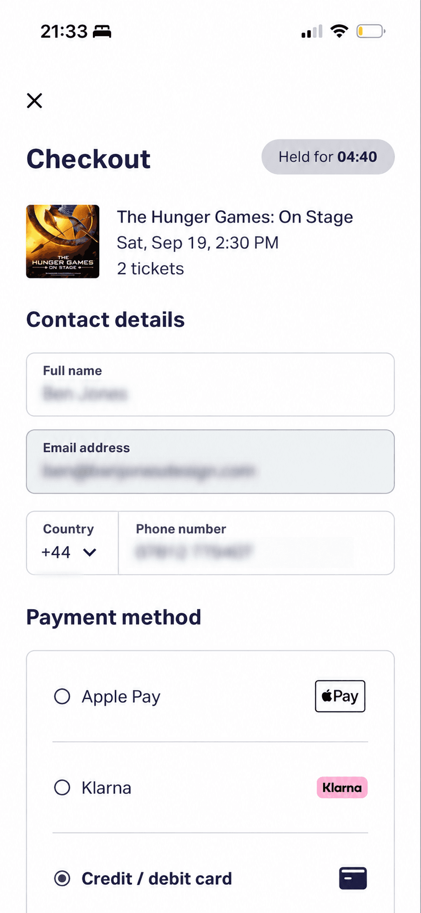
Contact fields and Apple Pay, Klarna and card routes are grouped into distinct sections. Their ordering and visual treatment shape the available payment path.
Checkout introduces contact and payment details after seats are selected, while the order stays summarised above. This stages the task around the current commitment.
A held-for countdown is visually prominent beside the checkout title. It communicates time pressure, but the exact consequence of expiry is not explained here.
Show 1 more principleShow fewer principles
The held-ticket countdown continues through checkout, making diminishing time part of every remaining decision without explaining what expires or can be recovered.
If TodayTix uses progressive disclosure and salience to explain required contact data and the held-ticket timer, then people should complete checkout with fewer doubts because purpose and time consequences are visible when needed.
Screen 10
Checkout details
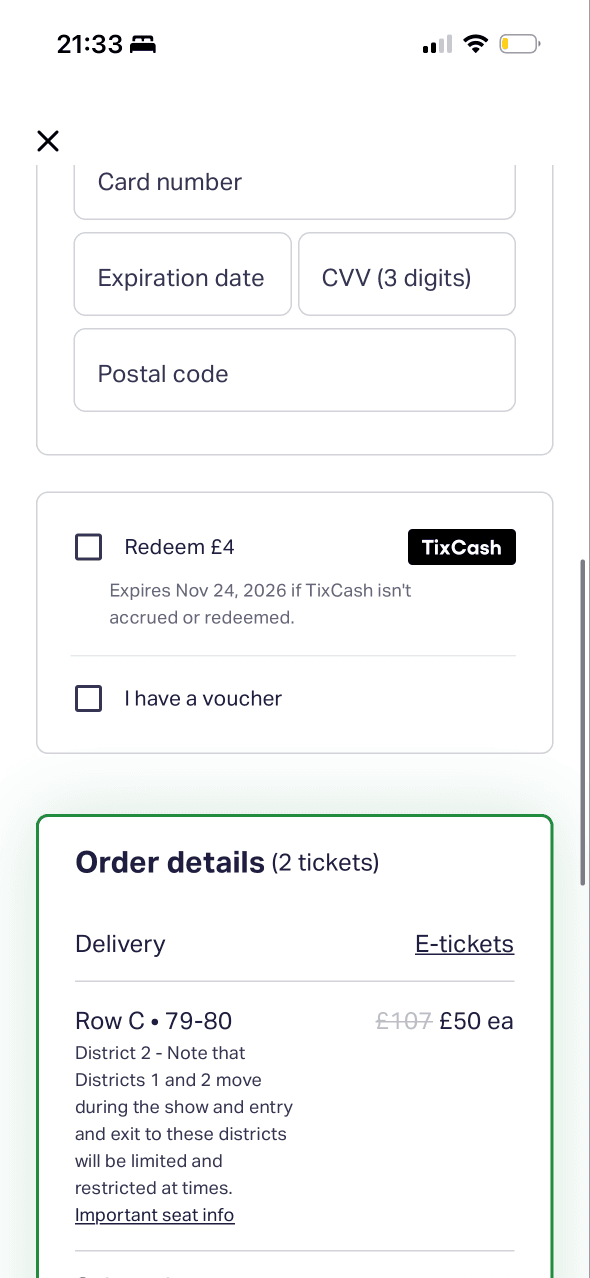
Payment fields, rewards, vouchers and order details compete within a long checkout. Grouping helps, but the person must still track several costs and conditions.
Expandable order details and optional redemption controls keep some information secondary. Any hidden material fee or restriction would undermine that staging.
Field-level validation and the running order summary can show whether the form is complete and correct. Their timing and accessibility are not visible in a static capture.
Show 1 more principleShow fewer principles
TixCash and voucher controls appear after substantial checkout progress, making existing account value feel relevant just before the final payment decision.
If TodayTix uses cognitive-load reduction and feedback to preserve data, explain errors and recover expired holds, then people should correct problems with less disruption because progress is never silently lost.
Screen 11
Review and pay
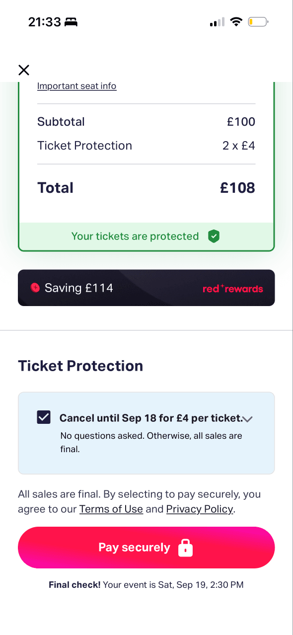
The total and Pay securely action are prominent at the end of the flow. Protection and savings are also visually strong, creating several competing value cues.
The summary itemises subtotal, protection and total before the final action. Protection appears selected, but the ease of removing it from this point is unclear.
Your tickets are protected frames the selected add-on as preserving the booking, while the savings message reinforces the value people may feel they now stand to lose.
Show 1 more principleShow fewer principles
The prominent Pay securely action appears at the end of a long sequence, where proximity to completion can make revisiting an add-on or seat choice feel more costly.
If TodayTix combines salience with balanced choice architecture for tickets, protection, rewards and the final total, then people should catch more mistakes because every material choice remains visible and reversible.
Screen 12
Leave checkout?
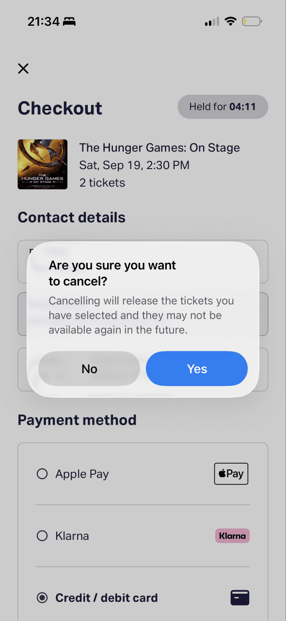
The confirmation interrupts an accidental exit and explains that selected tickets will be released, giving people one final chance to keep or abandon the booking deliberately.
The dialog says cancelling will release the tickets and they may not be available again. That makes the possible future loss vivid at the point of exit.
A negatively phrased question is answered with Yes and No, forcing people to translate the response into an outcome. Verb-led actions would reduce that ambiguity.
Show 1 more principleShow fewer principles
The possibility that tickets may disappear introduces an availability cue. It should reflect genuine inventory and remain factual rather than adding unverified pressure.
If TodayTix uses framing and regret aversion with outcome-led actions such as Keep my tickets and Release tickets, then people should choose correctly because each option states its consequence without extra ambiguity.
Conclusion
What this journey teaches us.
This flow does a good job of carrying the chosen performance, seats and price into checkout. The most useful information is usually available before payment, and the final summary gives people a chance to check the total.
Confidence falls where pressure rises faster than explanation. Clearer inventory evidence, an accessible alternative to the seat map and balanced add-on information would make the same journey feel safer without removing legitimate reservation limits.
Keep exploring