
Help people find the right show
I opened TodayTix with two different jobs in mind: finding a show I already knew about and working out what to see when I had no firm plan. The journey moves between a busy home feed, editorial collections, filters, search results and individual show pages.
What interested me was how often discovery and promotion share the same space. The app gives people plenty of routes into the catalogue, but labels such as “Special Offer”, follower counts and starting prices can shape a choice before the basis for them is clear. This case study looks at how TodayTix could keep that energy while making comparison easier and commercial cues more transparent.
- Captured
- Capture date not recorded
- Published
- Last updated
- Product version
- TodayTix iOS app; version not recorded
- Source
- View reference ↗
- 11
- Screens
- 12
- Ingredients
- 47
- Applications
Business goals
What works
What the captured flow does well.
- Several clear routes support both browsing and known-item search.
- Focused filter sheets keep complex choices manageable.
- Collections turn open-ended browsing into recognisable themes.
- Show pages bring key details close to the booking action.
What could improve
What deserves closer review.
- Editorial, personalised and paid placement are hard to tell apart.
- Savings and starting prices lack enough comparison context.
- Popularity signals appear without a useful denominator.
- Mixed search results need stronger type and ranking cues.
Screen-by-screen breakdown
Follow the journey.
Each observation shows what works or what could improve, on this screen or across the wider flow. The opportunity turns one or two principles into a testable hypothesis.
Screen 01
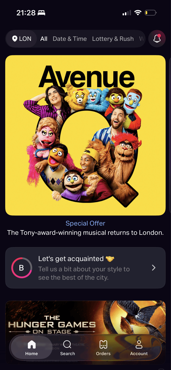
TodayTix home
The visual order is clear: the large show artwork draws attention first, followed by the Let’s get acquainted banner, then the notification button and its red dot.
Location, timing and ticket-type controls sit above the feed, giving people recognisable ways to narrow what they see before they browse.
Special Offer gives the featured show a commercial frame before the person sees why it is featured or how the offer compares with ordinary availability.
Show 2 more principlesShow fewer principles
The location and browsing controls establish the decisions that return in filters, search and booking, preparing people for the structure of the wider journey.
The page starts with one dominant show and reveals smaller discovery routes below it, creating a staged path from a concrete option into broader browsing.
If TodayTix uses salience and progressive disclosure to give the featured show, browsing setup and notification state one clear sequence, then people should know where to begin because the hierarchy matches the order of their decisions.
Screen 02
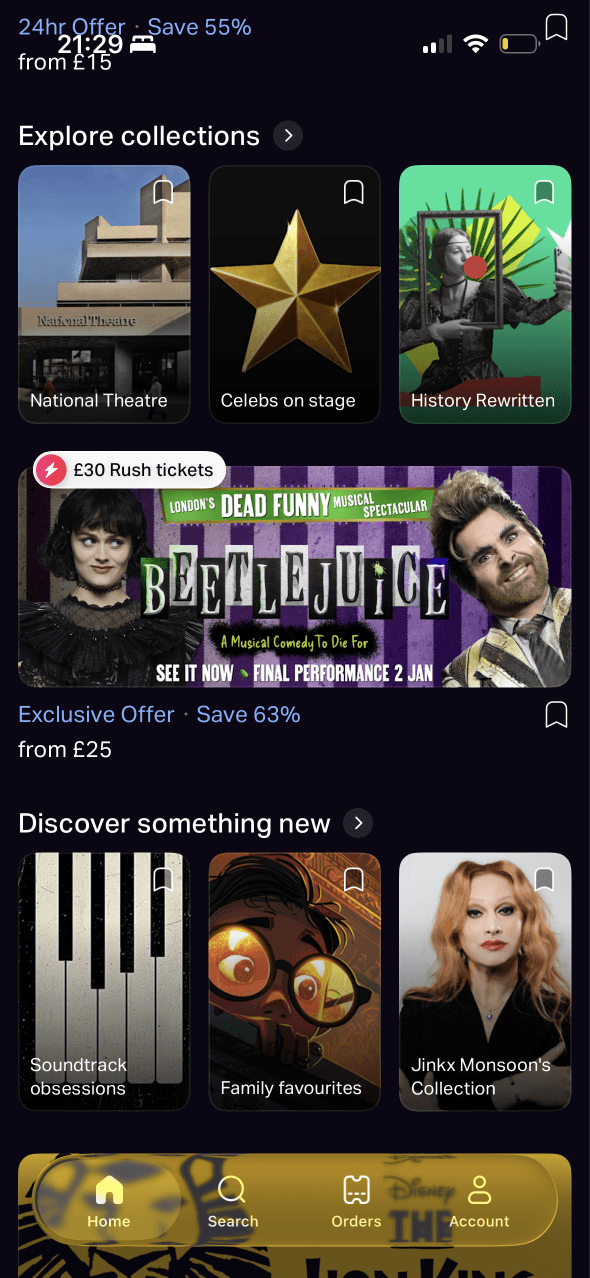
Home collections
The feed divides discovery into named rows such as collections, Rush tickets and new shows. This structure narrows a large catalogue into smaller choice sets.
Show artwork and familiar category names support recognition while browsing. Familiarity can aid navigation, but it does not establish that a show is relevant or good.
Discount badges, large artwork and high-contrast cards stand out from surrounding content. Their prominence is visible; their effect on attention or selection still needs testing.
Show 2 more principlesShow fewer principles
Repeated savings, Rush tickets and promotional cards make price and urgency prominent before a person has expressed what kind of show they want.
Collections, exclusive offers and new-show modules use similar visual treatment, making editorial selection, paid promotion and personalised relevance harder to distinguish.
If TodayTix combines choice architecture with clearer framing for editorial, personalised and promotional modules, then people should compare routes more confidently because they understand both the choice and why it is being shown.
Screen 03
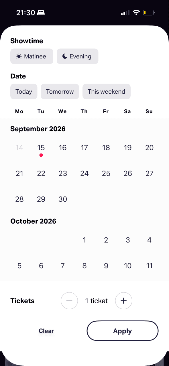
Date and ticket filters
Showtime, date and ticket quantity appear in a focused sheet rather than competing with the result list. This stages a complex decision, although its effect on effort is not shown.
Preset times and dates sit beside a calendar and quantity stepper, with Clear and Apply actions. The available options and their grouping shape how the search can be narrowed.
The sheet keeps several related constraints visible in one place. Whether that lowers mental effort depends on clear selected, unavailable and current-date states for every user.
Show 1 more principleShow fewer principles
The sheet has a clear Apply action, but it does not preview the number of matching shows or explain what changed when the person returns to results.
If TodayTix pairs progressive disclosure with a stronger feedback loop after Apply, then people should filter with fewer corrections because they can see both the choice they made and the result it produced.
Screen 04
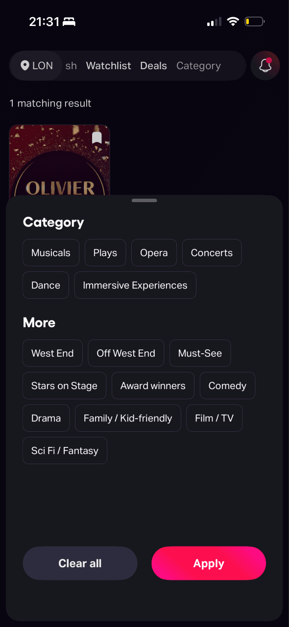
Category filters
Categories are presented as a bounded group of selectable chips with Clear all and Apply actions. This makes the available classification system explicit.
Several genres, formats and editorial labels appear in one compact panel. Short labels aid scanning, but overlap between options may still make selection effortful.
Terms such as Musicals, Comedy and Family are likely to be recognisable to many people. Labels such as Must-See depend more heavily on the app’s own judgement.
Show 1 more principleShow fewer principles
Labels such as Must-See and Award winners present an editorial judgement as a category, which can make recommendation and factual classification feel interchangeable.
If TodayTix uses choice architecture and recognition to group categories around familiar viewing goals, then people should find a useful filter faster because they do not have to translate their task into overlapping catalogue labels.
Screen 05
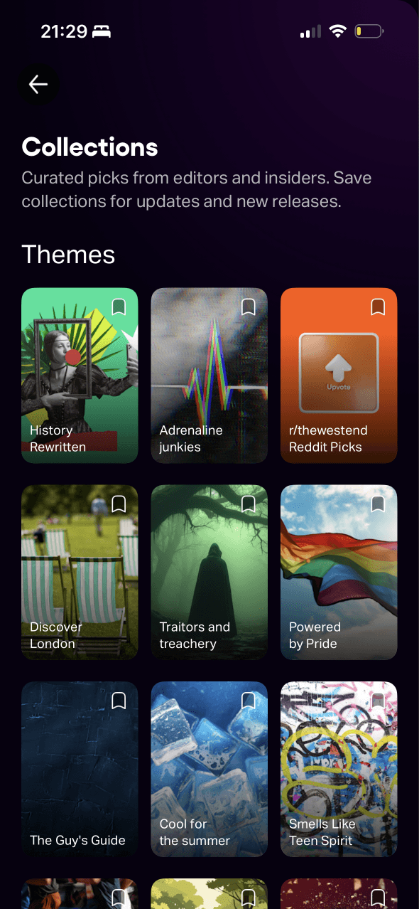
Collections
Named themes and illustrated cards let people choose through recognition rather than recalling a specific show. The labels still need to describe a dependable organising idea.
The catalogue is reorganised into a grid of editorial themes. That can make open-ended browsing manageable, while also giving the curator considerable influence over what is considered.
Colourful artwork carries much of the distinction between collections. Accessible names and visible text are needed so visual prominence is not the only information scent.
Show 1 more principleShow fewer principles
Collection names introduce themes that continue onto detail pages, helping people interpret the shows that follow through a consistent idea.
If TodayTix uses recognition and choice architecture to explain who curated each collection and what belongs in it, then people should choose a relevant theme more easily because the promise behind each card is concrete.

Screen 06
A collection page
A 56k follower count presents other people’s interest as information about the collection. The number lacks a time period, denominator and explanation of what following represents.
The collection combines an editorial description, a Follow action and included shows in one path. This connects the theme directly to a repeat-engagement choice.
The title and curatorial description frame the collection as authoritative coverage of award winners. That editorial frame does not by itself establish quality or personal fit.
Show 1 more principleShow fewer principles
Following creates a stored preference that can drive later updates, but the screen does not explain which messages this commitment will produce or how often.
If TodayTix balances social proof with transparent framing of the follower count and editorial source, then people should judge the collection more accurately because popularity is not left to stand in for quality or fit.
Screen 07
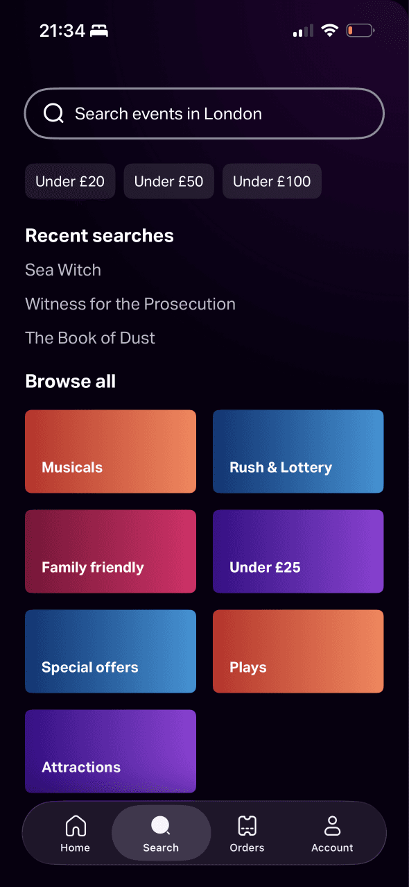
Search
The page offers recent searches, price shortcuts and broad categories before any typing begins. These routes shape the search task and make some intentions easier to express than others.
Previously searched titles and familiar category labels support recognition over recall. That convenience should be paired with a clear way to remove history.
Under £20, Under £50 and Under £100 introduce price reference points before results appear. Only behavioural evidence can show whether those values change later judgements.
Show 1 more principleShow fewer principles
Recent searches, price shortcuts and broad categories prepare people for the three result types they encounter next: exact matches, filtered lists and open browsing.
If TodayTix uses choice architecture and anchoring to separate known-show search, recent activity and budget browsing, then people should choose the right starting route because each path makes its purpose and price basis clear.
Screen 08
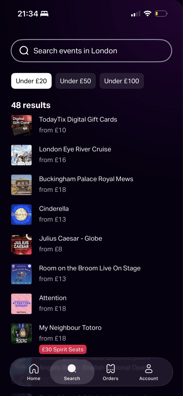
Results under £20
Under £20 becomes the reference point for the list, while each row uses a starting price. The two figures are easy to compare but do not reveal date, seat or fee conditions.
A filtered result count and repeated title-price rows support comparison within a bounded set. Starting prices may still conceal date, seat and fee differences.
The selected budget chip stays near the search field and is visually distinct. This helps preserve the active constraint without proving that every result meets the person’s full price expectation.
Show 1 more principleShow fewer principles
The budget frame continues into results through from prices, encouraging a low-price comparison even though the eventual seat and total may differ.
If TodayTix uses anchoring and framing to define what Under £20 and from prices include, then people should assess affordability more accurately because the reference price has a clear basis.
Screen 09
Search results
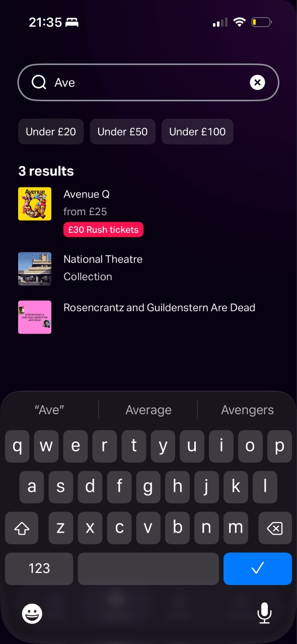
Artwork and partial title matches help people recognise likely destinations as they type. Similar-looking results can still be mistaken when their type is not explicit.
The result list mixes a show, a venue collection and another production beneath one query. Ranking and result-type labels determine which paths appear most plausible.
A Rush-ticket badge stands out within an otherwise restrained result list. That prominence may pull attention away from match quality, although behaviour cannot be inferred from the screen.
Show 1 more principleShow fewer principles
Autocomplete suggestions and mixed matches begin shaping the destination before the query is complete, so weak type labels can steer people toward an unintended route.
If TodayTix combines recognition with clearer choice architecture for exact shows, venues and collections, then people should select the intended result more reliably because each destination type is explicit.
Screen 10
Show page
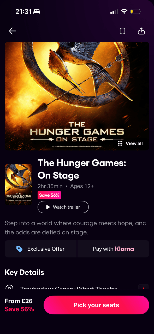
Save 56%, Exclusive Offer and Pay with Klarna frame the show through value and access as well as its content. The basis and eligibility of those claims are not visible here.
Large hero artwork, the show title and a persistent Pick your seats action dominate the page. This hierarchy keeps booking visible while potentially competing with lower-page details.
The percentage saving relies on a higher comparison price, making the current offer feel better value. The basis, eligible dates and seat locations behind that anchor are not visible here.
Show 1 more principleShow fewer principles
The overview presents essential show and booking information first, while longer editorial detail and related collections remain available further down the page.
If TodayTix uses framing and anchoring to place the source, eligibility and comparison basis beside each offer, then people should judge value more confidently because the claim and its evidence arrive together.
Screen 11
More show details
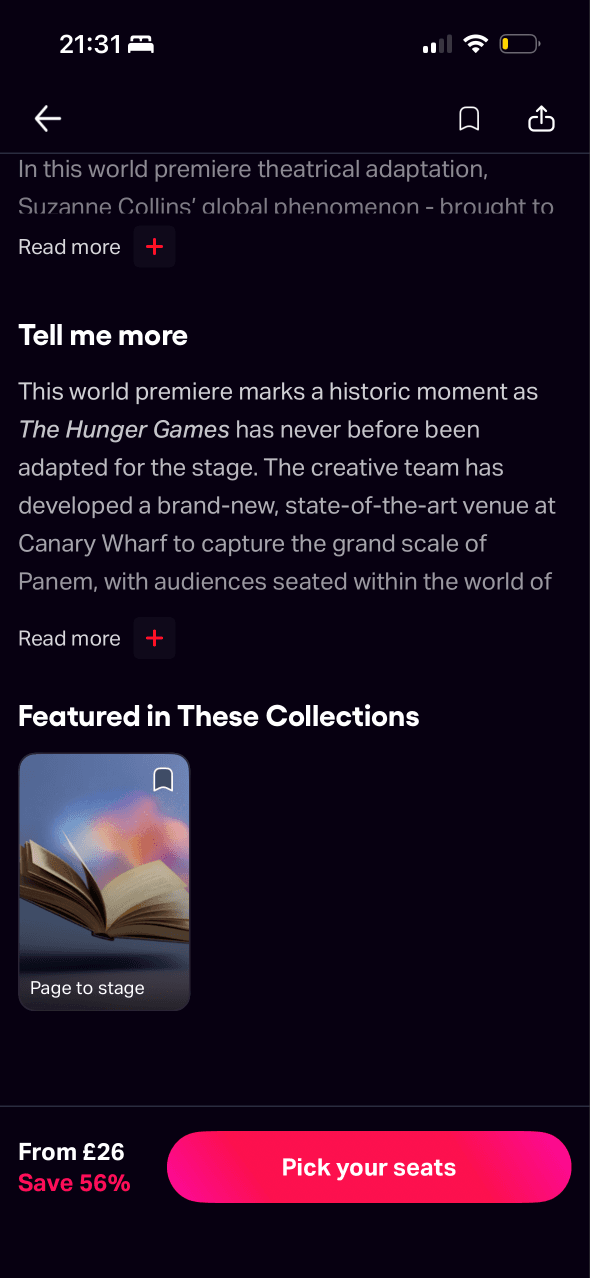
Longer show information and related collections sit below the key booking details. This keeps the first view focused while allowing people to seek more context.
The page offers Read more, a related collection and the persistent booking action at once. Their hierarchy shapes whether people continue learning or move straight to seats.
The show appears again through a related collection, adding another familiar route back to the same content and potentially giving repetition more weight than relevance.
Show 2 more principlesShow fewer principles
The related collection introduces the next browsing theme before the current show decision is complete, which can pull attention back into discovery instead of supporting closure.
The persistent booking bar remains visually dominant while the person reads expanded information, so the action can compete with the detail meant to support it.
If TodayTix uses progressive disclosure and salience to keep expanded information readable above the booking bar, then people should evaluate the show before acting because deeper content remains visible without losing the next step.
Conclusion
What this journey teaches us.
TodayTix is strongest when it turns a vague night-out idea into a small set of useful next steps. Search, collections and filters each help with a different kind of uncertainty, and the show page carries the decision forward without asking people to remember everything they have seen.
The bigger opportunity is not to add more discovery content. It is to make the reason behind each recommendation, offer and ranking easier to understand. That would help people judge fit rather than simply follow whatever is most visually prominent.
Keep exploring