
Earn the membership prompt
I followed Medium from sign-up and verification through suggested interests, membership pricing and the first personalised feed. The account steps are familiar, but the paid offer arrives before the captured experience has shown much value from the information people provided.
What interested me was the order of the exchange. A membership prompt is easier to judge when people have already seen a useful feed and can compare continuing for free with paying for clear additional value.
- Captured
- Capture date not recorded
- Published
- Last updated
- 10
- Screens
- 20
- Ingredients
- 40
- Applications

Common contexts
Business goals
What works
What the captured flow does well.
- Google, Facebook, Apple and email sign-up routes are visible together, with sign-in available for existing accounts.
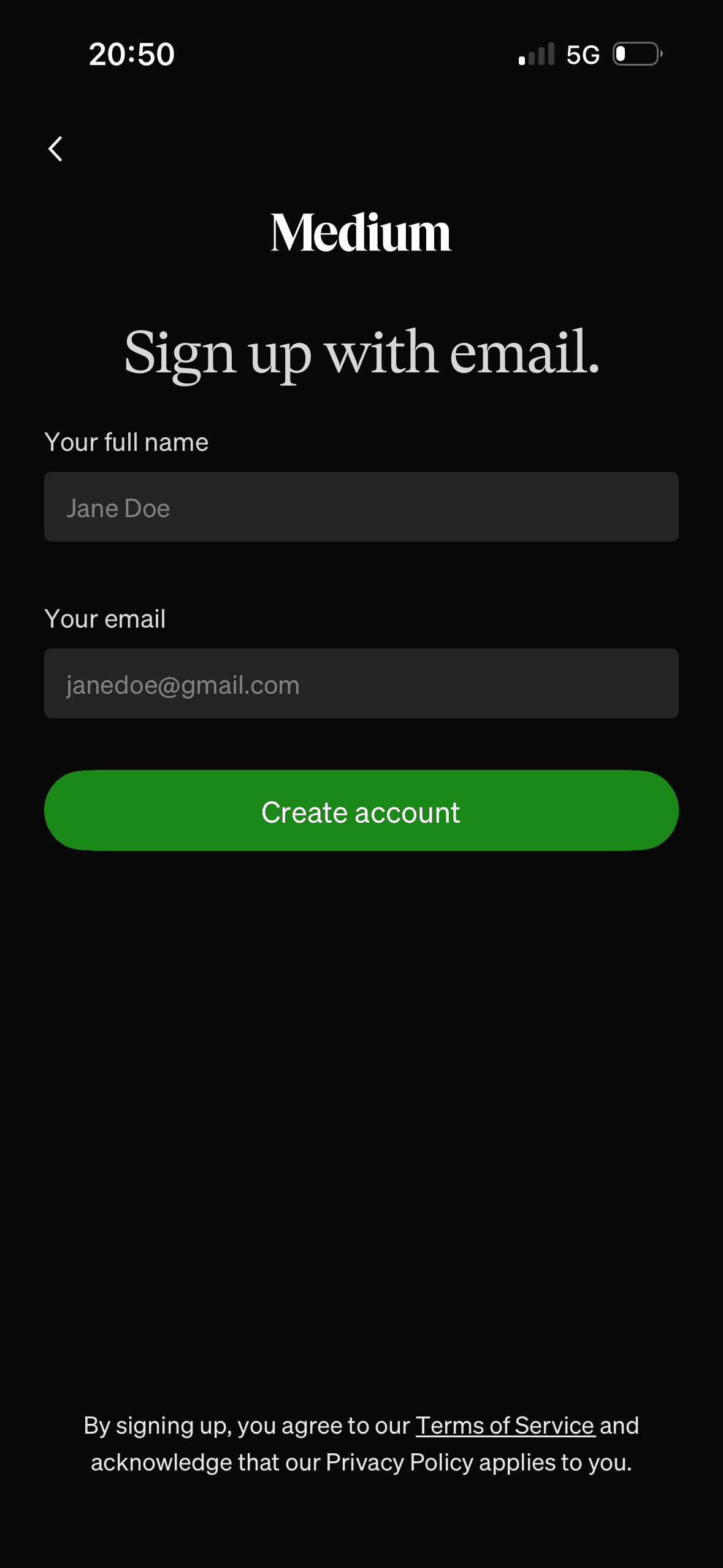
- The email form links to the Terms of Service and Privacy Policy before account creation.
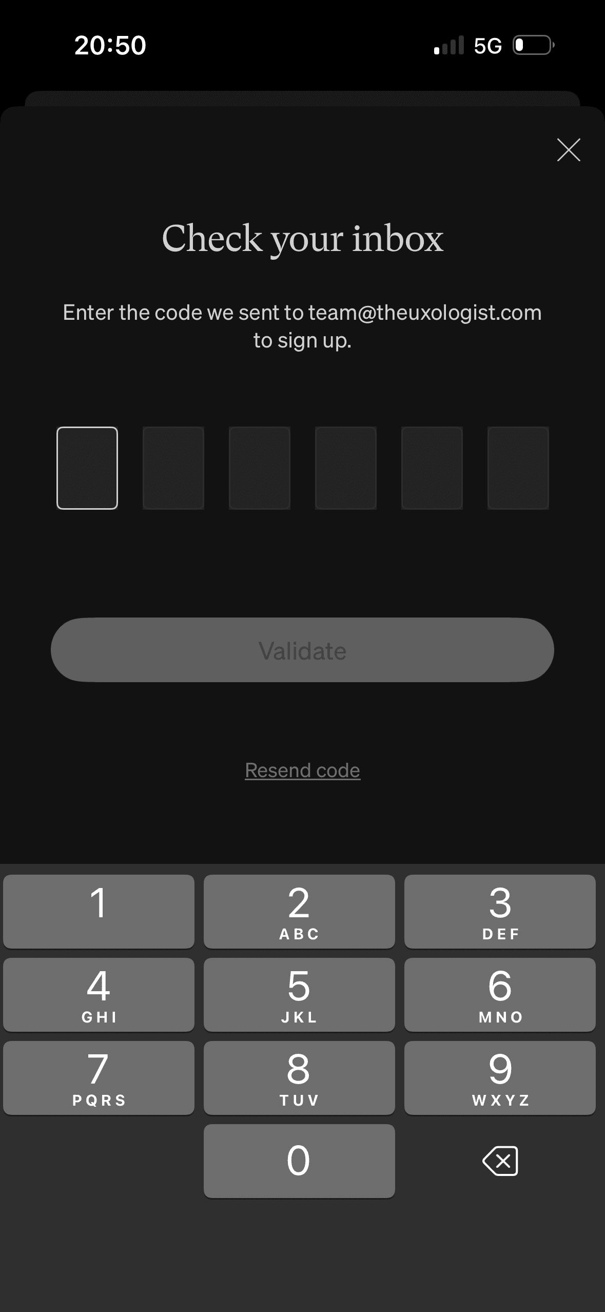
- The verification sheet repeats the destination email, offers code resend and disables validation until a code is entered.
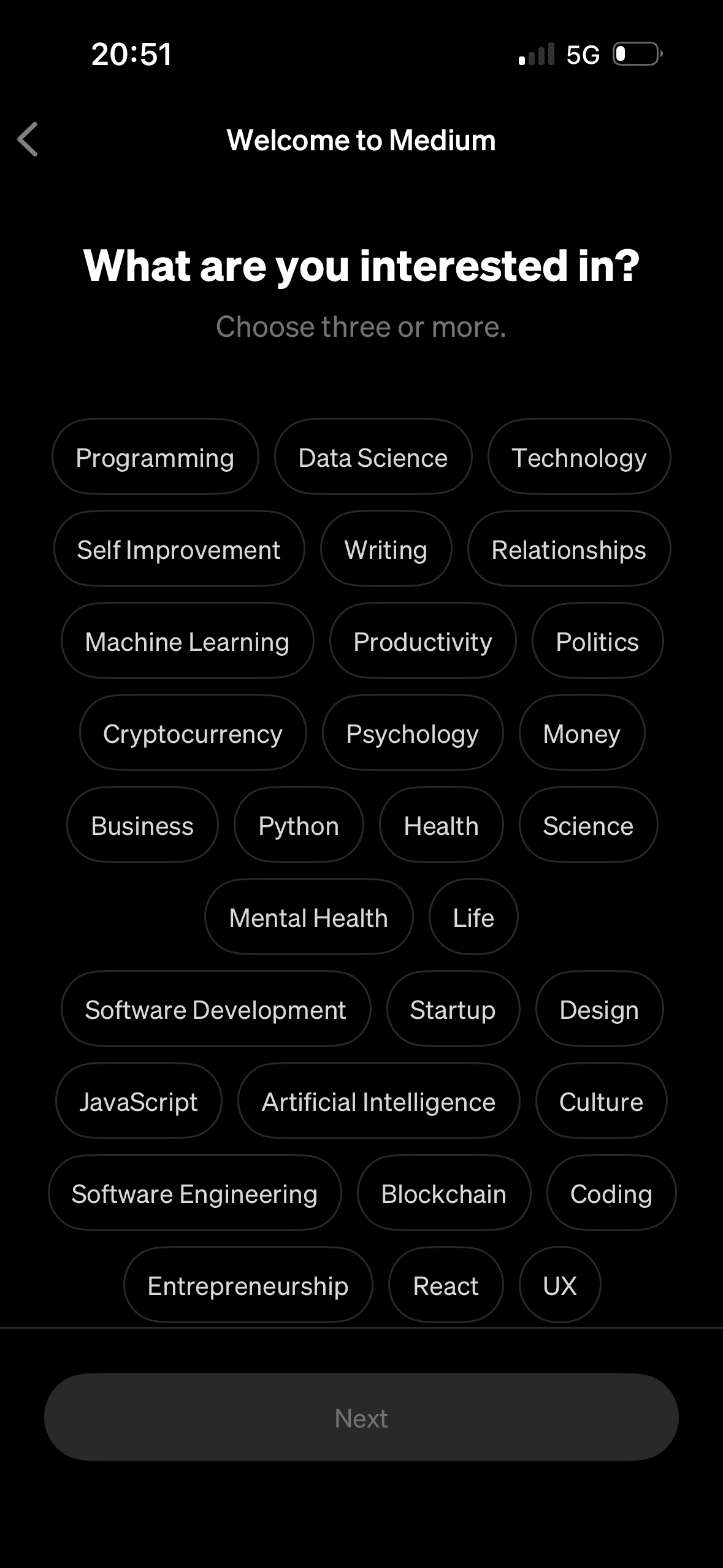
- The interest screen states the minimum number of topics and keeps Next unavailable before the requirement is met.
What could improve
What deserves closer review.
- The sign-up routes do not explain what account data each external provider shares or whether the recovery and privacy experience differs.
- Email sign-up does not say before submission that verification uses a one-time code, and the verification sheet has no visible route to correct the email address.
- The loading overlay gives no status, expected duration or recovery route if account creation stalls.
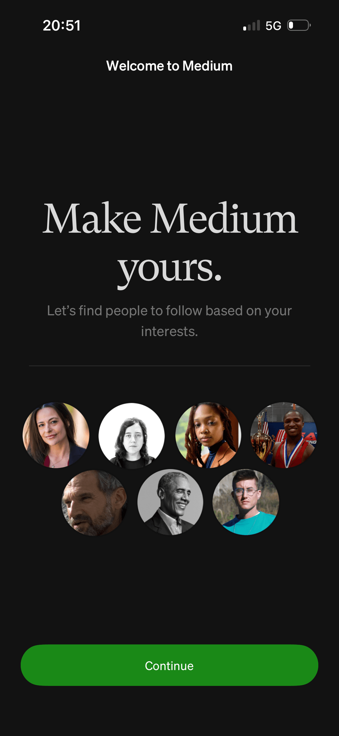
- The suggested-people screen says recommendations are based on interests before this captured sequence has collected any, and it does not explain whether anyone will be followed automatically.
Screen-by-screen breakdown
Follow the journey.
Each observation shows what works or what could improve, on this screen or across the wider flow. The opportunity turns one or two principles into a testable hypothesis.

Screen 01
Splash
The introductory message prepares people for the kind of task or benefit that follows. It is a flow-level cue because its effect depends on whether the next screens match that expectation.
The opening language defines how the journey should be interpreted before evidence or terms appear. Aspirational wording should not overstate the outcome or conceal later effort and cost.
The flow introduces one idea before moving to the next decision, reducing how much new information appears at once. Skip, back and reduced-motion routes determine whether that pacing stays supportive.
Show 1 more principleShow fewer principles
The arrangement of the introductory message and single next action determines which action is easiest to see and take. The screen should keep alternatives, refusal and correction proportionate to their importance.
If Medium were to keep the splash screen brief, then people should recover from interruption with less effort because progress, failure and the next available action remain clear. This would apply Priming and Framing Effect.
Screen 02
Choose a sign-up method
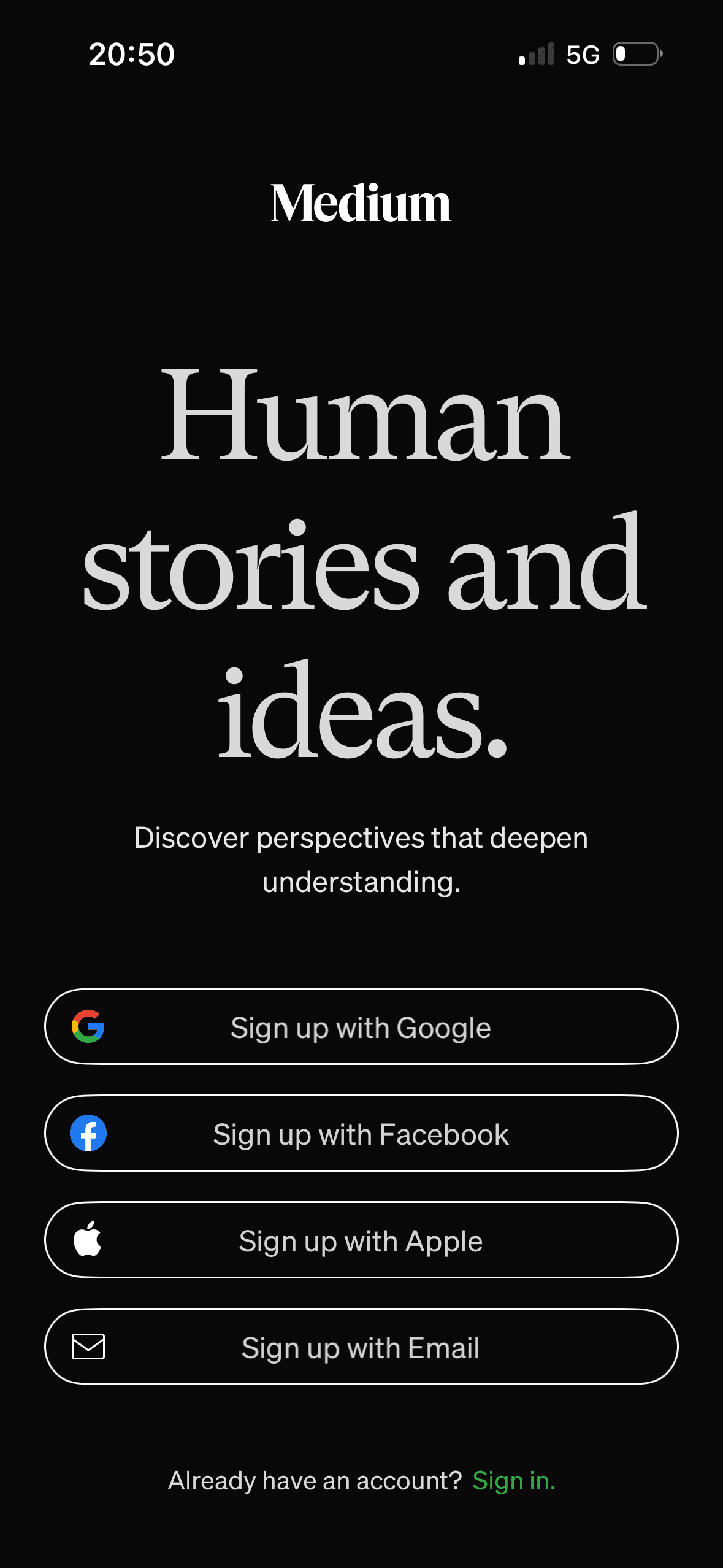
The screen keeps several account routes available in the same decision area. That is a useful choice structure because people can compare methods without leaving the flow.
One account route receives the strongest visual emphasis. That salience can steer selection before Medium explains any meaningful privacy, recovery or data-sharing difference.
Provider names and familiar logos make the available account routes easier to recognise. They support identification, but they are not evidence that a provider is safer or more trustworthy.
Show 1 more principleShow fewer principles
Items placed first or at the top receive an attention advantage before people inspect the rest. The first position should reflect the person’s task rather than an unexplained commercial priority.
If Medium were to keep every account route and sign-in visible, then people should recover from interruption with less effort because progress, failure and the next available action remain clear. This would apply Choice Architecture and Salience Effect.
Screen 03
Enter your email
Visual hierarchy gives the main controls, supporting information and available actions a clear point of entry. Important secondary information still needs enough prominence to be found before commitment.
The arrangement of the main controls, supporting information and available actions determines which action is easiest to see and take. The screen should keep alternatives, refusal and correction proportionate to their importance.
The immediate task stays focused on one decision before the wider journey continues. That sequencing reduces simultaneous choices when later steps remain predictable and reversible.
Show 1 more principleShow fewer principles
The screen asks people to interpret the main controls, supporting information and available actions without showing every relevant consequence nearby. Clearer grouping and concise support would reduce avoidable mental effort.
If Medium were to say that Medium will send a one-time code before the person submits their email, then people should make a more informed data choice because purpose, optionality and future use are clear before agreement. This would apply Salience Effect and Choice Architecture.
Screen 04
Verify your email
Visual hierarchy gives the main controls, supporting information and available actions a clear point of entry. Important secondary information still needs enough prominence to be found before commitment.
The arrangement of the main controls, supporting information and available actions determines which action is easiest to see and take. The screen should keep alternatives, refusal and correction proportionate to their importance.
The immediate task stays focused on one decision before the wider journey continues. That sequencing reduces simultaneous choices when later steps remain predictable and reversible.
Show 1 more principleShow fewer principles
The screen asks people to interpret the main controls, supporting information and available actions without showing every relevant consequence nearby. Clearer grouping and concise support would reduce avoidable mental effort.
If Medium were to add a clear way to correct the email address, state code expiry and resend timing, support password-manager or operating-system code entry and provide specific, recoverable error messages, then people should recover from interruption with less effort because progress, failure and the next available action remain clear. This would apply Salience Effect and Choice Architecture.
Screen 05
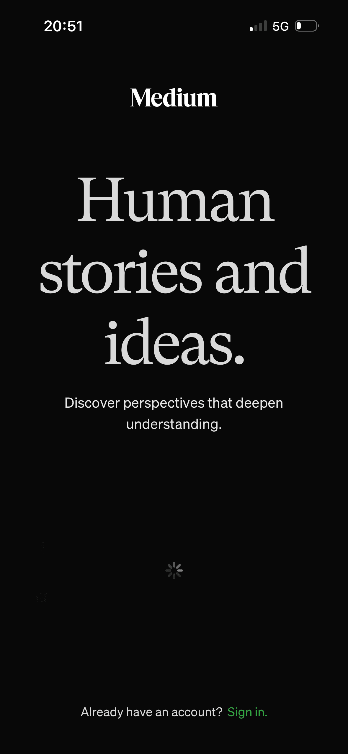
Creating your account
The screen makes a state change visible through the progress or loading state. That helps the person connect their action with the system response and identify the next step.
Visible progress can increase momentum as the apparent finish approaches. It becomes misleading if optional or commercial steps appear after the progress indicator suggests the journey is complete.
Colour, scale or placement makes the current state and primary next action easy to notice. The same state also needs a text or semantic cue rather than colour alone.
Show 1 more principleShow fewer principles
The arrangement of the progress message and system status determines which action is easiest to see and take. The screen should keep alternatives, refusal and correction proportionate to their importance.
If Medium were to announce a concise loading status to assistive technology, prevent duplicate submission and provide retry guidance if the request takes unusually long, then people should recover from interruption with less effort because progress, failure and the next available action remain clear. This would apply Feedback Loop and Goal Gradient Effect.
Screen 06
Choose people to follow
The introductory message prepares people for the kind of task or benefit that follows. It is a flow-level cue because its effect depends on whether the next screens match that expectation.
The opening language defines how the journey should be interpreted before evidence or terms appear. Aspirational wording should not overstate the outcome or conceal later effort and cost.
The flow introduces one idea before moving to the next decision, reducing how much new information appears at once. Skip, back and reduced-motion routes determine whether that pacing stays supportive.
Show 1 more principleShow fewer principles
The arrangement of the introductory message and single next action determines which action is easiest to see and take. The screen should keep alternatives, refusal and correction proportionate to their importance.
If Medium were to explain why these people are suggested and whether continuing follows anyone, then people should narrow the available options with less effort because the source, type and effect of each control are explicit. This would apply Priming and Framing Effect.
Screen 07
Choose your topics
The screen requires three or more choices from a fixed visible topic set before Next becomes available. This is an observable constraint in the choice architecture; the screenshot does not show whether the minimum improves relevance or excludes suitable interests.
Labels, rows or chips group the labelled options and their selected states into recognisable units, helping people scan a larger set without reading it as one block.
Names, icons, artwork or previous queries let people recognise a likely option instead of reconstructing it from memory. The cue still needs a text label and clear source.
Show 1 more principleShow fewer principles
The number, order or overlap of options can still make comparison demanding. Search, grouping, a clear reset and an explanation of what changes would reduce avoidable cognitive load.
If Medium were to explain how topic choices affect the feed, why three are required and whether the step can be skipped, then people should narrow the available options with less effort because the source, type and effect of each control are explicit. This would apply Chunking and Choice Architecture.
Screen 08
Membership offer
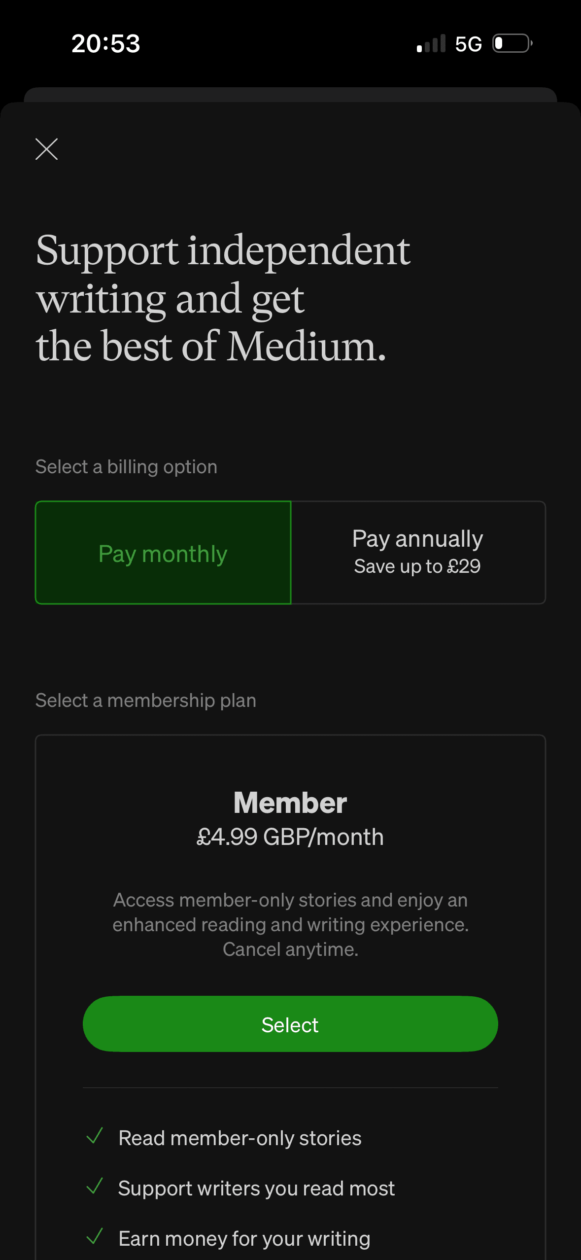
A visible close, skip or alternative plan can preserve autonomy within the offer. Its prominence should be compared with the purchase action rather than judged by presence alone.
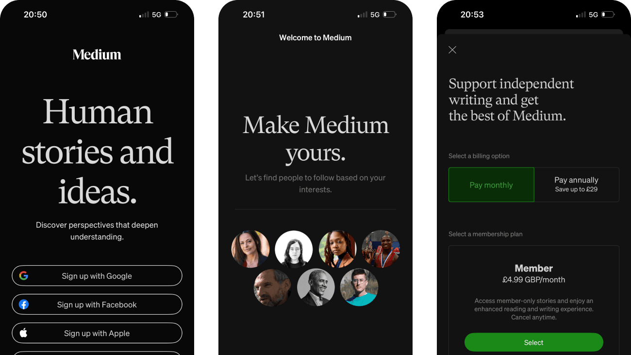
“Support independent writing and get the best of Medium” frames membership as both product access and support for writers. The screen does not show that this creates moral obligation or changes purchase behaviour.
The first price, percentage, crossed-out amount or weekly equivalent can become the comparison anchor. Total cost and renewal terms need equal visibility so the reference point is not misleading.
Show 1 more principleShow fewer principles
Immediate free access or an instant saving is shown before a later charge. This can favour the near-term reward unless the future cost and cancellation timing remain equally concrete.
If Medium were to state that membership is optional and give “Continue without membership” comparable prominence to Select, then people should compare the offer more accurately because price, eligibility and future cost are shown on the same basis. This would apply Choice Architecture and Framing Effect.
Screen 09
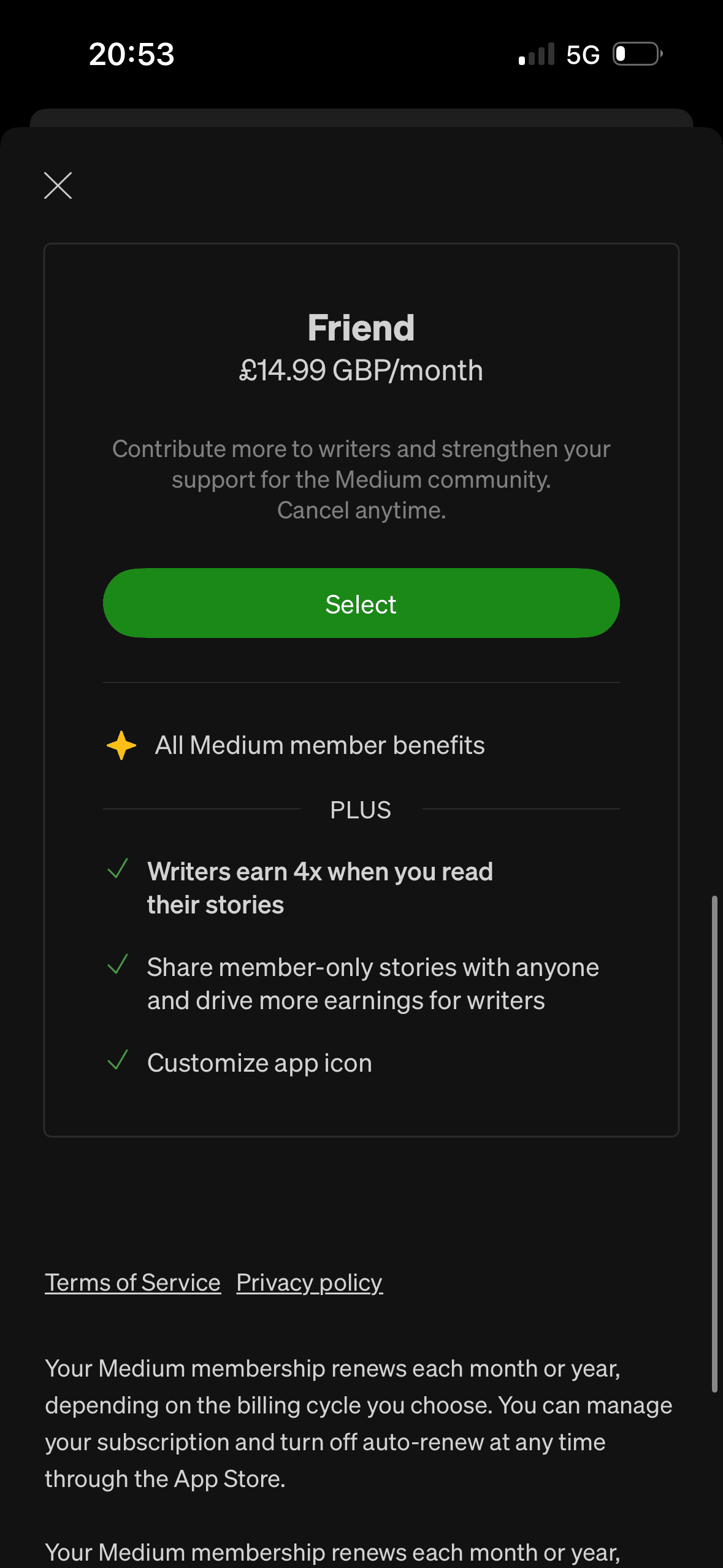
Membership details
A visible close, skip or alternative plan can preserve autonomy within the offer. Its prominence should be compared with the purchase action rather than judged by presence alone.
The offer foregrounds benefits or savings while renewal, eligibility or refusal receives less emphasis. That framing makes the attractive interpretation easier to process than the full commercial decision.
The first price, percentage, crossed-out amount or weekly equivalent can become the comparison anchor. Total cost and renewal terms need equal visibility so the reference point is not misleading.
Show 1 more principleShow fewer principles
Immediate free access or an instant saving is shown before a later charge. This can favour the near-term reward unless the future cost and cancellation timing remain equally concrete.
If Medium were to keep legal and renewal information available before selection, separate reader benefits from claims about helping writers and make plan comparison possible without relying on a long scroll, then people should compare the offer more accurately because price, eligibility and future cost are shown on the same basis. This would apply Choice Architecture and Framing Effect.
Screen 10
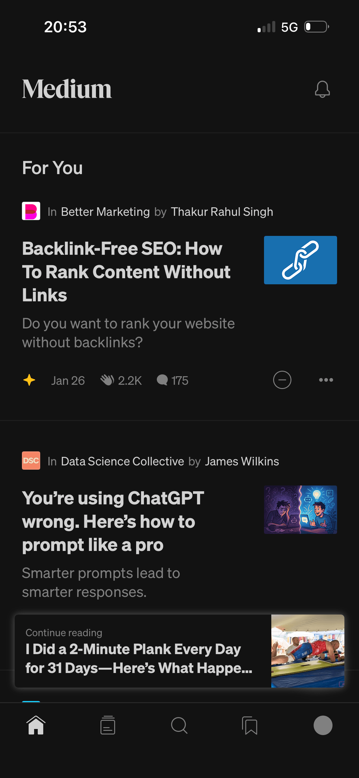
Personalised home feed
The content is divided into labelled rows or sections, which makes a long feed easier to scan by purpose or source.
Artwork, thumbnails and familiar titles support rapid recognition while browsing. They help identify content, but do not demonstrate relevance or quality by themselves.
Clap and response counts appear beside stories in the “For You” feed. They are observable records of engagement, not objective article quality, and may partly reflect prior visibility or accumulated social influence.
Show 1 more principleShow fewer principles
Ordering and naming the rows shapes which path is easiest to take. The screen does not always explain why an item appears or provide nearby controls to correct the recommendation.
If Medium were to explain or link to why stories are recommended, provide an easy way to edit interests and treat clap and response counts as engagement signals rather than quality, then people should narrow the available options with less effort because the source, type and effect of each control are explicit. This would apply Chunking and Social Proof.
Conclusion
What this journey teaches us.
Medium keeps several account routes visible, explains verification and presents concrete plan information. The first feed also includes useful publication and author context.
The opportunity is to let personalisation prove itself before asking for membership. Clearer free continuation, editable interests and a demonstrated recommendation result would make the offer easier to evaluate.
Keep exploring