
Show value before more setup
I followed Spotify from account creation through date of birth, artist choices and an optional Alexa link. The artist selection gives the product useful preference signals, but the captured journey does not yet show what those choices produce.
The design question is when to ask for more. Personal data and another service connection should follow a visible benefit, not arrive simply because the person is still moving through setup.
- Captured
- Capture date not recorded
- Published
- Last updated
- 7
- Screens
- 24
- Ingredients
- 28
- Applications

Common contexts
Business goals
What works
What the captured flow does well.
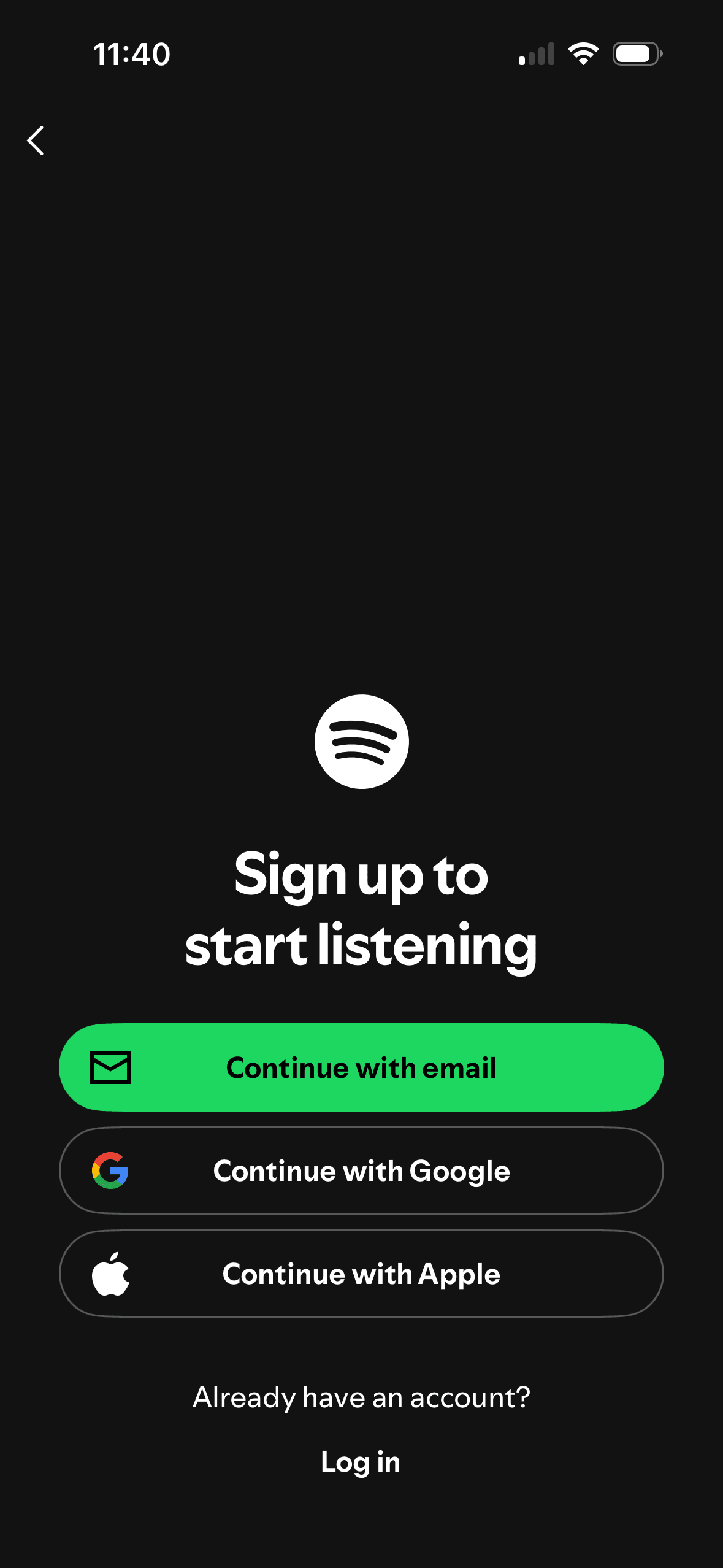
- Sign-up and log-in are clearly separated, with email, Google and Apple routes visible.
- Artist selection states a minimum, provides search and uses a visible check mark for a selected artist.
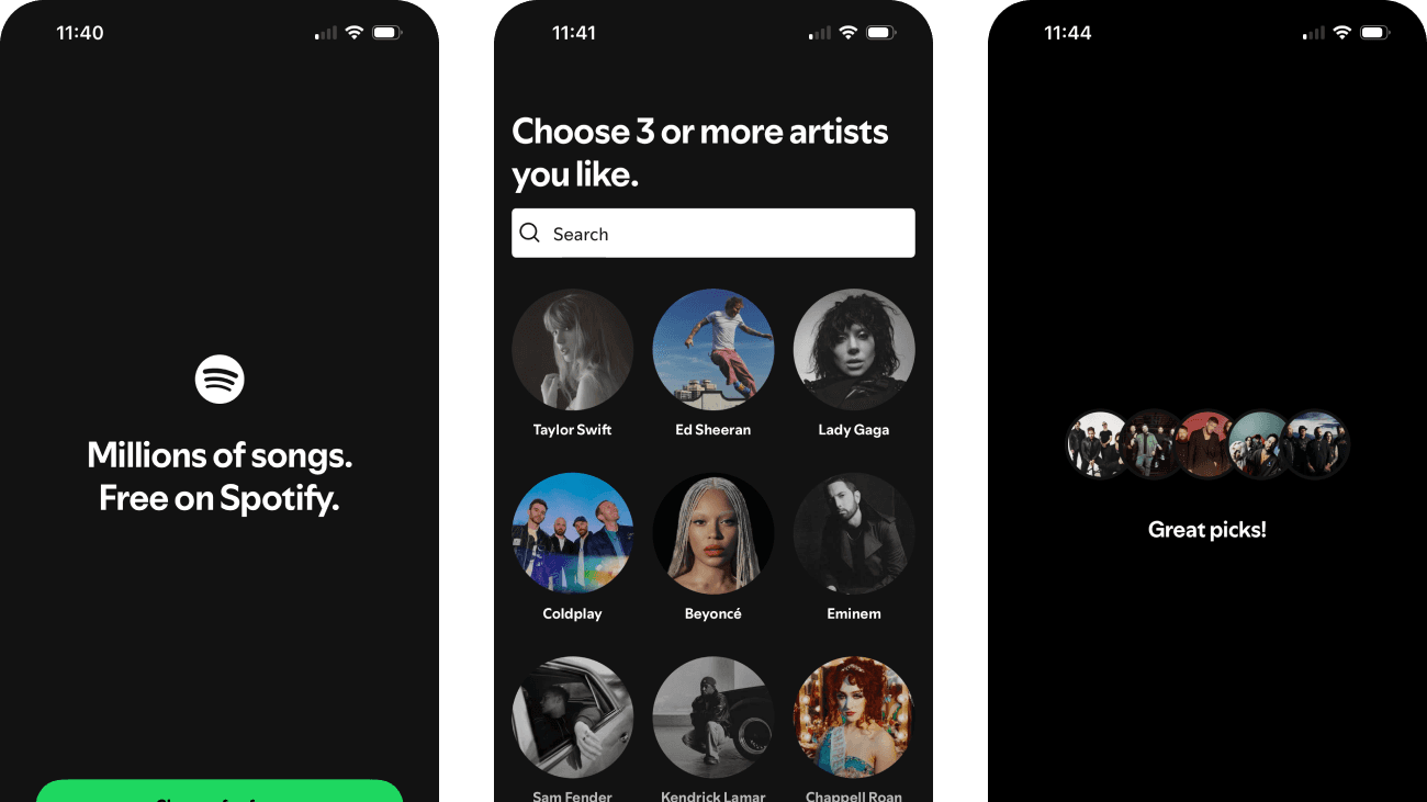
- The expanded artist screen appears to respond to an earlier selection while preserving search and a close action.
- The Alexa request explains its intended use and includes a prominent “Maybe later” route.
What could improve
What deserves closer review.
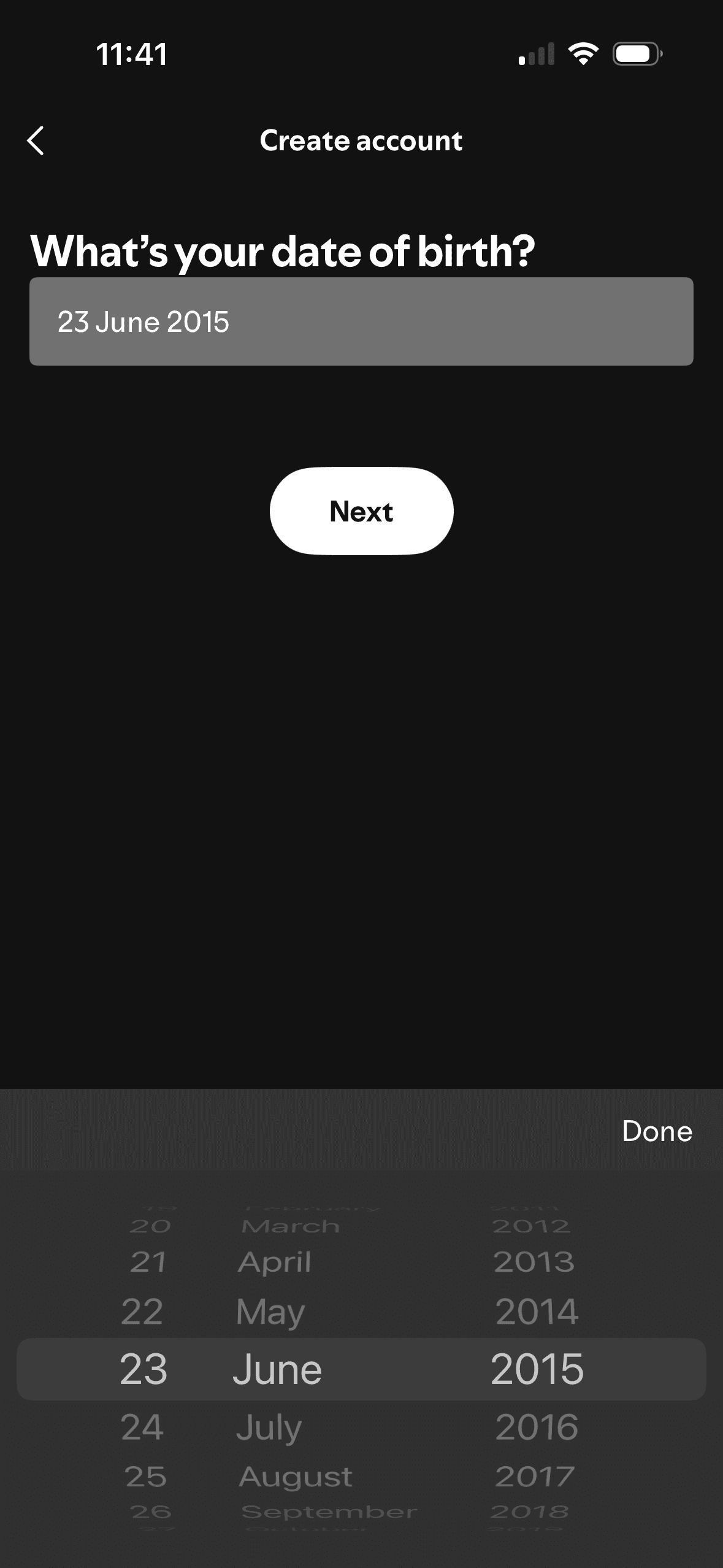
- Date of birth is requested without explaining why Spotify needs it, how it will be used or how long it will be retained.
- The flow does not show its total length, whether artist selection is optional or what happens if the person cannot find three suitable artists.
- The initial artist grid gives a small visible set an advantage; genre browsing and a clear “not here” route would make the starting point less restrictive.
- The Alexa request introduces account linking before the capture demonstrates the value of the selected preferences or explains data exchanged with Amazon.
Screen-by-screen breakdown
Follow the journey.
Each observation shows what works or what could improve, on this screen or across the wider flow. The opportunity turns one or two principles into a testable hypothesis.
Screen 01
Welcome
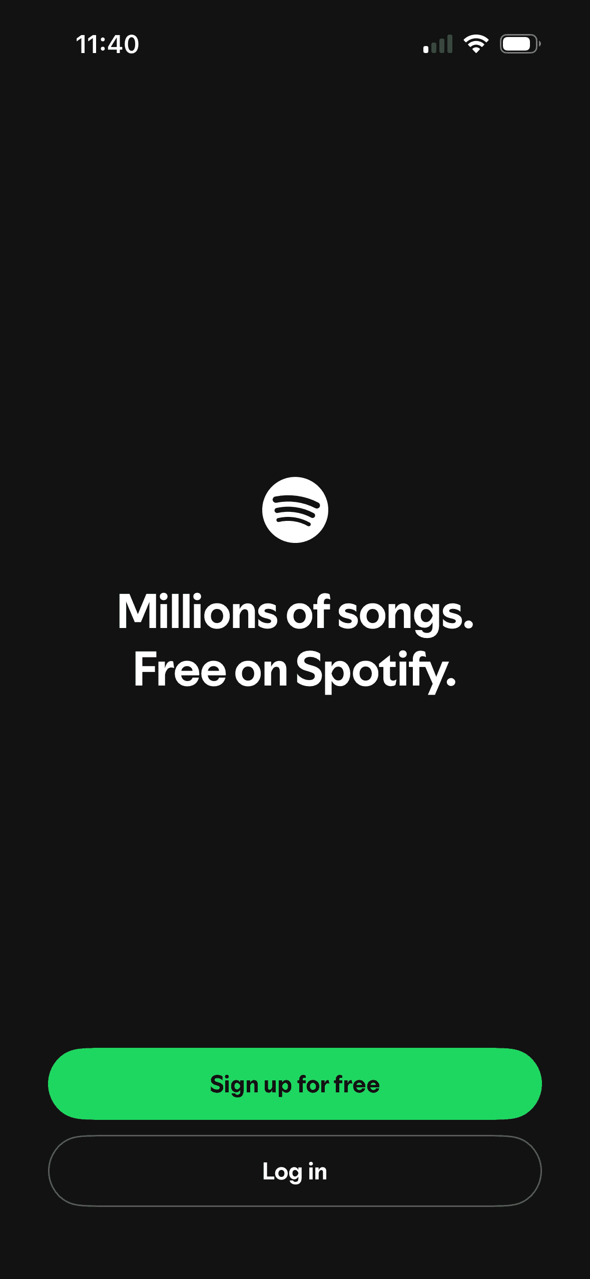
The headline pairs “Millions of songs” with “Free on Spotify”, framing catalog scale and price together. The screenshot does not show how people interpret “free” or whether the wording changes sign-up.
A filled green “Sign up for free” button receives more visual emphasis than the outlined “Log in” button. This is an observable hierarchy choice, not evidence that people were nudged or that one route improved outcomes.
The introductory message prepares people for the kind of task or benefit that follows. It is a flow-level cue because its effect depends on whether the next screens match that expectation.
Show 1 more principleShow fewer principles
The flow introduces one idea before moving to the next decision, reducing how much new information appears at once. Skip, back and reduced-motion routes determine whether that pacing stays supportive.
If Spotify were to keep the free offer prominent, but explain material limits such as advertising, playback restrictions or eligibility before sign-up, then people should make a more informed data choice because purpose, optionality and future use are clear before agreement. This would apply Choice Architecture and Framing Effect.
Screen 02
Sign-up options
The screen keeps several account routes available in the same decision area. That is a useful choice structure because people can compare methods without leaving the flow.
One account route receives the strongest visual emphasis. That salience can steer selection before Spotify explains any meaningful privacy, recovery or data-sharing difference.
Provider names and familiar logos make the available account routes easier to recognise. They support identification, but they are not evidence that a provider is safer or more trustworthy.
Show 1 more principleShow fewer principles
The immediate task stays focused on one decision before the wider journey continues. That sequencing reduces simultaneous choices when later steps remain predictable and reversible.
If Spotify were to keep all sign-up methods and log-in visible, then people should recover from interruption with less effort because progress, failure and the next available action remain clear. This would apply Choice Architecture and Salience Effect.
Screen 03
Personal details
Spotify asks for date of birth on a dedicated account-creation step. This is staged disclosure because the flow presents one decision at a time; the screenshot does not show the total number of steps or why the data is needed.
Keeping related profile fields together reduces switching between unrelated decisions. Optional and required fields still need explicit labels.
The screen asks for personal information without always making purpose, retention and later editability equally visible. Short explanatory copy would let people interpret the request more accurately.
Show 1 more principleShow fewer principles
The arrangement of the requested profile fields and supporting explanation determines which action is easiest to see and take. The screen should keep alternatives, refusal and correction proportionate to their importance.
If Spotify were to explain why date of birth is required, how it will be used and retained, and what age restrictions apply, then people should continue without unnecessary pressure because progress remains useful, flexible and easy to revise. This would apply Cognitive Load and Progressive Disclosure.
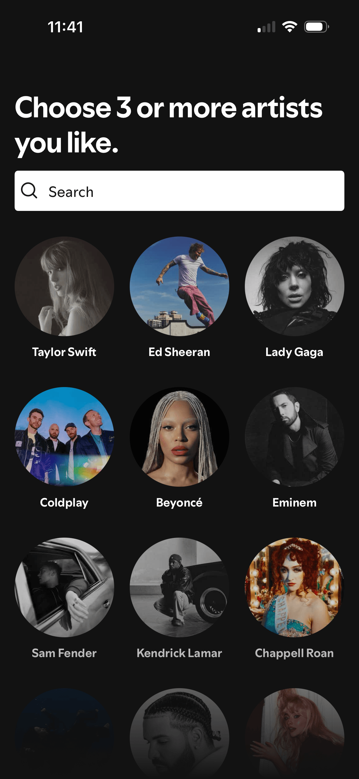
Screen 04
Artist selection
Visual hierarchy gives the available choices and selected state a clear point of entry. Important secondary information still needs enough prominence to be found before commitment.
The arrangement of the labelled options and their selected states determines which action is easiest to see and take. The screen should keep alternatives, refusal and correction proportionate to their importance.
The immediate task stays focused on one decision before the wider journey continues. That sequencing reduces simultaneous choices when later steps remain predictable and reversible.
Show 1 more principleShow fewer principles
The screen asks people to interpret the labelled options and their selected states without showing every relevant consequence nearby. Clearer grouping and concise support would reduce avoidable mental effort.
If Spotify were to explain how the choices affect recommendations, provide genre browsing and search, and offer a clear route when suitable artists are missing, then people should compare the offer more accurately because price, eligibility and future cost are shown on the same basis. This would apply Salience Effect and Choice Architecture.
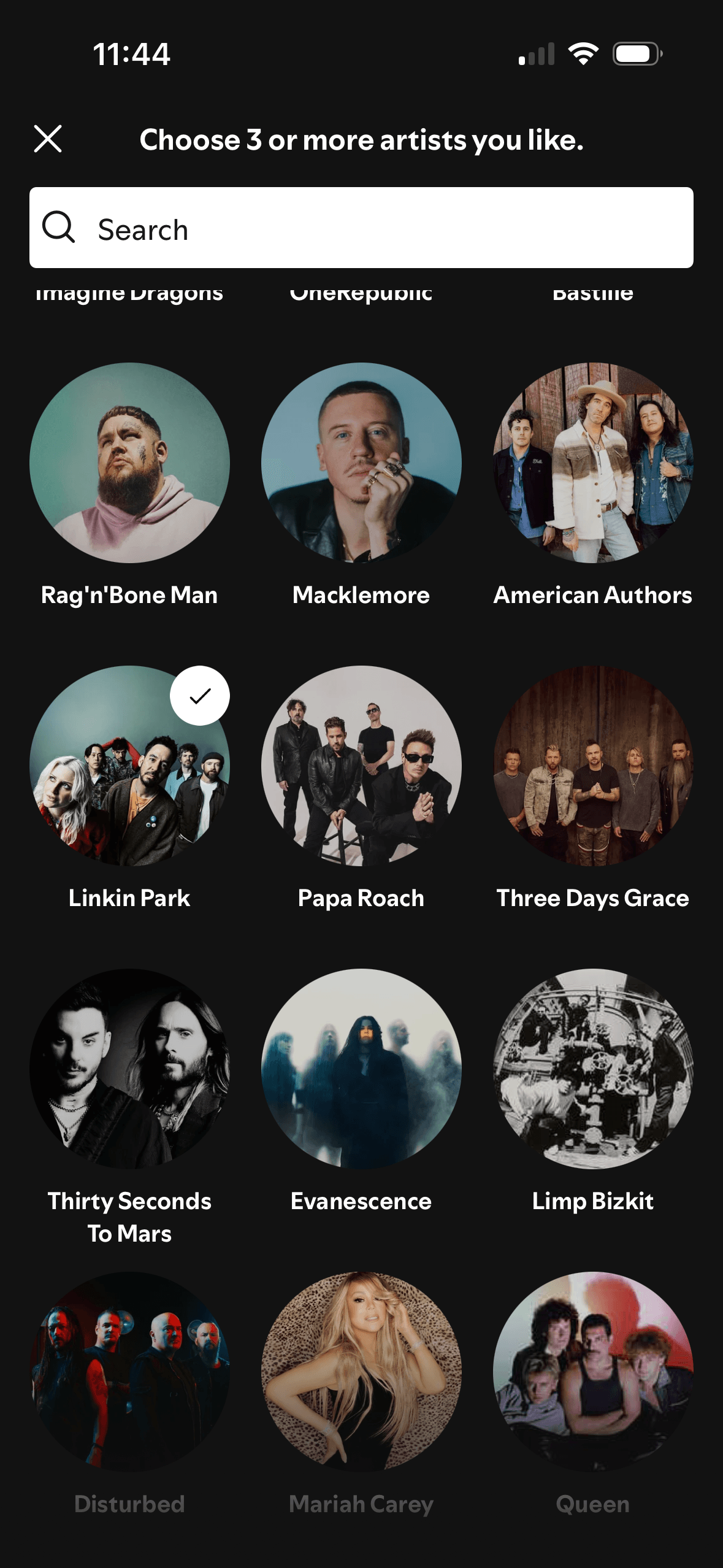
Screen 05
Artist selection expanded
Visual hierarchy gives the available choices and selected state a clear point of entry. Important secondary information still needs enough prominence to be found before commitment.
The arrangement of the labelled options and their selected states determines which action is easiest to see and take. The screen should keep alternatives, refusal and correction proportionate to their importance.
The immediate task stays focused on one decision before the wider journey continues. That sequencing reduces simultaneous choices when later steps remain predictable and reversible.
Show 1 more principleShow fewer principles
The screen asks people to interpret the labelled options and their selected states without showing every relevant consequence nearby. Clearer grouping and concise support would reduce avoidable mental effort.
If Spotify were to keep the selected state visible and explain why new suggestions appeared, then people should understand the next decision more clearly because its purpose and consequences are visible before they act. This would apply Salience Effect and Choice Architecture.
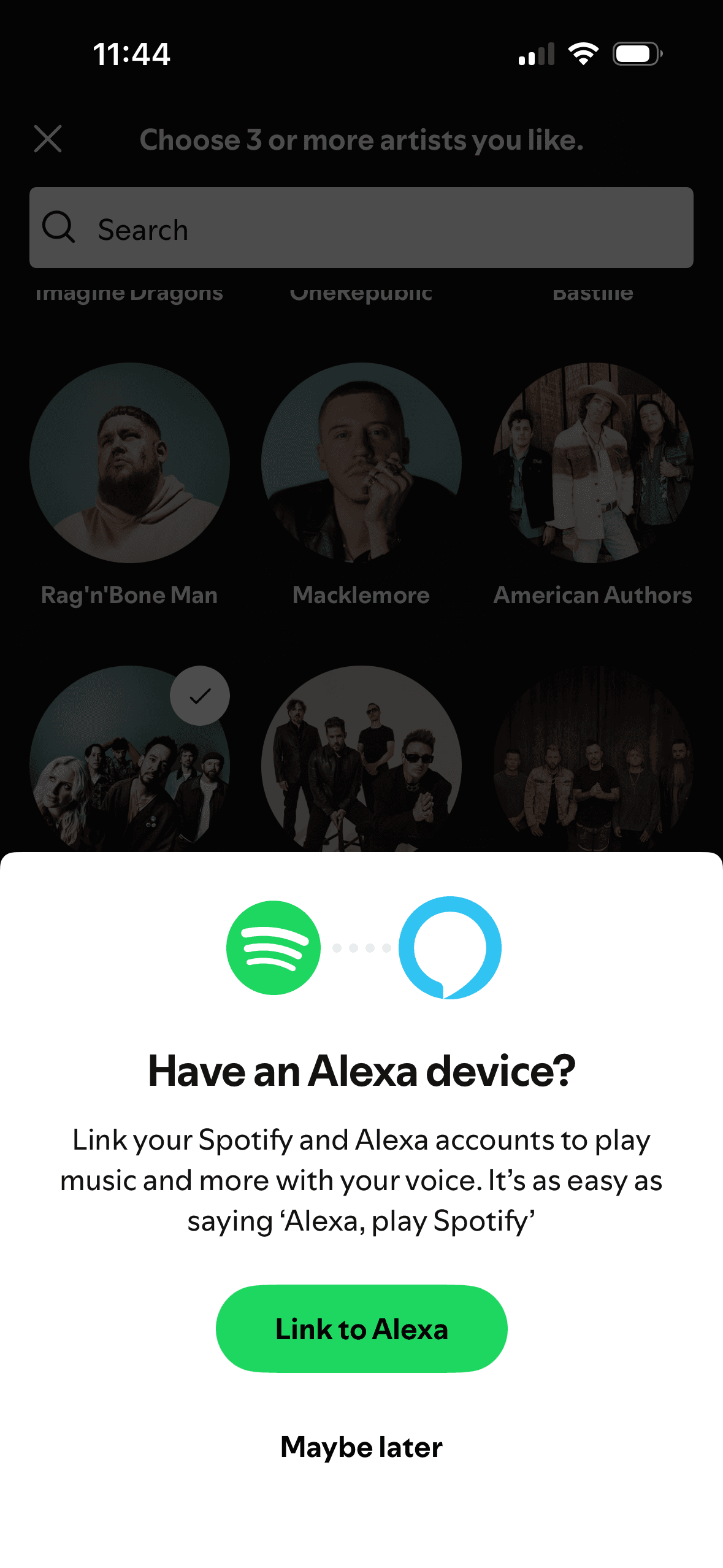
Screen 06
Alexa prompt
Visual hierarchy gives the main controls, supporting information and available actions a clear point of entry. Important secondary information still needs enough prominence to be found before commitment.
After music-preference setup, Spotify asks to link an external Alexa account. This is a new-scope request involving another service, so it needs a fresh informed decision. “Maybe later” provides a decline route; the screenshot does not show that earlier choices increased agreement.
The immediate task stays focused on one decision before the wider journey continues. That sequencing reduces simultaneous choices when later steps remain predictable and reversible.
Show 1 more principleShow fewer principles
The arrangement of the main controls, supporting information and available actions determines which action is easiest to see and take. The screen should keep alternatives, refusal and correction proportionate to their importance.
If Spotify were to treat Alexa linking as a fresh, optional decision, then people should make a more informed data choice because purpose, optionality and future use are clear before agreement. This would apply Salience Effect and Foot-in-the-Door Technique.

Screen 07
Final feedback
The screen confirms the outcome of the preceding action and keeps a next action visible. That closes the immediate interaction loop.
The final captured screen repeats selected artists with “Great picks!”. It creates a distinct ending cue that could be tested as a peak-end hypothesis, but the screenshot does not show later memory, satisfaction or retention.
The content is divided into labelled rows or sections, which makes a long feed easier to scan by purpose or source.
Show 1 more principleShow fewer principles
Ordering and naming the rows shapes which path is easiest to take. The screen does not always explain why an item appears or provide nearby controls to correct the recommendation.
If Spotify were to confirm how the selected artists will affect the experience, provide an edit route and lead directly to a useful first listening action, then people should understand the next decision more clearly because its purpose and consequences are visible before they act. This would apply Feedback Loop and Peak-End Rule.
Conclusion
What this journey teaches us.
Spotify makes artist selection easy to recognise and gives the Alexa request a visible later route. Selected artists are repeated back, providing a useful confirmation of the input.
The flow would be stronger if it explained the purpose of personal data and demonstrated a recommendation or playback result before asking for another account link. First value should be the reason to continue.
Keep exploring