
Ask only what onboarding needs
I followed Notion from account access through profile questions, team setup, a product tour and the first mobile checklist. The journey breaks a complex product into smaller steps, but it asks for a large amount of organisational detail before showing how each answer improves the workspace.
I wanted to understand whether the sequence helps people reach useful work or simply delays it. Progressive disclosure is valuable only when every new question has a clear purpose and an honest way to skip or return.
- Captured
- Capture date not recorded
- Published
- Last updated
- 17
- Screens
- 21
- Ingredients
- 69
- Applications

Common contexts
Business goals
What works
What the captured flow does well.
- Account access supports several identity providers, passkeys, single sign-on and email verification.
- Profile and profiling questions are separated into focused screens with a consistent progress indicator.
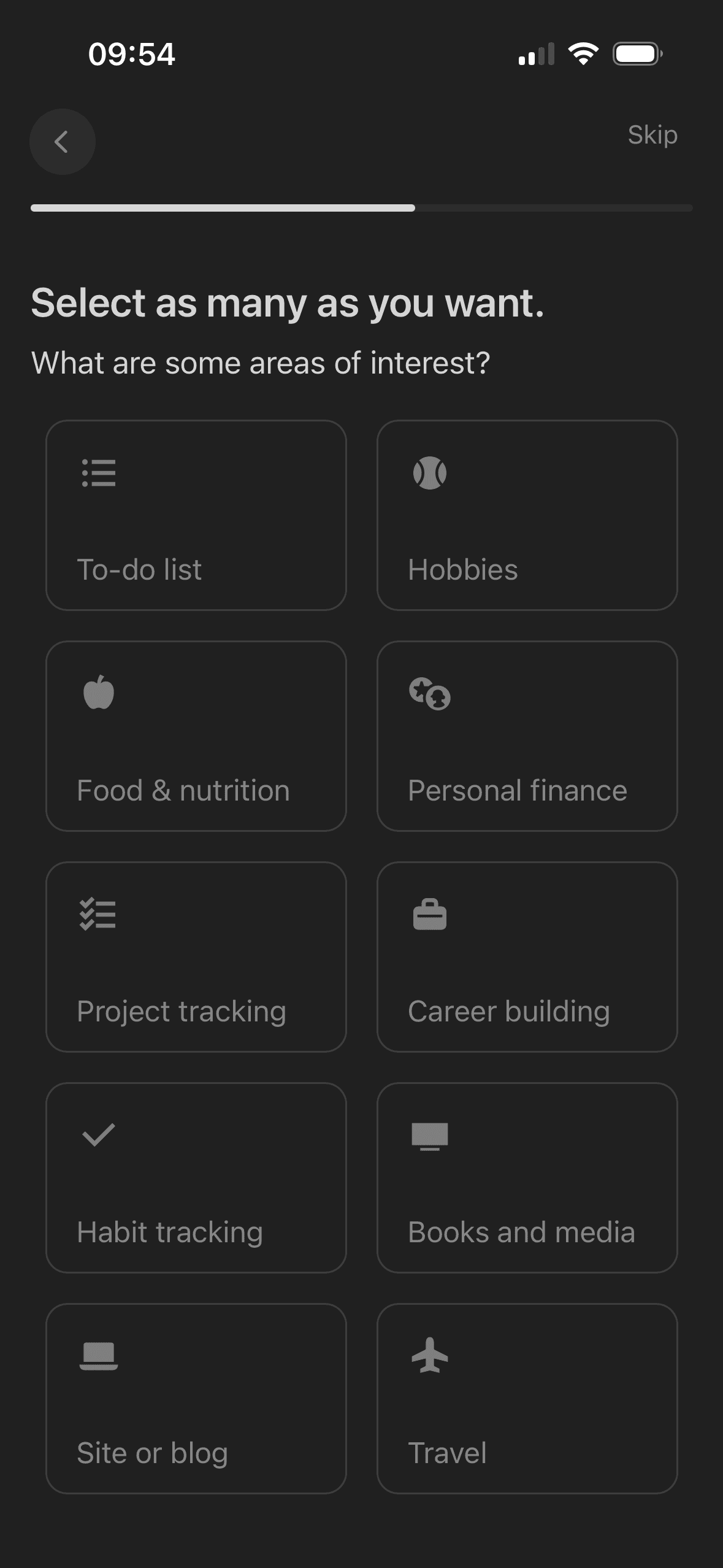
- The interest screen explicitly supports multiple selections and provides a visible Skip action.
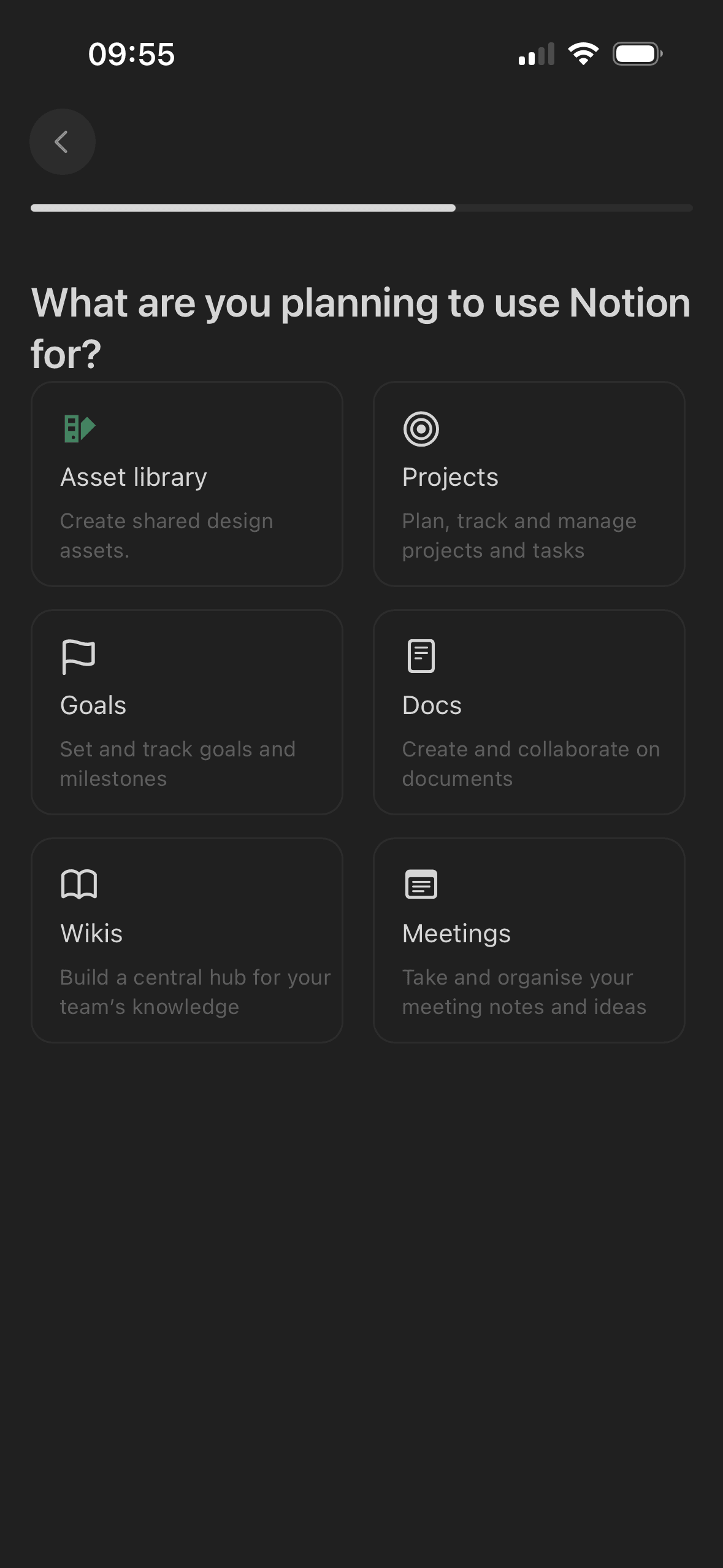
- Planned-use options include short descriptions rather than labels alone.
What could improve
What deserves closer review.
- The flow does not explain why work type, role, company size, interests and intended uses are needed, how they change the product, how long they are retained or where they can be edited.
- Most profiling and tour screens have no visible Skip action, and the progress bar does not state the number or names of remaining steps.
- The marketing control uses a negative opt-out statement inside profile creation instead of a separate, positive and unselected choice.
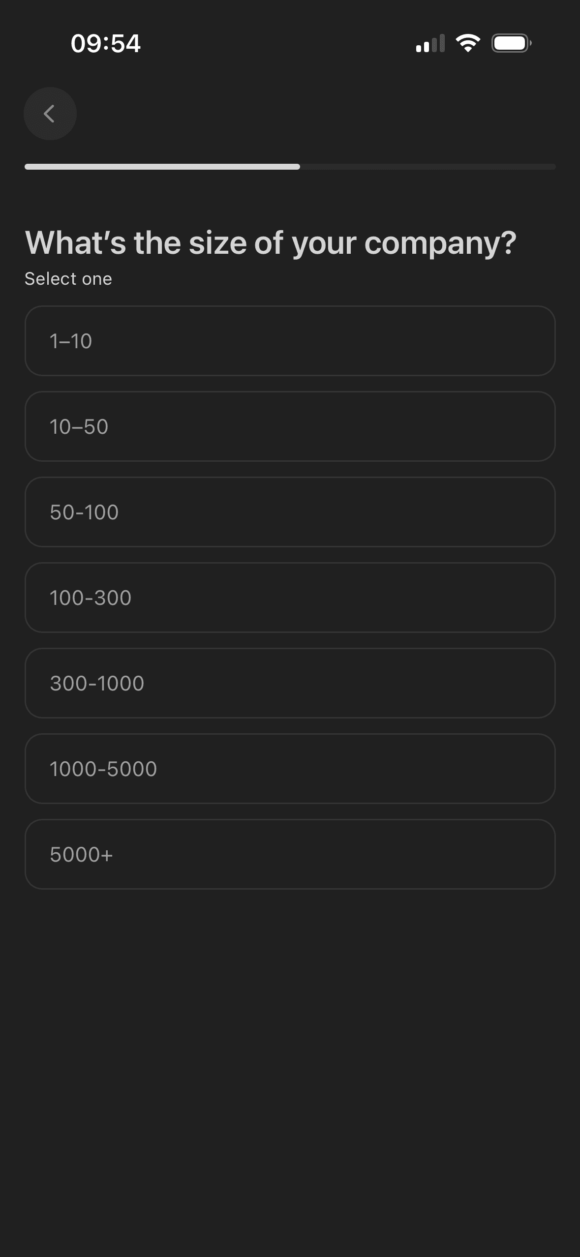
- Company-size ranges overlap at their boundaries, making values such as 10, 50, 100, 300, 1,000 and 5,000 ambiguous.
Screen-by-screen breakdown
Follow the journey.
Each observation shows what works or what could improve, on this screen or across the wider flow. The opportunity turns one or two principles into a testable hypothesis.
Screen 01
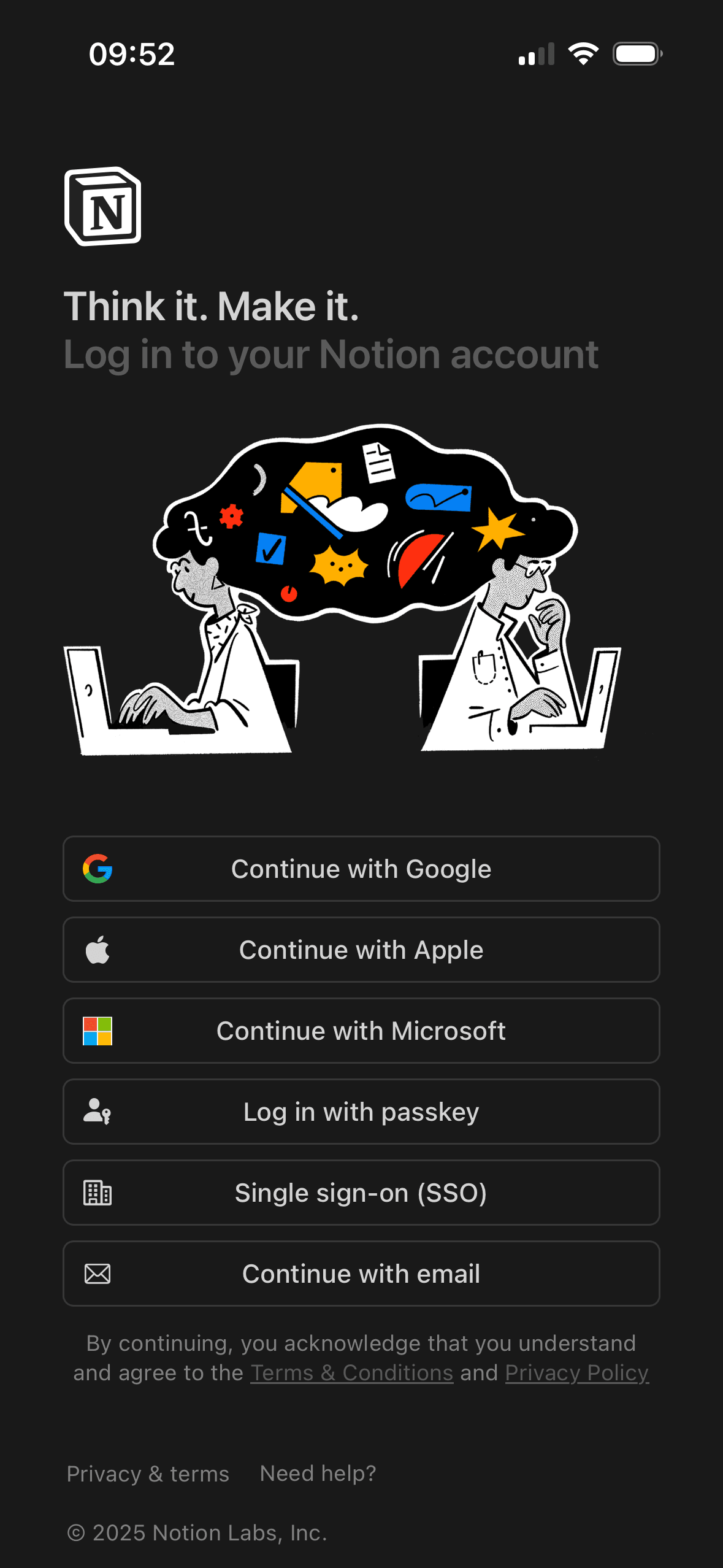
Choose an account method
The screen keeps several account routes available in the same decision area. That is a useful choice structure because people can compare methods without leaving the flow.
One account route receives the strongest visual emphasis. That salience can steer selection before Notion explains any meaningful privacy, recovery or data-sharing difference.
Provider names and familiar logos make the available account routes easier to recognise. They support identification, but they are not evidence that a provider is safer or more trustworthy.
Show 1 more principleShow fewer principles
The immediate task stays focused on one decision before the wider journey continues. That sequencing reduces simultaneous choices when later steps remain predictable and reversible.
If Notion were to distinguish signing in from creating a new account and say what information each provider shares, then people should understand the next decision more clearly because its purpose and consequences are visible before they act. This would apply Choice Architecture and Salience Effect.
Screen 02
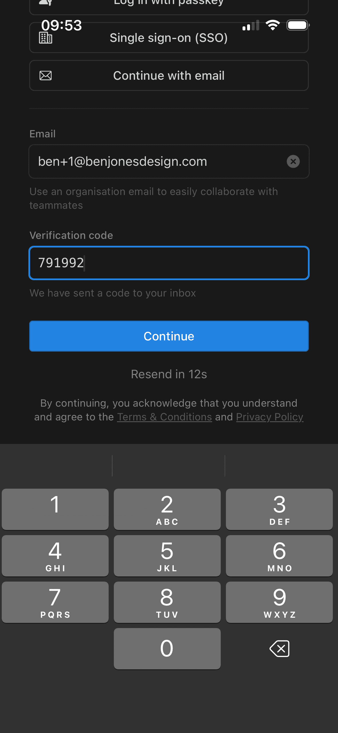
Verify your email
The destination, code-entry state and resend action show the person what happened and what they can do next. That visible response forms a useful feedback loop.
Expiry, incorrect-code and delivery recovery are not all visible beside the code field. People may have to infer how to recover when the expected email does not arrive.
Separating the verification code into a compact entry area makes the one-time task easier to scan than another full account form.
Show 1 more principleShow fewer principles
The arrangement of the code, destination and recovery actions determines which action is easiest to see and take. The screen should keep alternatives, refusal and correction proportionate to their importance.
If Notion were to name the email address receiving the code, provide an Edit email action and explain expiry, resend timing, autofill and recovery from an incorrect or expired code, then people should recover from interruption with less effort because progress, failure and the next available action remain clear. This would apply Feedback Loop and Cognitive Load.
Screen 03
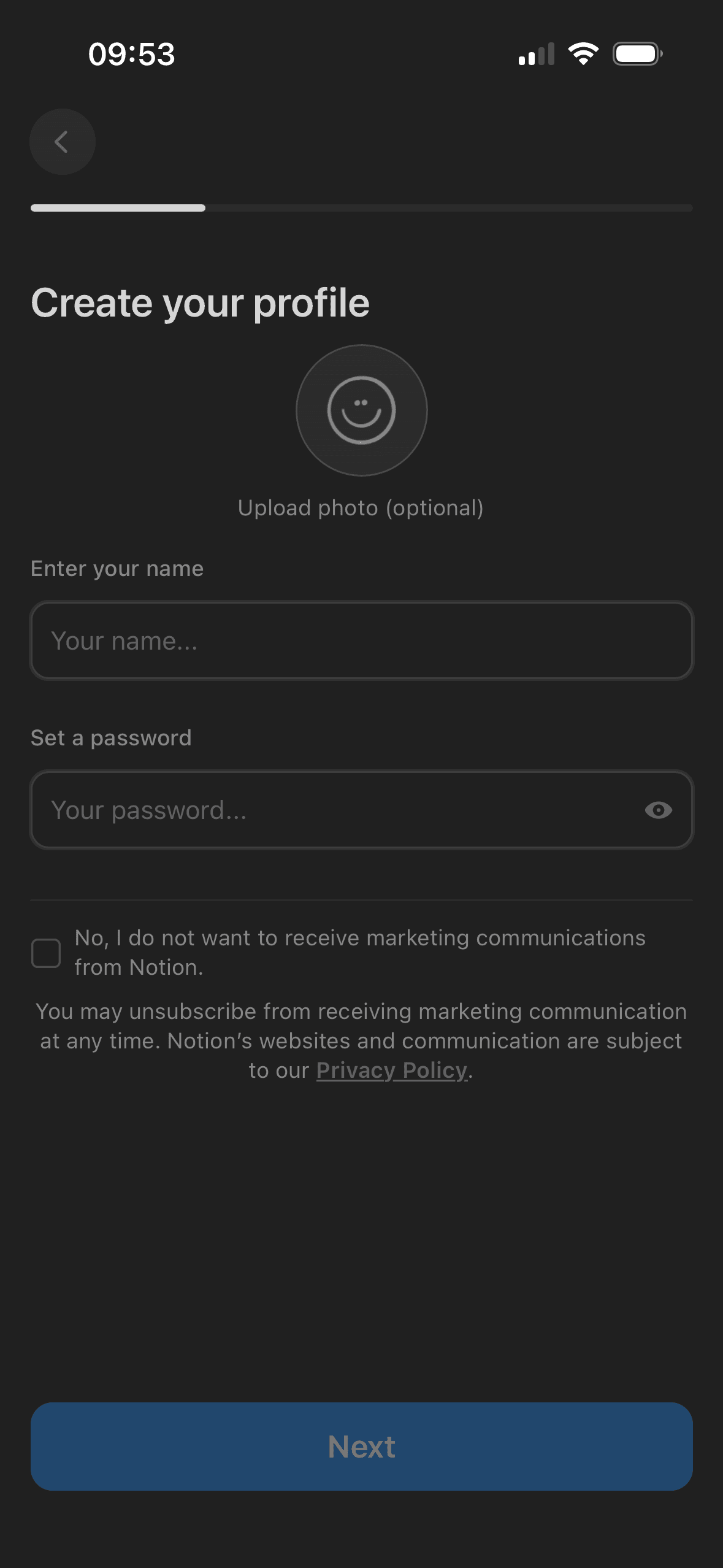
Create your profile
Profile information is requested in a bounded step rather than inside the first access decision. That pacing is useful when every field is necessary and the remaining journey is accurately represented.
The screen asks for personal information without always making purpose, retention and later editability equally visible. Short explanatory copy would let people interpret the request more accurately.
Keeping related profile fields together reduces switching between unrelated decisions. Optional and required fields still need explicit labels.
Show 1 more principleShow fewer principles
The arrangement of the requested profile fields and supporting explanation determines which action is easiest to see and take. The screen should keep alternatives, refusal and correction proportionate to their importance.
If Notion were to explain where the name and optional photo appear and state password requirements before submission, then people should make a more informed data choice because purpose, optionality and future use are clear before agreement. This would apply Progressive Disclosure and Framing Effect.
Screen 04
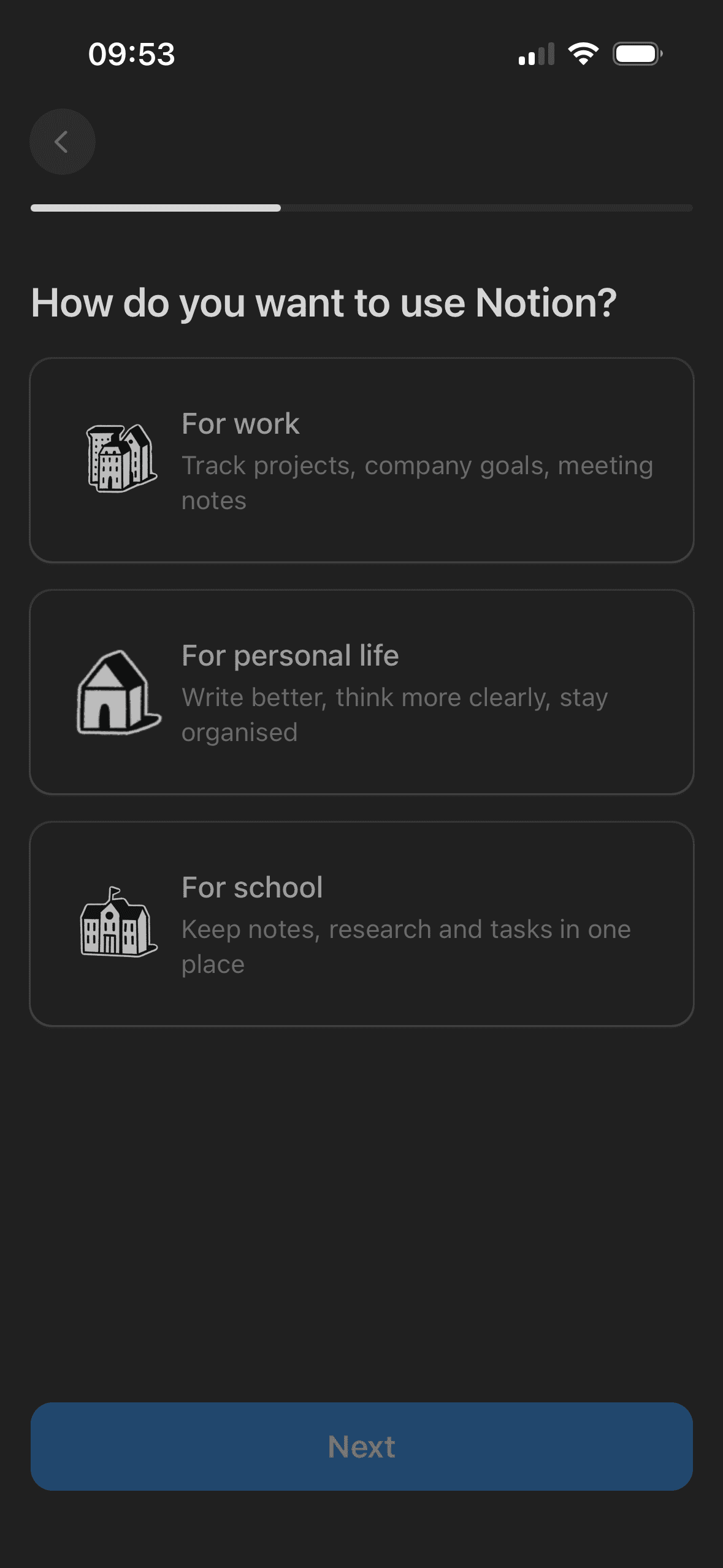
How will you use Notion?
Notion asks how the person plans to use the product on a focused step and shows progress through the wider setup. This is visible staged disclosure; the screenshot does not show whether the question is optional, how the answer is used or whether the sequence improves completion.
A visible close, skip or alternative plan can preserve autonomy within the offer. Its prominence should be compared with the purchase action rather than judged by presence alone.
The offer foregrounds benefits or savings while renewal, eligibility or refusal receives less emphasis. That framing makes the attractive interpretation easier to process than the full commercial decision.
Show 1 more principleShow fewer principles
The first price, percentage, crossed-out amount or weekly equivalent can become the comparison anchor. Total cost and renewal terms need equal visibility so the reference point is not misleading.
If Notion were to explain how Work, Personal or School changes the initial workspace, allow the question to be skipped and say where the choice can be changed later, then people should understand the next decision more clearly because its purpose and consequences are visible before they act. This would apply Choice Architecture and Progressive Disclosure.
Screen 05
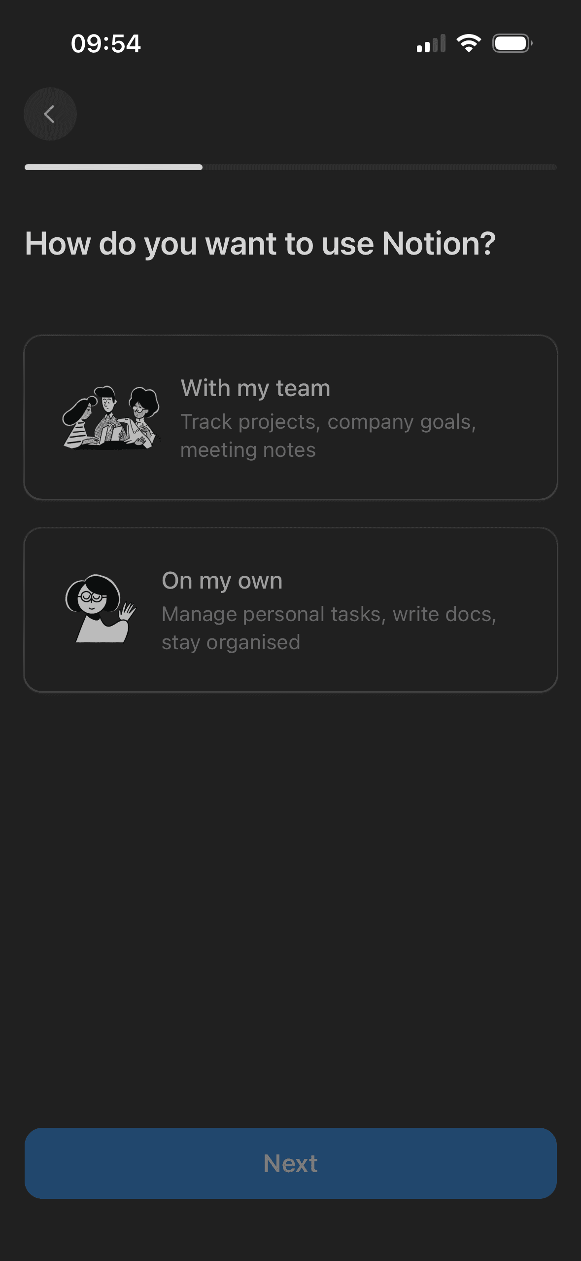
Choose team or solo use
Visual hierarchy gives the available choices and selected state a clear point of entry. Important secondary information still needs enough prominence to be found before commitment.
The arrangement of the main controls, supporting information and available actions determines which action is easiest to see and take. The screen should keep alternatives, refusal and correction proportionate to their importance.
The immediate task stays focused on one decision before the wider journey continues. That sequencing reduces simultaneous choices when later steps remain predictable and reversible.
Show 1 more principleShow fewer principles
The screen asks people to interpret the main controls, supporting information and available actions without showing every relevant consequence nearby. Clearer grouping and concise support would reduce avoidable mental effort.
If Notion were to explain what Team and On my own change, including workspace access and any billing consequences, then people should understand the next decision more clearly because its purpose and consequences are visible before they act. This would apply Salience Effect and Choice Architecture.
Screen 06
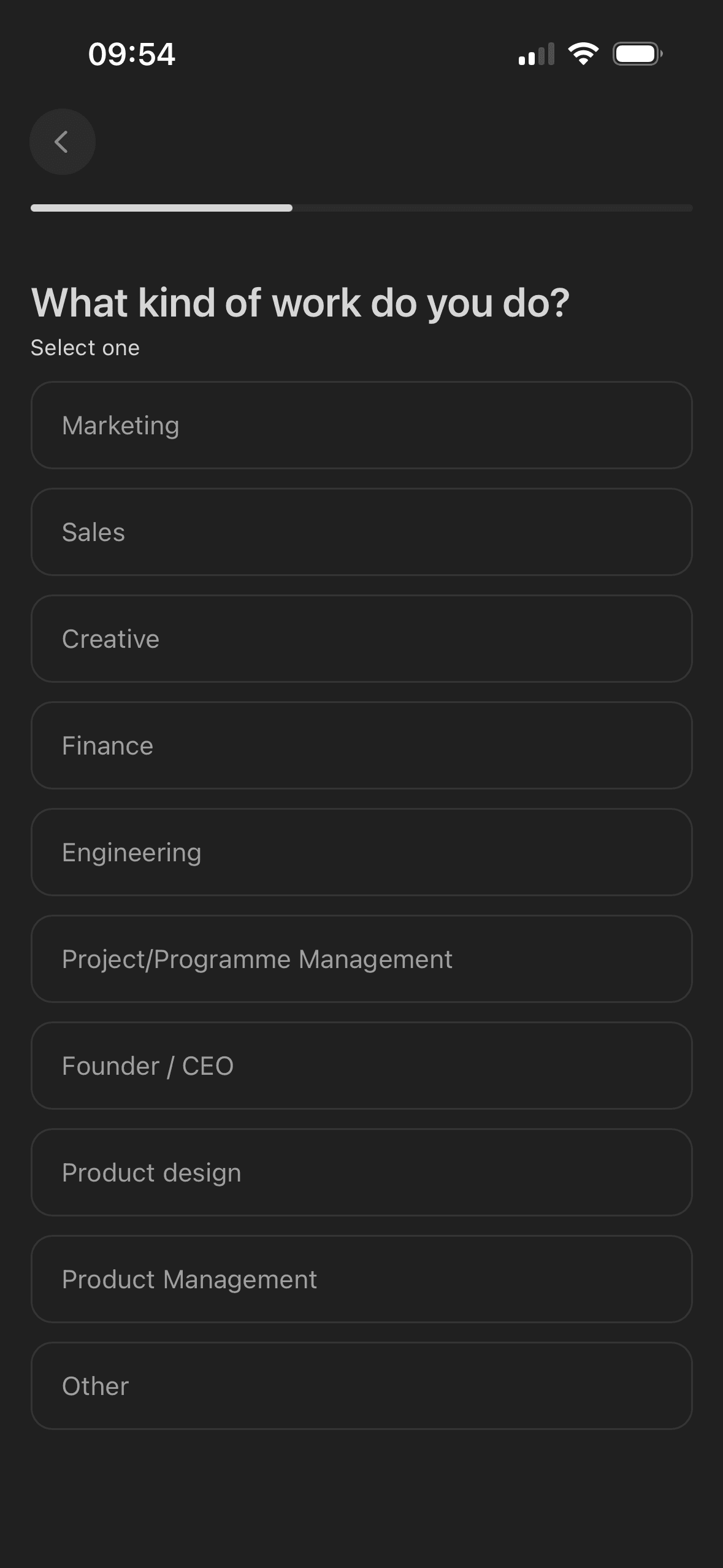
Choose your work type
The screen turns the labelled options and their selected states into explicit options rather than asking people to recall a hidden command or category.
The screen asks for personal information without always making purpose, retention and later editability equally visible. Short explanatory copy would let people interpret the request more accurately.
Profile information is requested in a bounded step rather than inside the first access decision. That pacing is useful when every field is necessary and the remaining journey is accurately represented.
Show 1 more principleShow fewer principles
Labels, rows or chips group the labelled options and their selected states into recognisable units, helping people scan a larger set without reading it as one block.
If Notion were to say why work type is requested and what it changes, then people should narrow the available options with less effort because the source, type and effect of each control are explicit. This would apply Choice Architecture and Framing Effect.
Screen 07
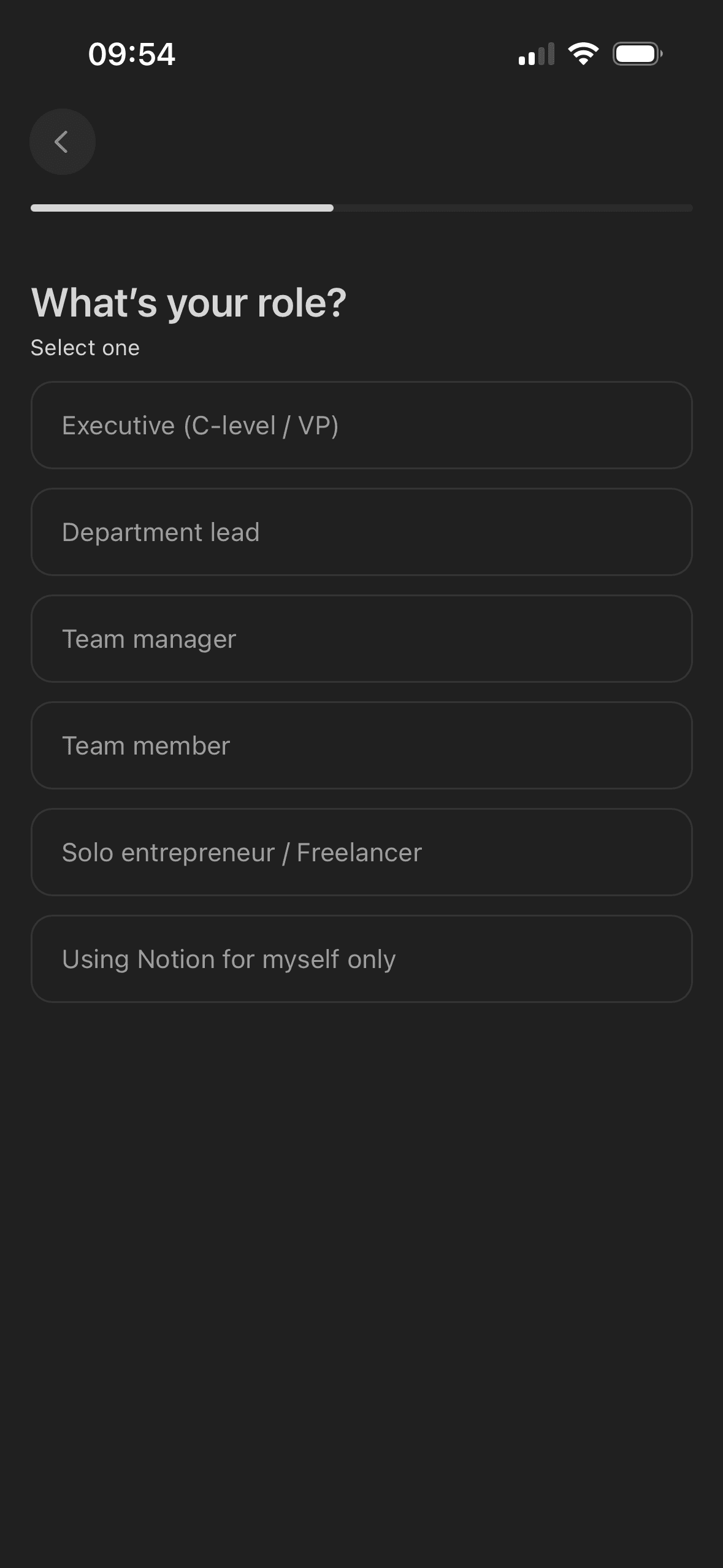
Choose your role
The screen turns the labelled options and their selected states into explicit options rather than asking people to recall a hidden command or category.
Notion asks for one role choice on a focused step and shows progress through setup. This is staged disclosure; the screen has no visible Skip action, does not explain how the answer is used and cannot establish reduced effort or drop-off.
Labels, rows or chips group the labelled options and their selected states into recognisable units, helping people scan a larger set without reading it as one block.
Show 1 more principleShow fewer principles
The screen asks for personal information without always making purpose, retention and later editability equally visible. Short explanatory copy would let people interpret the request more accurately.
If Notion were to clarify the difference between individual contributor, lead, manager and executive, explain how the answer will be used and provide Other, Skip and later editing, then people should understand the next decision more clearly because its purpose and consequences are visible before they act. This would apply Choice Architecture and Progressive Disclosure.
Screen 08
Choose company size
The screen turns the labelled options and their selected states into explicit options rather than asking people to recall a hidden command or category.
The screen asks for personal information without always making purpose, retention and later editability equally visible. Short explanatory copy would let people interpret the request more accurately.
Profile information is requested in a bounded step rather than inside the first access decision. That pacing is useful when every field is necessary and the remaining journey is accurately represented.
Show 1 more principleShow fewer principles
Labels, rows or chips group the labelled options and their selected states into recognisable units, helping people scan a larger set without reading it as one block.
If Notion were to use non-overlapping ranges such as 1–9 and 10–49, explain why company size is relevant and allow Skip or later editing, then people should understand the next decision more clearly because its purpose and consequences are visible before they act. This would apply Choice Architecture and Framing Effect.
Screen 09
Select areas of interest
Visual hierarchy gives the labelled options and their selected states a clear point of entry. Important secondary information still needs enough prominence to be found before commitment.
The arrangement of the labelled options and their selected states determines which action is easiest to see and take. The screen should keep alternatives, refusal and correction proportionate to their importance.
The immediate task stays focused on one decision before the wider journey continues. That sequencing reduces simultaneous choices when later steps remain predictable and reversible.
Show 1 more principleShow fewer principles
The screen asks people to interpret the labelled options and their selected states without showing every relevant consequence nearby. Clearer grouping and concise support would reduce avoidable mental effort.
If Notion were to keep the visible Skip and multi-select instruction, then people should narrow the available options with less effort because the source, type and effect of each control are explicit. This would apply Salience Effect and Choice Architecture.
Screen 10
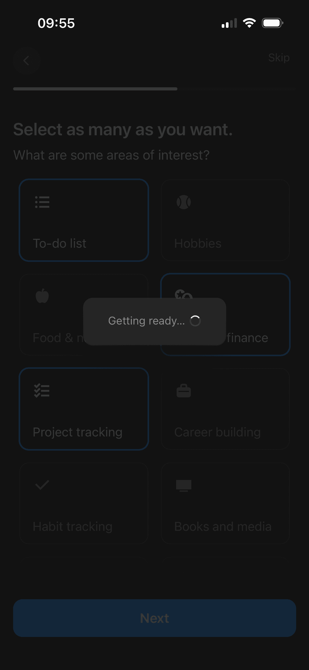
Preparing your workspace
The screen makes a state change visible through the progress or loading state. That helps the person connect their action with the system response and identify the next step.
Visible progress can increase momentum as the apparent finish approaches. It becomes misleading if optional or commercial steps appear after the progress indicator suggests the journey is complete.
Colour, scale or placement makes the current state and primary next action easy to notice. The same state also needs a text or semantic cue rather than colour alone.
Show 1 more principleShow fewer principles
The arrangement of the progress message and system status determines which action is easiest to see and take. The screen should keep alternatives, refusal and correction proportionate to their importance.
If Notion were to say what is being prepared and give a useful status if it takes more than a moment, then people should recover from interruption with less effort because progress, failure and the next available action remain clear. This would apply Feedback Loop and Goal Gradient Effect.
Screen 11
Choose a Notion use case
A visible close, skip or alternative plan can preserve autonomy within the offer. Its prominence should be compared with the purchase action rather than judged by presence alone.
The offer foregrounds benefits or savings while renewal, eligibility or refusal receives less emphasis. That framing makes the attractive interpretation easier to process than the full commercial decision.
The first price, percentage, crossed-out amount or weekly equivalent can become the comparison anchor. Total cost and renewal terms need equal visibility so the reference point is not misleading.
Show 1 more principleShow fewer principles
Immediate free access or an instant saving is shown before a later charge. This can favour the near-term reward unless the future cost and cancellation timing remain equally concrete.
If Notion were to keep the short descriptions, but state whether one or several uses can be selected and how the choice affects the workspace, then people should understand the next decision more clearly because its purpose and consequences are visible before they act. This would apply Choice Architecture and Framing Effect.
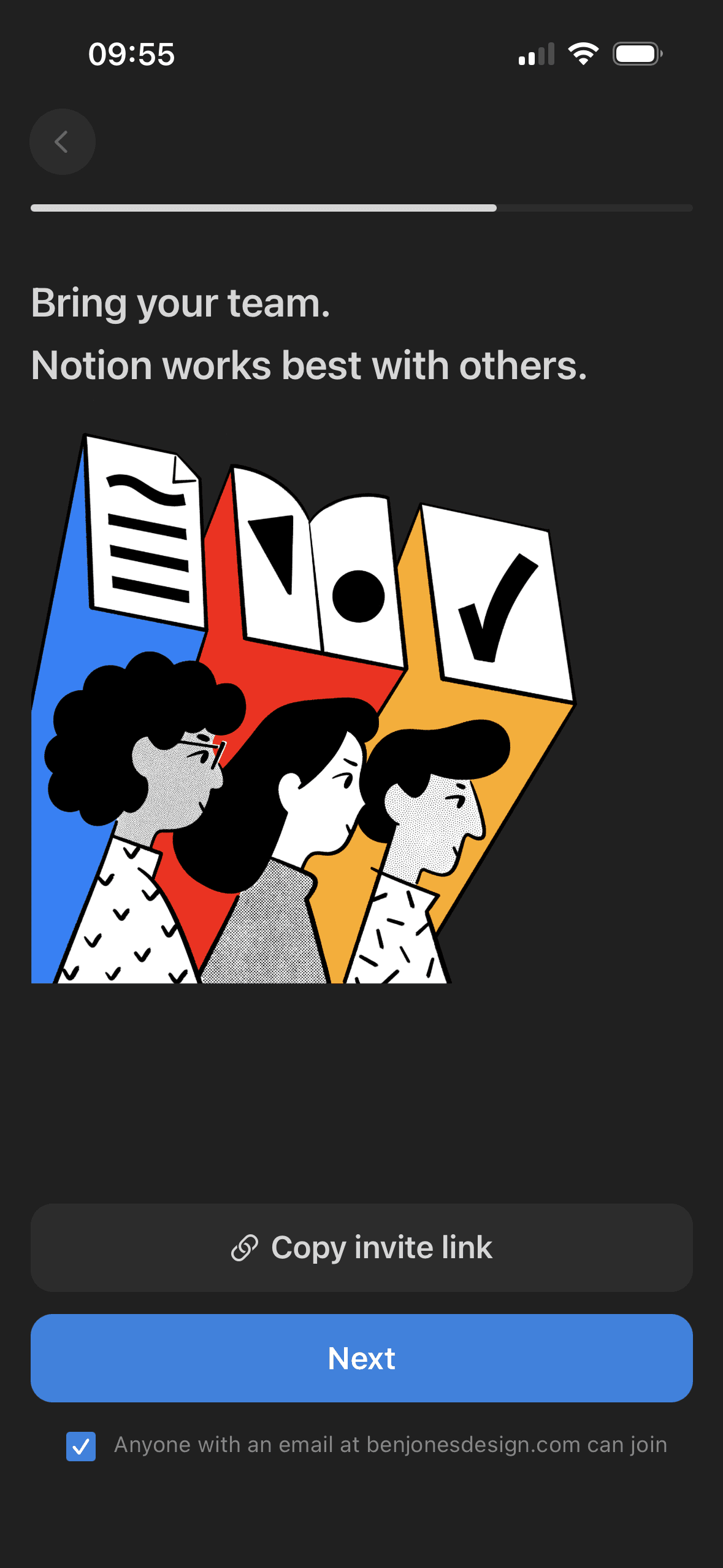
Screen 12
Invite people to the workspace
A separate explanation before the operating-system permission can make the request more understandable, provided the next system choices are previewed accurately.
The social request arrives after earlier setup or progress, when continuing may feel easier than reconsidering a new permission. It should be introduced as a fresh optional decision.
Visual hierarchy gives the social action, permission and skip route a clear point of entry. Important secondary information still needs enough prominence to be found before commitment.
Show 1 more principleShow fewer principles
Syncing, inviting or sharing is presented beside a less prominent refusal route. Equal hierarchy and a clear explanation of access would better preserve autonomy.
If Notion were to default domain-wide joining to off and explain exactly who can join, how they will discover the workspace and what access they receive, then people should understand the next decision more clearly because its purpose and consequences are visible before they act. This would apply Progressive Disclosure and Foot-in-the-Door Technique.
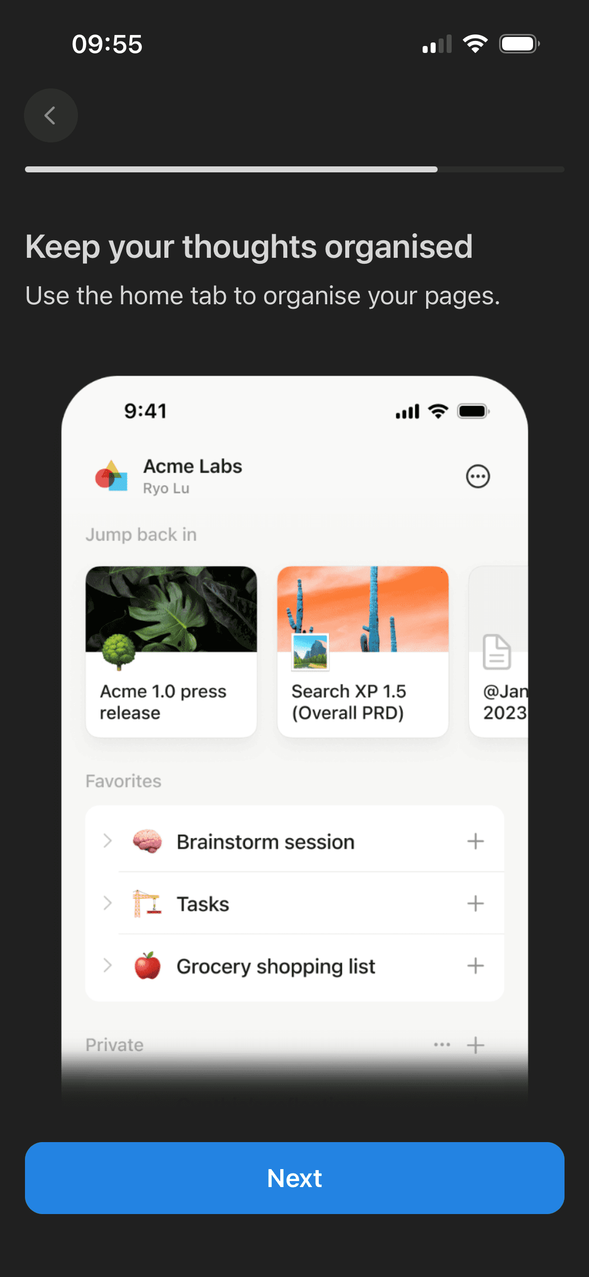
Screen 13
Organise your workspace
The introductory message prepares people for the kind of task or benefit that follows. It is a flow-level cue because its effect depends on whether the next screens match that expectation.
This walkthrough screen introduces one organisation topic and shows progress through the tour. That is staged disclosure; the capture does not show a Skip route, active practice or whether people understand and retain the explanation.
The opening language defines how the journey should be interpreted before evidence or terms appear. Aspirational wording should not overstate the outcome or conceal later effort and cost.
Show 1 more principleShow fewer principles
The arrangement of the introductory message and single next action determines which action is easiest to see and take. The screen should keep alternatives, refusal and correction proportionate to their importance.
If Notion were to show the tour position as a count, provide Back and Skip tour and let people revisit it later, then people should understand the next decision more clearly because its purpose and consequences are visible before they act. This would apply Priming and Progressive Disclosure.
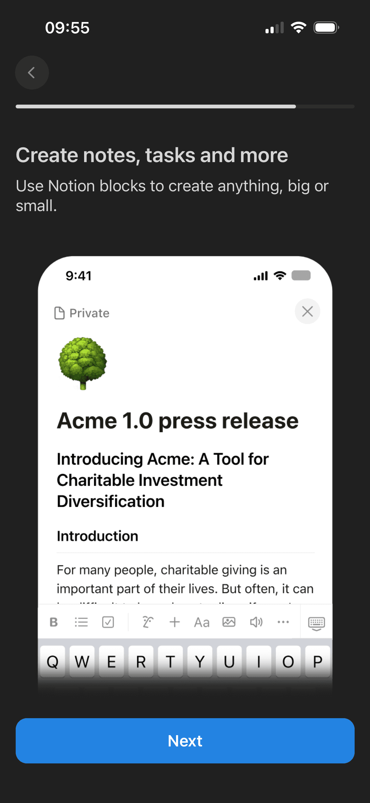
Screen 14
Notes, tasks and blocks
The introductory message prepares people for the kind of task or benefit that follows. It is a flow-level cue because its effect depends on whether the next screens match that expectation.
The opening language defines how the journey should be interpreted before evidence or terms appear. Aspirational wording should not overstate the outcome or conceal later effort and cost.
The task keeps the prompt, response state and next action close together, making it easier to understand whether an answer or action was accepted.
Show 2 more principlesShow fewer principles
The flow introduces one idea before moving to the next decision, reducing how much new information appears at once. Skip, back and reduced-motion routes determine whether that pacing stays supportive.
The activity is broken into a short, bounded step rather than presenting the whole lesson or exercise at once.
If Notion were to keep this topic focused, but provide Back, Skip tour and a way to practise or open the relevant feature, then people should understand the next decision more clearly because its purpose and consequences are visible before they act. This would apply Priming and Framing Effect.
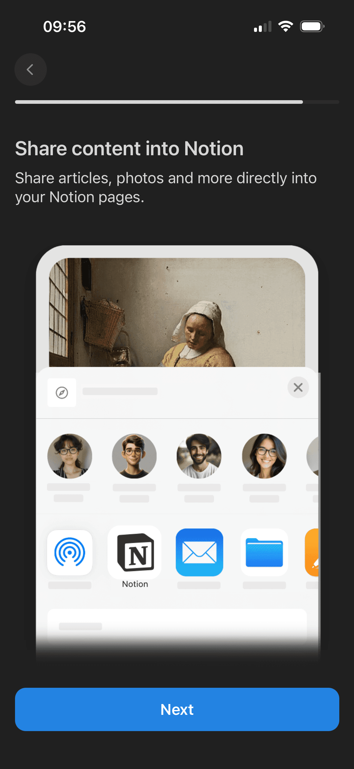
Screen 15
Share work
The introductory message prepares people for the kind of task or benefit that follows. It is a flow-level cue because its effect depends on whether the next screens match that expectation.
This later walkthrough screen introduces one sharing topic while other features remain outside the step. It is a visible staged sequence; its usefulness, optionality and effect on learning would still need to be tested.
The social request arrives after earlier setup or progress, when continuing may feel easier than reconsidering a new permission. It should be introduced as a fresh optional decision.
Show 1 more principleShow fewer principles
Syncing, inviting or sharing is presented beside a less prominent refusal route. Equal hierarchy and a clear explanation of access would better preserve autonomy.
If Notion were to explain what sharing changes and let people try it with a safe example or continue without sharing, then people should understand the next decision more clearly because its purpose and consequences are visible before they act. This would apply Priming and Progressive Disclosure.
Screen 16
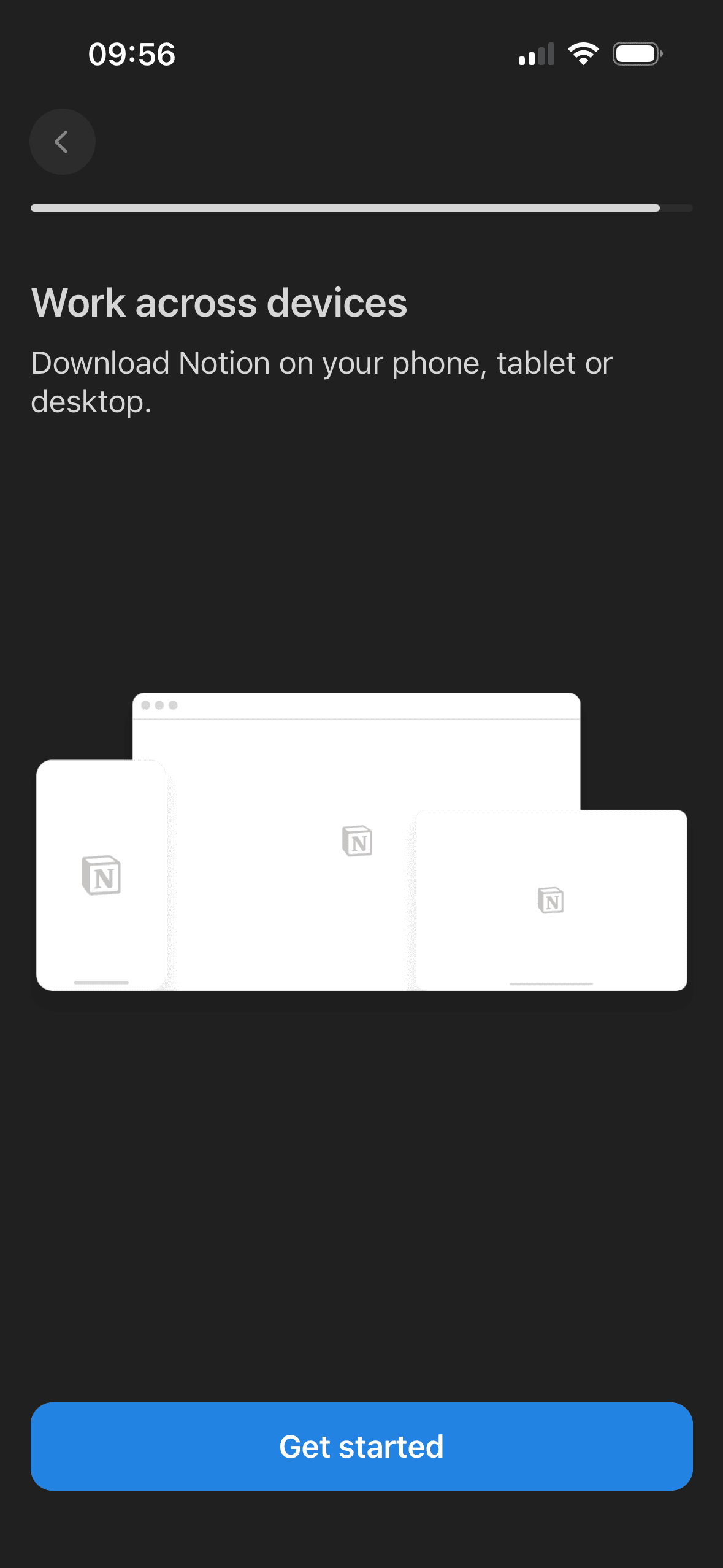
Use Notion on other devices
The introductory message prepares people for the kind of task or benefit that follows. It is a flow-level cue because its effect depends on whether the next screens match that expectation.
The opening language defines how the journey should be interpreted before evidence or terms appear. Aspirational wording should not overstate the outcome or conceal later effort and cost.
The flow introduces one idea before moving to the next decision, reducing how much new information appears at once. Skip, back and reduced-motion routes determine whether that pacing stays supportive.
Show 1 more principleShow fewer principles
The arrangement of the introductory message and single next action determines which action is easiest to see and take. The screen should keep alternatives, refusal and correction proportionate to their importance.
If Notion were to use a specific final action such as Open my workspace and keep Back and Skip available, then people should compare the offer more accurately because price, eligibility and future cost are shown on the same basis. This would apply Priming and Framing Effect.
Screen 17
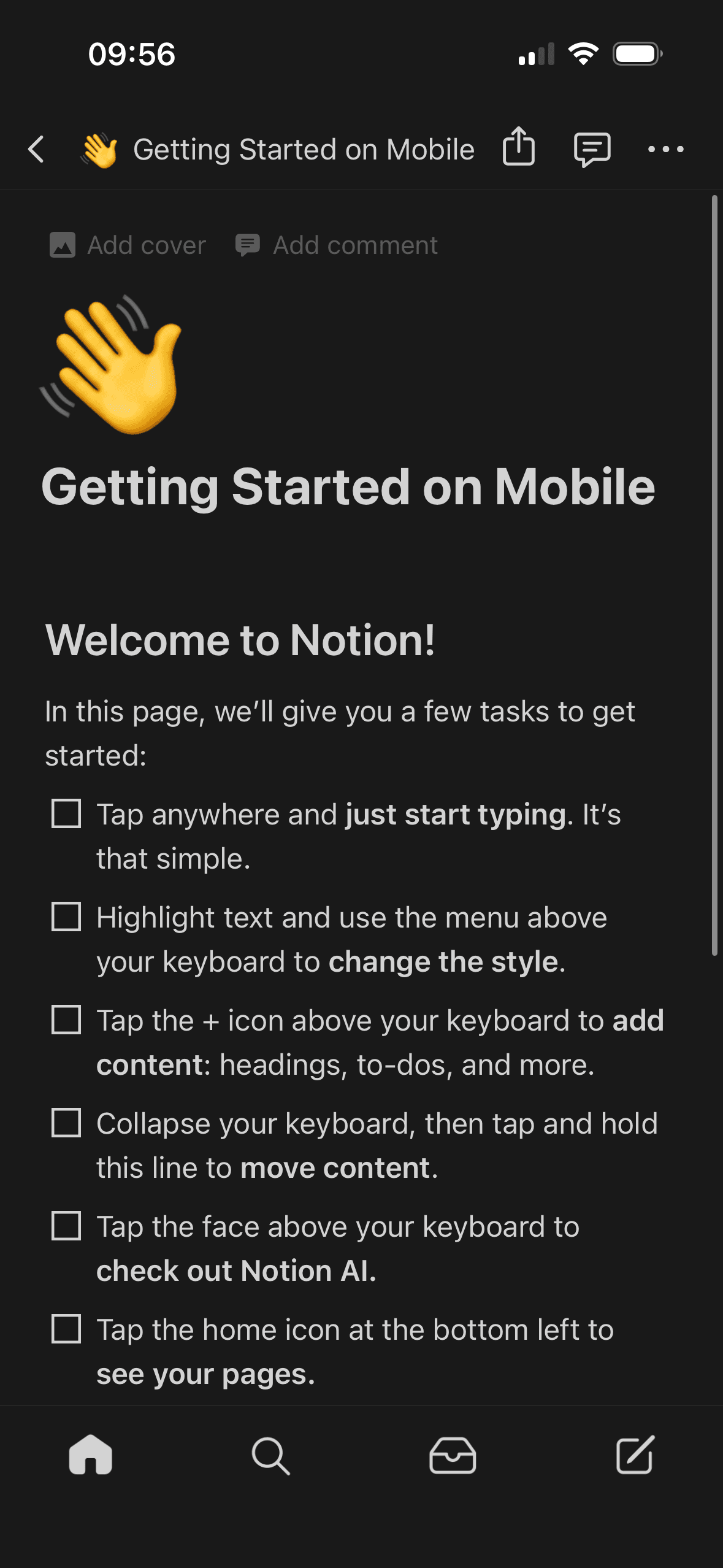
Getting started on mobile
The introductory message prepares people for the kind of task or benefit that follows. It is a flow-level cue because its effect depends on whether the next screens match that expectation.
The opening language defines how the journey should be interpreted before evidence or terms appear. Aspirational wording should not overstate the outcome or conceal later effort and cost.
The flow introduces one idea before moving to the next decision, reducing how much new information appears at once. Skip, back and reduced-motion routes determine whether that pacing stays supportive.
Show 1 more principleShow fewer principles
The arrangement of the main controls, supporting information and available actions determines which action is easiest to see and take. The screen should keep alternatives, refusal and correction proportionate to their importance.
If Notion were to turn the long checklist into a small set of optional first actions based on the person's stated goal, then people should continue without unnecessary pressure because progress remains useful, flexible and easy to revise. This would apply Priming and Framing Effect.
Conclusion
What this journey teaches us.
Notion keeps individual questions focused and uses a consistent structure across a long setup. Multiple account methods, optional interests and team-invitation routes give parts of the journey useful flexibility.
The flow needs a clearer line between required setup and optional profiling. Explaining how answers change the workspace, removing ambiguous ranges and offering a practical first task would make the staged journey more purposeful.
Keep exploring