
Make discovery easier to control
I explored Netflix across personalised rows, continuing activity, popularity lists, categories and the My Netflix area. The service gives people many routes back into viewing, but it rarely explains why a title or row has been prioritised.
This case study is less about whether recommendations are accurate and more about control. People need to understand the source of a suggestion and have practical ways to hide, change or organise what follows them around the product.
- Captured
- Capture date not recorded
- Published
- Last updated
- 9
- Screens
- 35
- Ingredients
- 36
- Applications

Common contexts
Business goals
What works
What the captured flow does well.
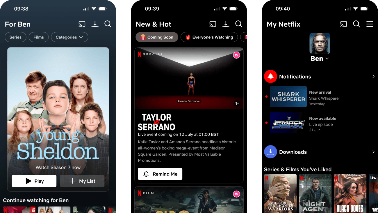
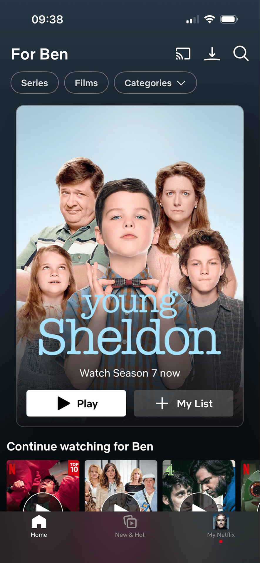
- The home header identifies the active profile and keeps Series, Films, Categories, search, casting and downloads available.
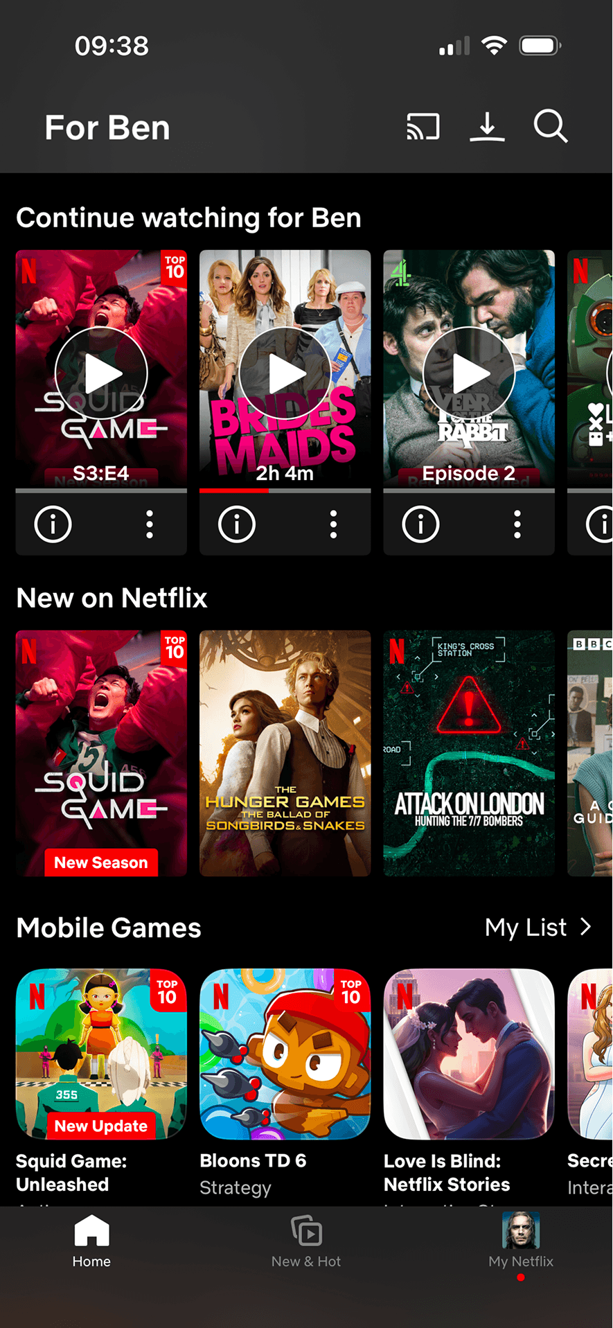
- Continue watching shows a direct play action, episode or duration information, visible progress and an information menu for each title.
- Rows use explicit headings such as New on Netflix, Top 10 Series in the UK Today, Only on Netflix and Critically Acclaimed Series.
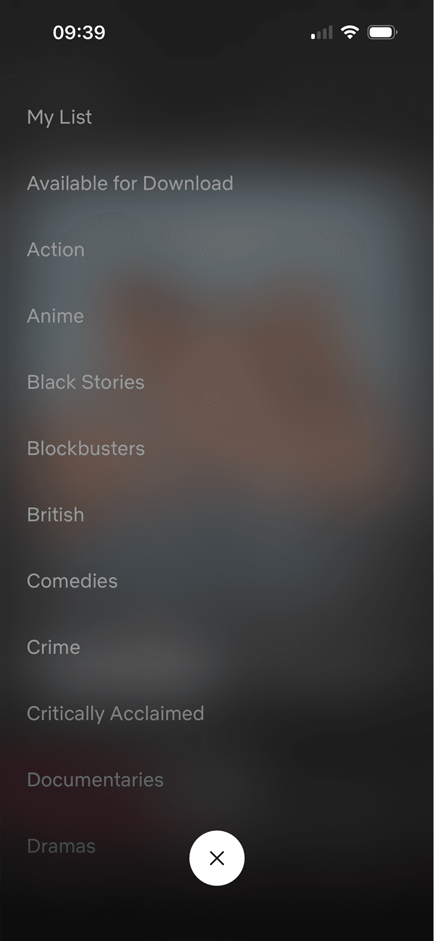
- The category overlay presents a broad alphabetical list with a visible close control.
What could improve
What deserves closer review.
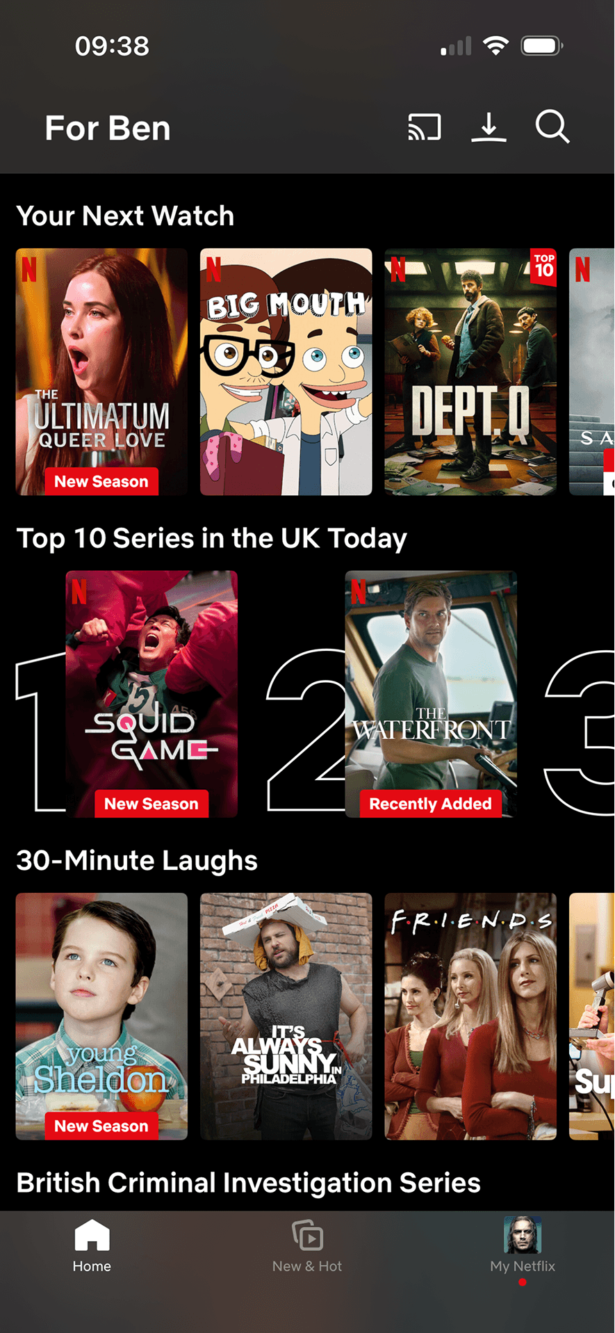
- “For Ben”, “We think you’ll love these” and “Your Next Watch” do not explain which activity shaped the ranking or offer a nearby way to adjust it.
- Top 10 and Everyone’s Watching do not state their ranking method, time window or whether the list is editorial, behavioural or location-specific beyond the visible UK label.
- The same title appears in multiple rows, but the capture does not provide a “not interested”, hide or row-level personalisation control.
- The long category overlay has no visible search, grouping or indication of the current selection, increasing the effort of finding one category.
Screen-by-screen breakdown
Follow the journey.
Each observation shows what works or what could improve, on this screen or across the wider flow. The opportunity turns one or two principles into a testable hypothesis.
Screen 01
Featured content and filter tabs
The screen turns the filters, selected states and result controls into explicit options rather than asking people to recall a hidden command or category.
The number, order or overlap of options can still make comparison demanding. Search, grouping, a clear reset and an explanation of what changes would reduce avoidable cognitive load.
Labels, rows or chips group the filters, selected states and result controls into recognisable units, helping people scan a larger set without reading it as one block.
Show 1 more principleShow fewer principles
Names, icons, artwork or previous queries let people recognise a likely option instead of reconstructing it from memory. The cue still needs a text label and clear source.
If Netflix were to keep the active profile and content controls visible, then people should make a more informed data choice because purpose, optionality and future use are clear before agreement. This would apply Choice Architecture and Cognitive Load.
Screen 02
Continue watching and new releases
Netflix labels a row “Continue watching”, shows episode or duration information, retains visible progress and provides a direct play control. This supports resuming interrupted, self-chosen content; the screenshot does not show a Zeigarnik memory effect, felt tension or increased viewing.
The content is divided into labelled rows or sections, which makes a long feed easier to scan by purpose or source.
Artwork, thumbnails and familiar titles support rapid recognition while browsing. They help identify content, but do not demonstrate relevance or quality by themselves.
Show 1 more principleShow fewer principles
Ordering and naming the rows shapes which path is easiest to take. The screen does not always explain why an item appears or provide nearby controls to correct the recommendation.
If Netflix were to preserve direct playback, progress and per-title information, then people should continue without unnecessary pressure because progress remains useful, flexible and easy to revise. This would apply Chunking and Zeigarnik Effect.
Screen 03
Top 10 and your next watch
The content is divided into labelled rows or sections, which makes a long feed easier to scan by purpose or source.
Ordering and naming the rows shapes which path is easiest to take. The screen does not always explain why an item appears or provide nearby controls to correct the recommendation.
Netflix labels a row “Top 10 Series in the UK Today” and places large rank numbers behind the first titles. This is an explicit popularity cue; the screenshot does not explain the ranking method or show that popularity predicts personal relevance or quality.
Show 1 more principleShow fewer principles
The heading “Your Next Watch” frames a recommendation row as a likely next choice. The screenshot does not explain why the titles were selected or show that this wording changes selection or satisfaction.
If Netflix were to state how “Your Next Watch” and “Top 10 Series in the UK Today” are produced, including relevant location and time windows, then people should understand the next decision more clearly because its purpose and consequences are visible before they act. This would apply Chunking and Social Proof.
Screen 04
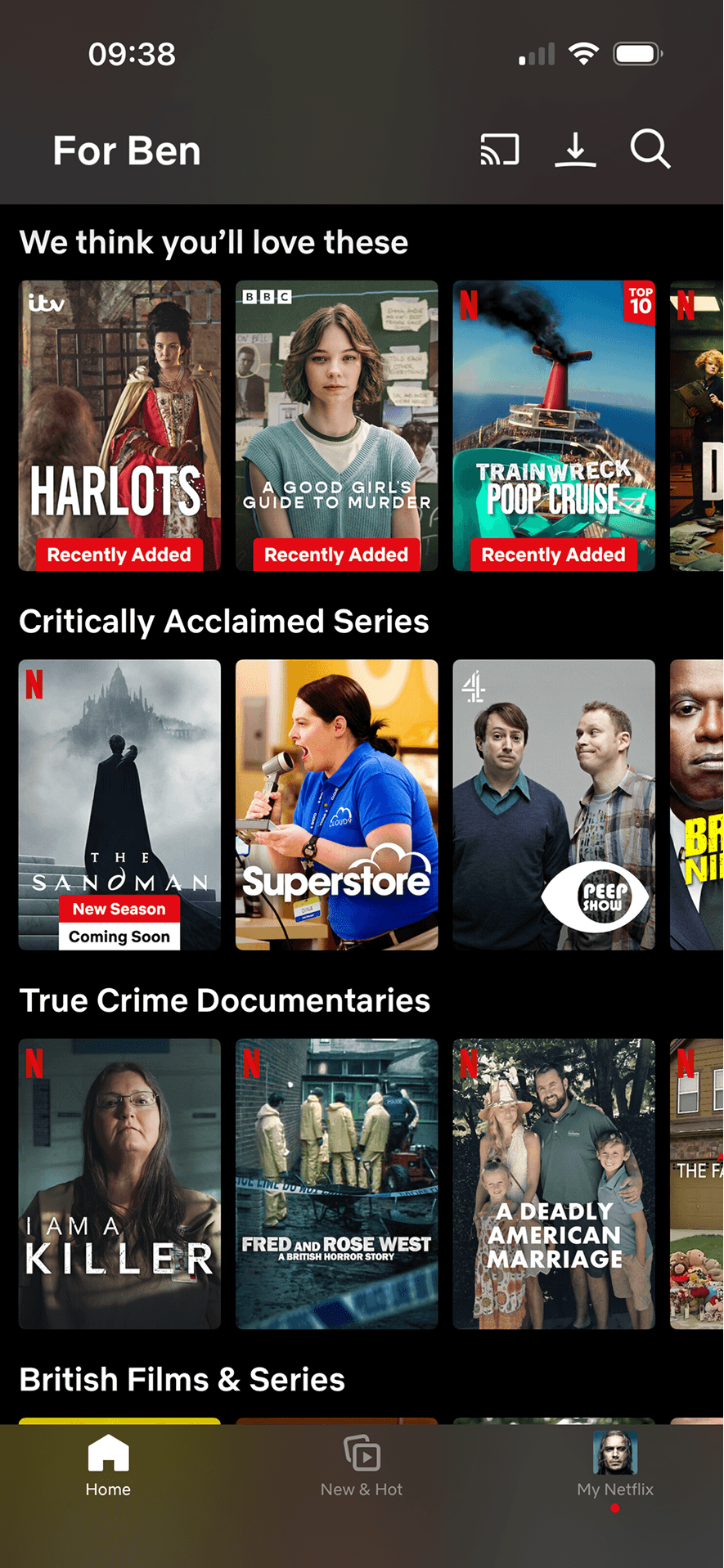
Suggested content and topic rows
The content is divided into labelled rows or sections, which makes a long feed easier to scan by purpose or source.
Ordering and naming the rows shapes which path is easiest to take. The screen does not always explain why an item appears or provide nearby controls to correct the recommendation.
Artwork, thumbnails and familiar titles support rapid recognition while browsing. They help identify content, but do not demonstrate relevance or quality by themselves.
Show 1 more principleShow fewer principles
Several dense rows compete for attention at once. Stronger task-based grouping and fewer simultaneous promotional labels would make the next choice easier to parse.
If Netflix were to explain the basis of “We think you’ll love these” and provide row-level feedback controls, then people should understand the next decision more clearly because its purpose and consequences are visible before they act. This would apply Chunking and Choice Architecture.
Screen 05
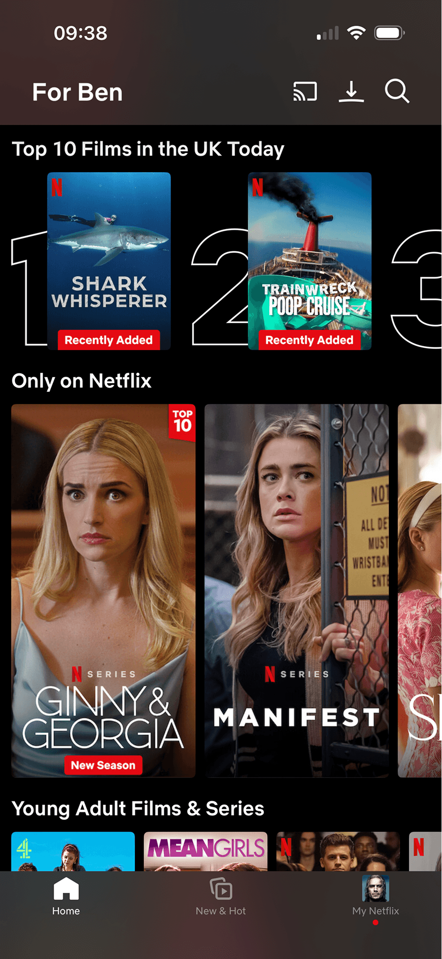
Exclusive and trending Netflix content
Visual hierarchy gives the main controls, supporting information and available actions a clear point of entry. Important secondary information still needs enough prominence to be found before commitment.
Availability, exclusivity or time pressure is made salient on this screen. Unless the limit is specific and verifiable, it can create urgency without helping the underlying choice.
The prospect of missing the item, price or access can carry more weight than an equivalent gain. A consequence-free way to leave or revisit the decision is needed.
Show 1 more principleShow fewer principles
The arrangement of the main controls, supporting information and available actions determines which action is easiest to see and take. The screen should keep alternatives, refusal and correction proportionate to their importance.
If Netflix were to keep “Top 10” and “Only on Netflix” as distinct, factual labels, then people should narrow the available options with less effort because the source, type and effect of each control are explicit. This would apply Salience Effect and Scarcity Principle.
Screen 06
Full category menu overlay
The screen turns the labelled options and their selected states into explicit options rather than asking people to recall a hidden command or category.
The category overlay presents many differently scoped options in one long list. For someone seeking a known category, this creates a hypothesis of avoidable search and memory demand—not evidence of cognitive load from the screenshot. Test find time, wrong selections, backtracking and reported effort with new and experienced viewers, comparing clearer grouping or search while preserving browse choice.
Labels, rows or chips group the labelled options and their selected states into recognisable units, helping people scan a larger set without reading it as one block.
Show 1 more principleShow fewer principles
Names, icons, artwork or previous queries let people recognise a likely option instead of reconstructing it from memory. The cue still needs a text label and clear source.
If Netflix were to add category search or meaningful grouping, show the current selection and preserve focus when the overlay opens and closes, then people should narrow the available options with less effort because the source, type and effect of each control are explicit. This would apply Choice Architecture and Cognitive Load.
Screen 07
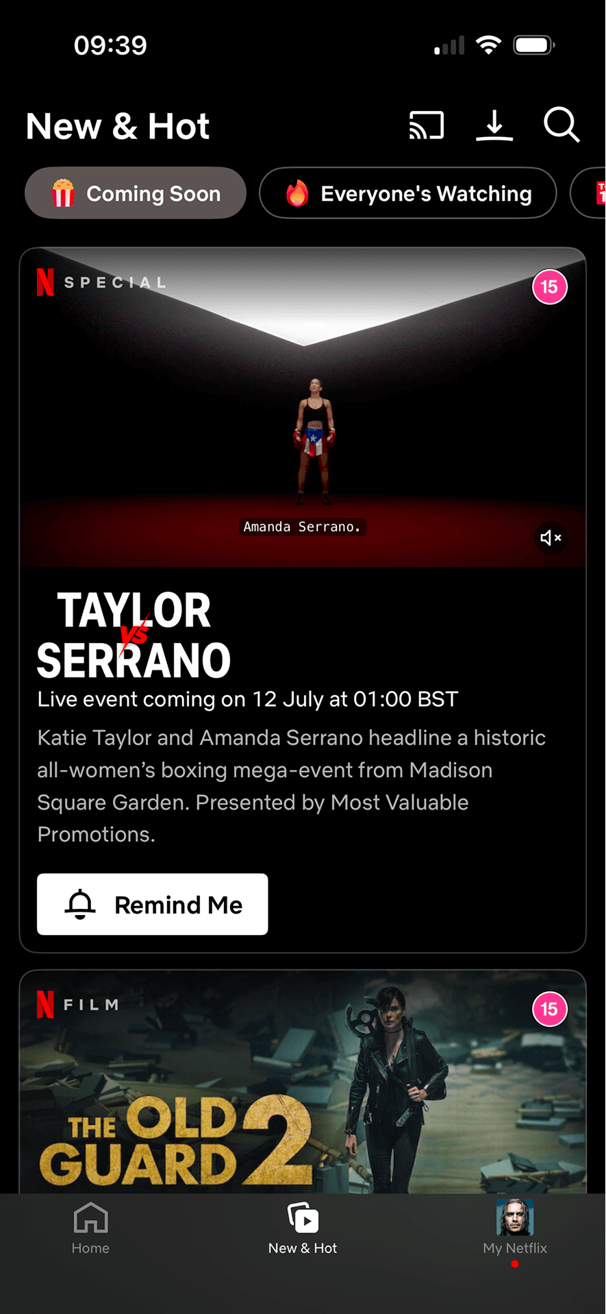
New and Hot
Visual hierarchy gives the main controls, supporting information and available actions a clear point of entry. Important secondary information still needs enough prominence to be found before commitment.
The immediate task stays focused on one decision before the wider journey continues. That sequencing reduces simultaneous choices when later steps remain predictable and reversible.
The arrangement of the main controls, supporting information and available actions determines which action is easiest to see and take. The screen should keep alternatives, refusal and correction proportionate to their importance.
Show 1 more principleShow fewer principles
Netflix offers an “Everyone’s Watching” filter alongside Coming Soon and Top 10. The label uses viewing by others as a discovery route, but the screenshot does not state its geography, time window or ranking criteria or show that people follow it.
If Netflix were to explain the date, time zone and notification behaviour before Remind Me is saved, then people should understand the next decision more clearly because its purpose and consequences are visible before they act. This would apply Salience Effect and Social Proof.
Screen 08
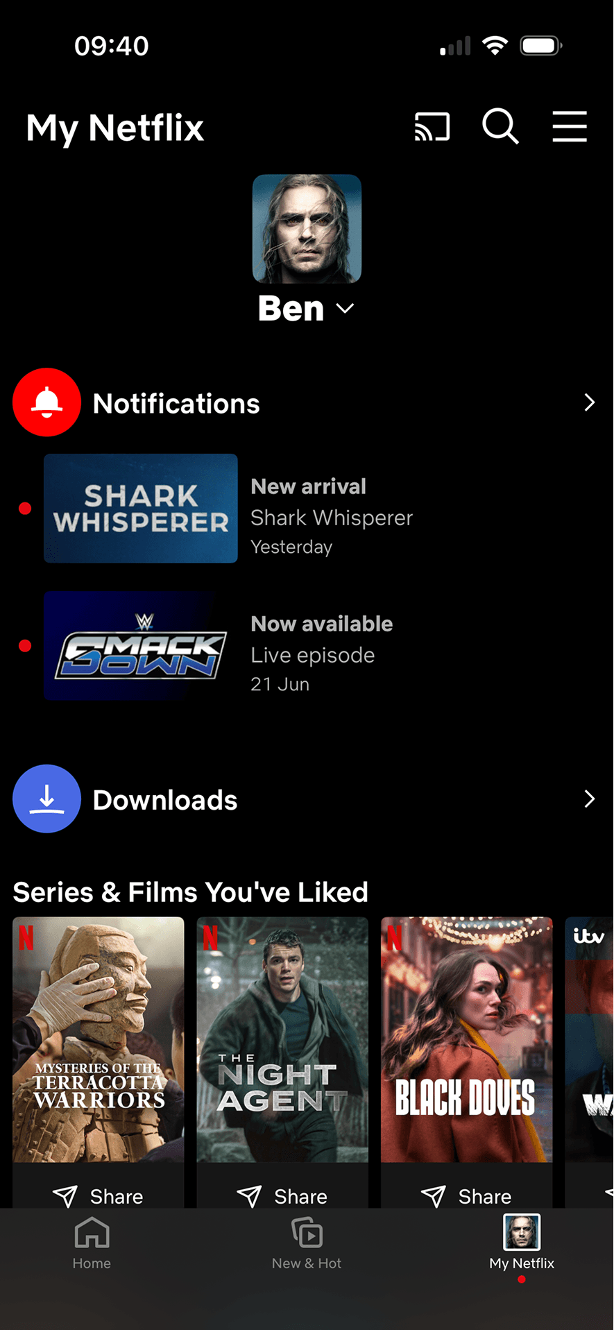
My Netflix notifications and downloads
Asking for this choice separately from basic account access can support informed consent, provided the full purpose is visible before the person acts.
The relative emphasis given to accept, refuse and manage choices can make one route feel easier than another. Button weight, wording and placement should support a voluntary decision.
Benefit-led, loss-led or negatively phrased copy changes the way people interpret the choice. The purpose, frequency and consequence should be clear without making refusal sound irresponsible.
Show 1 more principleShow fewer principles
A preselected state, completed-state message or negative opt-out would make inaction count as agreement. Optional communication and data use should begin unselected.
If Netflix were to keep notifications, downloads and liked titles clearly separated, then people should understand the next decision more clearly because its purpose and consequences are visible before they act. This would apply Progressive Disclosure and Choice Architecture.
Screen 09
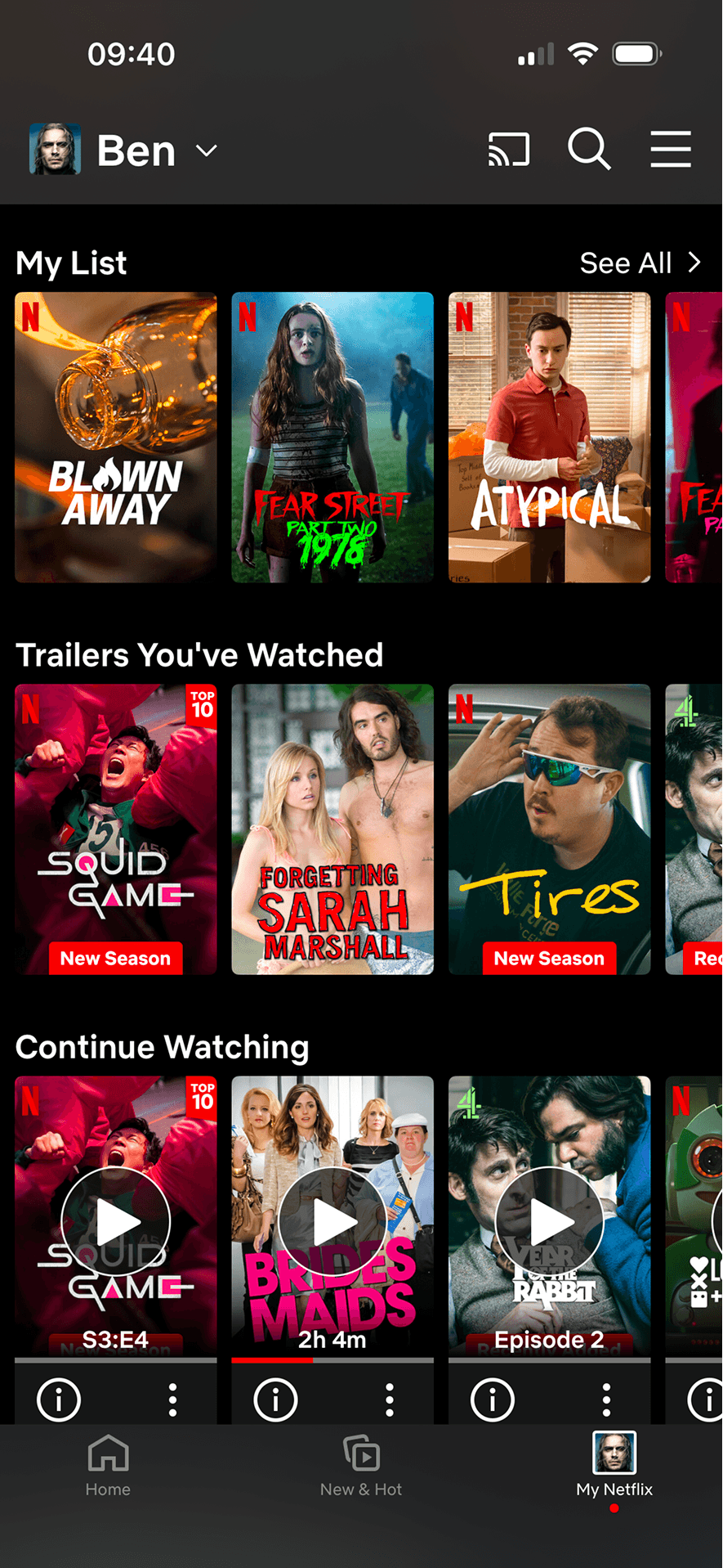
Saved and unfinished shows
Bringing the previous activity brought back into view back into view makes an unfinished or previously considered task easy to resume. This is a continuation cue, not evidence that the person still intends to finish it.
Ordering and naming the rows shapes which path is easiest to take. The screen does not always explain why an item appears or provide nearby controls to correct the recommendation.
The screen confirms the outcome of the preceding action and keeps a next action visible. That closes the immediate interaction loop.
Show 1 more principleShow fewer principles
The content is divided into labelled rows or sections, which makes a long feed easier to scan by purpose or source.
If Netflix were to let people sort, filter or group My List and remove items without opening each title, then people should narrow the available options with less effort because the source, type and effect of each control are explicit. This would apply Zeigarnik Effect and Choice Architecture.
Conclusion
What this journey teaches us.
Netflix is good at preserving useful viewing context. Progress, episode information, categories, reminders and saved areas give people recognisable ways to resume or explore.
Discovery would feel more deliberate with clearer ranking explanations and nearby personalisation controls. Popularity and repetition can support orientation, but they should not quietly become the only reasons a title stays prominent.
Keep exploring