
Explain why products appear
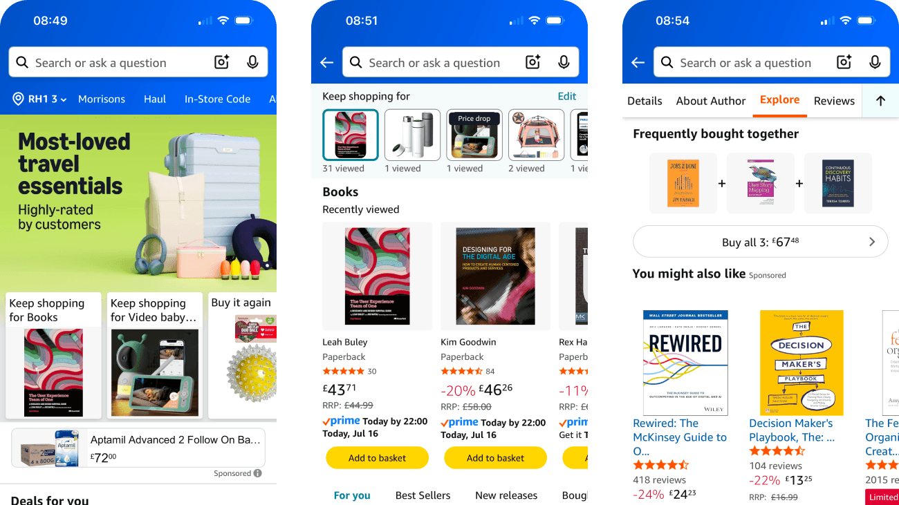
I explored Amazon across its home feed, deals, recent activity, repeat purchases, lists and product recommendations. Many modules name a source, but personalised, sponsored and urgency-led content still compete within the same dense journey.
This case study looks at the reason behind each recommendation. A label such as recently viewed or frequently bought together can help, but people also need to understand the data, comparison and commercial relationship behind it.
- Captured
- Capture date not recorded
- Published
- Last updated
- 11
- Screens
- 20
- Ingredients
- 44
- Applications

Common contexts
Business goals
What works
What the captured flow does well.
- Search remains available across the captured home, category, account, list and product views.
- Several modules name their basis, including Keep shopping, Based on your recent shopping trends, 4 stars and above, Recently viewed, Buy again and Customers who bought this item also bought.
- Product cards provide price, discount, RRP where shown, Prime and delivery information, ratings and review counts.
- The Books view separates For you, Best Sellers and New releases and provides Prime, price and rating filters.
What could improve
What deserves closer review.
- “Most-loved”, Deals for you and Based on your recent shopping trends do not explain their population, time window, ranking inputs or nearby personalisation controls.
- Limited-time deal labels show percentages but no visible end time, price history or evidence that the reference discount is the best available comparison.
- The feed mixes personalised content, sponsored products, promotions and repeat-purchase suggestions with different visual treatments and limited explanation of why each appears.
- Recently viewed shows view counts that may be mistaken for popularity, while the capture does not show history deletion, retention or privacy controls.
Screen-by-screen breakdown
Follow the journey.
Each observation shows what works or what could improve, on this screen or across the wider flow. The opportunity turns one or two principles into a testable hypothesis.
Screen 01
Home page
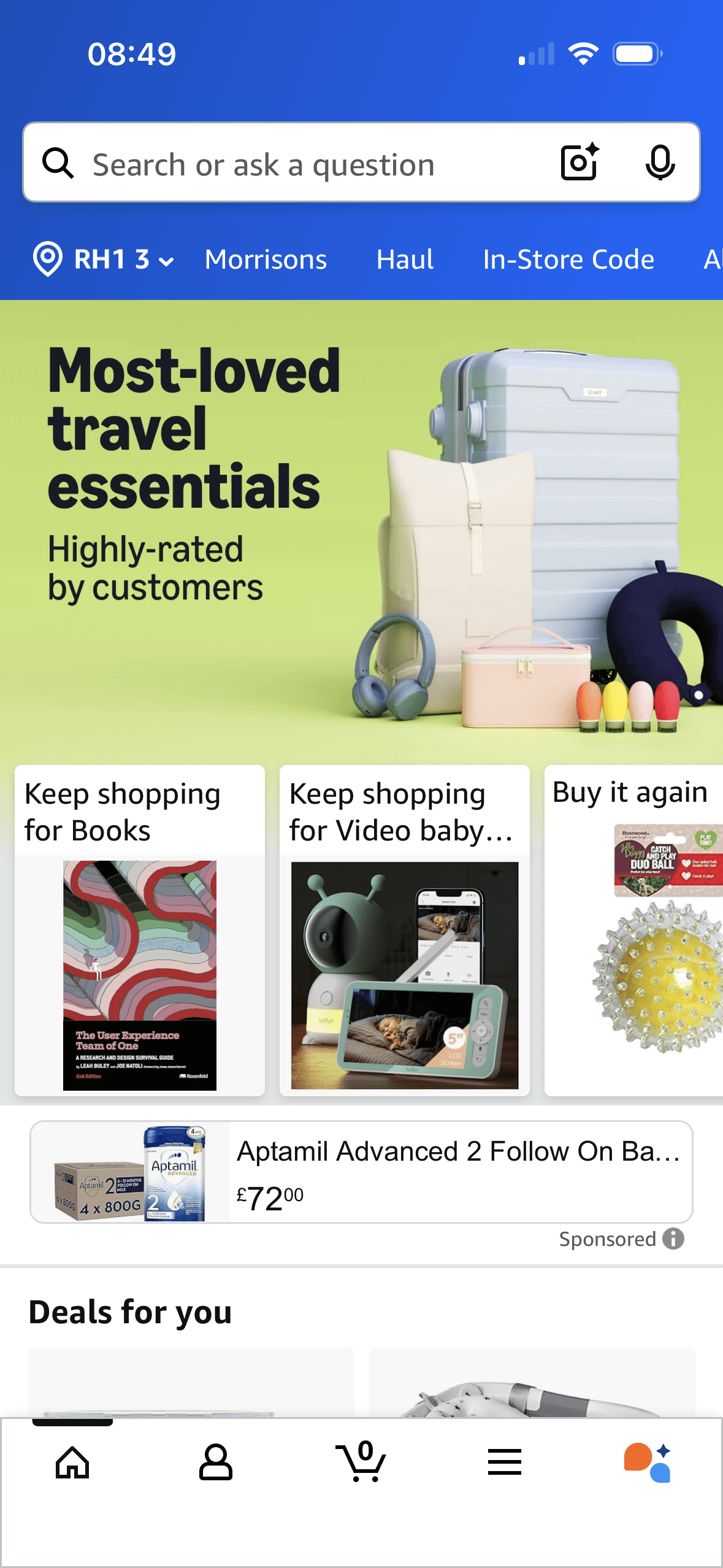
The content is divided into labelled rows or sections, which makes a long feed easier to scan by purpose or source.
The home promotion says “Most-loved travel essentials” and “Highly-rated by customers”. These are explicit popularity and evaluation cues; the screenshot does not define the ranking population or show that the products are suitable for this person.
Artwork, thumbnails and familiar titles support rapid recognition while browsing. They help identify content, but do not demonstrate relevance or quality by themselves.
Show 1 more principleShow fewer principles
Ordering and naming the rows shapes which path is easiest to take. The screen does not always explain why an item appears or provide nearby controls to correct the recommendation.
If Amazon were to keep search and delivery location visible, but explain what “Most-loved” measures and which behaviour shaped Keep shopping and Buy it again, then people should compare the offer more accurately because price, eligibility and future cost are shown on the same basis. This would apply Chunking and Social Proof.
Screen 02
Deals and recommendations
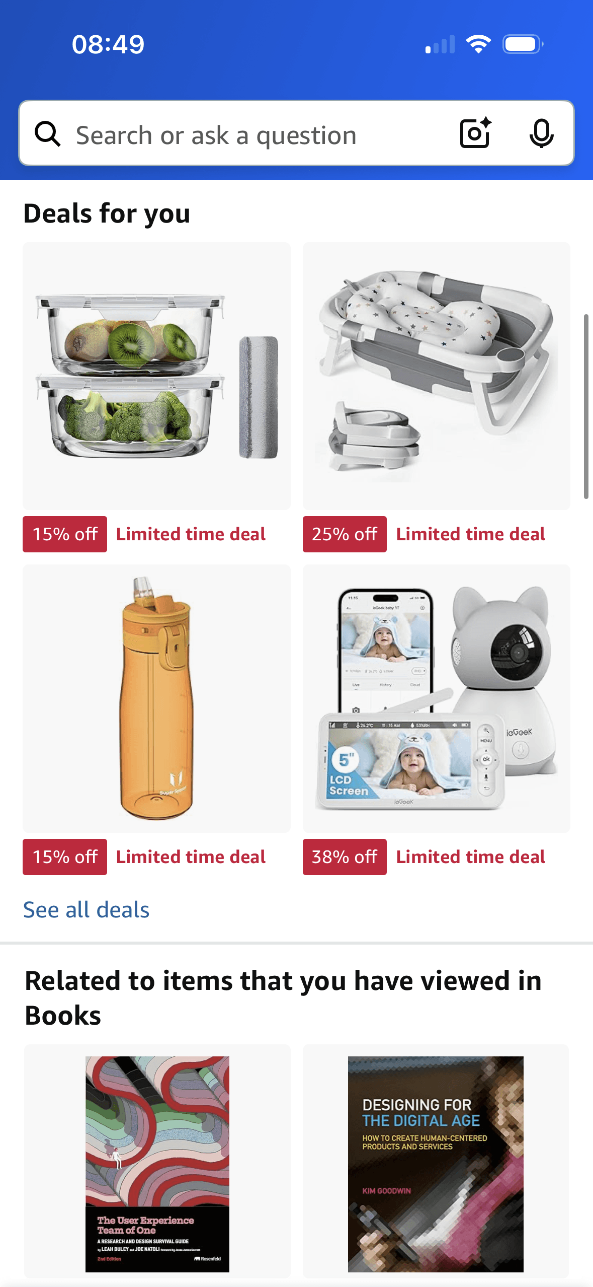
The content is divided into labelled rows or sections, which makes a long feed easier to scan by purpose or source.
Deal cards display a percentage reduction beside “Limited time deal”. This frames availability as time-limited, but the screenshot does not show the end time, price history or whether the label changes purchase behaviour.
Artwork, thumbnails and familiar titles support rapid recognition while browsing. They help identify content, but do not demonstrate relevance or quality by themselves.
Show 1 more principleShow fewer principles
Ordering and naming the rows shapes which path is easiest to take. The screen does not always explain why an item appears or provide nearby controls to correct the recommendation.
If Amazon were to for every limited-time deal, show the end time, price history and comparison basis before purchase, then people should compare the offer more accurately because price, eligibility and future cost are shown on the same basis. This would apply Chunking and Scarcity Principle.
Screen 03
Recent shopping trends
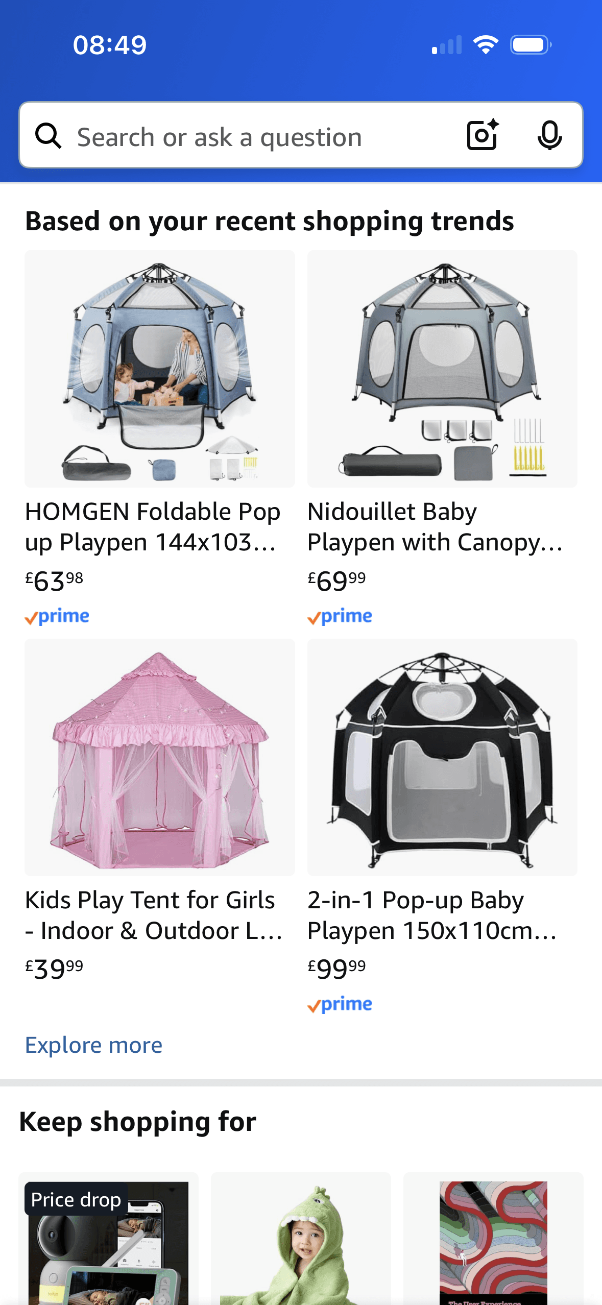
The content is divided into labelled rows or sections, which makes a long feed easier to scan by purpose or source.
Ordering and naming the rows shapes which path is easiest to take. The screen does not always explain why an item appears or provide nearby controls to correct the recommendation.
Artwork, thumbnails and familiar titles support rapid recognition while browsing. They help identify content, but do not demonstrate relevance or quality by themselves.
Show 1 more principleShow fewer principles
Several dense rows compete for attention at once. Stronger task-based grouping and fewer simultaneous promotional labels would make the next choice easier to parse.
If Amazon were to explain the activity and time period behind “recent shopping trends”, provide a clear route to view or delete the source history and keep Prime delivery as fulfilment information rather than a proxy for product suitability, then people should understand the next decision more clearly because its purpose and consequences are visible before they act. This would apply Chunking and Choice Architecture.
Screen 04
Ratings and list-based deals
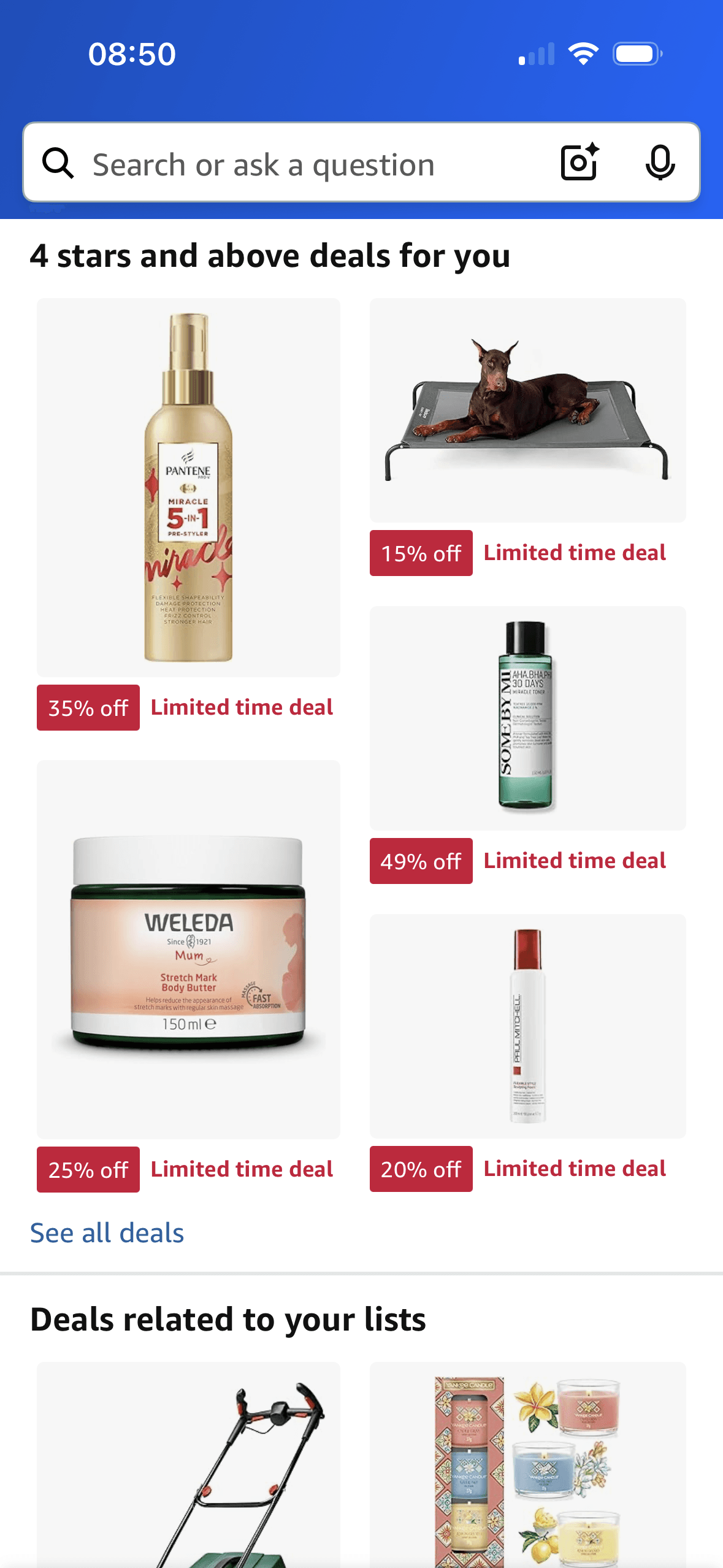
The heading “4 stars and above deals for you” frames the row around a rating threshold and a personalised deal claim. The screenshot does not state a minimum review count or show increased confidence or purchase.
The content is divided into labelled rows or sections, which makes a long feed easier to scan by purpose or source.
Artwork, thumbnails and familiar titles support rapid recognition while browsing. They help identify content, but do not demonstrate relevance or quality by themselves.
Show 1 more principleShow fewer principles
Ordering and naming the rows shapes which path is easiest to take. The screen does not always explain why an item appears or provide nearby controls to correct the recommendation.
If Amazon were to clarify whether “4 stars and above” uses a minimum review count and whether Deals related to your lists uses saves, purchases or browsing, then people should understand the next decision more clearly because its purpose and consequences are visible before they act. This would apply Chunking and Framing Effect.
Screen 05
My Lists landing page
The content is divided into labelled rows or sections, which makes a long feed easier to scan by purpose or source.
Artwork, thumbnails and familiar titles support rapid recognition while browsing. They help identify content, but do not demonstrate relevance or quality by themselves.
Ordering and naming the rows shapes which path is easiest to take. The screen does not always explain why an item appears or provide nearby controls to correct the recommendation.
Show 1 more principleShow fewer principles
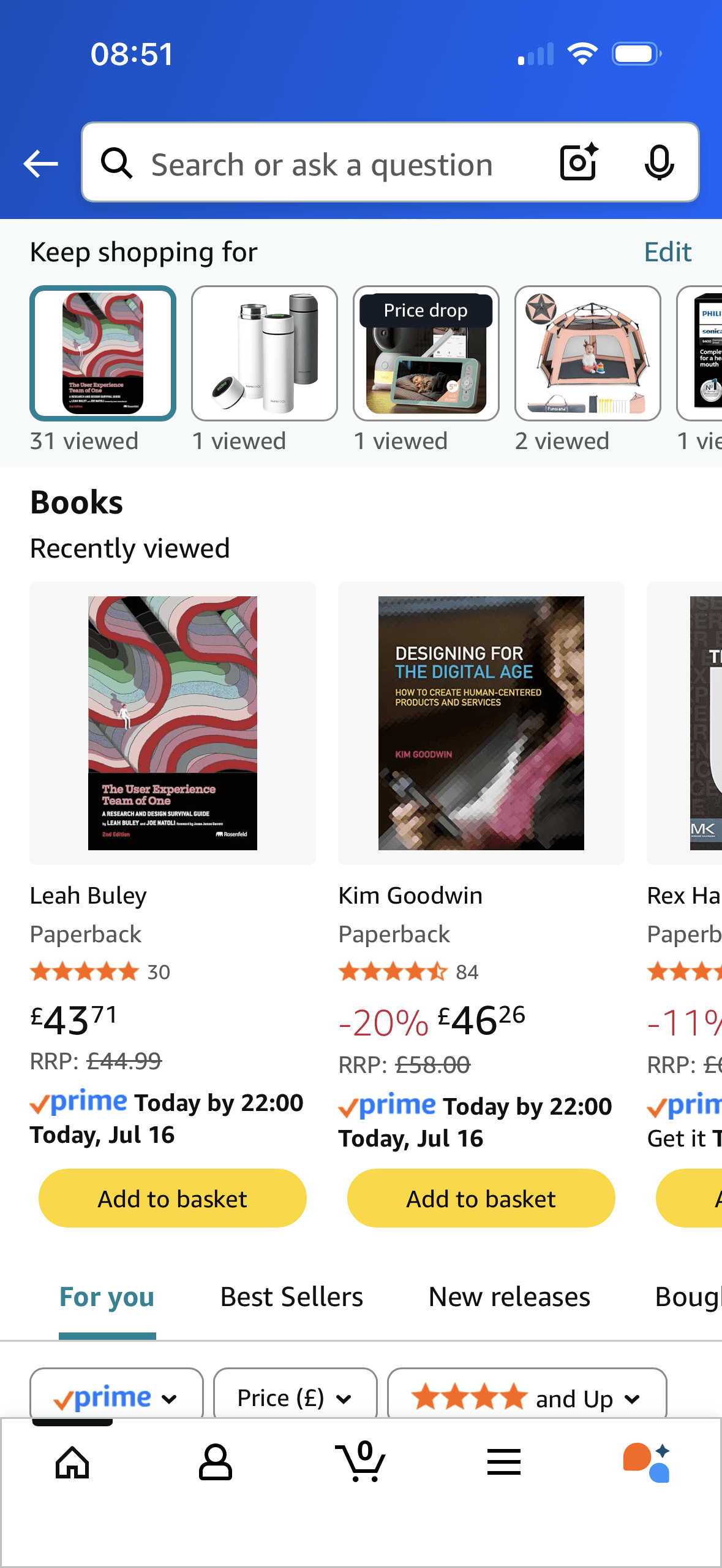
Book cards show a current price beside a struck-through RRP. The RRP is a numerical reference for judging the current price; its usefulness depends on the reference being genuine, current and directly comparable.
If Amazon were to keep Edit available for recent-view history and explain what each view count means, then people should compare the offer more accurately because price, eligibility and future cost are shown on the same basis. This would apply Chunking and Anchoring Bias.
Screen 06
List recommendations
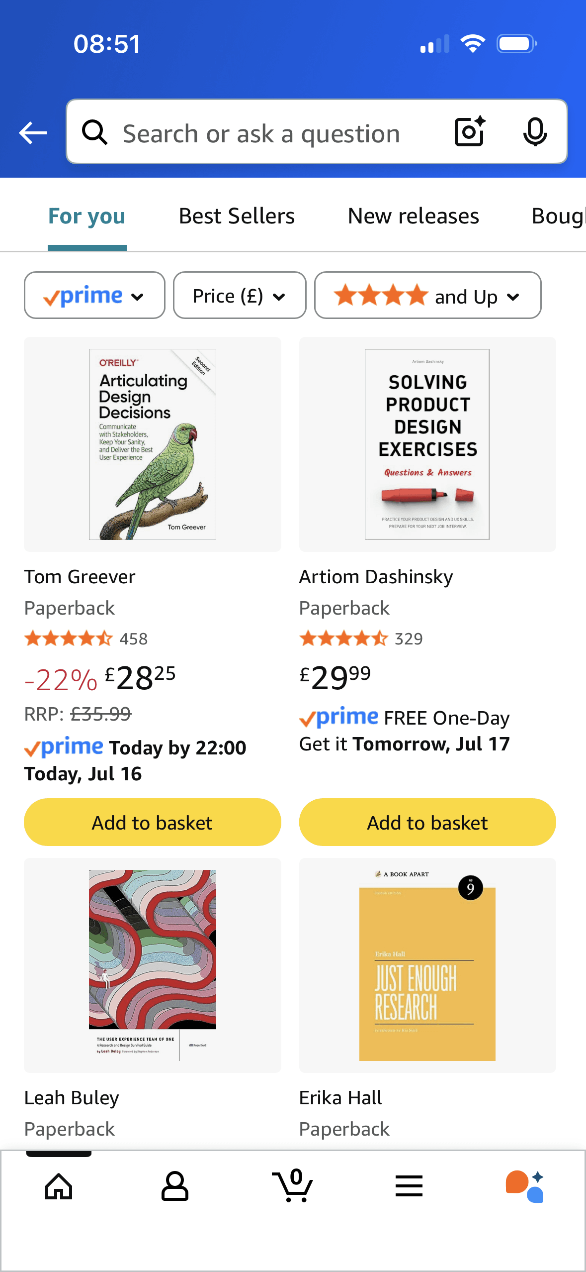
The content is divided into labelled rows or sections, which makes a long feed easier to scan by purpose or source.
Ordering and naming the rows shapes which path is easiest to take. The screen does not always explain why an item appears or provide nearby controls to correct the recommendation.
Artwork, thumbnails and familiar titles support rapid recognition while browsing. They help identify content, but do not demonstrate relevance or quality by themselves.
Show 1 more principleShow fewer principles
Several dense rows compete for attention at once. Stronger task-based grouping and fewer simultaneous promotional labels would make the next choice easier to parse.
If Amazon were to keep For you, Best Sellers and New releases visibly distinct and preserve active filter states, then people should narrow the available options with less effort because the source, type and effect of each control are explicit. This would apply Chunking and Choice Architecture.
Screen 07
My account
Visual hierarchy gives the main controls, supporting information and available actions a clear point of entry. Important secondary information still needs enough prominence to be found before commitment.
The arrangement of the main controls, supporting information and available actions determines which action is easiest to see and take. The screen should keep alternatives, refusal and correction proportionate to their importance.
The immediate task stays focused on one decision before the wider journey continues. That sequencing reduces simultaneous choices when later steps remain predictable and reversible.
Show 1 more principleShow fewer principles
The screen asks people to interpret the main controls, supporting information and available actions without showing every relevant consequence nearby. Clearer grouping and concise support would reduce avoidable mental effort.
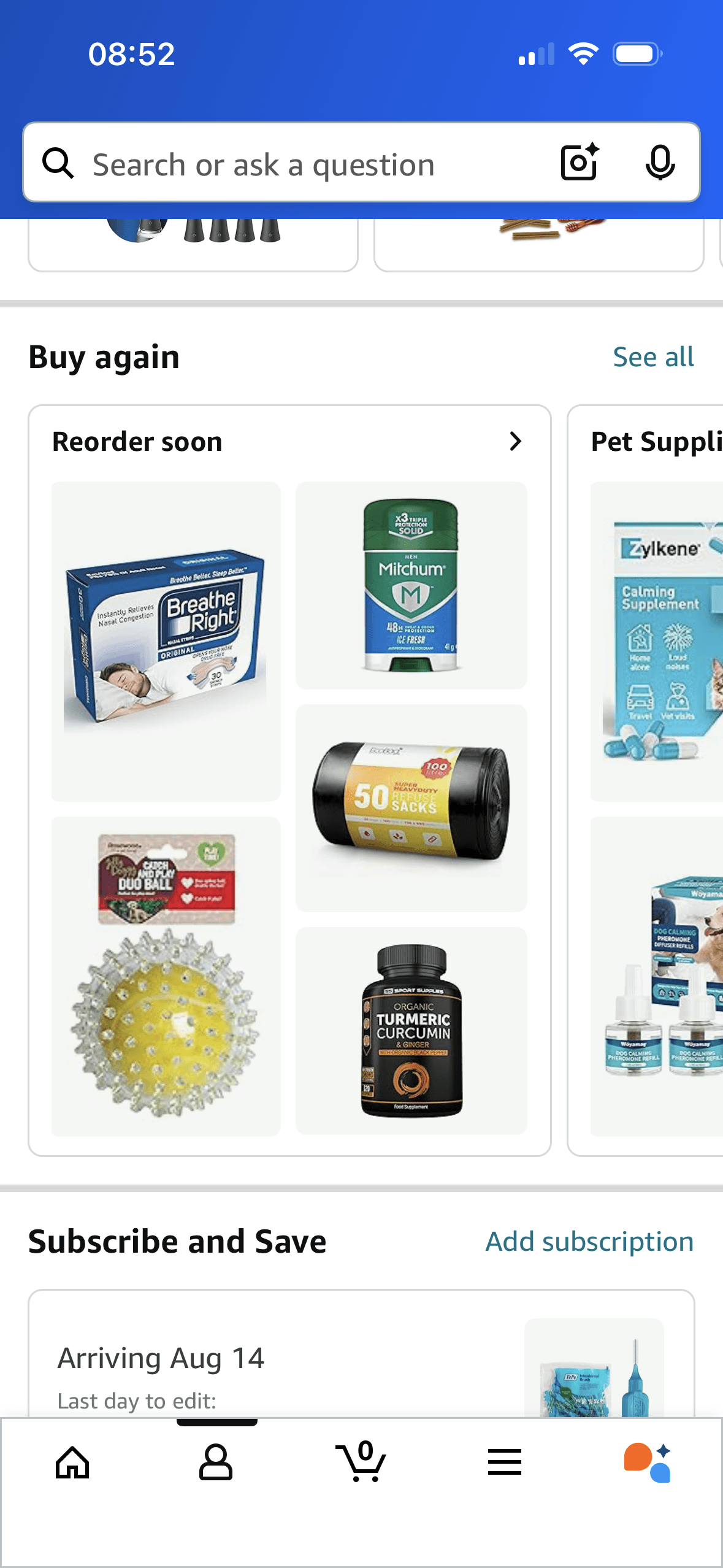
If Amazon were to label why an item appears under Reorder soon, show the last purchase and estimated consumption basis, and provide snooze, hide and “not a recurring purchase” controls, then people should recover from interruption with less effort because progress, failure and the next available action remain clear. This would apply Salience Effect and Choice Architecture.
Screen 08
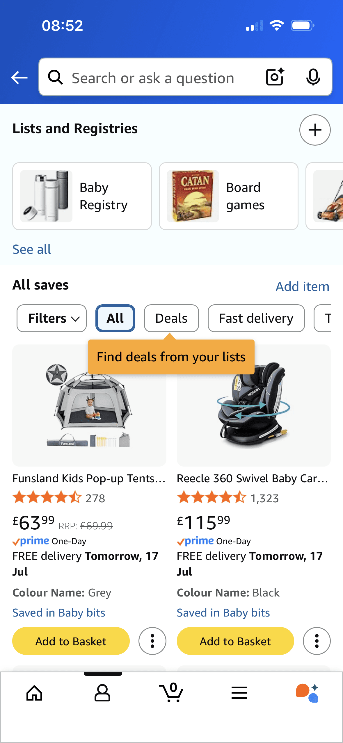
My lists page
The content is divided into labelled rows or sections, which makes a long feed easier to scan by purpose or source.
Ordering and naming the rows shapes which path is easiest to take. The screen does not always explain why an item appears or provide nearby controls to correct the recommendation.
Artwork, thumbnails and familiar titles support rapid recognition while browsing. They help identify content, but do not demonstrate relevance or quality by themselves.
Show 1 more principleShow fewer principles
Several dense rows compete for attention at once. Stronger task-based grouping and fewer simultaneous promotional labels would make the next choice easier to parse.
If Amazon were to keep saved-item source, delivery, rating and price visible, then people should make a more informed data choice because purpose, optionality and future use are clear before agreement. This would apply Chunking and Choice Architecture.
Screen 09
Product page explore section
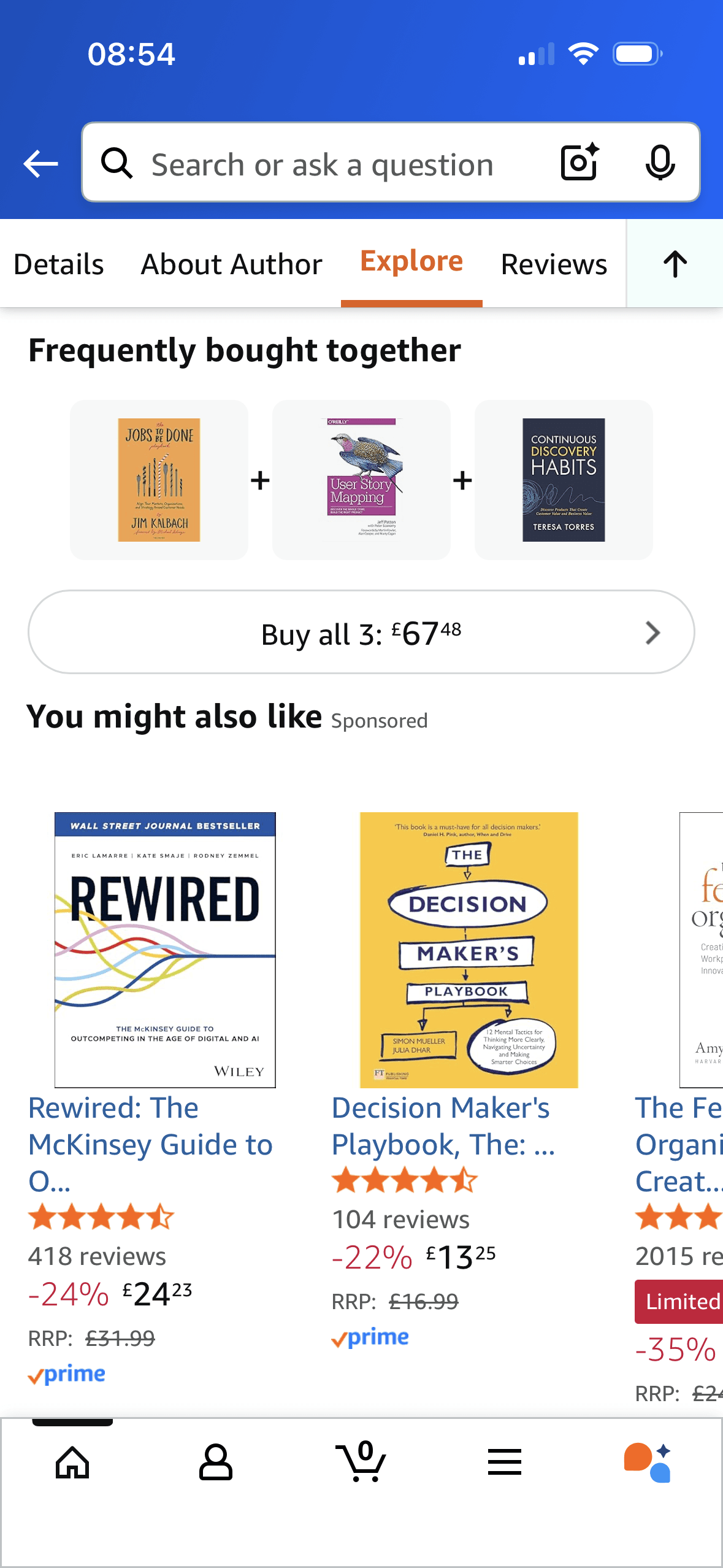
Amazon labels a bundle “Frequently bought together” and shows review counts on suggested books. These are visible signals of other customers’ behaviour and evaluation; purchase frequency does not establish compatibility, suitability or better value.
The content is divided into labelled rows or sections, which makes a long feed easier to scan by purpose or source.
Artwork, thumbnails and familiar titles support rapid recognition while browsing. They help identify content, but do not demonstrate relevance or quality by themselves.
Show 1 more principleShow fewer principles
Ordering and naming the rows shapes which path is easiest to take. The screen does not always explain why an item appears or provide nearby controls to correct the recommendation.
If Amazon were to for Frequently bought together, explain how frequently and over what period, confirm compatibility where relevant and allow each item to be removed before Buy all, then people should compare the offer more accurately because price, eligibility and future cost are shown on the same basis. This would apply Chunking and Social Proof.
Screen 10
Product page explore section 2
The content is divided into labelled rows or sections, which makes a long feed easier to scan by purpose or source.
Artwork, thumbnails and familiar titles support rapid recognition while browsing. They help identify content, but do not demonstrate relevance or quality by themselves.
Ordering and naming the rows shapes which path is easiest to take. The screen does not always explain why an item appears or provide nearby controls to correct the recommendation.
Show 1 more principleShow fewer principles
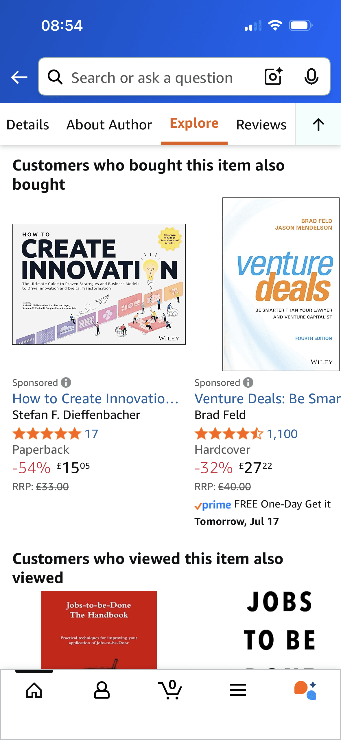
Amazon labels products “Customers who bought this item also bought” and shows star averages and review counts. These are direct signals of others’ actions and evaluations; they do not prove that the products suit this person or work well together.
If Amazon were to increase the visual separation of Sponsored recommendations and explain why the advert is shown, then people should narrow the available options with less effort because the source, type and effect of each control are explicit. This would apply Chunking and Social Proof.
Screen 11
Product page explore section 3
The content is divided into labelled rows or sections, which makes a long feed easier to scan by purpose or source.
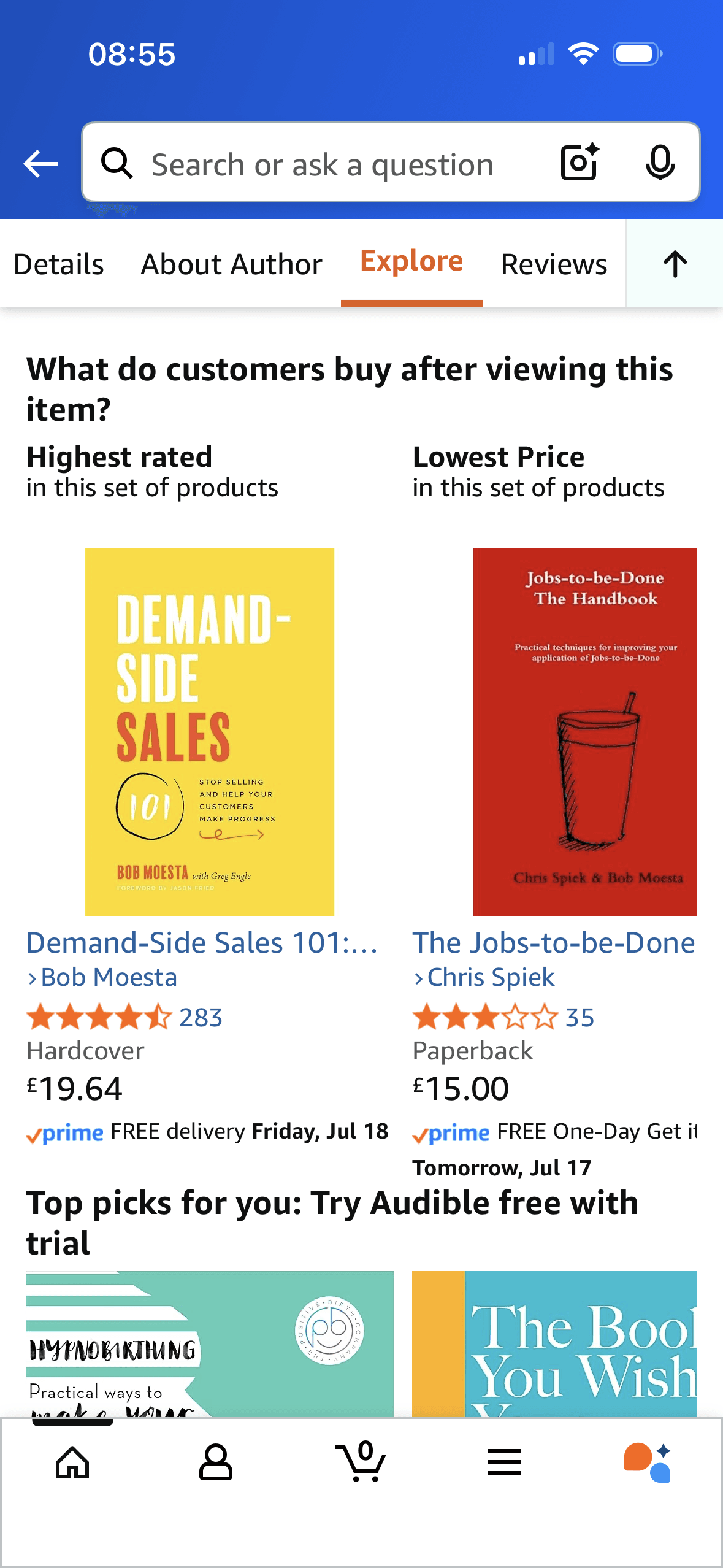
The page compares “Highest rated” with “Lowest Price in this set of products”. These headings frame the same recommendation set around two different attributes; the screenshot does not state the rating threshold or show improved comparison.
Artwork, thumbnails and familiar titles support rapid recognition while browsing. They help identify content, but do not demonstrate relevance or quality by themselves.
Show 1 more principleShow fewer principles
Ordering and naming the rows shapes which path is easiest to take. The screen does not always explain why an item appears or provide nearby controls to correct the recommendation.
If Amazon were to keep Highest rated and Lowest price as clearly defined comparison frames, including minimum review count and total delivered price, then people should compare the offer more accurately because price, eligibility and future cost are shown on the same basis. This would apply Chunking and Framing Effect.
Conclusion
What this journey teaches us.
Amazon provides strong product detail and often labels the basis of a recommendation. Search, lists, filters and ratings give people several practical comparison routes.
The challenge is separating assistance from persuasion. Clearer personalisation controls, price-history context, advertising treatment and ways to hide repeat suggestions would make the feed more accountable to the shopper’s goal.
Keep exploring