
Making money feel manageable
I moved through PayPal’s home, balance, borrowing, debit-card, payment-method and activity screens to see how the app explains what someone has, what they owe and what they can do next. These are related money tasks, but they carry very different consequences.
The clearest screens reduce the decision to one status or next action. The harder moments arrive when promotions, unfamiliar products, partial account details and transaction history compete with the task that brought someone into the app.
Some screenshots use fictional personal details and activity. Private locations remain obscured where needed.
- Captured
- Capture date not recorded
- Published
- Last updated
- Product version
- PayPal iOS app 8.107.2
- Source
- View reference ↗
- 23
- Screens
- 10
- Ingredients
- 46
- Applications
Common contexts
Business goals
What works
What the captured flow does well.
- Account states are usually stated in plain language.
- Focused flows reveal one decision at a time.
- Activity and payment controls stay reachable.
- Progress and status receive visible feedback.
What could improve
What deserves closer review.
- The home feed mixes account work with promotion.
- Financial products can appear before their consequences.
- Payment details need stronger privacy treatment.
- Some histories make the next useful action hard to find.
Screen-by-screen breakdown
Follow the journey.
Each observation shows what works or what could improve, on this screen or across the wider flow. The opportunity turns one or two principles into a testable hypothesis.

Screen 01
PayPal home
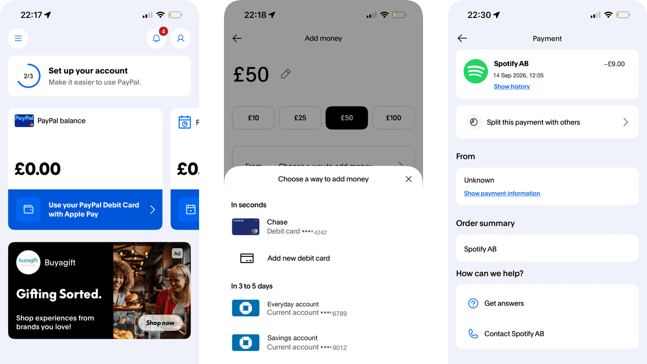
Balance and the blue debit-card action occupy the upper account area, while a large shopping promotion appears below. The difference in scale creates a strong reading hierarchy.
Setup, balance, payment tools and shopping are presented together. Someone opening the app for a routine account task must separate that task from optional promotions.
If we group account actions ahead of optional shopping and product offers, then people should be better able to find the next account action because the available actions and their differences would be clearer at the point of choice.

Screen 02
More home cards
PayPal Credit and Pools occupy separate home-feed cards. The credit card already gives a representative APR and subject-to-status wording, while the neighbouring card describes pooling money with friends.
Borrowing and pooling money still share the same card structure and plus-shaped action. Those matching controls can make different commitments appear similar even though the borrowing terms are present.
If we give the credit action a specific label such as Explore credit, keeping the APR and eligibility wording beside it, then people should be better able to distinguish account tasks from optional offers because the immediate benefit would be presented alongside the relevant conditions and consequences.

Screen 03
Finish account setup
The setup sheet shows a fraction completed and a list of remaining tasks. This makes the distance to the displayed completion state concrete.
Linking another service is placed alongside account verification work. The progress total can make optional setup feel necessary even when it is not needed for the current task.
If we separate required account setup from optional service links in the progress list, then people should be better able to identify what remains in account setup because the available actions and their differences would be clearer at the point of choice.

Personal details and activity have been replaced with fictional examples.
Screen 04
PayPal balance
The available balance is the largest figure, with Add money immediately below it. The hierarchy connects the current account state with its relevant action.
The card summary and empty activity area introduce secondary information beneath the balance. Explaining which payments this balance funds would help people interpret what the figure means.
If we explain the balance’s role in funding payments beside Add money, then people should be better able to check the available balance because fewer details need to be held in mind at once.

Personal details and activity have been replaced with fictional examples.
Screen 05
Ways to add money
Add money opens a short sheet over the balance page. Only the available funding routes are introduced, while the original account context remains visible behind it.
The debit-card and bank routes display different timing, which is useful for comparison. Any difference in fees or limits should be presented at this same choice point.
If we show timing, fees and limits consistently for each funding route, then people should be better able to choose how to add money because the available actions and their differences would be clearer at the point of choice.

Personal details and activity have been replaced with fictional examples.
Screen 06
Choose an amount
Suggested amount chips give concrete starting values beside the entered amount. They can reduce typing for a person who already wants one of those amounts.
Predefined amounts also set a reference range for the decision. The easiest amount to select may not match what someone needs or can afford to transfer.
If we keep a clearly labelled custom amount as easy to use as the suggested values, then people should be better able to enter an amount to add because a suggested value would not be the only easy starting point for choosing an amount.

Personal details and activity have been replaced with fictional examples.
Screen 07
Choose a funding method
Payment methods are grouped by arrival time: in seconds, or in three to five days. Each group also offers a way to add a new card or bank account, so timing is part of the choice rather than a detail to remember later.
The faster group comes first, while the slower group sits further down the sheet. That order may favour a quick selection from the first group. No method is visibly selected here, so the next step matters: it should repeat the chosen method and its timing before money moves.
If we repeat the chosen funding method and arrival time on the next confirmation screen, then people should be better able to choose where the added money comes from because the timing cue used to choose a method would remain visible when checking that choice.

Screen 08
No current Pay Later loans
A clear empty-state message says there are no loans to show. The screen resolves the account-status question without forcing the person to inspect an empty history.
The calendar illustration and positive wording make the state approachable, but Go back does not name its destination. A descriptive return action would make the next step more predictable.
If we name the destination of the return action in the empty state, then people should be better able to return to the intended account area after checking loans because the button would name where it takes the person next.

Screen 09
Pay in 3 explained
The numbered sequence starts with choosing PayPal at checkout, then applying for Pay in 3, and finally completing the purchase with automatic payments. It makes the application and repayment arrangement part of the explanation.
Shop now, Pay later is more prominent than the conditions below. The appealing timing frame should not obscure repayment dates, eligibility or consequences of missed payments.
If we place the repayment schedule and key conditions beside the main product explanation, then people should be better able to understand the repayment commitment before shopping because the immediate benefit would be presented alongside the relevant conditions and consequences.

Screen 10
Crypto overview
A risk warning appears first in grey text on white, followed by a red request for additional information. The warning precedes Buy, but the stronger red block draws attention to the account action needed to continue.
The additional-information request can look like the main obstacle to buying. Below it, current exchange prices accompany the asset list; they do not show price movements or establish suitability.
If we distinguish completing the account-information step from deciding whether to invest, keeping the risk warning prominent beside Buy, then people should be better able to understand the crypto product before choosing it because account verification would not be framed as sufficient preparation for a purchase decision.

Screen 11
Money tools menu
Headings such as Shop and save and Manage finances divide the long menu into jobs. The grouping offers a route to a known task without browsing promotional cards.
Rows cover very different commitments, from tracking a package to borrowing money. Similar visual treatment gives little warning when a choice carries greater consequences.
If we add short consequence cues to borrowing and account-linking destinations, then people should be better able to find the relevant money-management tool because fewer details need to be held in mind at once.

Screen 12
More account tools
Get paid and Profile and support continue the menu’s task-based grouping. Those headings help distinguish receiving money from maintaining the account.
Some related tools sit below the first visible menu area. People may leave before finding support or a less prominent payment route if the initial view appears complete.
If we make the continuation of the menu and its remaining task groups apparent, then people should be better able to locate payment or account-support tools because the information needed for the task would be easier to notice.

Personal details and activity have been replaced with fictional examples.
Screen 13
Set up the debit card
The prompt explains that creating a PIN is required to get the digital card. It names the next setup task before the person continues.
Continue is a broad label for a specific next step. Naming PIN creation in the action would reinforce what will happen and distinguish setup from simply viewing card details.
If we label the continuation as creating a PIN and retain a clear way to leave setup, then people should be better able to understand the PIN prerequisite before continuing card setup because the available actions and their differences would be clearer at the point of choice.

Personal details and activity have been replaced with fictional examples.
Screen 14
Manage the debit card
Manage and Activity divide card controls from transaction history. Lock card, wallet access and reporting options appear together as recognisable management tasks.
The spending artwork is visually stronger than lost-card and replacement actions. Urgent recovery controls should remain easy to locate even when the person is under stress.
If we give lock and lost-card actions a clear place above less urgent options, then people should be better able to find the relevant debit-card control because the information needed for the task would be easier to notice.

Personal details and activity have been replaced with fictional examples.
Screen 15
Card limits and address
Limits, connected services and billing information continue below the main card controls. These details remain available without occupying the first management view.
Purchase limits and a full address share a long continuation of the page. Clear grouping and masked personal details would make the operational limits easier to inspect safely.
If we separate limits from personal billing details and conceal the address until requested, then people should be better able to check card limits without unnecessarily exposing billing details because fewer details need to be held in mind at once.

Personal details and activity have been replaced with fictional examples.
Screen 16
Card activity empty state
The Activity tab states that purchases will appear here. This explains an empty history instead of leaving the card area looking unfinished.
Shop in stores and online turns a status view into a prompt to spend. A neutral explanation of recorded activity would answer the current task without encouraging a purchase.
If we explain which transactions appear here using a neutral empty-state message, then people should be better able to understand why no card activity is listed because the immediate benefit would be presented alongside the relevant conditions and consequences.

Screen 17
Accounts overview
Balance, rewards and borrowing options occupy separate blocks in the Accounts overview. Linked cards appear in the following scrolled view, so this first panel is an overview of several kinds of account value.
Available money, reward points and borrowing offers sit close together. Their different financial meanings should be unmistakable before a person treats them as equivalent resources.
If we label owned funds, rewards and credit as distinct types of account value, then people should be better able to find the relevant balance or payment method because the immediate benefit would be presented alongside the relevant conditions and consequences.

Screen 18
Banks and cards
Card artwork and bank names provide visual cues for recognising linked payment methods. They reduce the need to remember the order in which accounts were added.
Brand artwork alone may not distinguish multiple cards from the same provider. A short user-chosen label could make selection clearer without exposing complete card details.
If we allow a short card label alongside the brand artwork and keep full details behind an explicit action, then people should be better able to choose the intended linked bank or card because the available actions and their differences would be clearer at the point of choice.

Personal details and activity have been replaced with fictional examples.
Screen 19
Payment preferences
The payment method is shown under Online purchases, while in-person purchases, linked businesses and automatic payments have separate destinations. The row ties the displayed method to a specific use rather than naming a global default.
A method shown for online purchases may shape later payments, but that row alone does not explain when it can be overridden at checkout. Clarifying that boundary would support a deliberate choice.
If we explain how the online-purchase preference can be changed or overridden at checkout, then people should be better able to set the preferred payment method because the existing choice and its consequences would be visible for deliberate review.

Personal details and activity have been replaced with fictional examples.
Screen 20
Activity overview
Transactions are grouped in a dated activity list, with search and filter controls above. The history connects past actions with the current account record.
Names, amounts and transaction details are exposed together. Masking sensitive values in a general overview could preserve useful history without revealing every detail at a glance.
If we offer a privacy view that conceals names and amounts until an entry is opened, then people should be better able to find a past transaction without revealing unnecessary details because sensitive or secondary detail would appear when requested rather than by default.

Screen 21
Filter activity
Transaction type, payment direction and date range use separate groups of choices. People can narrow three different dimensions without constructing a search phrase.
All transactions and all dates make a broad starting selection. The selected filters should remain visible after Apply so the resulting list is not mistaken for complete history.
If we show the applied type, direction and date filters above the resulting activity list, then people should be better able to narrow the activity list to relevant transactions because the existing choice and its consequences would be visible for deliberate review.

Personal details and activity have been replaced with fictional examples.
Screen 22
Payment details
Opening a transaction reveals its merchant, amount, source section and support options. Here the source is labelled Unknown, so the deeper view exposes a gap rather than identifying how the payment was funded.
Unknown gives no explanation for the missing source or how to check it. A person investigating a payment needs to distinguish unavailable information from an unrecognised payment.
If we explain why the source is unavailable and give a clear route to check the payment, then people should be better able to check the details of a particular payment because the displayed status would explain the result of the preceding action.

Personal details and activity have been replaced with fictional examples.
Screen 23
Merchant payment history
A merchant-specific list gathers repeated payments in date order. It gives the person a way to check a recurring relationship instead of searching the full activity feed.
A long sequence of amounts and dates can make changes difficult to spot. A concise cadence and amount summary could help identify an unexpected charge without adding more rows.
If we summarise the usual billing cadence and highlight departures from it, then people should be better able to spot changes in repeated merchant payments because fewer details need to be held in mind at once.
Conclusion
What this journey teaches us.
PayPal feels manageable when balance, commitment and action remain visibly separate. A person should be able to tell whether they are looking at money they hold, credit they may use, or a record of something that already happened.
The practical lesson is to keep commercial prompts outside the critical account hierarchy, explain optional products before commitment and make sensitive details visible only when they help the current task.
Keep exploring