
Keep recommendations explainable
I explored how Airbnb moves people between homes, experiences and services while preserving a destination search. The journey offers many useful ways to browse, compare and filter, but editorial, behavioural and commercial signals often share the same space.
I was most interested in the labels that explain why something appears. Popularity, favourites and quality claims can help people narrow a large catalogue, but they need enough context to support a real comparison.
- Captured
- Capture date not recorded
- Published
- Last updated
- 15
- Screens
- 16
- Ingredients
- 60
- Applications

Common contexts
Business goals
What works
What the captured flow does well.
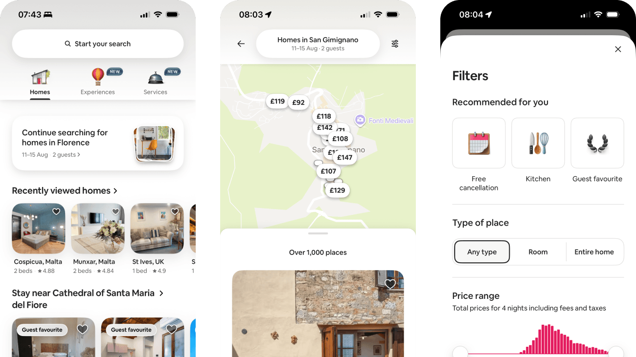
- Homes, Experiences and Services are separate top-level routes while search remains available.
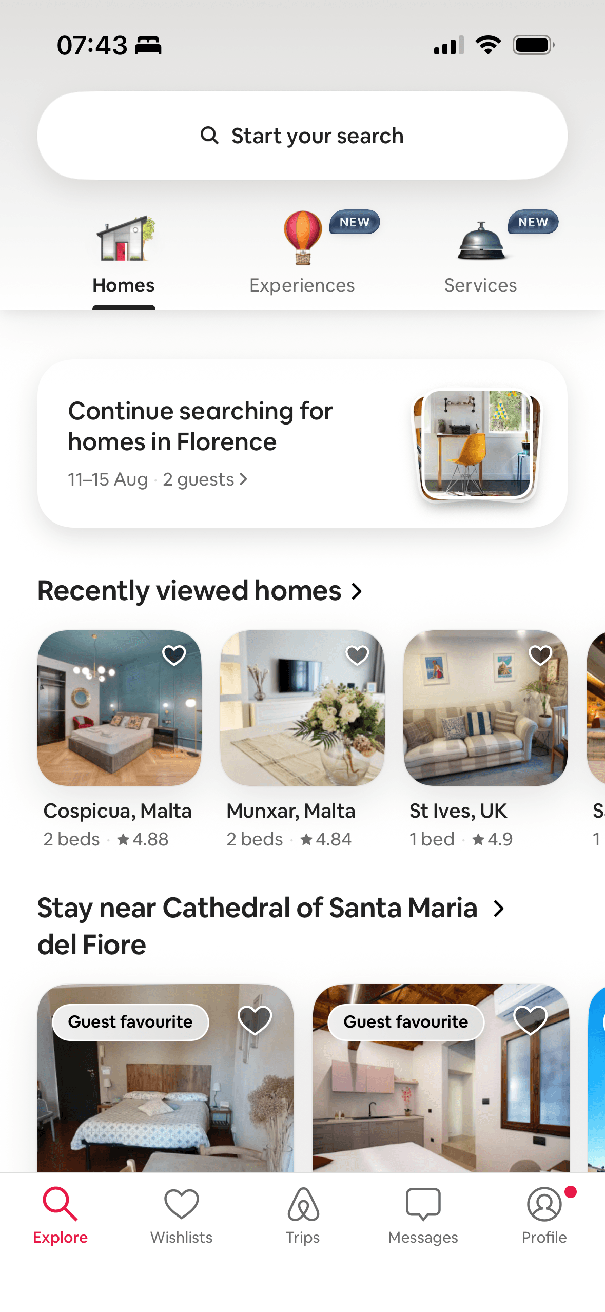
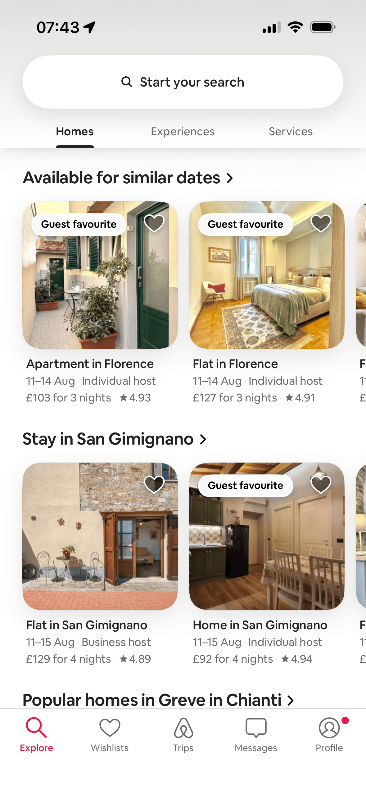
- The home feed preserves destination, dates and guest count and separates recent views, similar dates, nearby areas and popularity-based rows.
- Map and list views keep destination, dates, guest count, filter access and total-price information available.
- Home filters group recommended options, place type, total price, rooms, amenities, booking options, standout stays, property type, accessibility and host language.
What could improve
What deserves closer review.
- Continue searching, recently viewed and recommended filters do not explain the activity used, how long it is retained or how to clear or change personalisation.
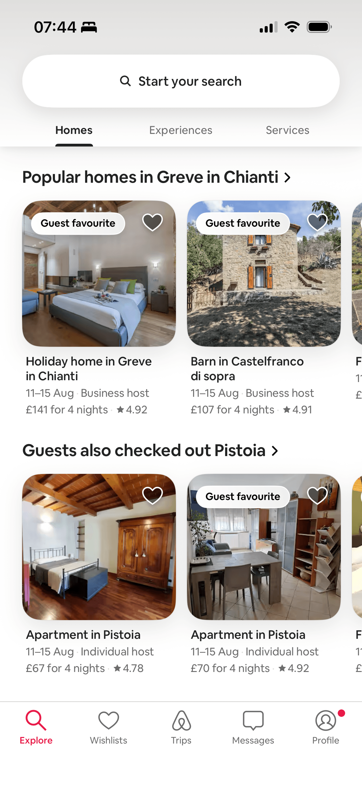
- Popular, Guest favourite, Original and Luxe labels do not provide their criteria, time window, review threshold or reassessment process in the captured views.
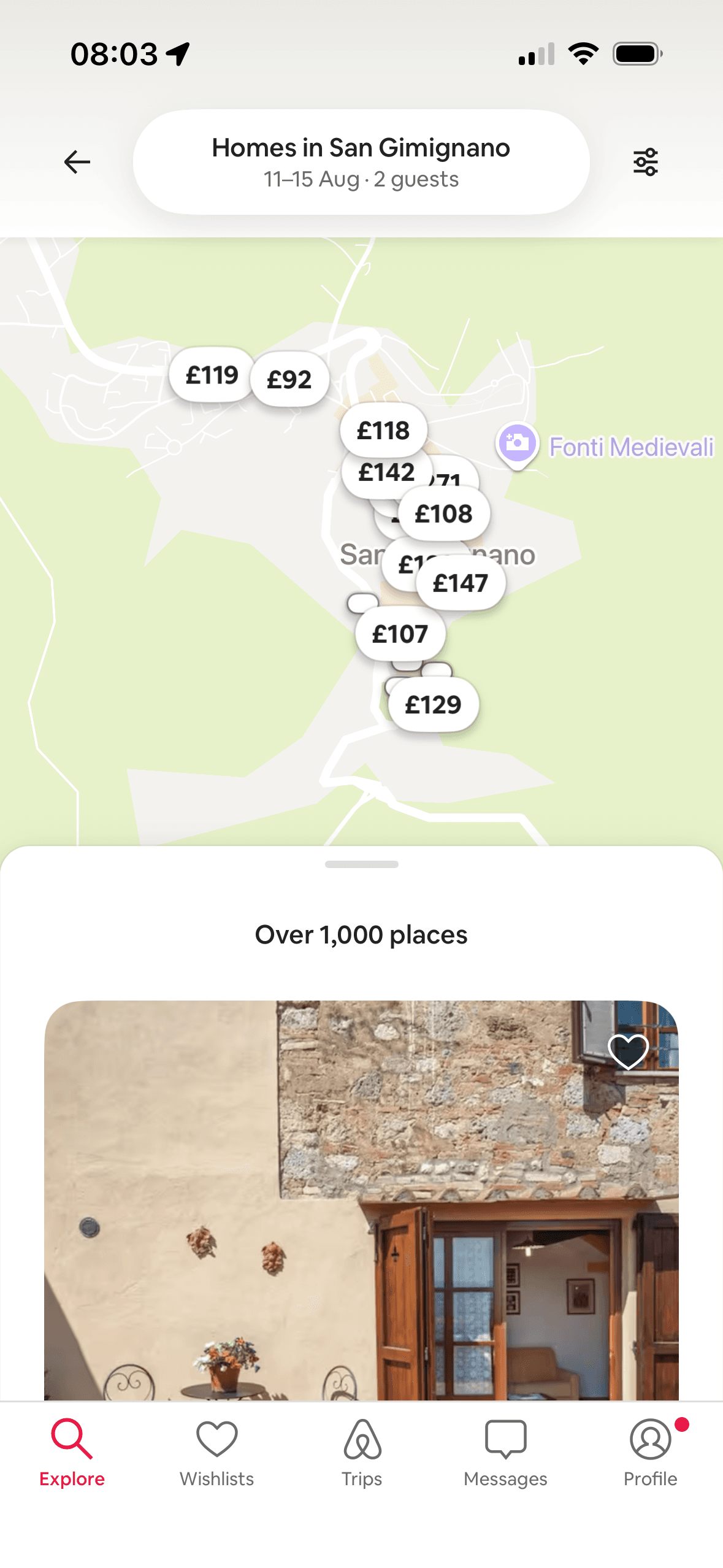
- Map price markers overlap heavily and the initial result says “Over 1,000 places”, making geographic and price comparison difficult at that zoom level.
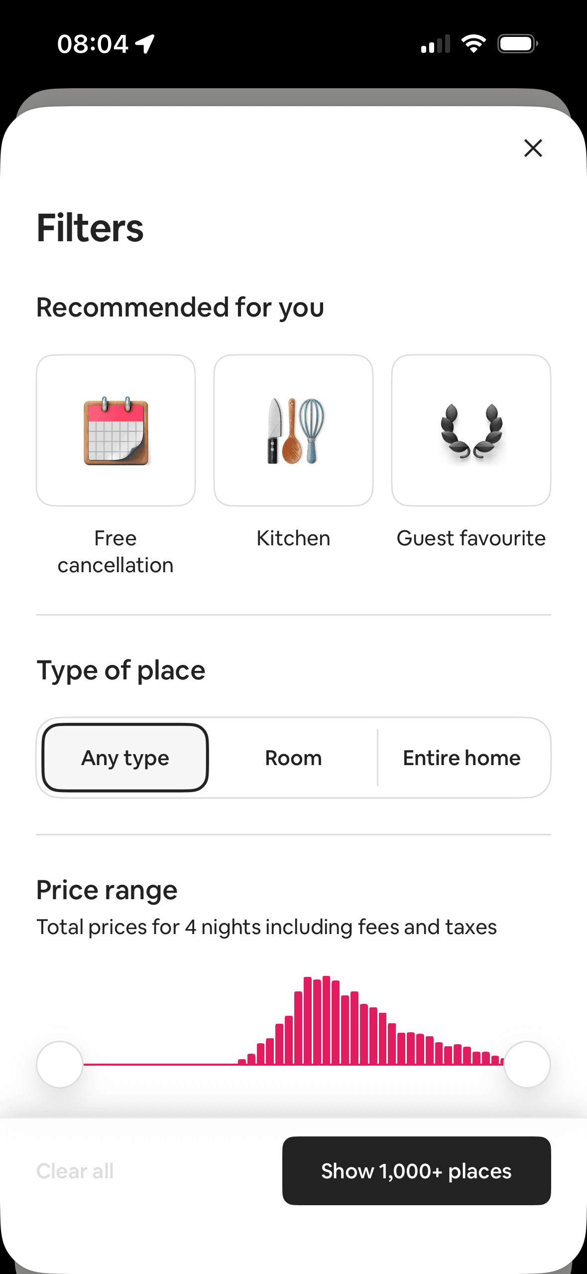
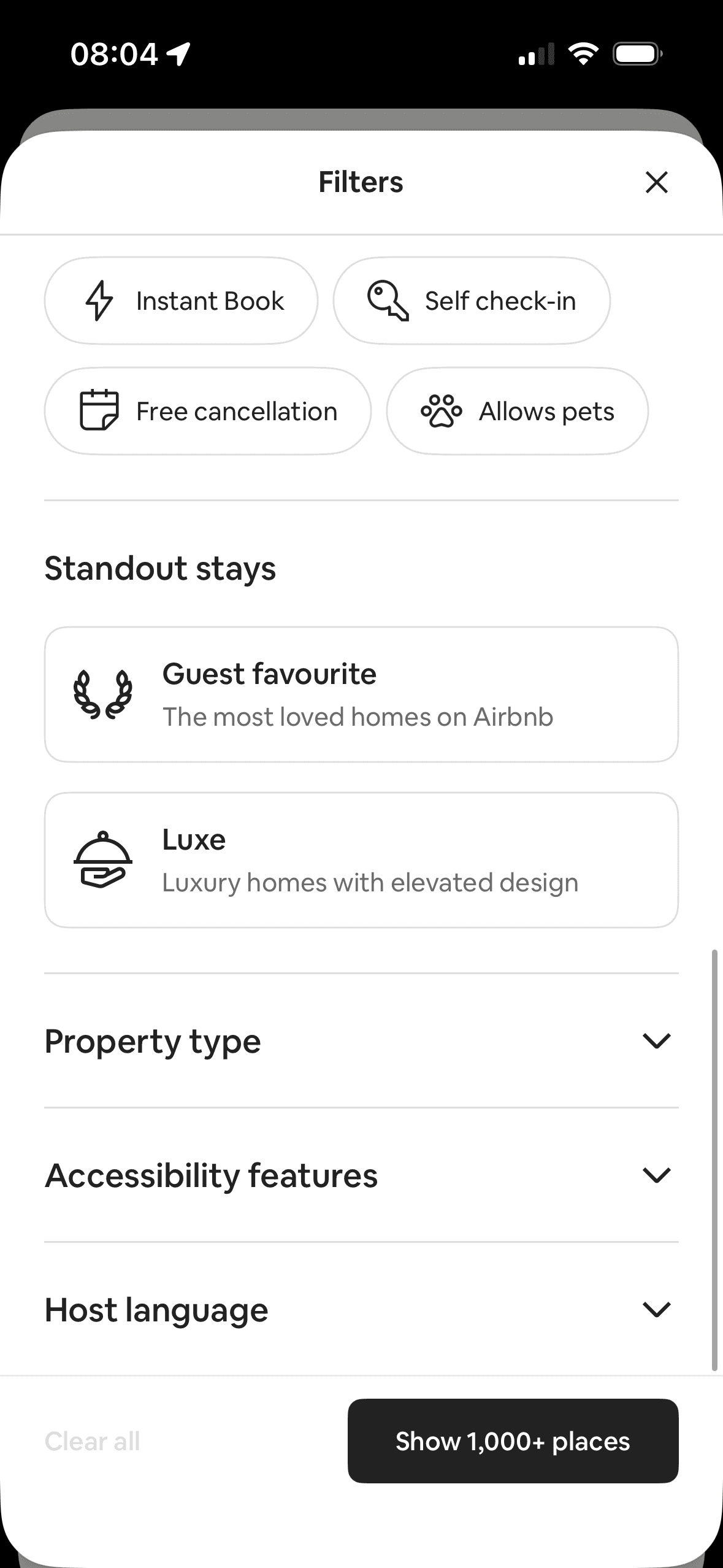
- The home filter sheet is long and mixes recommendations, commercial labels and practical requirements; Clear all is disabled before selection and selected-filter review is not shown.
Screen-by-screen breakdown
Follow the journey.
Each observation shows what works or what could improve, on this screen or across the wider flow. The opportunity turns one or two principles into a testable hypothesis.
Screen 01
Homes overview
The content is divided into labelled rows or sections, which makes a long feed easier to scan by purpose or source.
Ordering and naming the rows shapes which path is easiest to take. The screen does not always explain why an item appears or provide nearby controls to correct the recommendation.
Artwork, thumbnails and familiar titles support rapid recognition while browsing. They help identify content, but do not demonstrate relevance or quality by themselves.
Show 1 more principleShow fewer principles
Several dense rows compete for attention at once. Stronger task-based grouping and fewer simultaneous promotional labels would make the next choice easier to parse.
If Airbnb were to keep the destination, dates and guests in Continue searching and distinguish that saved task from Recently viewed, then people should make a more informed data choice because purpose, optionality and future use are clear before agreement. This would apply Chunking and Choice Architecture.
Screen 02
Similar dates and areas
The content is divided into labelled rows or sections, which makes a long feed easier to scan by purpose or source.
Airbnb separates alternatives into rows for similar dates, another area and popular homes. This is an observable choice structure; the screenshot does not show that it reduces effort or improves selection.
Artwork, thumbnails and familiar titles support rapid recognition while browsing. They help identify content, but do not demonstrate relevance or quality by themselves.
Show 1 more principleShow fewer principles
“Available for similar dates” frames a row as an alternative to the preserved Florence search. The screenshot does not explain how similar the dates are or show that the wording feels personally relevant.
If Airbnb were to keep similar-date and nearby-area alternatives in separate, descriptive rows, then people should compare the offer more accurately because price, eligibility and future cost are shown on the same basis. This would apply Choice Architecture and Framing Effect.
Screen 03
Popular and related homes
The content is divided into labelled rows or sections, which makes a long feed easier to scan by purpose or source.
Artwork, thumbnails and familiar titles support rapid recognition while browsing. They help identify content, but do not demonstrate relevance or quality by themselves.
Ordering and naming the rows shapes which path is easiest to take. The screen does not always explain why an item appears or provide nearby controls to correct the recommendation.
Show 1 more principleShow fewer principles
Airbnb uses “Popular homes”, Guest favourite, star averages and “Guests also checked out” as signals of other travellers’ choices and evaluations. The screenshot does not define the labels or show that popularity predicts suitability.
If Airbnb were to define Popular homes, Guest favourite and Guests also checked out, including geography, time window, review volume and eligibility, then people should compare the offer more accurately because price, eligibility and future cost are shown on the same basis. This would apply Chunking and Social Proof.
Screen 04
Map and listings
Price markers and the selected listing create a clear visual relationship between place and option. The selected state should remain visible without relying on colour alone.
The content is divided into labelled rows or sections, which makes a long feed easier to scan by purpose or source.
Ordering and naming the rows shapes which path is easiest to take. The screen does not always explain why an item appears or provide nearby controls to correct the recommendation.
Show 1 more principleShow fewer principles
The map shows multiple visible price markers before a listing card is opened. These prices can provide a comparison range; which markers people see first and whether they change later judgement require behavioural evidence.
If Airbnb were to provide clear map-only and list-only modes, reduce overlapping price markers and state whether map prices are nightly or total, then people should compare the offer more accurately because price, eligibility and future cost are shown on the same basis. This would apply Salience Effect and Anchoring Bias.
Screen 05
Full homes list
Several dense rows compete for attention at once. Stronger task-based grouping and fewer simultaneous promotional labels would make the next choice easier to parse.
The content is divided into labelled rows or sections, which makes a long feed easier to scan by purpose or source.
Artwork, thumbnails and familiar titles support rapid recognition while browsing. They help identify content, but do not demonstrate relevance or quality by themselves.
Show 1 more principleShow fewer principles
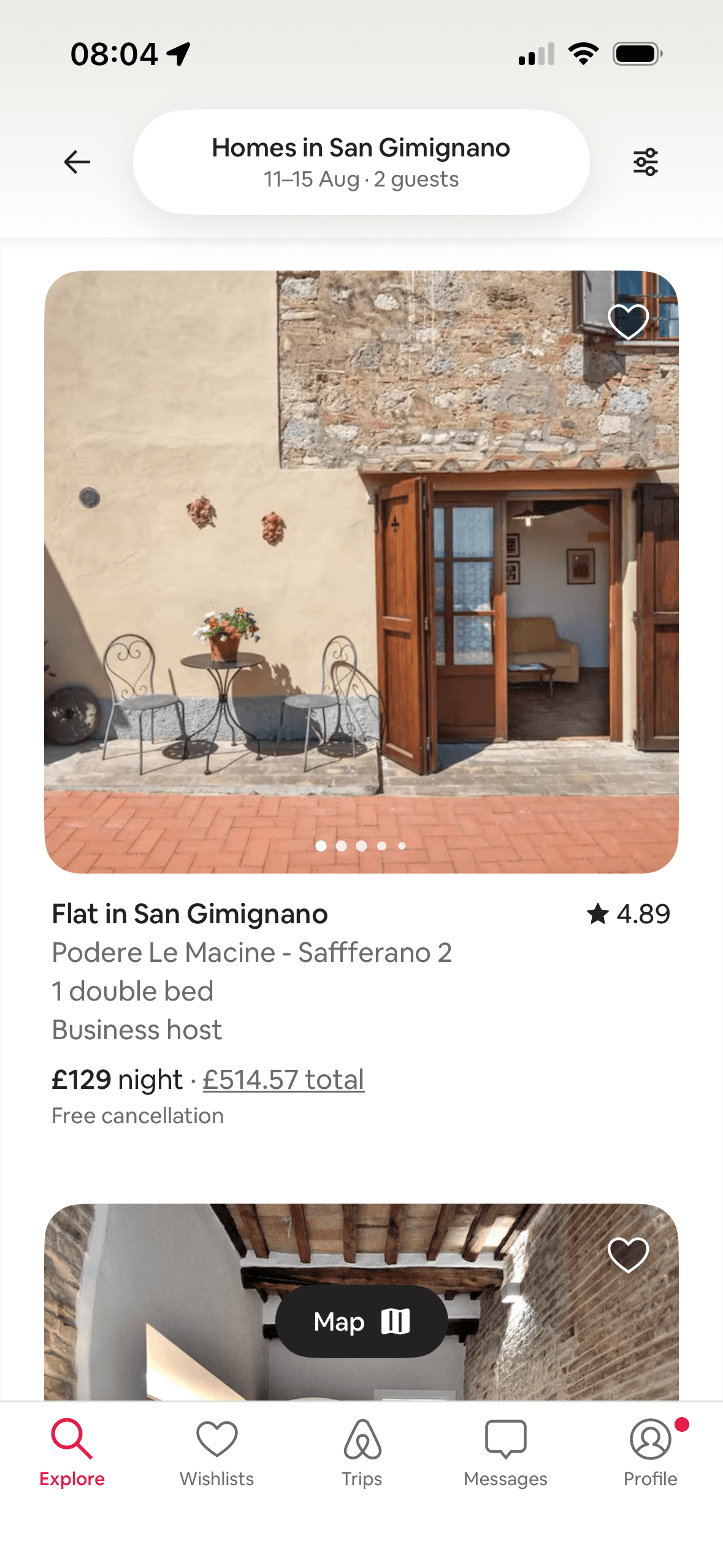
The full list uses a repeated card structure for image, title, location, bed, host type, rating, nightly price, total price and cancellation. This supports direct comparison by design; the screenshot does not measure scanning speed or choice quality.
If Airbnb were to keep a consistent card structure for image, location, host type, rating, nightly price, total price and cancellation terms, then people should compare the offer more accurately because price, eligibility and future cost are shown on the same basis. This would apply Choice Architecture and Cognitive Load.
Screen 06
Main home filters
The number, order or overlap of options can still make comparison demanding. Search, grouping, a clear reset and an explanation of what changes would reduce avoidable cognitive load.
The content is divided into labelled rows or sections, which makes a long feed easier to scan by purpose or source.
Artwork, thumbnails and familiar titles support rapid recognition while browsing. They help identify content, but do not demonstrate relevance or quality by themselves.
Show 1 more principleShow fewer principles
The filter sheet groups recommended options, place type and total price before later rooms, amenities and booking controls. This is an observable choice structure; the screenshot does not show that the grouping reduces overload.
If Airbnb were to explain why Free cancellation, Kitchen and Guest favourite are recommended and keep them separate from neutral place and price controls, then people should compare the offer more accurately because price, eligibility and future cost are shown on the same basis. This would apply Choice Architecture and Cognitive Load.
Screen 07
Rooms and amenities
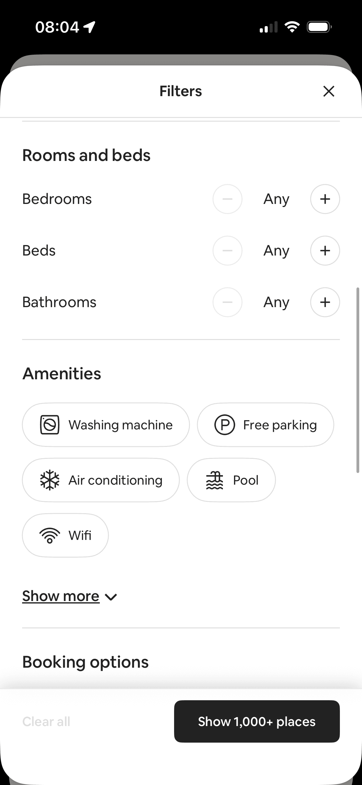
The screen turns the filters, selected states and result controls into explicit options rather than asking people to recall a hidden command or category.
The number, order or overlap of options can still make comparison demanding. Search, grouping, a clear reset and an explanation of what changes would reduce avoidable cognitive load.
The content is divided into labelled rows or sections, which makes a long feed easier to scan by purpose or source.
Show 1 more principleShow fewer principles
Artwork, thumbnails and familiar titles support rapid recognition while browsing. They help identify content, but do not demonstrate relevance or quality by themselves.
If Airbnb were to keep rooms, beds and bathrooms as labelled steppers and amenities as text-plus-icon controls, then people should narrow the available options with less effort because the source, type and effect of each control are explicit. This would apply Choice Architecture and Cognitive Load.
Screen 08
More home filters
The screen turns the filters, selected states and result controls into explicit options rather than asking people to recall a hidden command or category.
The content is divided into labelled rows or sections, which makes a long feed easier to scan by purpose or source.
Artwork, thumbnails and familiar titles support rapid recognition while browsing. They help identify content, but do not demonstrate relevance or quality by themselves.
Show 1 more principleShow fewer principles
The Guest favourite filter is described as “The most loved homes on Airbnb”. This frames the category around aggregated approval; the screenshot does not define eligibility or establish quality for a particular trip.
If Airbnb were to explain Guest favourite and Luxe eligibility and link to their criteria, then people should understand the next decision more clearly because its purpose and consequences are visible before they act. This would apply Choice Architecture and Framing Effect.
Screen 09
Experiences intro modal
The introductory message prepares people for the kind of task or benefit that follows. It is a flow-level cue because its effect depends on whether the next screens match that expectation.
The flow introduces one idea before moving to the next decision, reducing how much new information appears at once. Skip, back and reduced-motion routes determine whether that pacing stays supportive.
The arrangement of the introductory message and single next action determines which action is easiest to see and take. The screen should keep alternatives, refusal and correction proportionate to their importance.
Show 1 more principleShow fewer principles
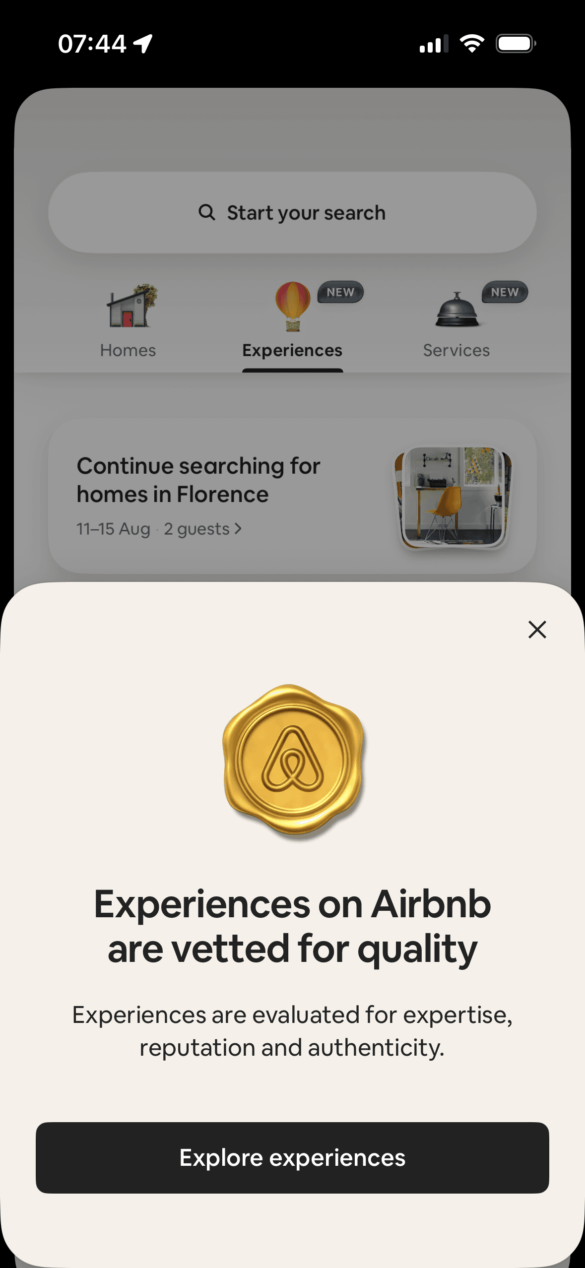
The introduction says Experiences are “vetted for quality” and evaluated for expertise, reputation and authenticity. This frames the catalogue as curated; the screenshot does not show the criteria, reviewer or effect on trust.
If Airbnb were to link “vetted for quality” to the criteria, reviewer, reassessment process and complaint route, then people should understand the next decision more clearly because its purpose and consequences are visible before they act. This would apply Priming and Framing Effect.
Screen 10
Florence experiences
The content is divided into labelled rows or sections, which makes a long feed easier to scan by purpose or source.
Artwork, thumbnails and familiar titles support rapid recognition while browsing. They help identify content, but do not demonstrate relevance or quality by themselves.
Ordering and naming the rows shapes which path is easiest to take. The screen does not always explain why an item appears or provide nearby controls to correct the recommendation.
Show 1 more principleShow fewer principles
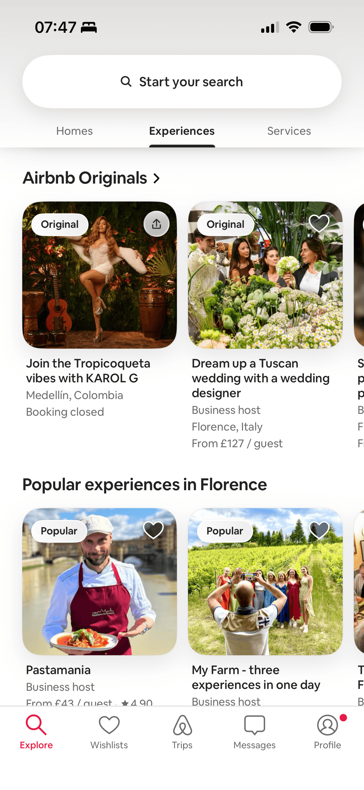
Airbnb labels a section “Popular experiences in Florence” and adds Popular badges. This uses aggregate demand as discovery information; the screenshot does not define popularity, geography or time window.
If Airbnb were to explain Original, Popular and Booking closed separately, then people should understand the next decision more clearly because its purpose and consequences are visible before they act. This would apply Chunking and Social Proof.
Screen 11
Experiences near you
The content is divided into labelled rows or sections, which makes a long feed easier to scan by purpose or source.
Artwork, thumbnails and familiar titles support rapid recognition while browsing. They help identify content, but do not demonstrate relevance or quality by themselves.
Ordering and naming the rows shapes which path is easiest to take. The screen does not always explain why an item appears or provide nearby controls to correct the recommendation.
Show 1 more principleShow fewer principles
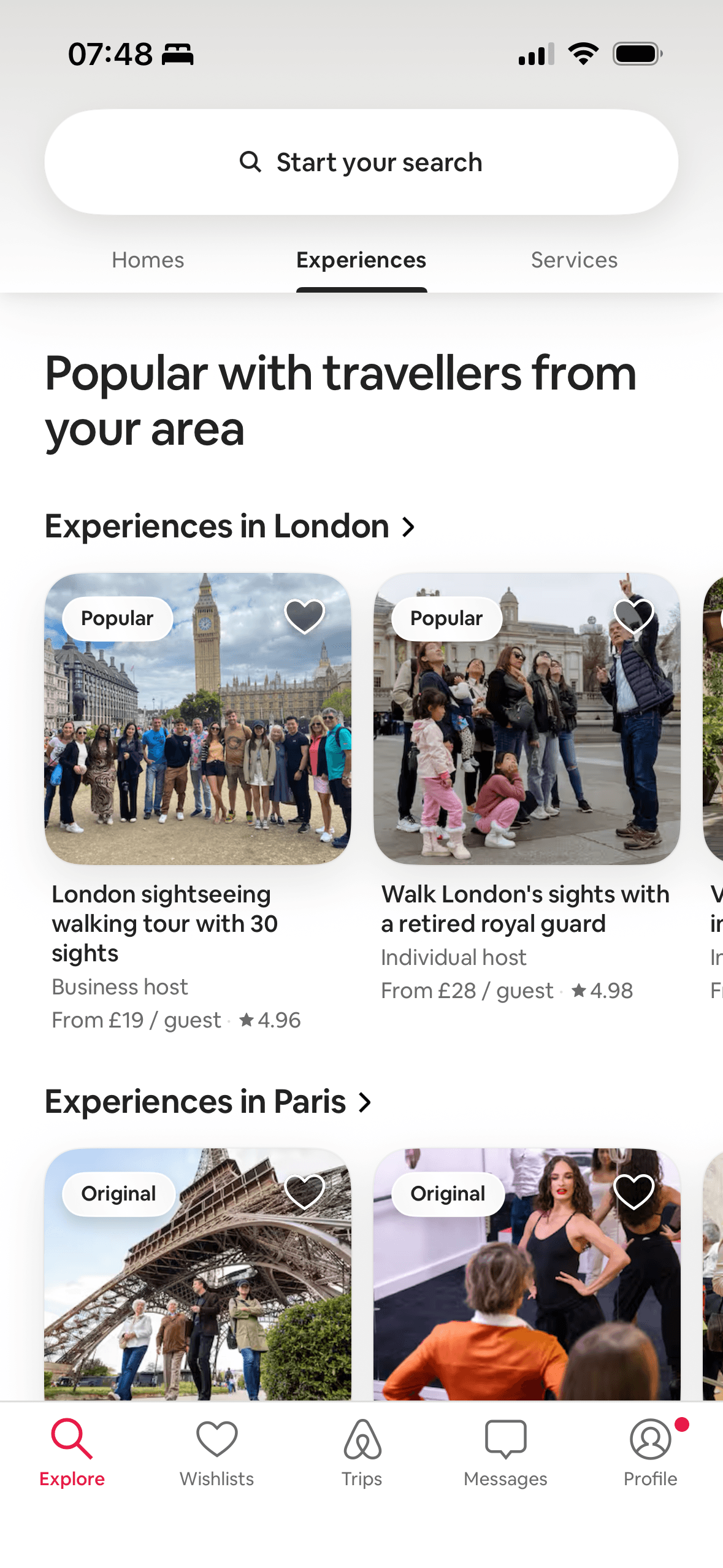
Airbnb presents “Popular with travellers from your area” and Popular badges alongside ratings. The reference group is visible, but the screenshot does not define “your area”, the time window or the number of travellers.
If Airbnb were to state what “your area” means and how it was inferred, and offer a location control, then people should compare the offer more accurately because price, eligibility and future cost are shown on the same basis. This would apply Chunking and Social Proof.
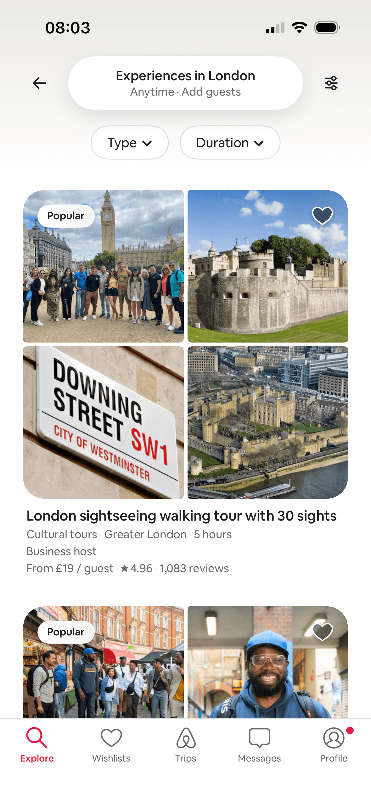
Screen 12
London experiences
The content is divided into labelled rows or sections, which makes a long feed easier to scan by purpose or source.
Artwork, thumbnails and familiar titles support rapid recognition while browsing. They help identify content, but do not demonstrate relevance or quality by themselves.
Ordering and naming the rows shapes which path is easiest to take. The screen does not always explain why an item appears or provide nearby controls to correct the recommendation.
Show 1 more principleShow fewer principles
The London list combines a Popular badge with a 4.96 star average and 1,083 reviews. The review count gives scale to the average, but popularity and past satisfaction do not guarantee fit, accessibility or current quality.
If Airbnb were to keep type and duration filters visible and pair every rating with its review count, then people should compare the offer more accurately because price, eligibility and future cost are shown on the same basis. This would apply Chunking and Social Proof.
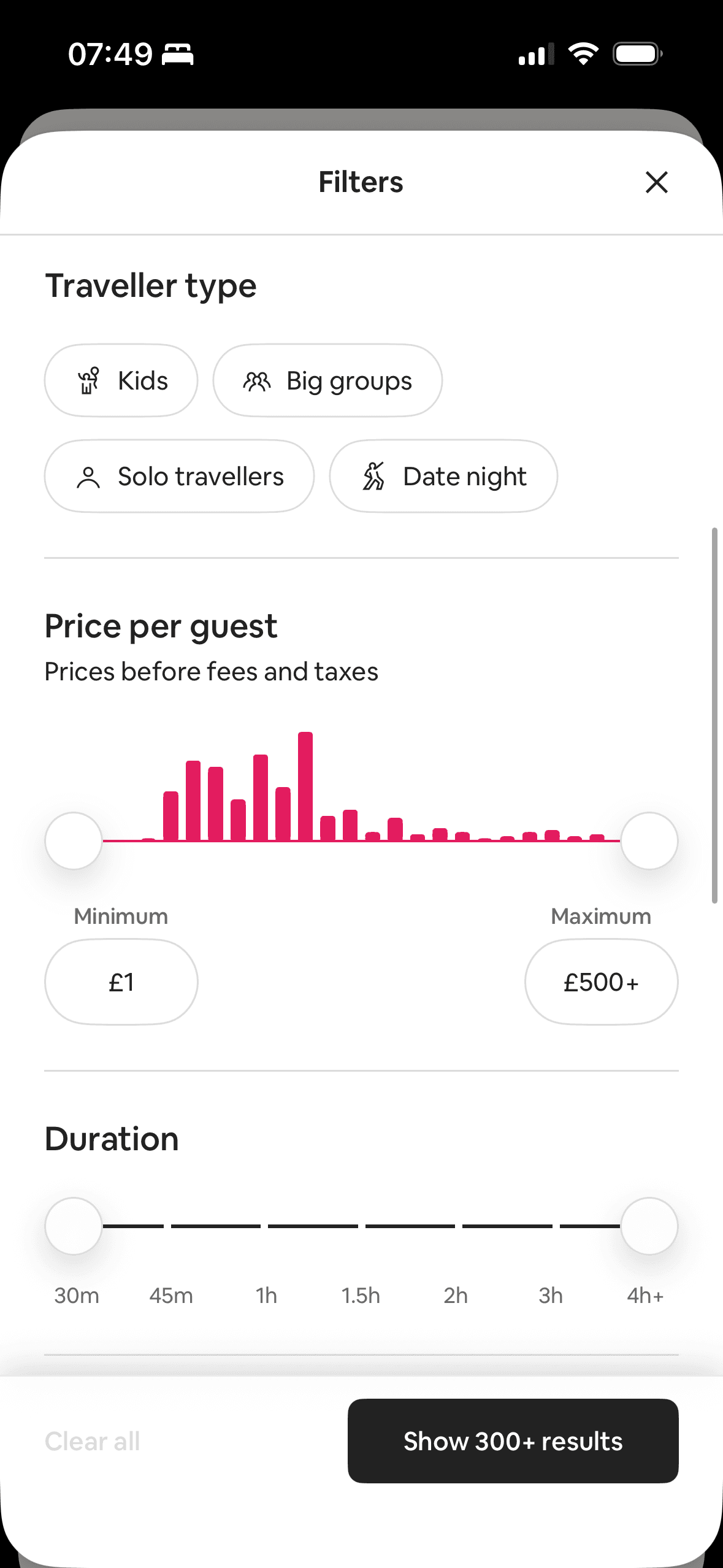
Screen 13
Experience price and duration
The offer foregrounds benefits or savings while renewal, eligibility or refusal receives less emphasis. That framing makes the attractive interpretation easier to process than the full commercial decision.
Labels, rows or chips group the offer, price and refusal route into recognisable units, helping people scan a larger set without reading it as one block.
The first price, percentage, crossed-out amount or weekly equivalent can become the comparison anchor. Total cost and renewal terms need equal visibility so the reference point is not misleading.
Show 1 more principleShow fewer principles
The experience filter separates traveller type, price per guest and duration, with labelled presets and ranges. This is an observable choice structure; the screenshot does not show easier comparison or fewer abandoned searches.
If Airbnb were to keep traveller type, price and duration as separate controls, but use consistent total-price language across Airbnb, then people should compare the offer more accurately because price, eligibility and future cost are shown on the same basis. This would apply Choice Architecture and Framing Effect.
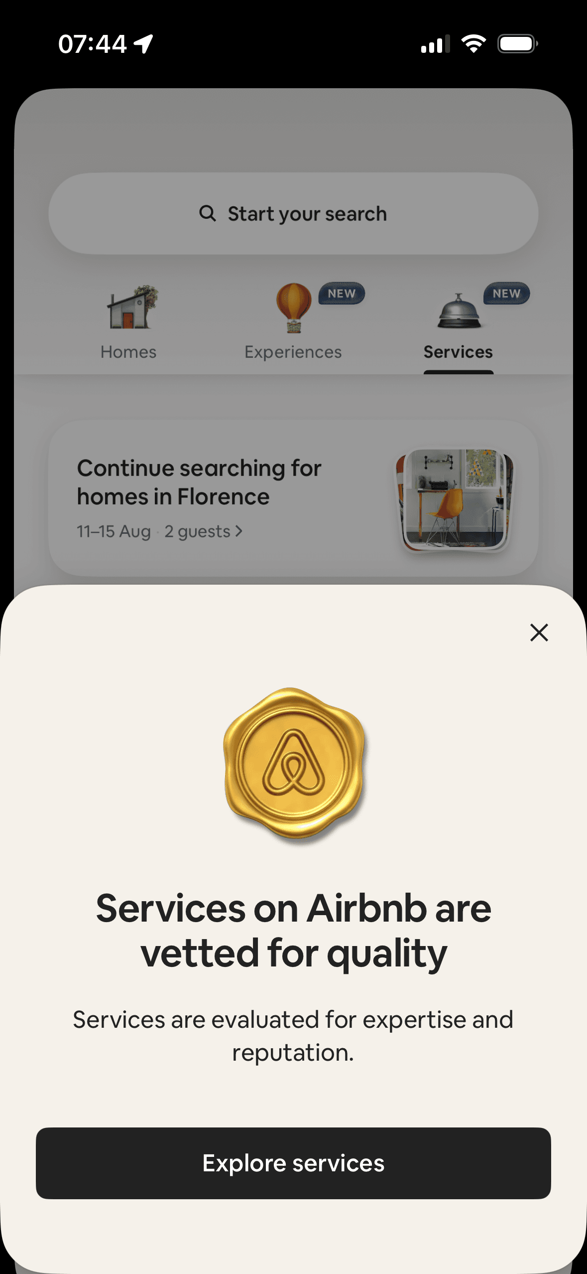
Screen 14
Services intro modal
The introductory message prepares people for the kind of task or benefit that follows. It is a flow-level cue because its effect depends on whether the next screens match that expectation.
The flow introduces one idea before moving to the next decision, reducing how much new information appears at once. Skip, back and reduced-motion routes determine whether that pacing stays supportive.
The opening language defines how the journey should be interpreted before evidence or terms appear. Aspirational wording should not overstate the outcome or conceal later effort and cost.
Show 1 more principleShow fewer principles
The Services introduction says listings are “vetted for quality” and evaluated for expertise and reputation. This is an explicit expertise signal; the screenshot does not provide criteria or show that it creates justified trust.
If Airbnb were to link “vetted for quality” to the evaluation criteria, reviewer, reassessment and complaint process, then people should narrow the available options with less effort because the source, type and effect of each control are explicit. This would apply Priming and Authority Bias.
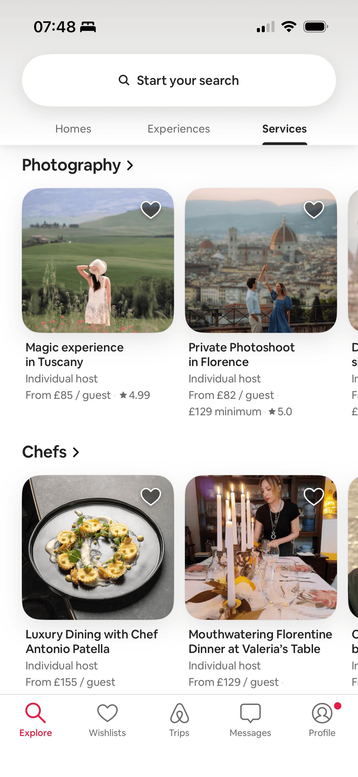
Screen 15
Services browse
The content is divided into labelled rows or sections, which makes a long feed easier to scan by purpose or source.
Artwork, thumbnails and familiar titles support rapid recognition while browsing. They help identify content, but do not demonstrate relevance or quality by themselves.
Ordering and naming the rows shapes which path is easiest to take. The screen does not always explain why an item appears or provide nearby controls to correct the recommendation.
Show 1 more principleShow fewer principles
Service cards show star averages beside category, host type and price. These summarise previous evaluations, but without visible review counts the evidence behind a 5.0 average is unclear and suitability remains unverified.
If Airbnb were to add short category descriptions and explain whether price is per guest, per hour or per service, then people should compare the offer more accurately because price, eligibility and future cost are shown on the same basis. This would apply Chunking and Social Proof.
Conclusion
What this journey teaches us.
Airbnb’s strongest pattern is giving people several coherent routes through a large catalogue. Maps, lists, filters and distinct product areas support different stages of the same trip.
The next improvement is explanation. Recommendation sources, popularity labels, quality criteria and total-price rules should be visible where they influence the choice, not left for people to infer.
Keep exploring