
Keep paid and organic search distinct
I followed YouTube from the home feed into search history, voice input, suggestions, sponsored results and detailed filters. The journey offers useful shortcuts, but it does not always explain where a suggestion came from or which choices are currently shaping the results.
The most important distinction is between finding something and being shown something paid for. Search tools should keep commercial placement, history and ranking inputs understandable without making people inspect every result closely.
- Captured
- Capture date not recorded
- Published
- Last updated
- 8
- Screens
- 22
- Ingredients
- 32
- Applications
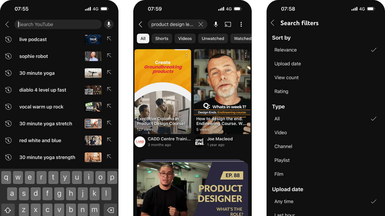

Common contexts
Business goals
What works
What the captured flow does well.
- Search is available in the home header and remains visible through results.
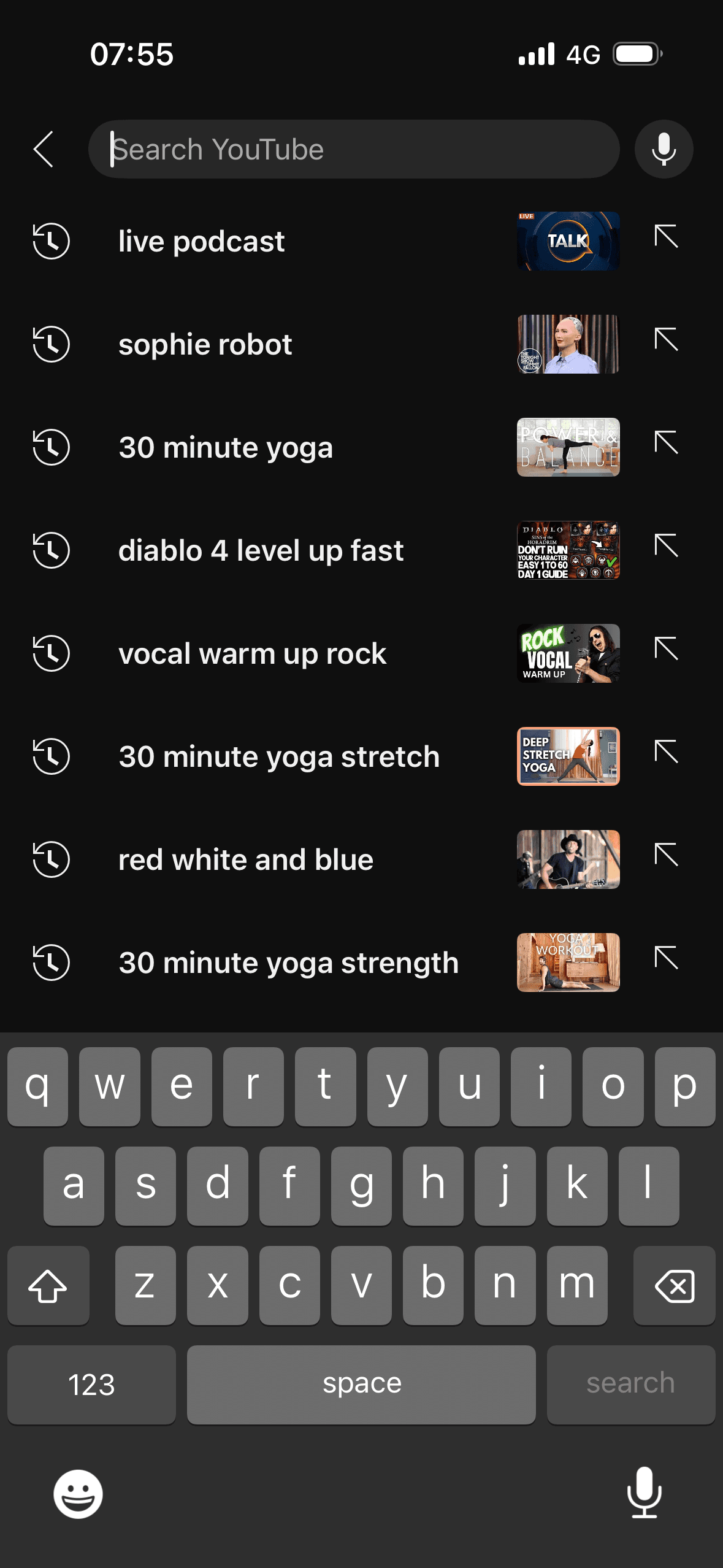
- The search landing page shows recent query text, a history symbol, thumbnails and a control for reusing each query.
- Voice search says “Speak now”, presents a distinct listening state and provides a close control.
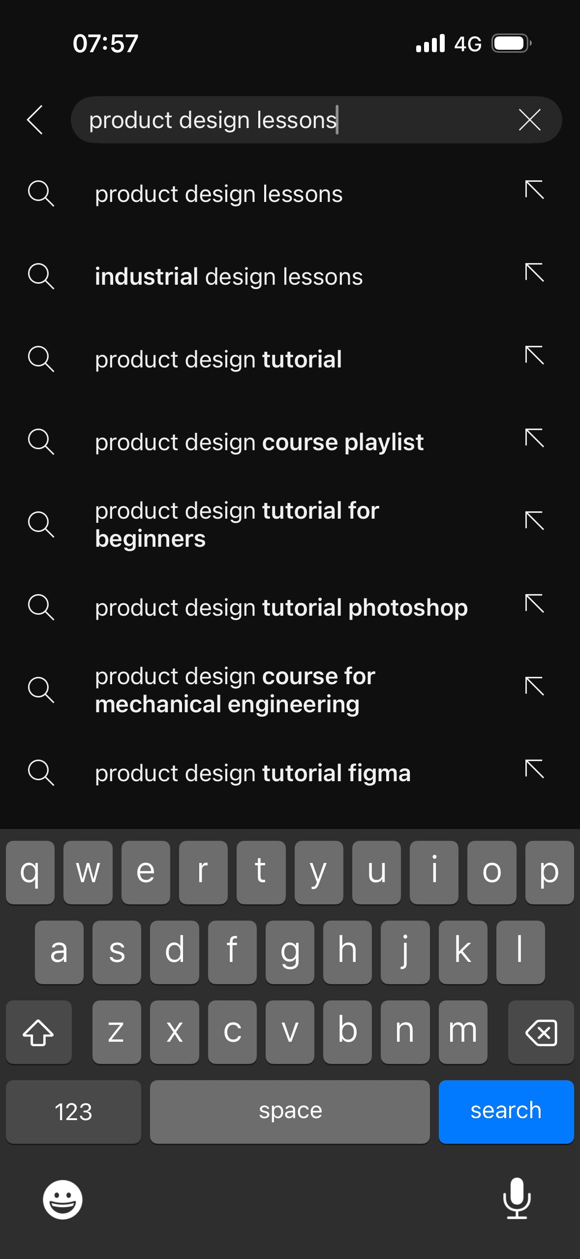
- Query suggestions preserve the entered words and visually distinguish proposed additions.
What could improve
What deserves closer review.
- The arrow beside each recent query is not explained in the screenshot, and no delete or clear-history control is visible.
- The voice screen does not show what audio is processed, how to stop recording, or the recovery state for silence, permission denial or a recognition error.
- Suggestions do not say whether they come from the typed text, personal history, general popularity or another ranking input.
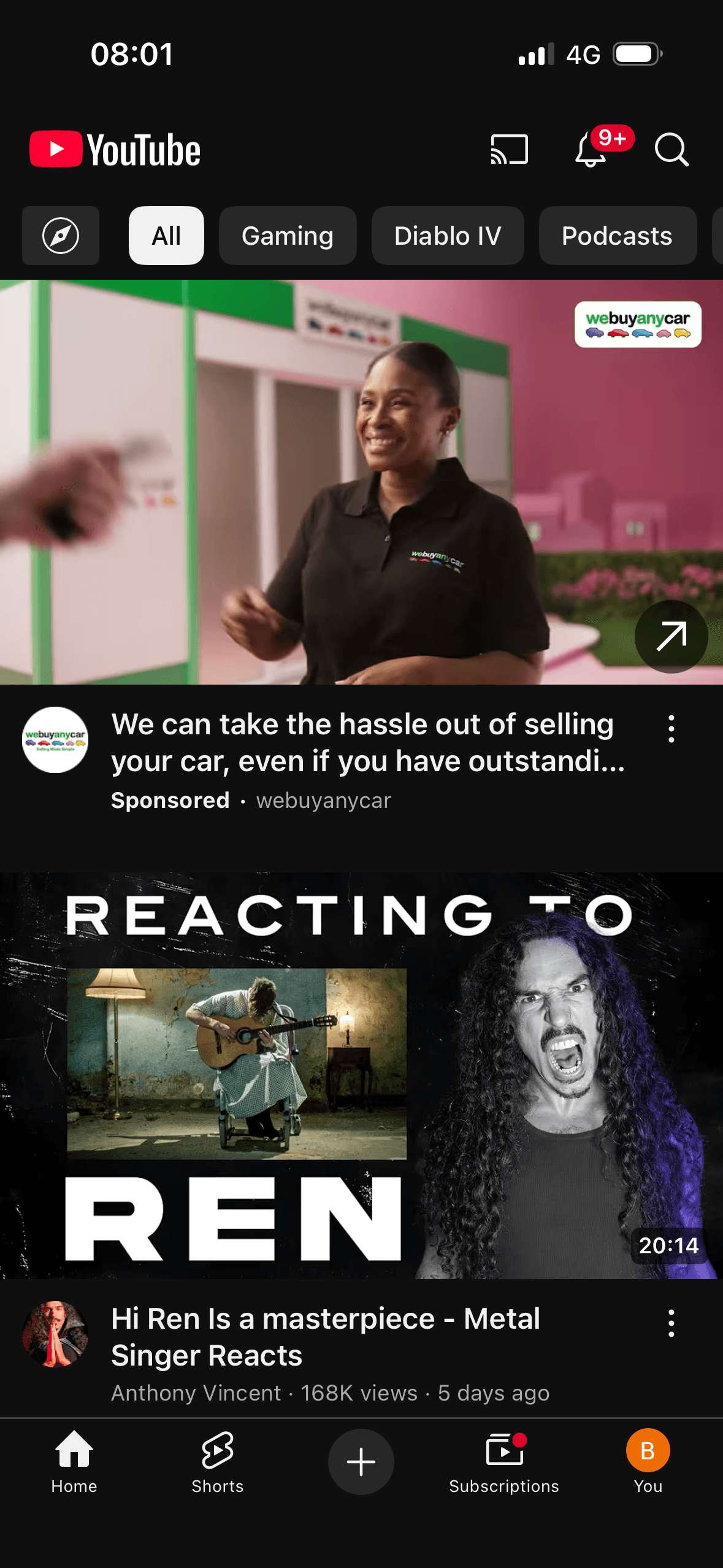
- The sponsored result occupies the first visible result area and resembles the surrounding content stream; the screen does not explain why that advertisement was shown.
Screen-by-screen breakdown
Follow the journey.
Each observation shows what works or what could improve, on this screen or across the wider flow. The opportunity turns one or two principles into a testable hypothesis.
Screen 01
YouTube home
The content is divided into labelled rows or sections, which makes a long feed easier to scan by purpose or source.
Ordering and naming the rows shapes which path is easiest to take. The screen does not always explain why an item appears or provide nearby controls to correct the recommendation.
Artwork, thumbnails and familiar titles support rapid recognition while browsing. They help identify content, but do not demonstrate relevance or quality by themselves.
Show 1 more principleShow fewer principles
Several dense rows compete for attention at once. Stronger task-based grouping and fewer simultaneous promotional labels would make the next choice easier to parse.
If YouTube were to keep search in a predictable header position with an accessible name and adequate target size, then people should narrow the available options with less effort because the source, type and effect of each control are explicit. This would apply Chunking and Choice Architecture.
Screen 02
Search landing
The screen turns the query, suggestions and result controls into explicit options rather than asking people to recall a hidden command or category.
The number, order or overlap of options can still make comparison demanding. Search, grouping, a clear reset and an explanation of what changes would reduce avoidable cognitive load.
Labels, rows or chips group the query, suggestions and result controls into recognisable units, helping people scan a larger set without reading it as one block.
Show 1 more principleShow fewer principles
Names, icons, artwork or previous queries let people recognise a likely option instead of reconstructing it from memory. The cue still needs a text label and clear source.
If YouTube were to give the reuse arrow an accessible label, make individual deletion and clear-history controls easy to find and explain whether thumbnails represent the previous result, then people should narrow the available options with less effort because the source, type and effect of each control are explicit. This would apply Choice Architecture and Cognitive Load.

Screen 03
Voice search interface
The number, order or overlap of options can still make comparison demanding. Search, grouping, a clear reset and an explanation of what changes would reduce avoidable cognitive load.
The voice-search overlay says “Speak now”, presents a listening state and provides a close control. This communicates system status while input is expected; the static screenshot cannot verify animation, recognition accuracy or error recovery.
The screen turns the query, suggestions and result controls into explicit options rather than asking people to recall a hidden command or category.
Show 1 more principleShow fewer principles
Labels, rows or chips group the query, suggestions and result controls into recognisable units, helping people scan a larger set without reading it as one block.
If YouTube were to announce when listening starts and stops, explain microphone use at the permission point and provide clear states for silence, no match, permission denial and retry, then people should recover from interruption with less effort because progress, failure and the next available action remain clear. This would apply Feedback Loop and Cognitive Load.
Screen 04
Search suggestions
The screen turns the query, suggestions and result controls into explicit options rather than asking people to recall a hidden command or category.
The number, order or overlap of options can still make comparison demanding. Search, grouping, a clear reset and an explanation of what changes would reduce avoidable cognitive load.
Labels, rows or chips group the query, suggestions and result controls into recognisable units, helping people scan a larger set without reading it as one block.
Show 1 more principleShow fewer principles
Names, icons, artwork or previous queries let people recognise a likely option instead of reconstructing it from memory. The cue still needs a text label and clear source.
If YouTube were to distinguish typed text from the proposed completion and make insertion controls understandable to screen readers, then people should understand the next decision more clearly because its purpose and consequences are visible before they act. This would apply Choice Architecture and Cognitive Load.

Screen 05
Search results with sponsored result
The screen turns the query, suggestions and result controls into explicit options rather than asking people to recall a hidden command or category.
Paid placement occupies a highly visible result position. The Sponsored label needs enough prominence and attachment to the card for people to distinguish advertising at a glance.
Labels, rows or chips group the query, suggestions and result controls into recognisable units, helping people scan a larger set without reading it as one block.
Show 1 more principleShow fewer principles
The advertisement is presented within the same result stream as organic content. Clear advertiser and “Why this ad?” information would make the commercial frame explicit.
If YouTube were to keep the Sponsored label visually and programmatically attached to the advertisement, identify the advertiser and provide a “Why this ad?” route, then people should make a more informed data choice because purpose, optionality and future use are clear before agreement. This would apply Choice Architecture and Salience Effect.
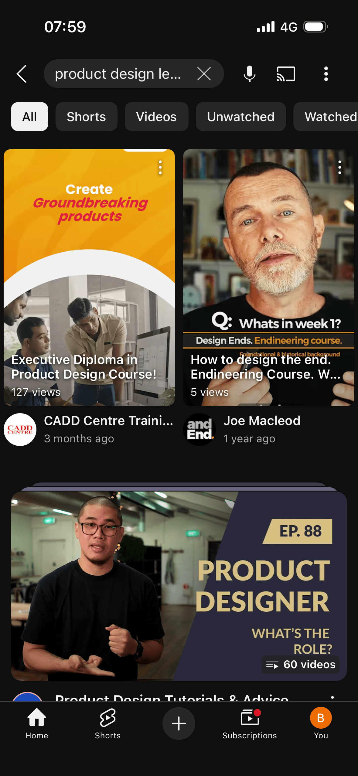
Screen 06
Search results with format shortcuts
The screen turns the query, suggestions and result controls into explicit options rather than asking people to recall a hidden command or category.
The number, order or overlap of options can still make comparison demanding. Search, grouping, a clear reset and an explanation of what changes would reduce avoidable cognitive load.
Labels, rows or chips group the query, suggestions and result controls into recognisable units, helping people scan a larger set without reading it as one block.
Show 1 more principleShow fewer principles
Names, icons, artwork or previous queries let people recognise a likely option instead of reconstructing it from memory. The cue still needs a text label and clear source.
If YouTube were to keep the selected format chip clear, preserve access to the full filter set and make horizontally hidden choices discoverable, then people should narrow the available options with less effort because the source, type and effect of each control are explicit. This would apply Choice Architecture and Cognitive Load.
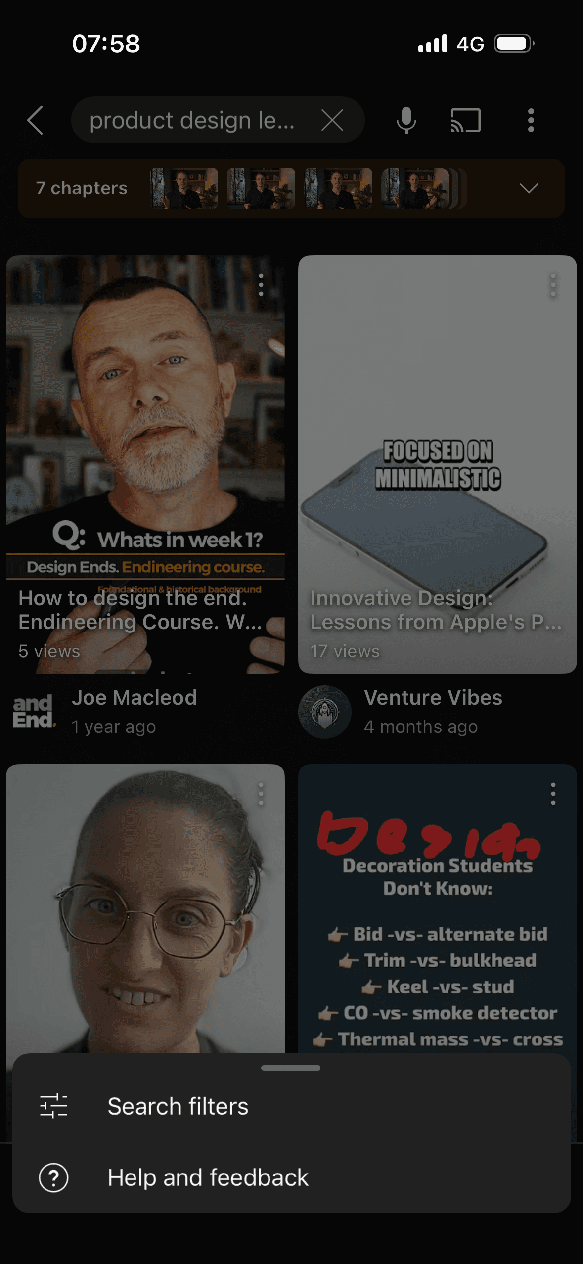
Screen 07
Search options menu
The overflow menu reveals Search filters and Help and feedback without keeping those secondary routes in the results header. This is an observable use of progressive disclosure; the screenshot does not show whether people discover the menu.
The number, order or overlap of options can still make comparison demanding. Search, grouping, a clear reset and an explanation of what changes would reduce avoidable cognitive load.
The screen turns the query, suggestions and result controls into explicit options rather than asking people to recall a hidden command or category.
Show 1 more principleShow fewer principles
Labels, rows or chips group the query, suggestions and result controls into recognisable units, helping people scan a larger set without reading it as one block.
If YouTube were to use descriptive option labels, move keyboard or screen-reader focus into the menu, keep a reliable close route and return focus to the trigger, then people should narrow the available options with less effort because the source, type and effect of each control are explicit. This would apply Progressive Disclosure and Cognitive Load.
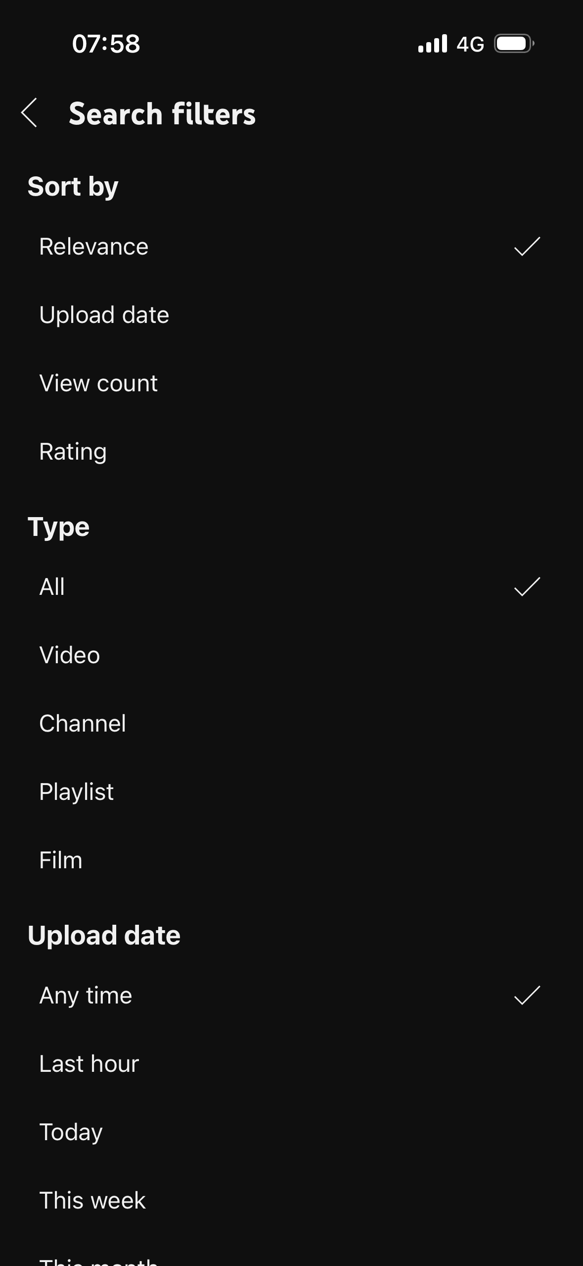
Screen 08
Search filters
The screen turns the filters, selected states and result controls into explicit options rather than asking people to recall a hidden command or category.
Relevance, All and Any time are visibly preselected and will define the result set unless changed. These are interface defaults; the screenshot does not show whether people keep them or whether they produce the best result for a task.
Labels, rows or chips group the filters, selected states and result controls into recognisable units, helping people scan a larger set without reading it as one block.
Show 1 more principleShow fewer principles
The number, order or overlap of options can still make comparison demanding. Search, grouping, a clear reset and an explanation of what changes would reduce avoidable cognitive load.
If YouTube were to show whether changes apply immediately, provide Reset all, summarise active filters on return to results and announce result updates, then people should narrow the available options with less effort because the source, type and effect of each control are explicit. This would apply Choice Architecture and Default Effect.
Conclusion
What this journey teaches us.
YouTube provides several ways to express and narrow a query, including voice, suggestions, format shortcuts and detailed filters. Visible listening and selected states provide useful feedback.
Search would be easier to judge with clearer history controls, suggestion sources, active-filter summaries and stronger sponsored separation. The result page should explain its structure before asking people to trust its order.
Keep exploring