
Making rewards worth the effort
I followed PayPal+ from the rewards home into tier benefits, ways to earn, a shopping streak and the reward catalogue. It is a useful example of how a familiar payments product becomes a loyalty programme with levels, points and time-bound challenges.
The mechanics are easy to spot, but the real value is harder to judge. This case study looks at how progress and rewards can motivate without hiding the spend, time or product conditions behind them.
Some screenshots use fictional personal details and activity. Private locations remain obscured where needed.
- Captured
- Capture date not recorded
- Published
- Last updated
- Product version
- PayPal iOS app 8.107.2
- Source
- View reference ↗
- 12
- Screens
- 9
- Ingredients
- 24
- Applications
Business goals
What works
What the captured flow does well.
- Points and tier progress are visible in one place.
- Ways to earn are grouped by the product involved.
- Challenge requirements are listed before activation.
- Reward cards use direct claim actions.
What could improve
What deserves closer review.
- Tier gaps are much more prominent than their practical value.
- Challenges ask for spending before showing expected value clearly.
- Countdowns and activation can add avoidable pressure.
- Urgency language appears in the reward catalogue without evidence.
Screen-by-screen breakdown
Follow the journey.
Each observation shows what works or what could improve, on this screen or across the wider flow. The opportunity turns one or two principles into a testable hypothesis.

Screen 01
Rewards overview
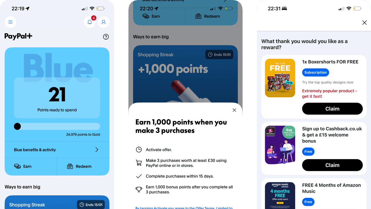
The point balance, tier colour and progress indicator provide a visible current position. The next tier gives the rewards system a concrete destination.
Ways to earn places earning opportunities beneath the progress display. That sequence can encourage spending to complete a goal without first judging the value of the reward.
If we show the value and qualifying spend behind tier progress beside the target, then people should be better able to understand the rewards balance and available benefits because the immediate benefit would be presented alongside the relevant conditions and consequences.

Screen 02
Blue tier benefits
Blue, Gold and Black tabs keep the tier options together. Each tier can be inspected without leaving the benefits view or relying on a separate explanation.
Benefit headlines emphasise access and earning, while eligibility details are quieter. Comparing tiers should include the effort and restrictions as well as the headline perks.
If we give each tier a matching summary of benefits, qualification and restrictions, then people should be better able to check the benefits of the current rewards tier because the immediate benefit would be presented alongside the relevant conditions and consequences.

Screen 03
Gold rewards benefits
The Gold view separates higher redemption value, a qualifying Friday reward and subscription cashback. Each benefit has its own heading and explanation, making the conditions available alongside the appeal.
Get £150 cashback leads the subscription section, while the explanation limits cashback to £12.50 per month. The large headline and smaller monthly cap describe different time frames, so the yearly maximum may become the main impression.
If we state the monthly cap beside the yearly maximum in the subscription cashback heading, then people should be better able to compare the benefits and conditions of Gold rewards because the prominent promise and its limit would use clear time frames together.

Personal details and activity have been replaced with fictional examples.
Screen 04
Rewards activity
Benefits and Activity are separate tabs beneath the point balance. The Activity route gives someone a place to connect earning promises with recorded progress.
A balance alone does not explain pending, excluded or expired points. Activity needs those distinctions if people are to reconcile the total with their own purchases.
If we show point status and calculation details beside each activity entry, then people should be better able to reconcile points activity with the balance because the displayed status would explain the result of the preceding action.

Screen 05
Ways to earn introduction
Four rows explain earning through Checkout, the debit card, PayPal Credit and sending money abroad. Each names its method and gives points per £10, so the rates already share a consistent comparison basis.
The common spending basis helps, but points still need translating into usable value. Placing credit beside other payment methods also means the reward comparison should not distract from borrowing costs.
If we add the cash-equivalent reward for the same spend beside each rate, while keeping borrowing costs distinct from rewards, then people should be better able to find an eligible way to earn points because the reward would be comparable in usable value rather than points alone.

Screen 06
Redeem points at checkout
The sheet names PayPal Checkout as the place to redeem points. It also explains the Blue-tier exchange rate and says points can be redeemed at any time and in any amount, preparing people for a later purchase.
The balance is shown in points, while the explanation uses a much larger example to express their cash value. People still have to calculate what their own balance is worth.
If we show the current points balance in currency beside it, while keeping the exchange rate and redemption explanation, then people should be better able to understand how to redeem points at checkout because the value of the current balance would not require a separate calculation.

Screen 07
Shopping streak offer
The shopping-streak card combines a three-purchase target with a points reward and Activate action. It makes both the requested effort and completion target visible.
The time limit and word streak can make missing the target feel like losing progress. The design should keep qualifying conditions visible without encouraging unneeded purchases.
If we state the qualifying conditions and make clear that participation is optional, then people should be better able to assess the conditions of a shopping-streak offer because the offer could be assessed without treating non-participation as losing something already owned.

Screen 08
Activate the shopping streak
A dedicated sheet explains the purchase target before activation. The separate Activate control creates a visible decision point rather than silently enrolling the account.
The reward headline precedes minimum-spend and timing conditions. The value of the points should be as easy to assess as the effort required to earn them.
If we put the reward’s currency value beside the minimum qualifying spend, then people should be better able to decide whether to activate the shopping streak because the immediate benefit would be presented alongside the relevant conditions and consequences.

Screen 09
Shopping streak activated
The action changes to Active with a confirmation mark. This distinguishes enrolment from the purchases still needed to earn the points.
The active state can encourage continuing toward the purchase target. A visible route to inspect the rules helps keep progress meaningful without implying that spending is now required.
If we show the remaining qualifying actions and rules beside the active state, then people should be better able to confirm that the shopping streak is active because visible progress would be tied to the actual qualifying effort rather than an ambiguous target.

Screen 10
More earning offers
Large reward artwork and percentage figures lead the scrollable offers. The design makes the earning proposition easy to spot as someone moves down the page.
A heading about points within reach frames the next purchase as progress. The cash value and eligibility need enough prominence to support a deliberate assessment of the exchange.
If we display the reward’s practical value beside each earning headline, then people should be better able to compare optional earning offers because the immediate benefit would be presented alongside the relevant conditions and consequences.

Screen 11
Everyday earning routes
Every everyday earning route uses points per £10, paired with its payment method. That consistent basis supports comparison without asking people to normalise different spending amounts.
A credit-related points promotion sits above the everyday earning list. It includes affordability and eligibility wording, but its oversized reward headline can still overshadow the difference between earning points and taking on credit.
If we give the credit commitment comparable prominence to the reward in the promotional card, then people should be better able to understand which everyday purchases qualify because the reward and borrowing consequence would be presented together.

Screen 12
Choose a reward
Several rewards appear as separate cards with their own Claim actions. The person can inspect alternatives rather than being assigned one reward automatically.
Free-product and subscription offers can involve different conditions after claiming. The reward label should not obscure delivery charges, renewal or eligibility requirements.
If we show claim conditions and any later charge beside each reward action, then people should be better able to compare reward conditions before claiming because the immediate benefit would be presented alongside the relevant conditions and consequences.
Conclusion
What this journey teaches us.
The strongest part of PayPal+ is its visible structure. People can see their points, tier and available earning routes without learning a new navigation model.
The weaker part is value translation. A reward system should make the exchange plain: what someone spends, what they receive, when it expires and whether the same value is available without joining a challenge.
Keep exploring