
Giving people account control
I followed PayPal from profile and contact details through notifications, marketing, security, privacy, permissions, help and messages. These screens matter because account control is not one setting: it is the ability to find, understand and reverse several different kinds of choice.
The strongest parts use familiar categories and dedicated pages. The risk is that important privacy or security controls can inherit the same visual weight as low-consequence preferences, while personal details remain visible in places where they are not needed.
Some screenshots use fictional personal details and activity. Private locations remain obscured where needed.
- Captured
- Capture date not recorded
- Published
- Last updated
- Product version
- PayPal iOS app 8.107.2
- Source
- View reference ↗
- 14
- Screens
- 7
- Ingredients
- 28
- Applications
Business goals
What works
What the captured flow does well.
- Settings use familiar account categories.
- Security and privacy have dedicated destinations.
- Notification choices remain editable.
- Help and messages sit inside the account experience.
What could improve
What deserves closer review.
- High- and low-consequence settings look similar.
- Some preferences do not summarise their current state.
- Personal details need stronger masking in overview screens.
- Support routes can feel separate from the relevant task.
Screen-by-screen breakdown
Follow the journey.
Each observation shows what works or what could improve, on this screen or across the wider flow. The opportunity turns one or two principles into a testable hypothesis.

Personal details and activity have been replaced with fictional examples.
Screen 01
Profile overview
Profile controls, subscriptions, messages and account settings appear as named destinations. The overview gives the person a recognisable route into several kinds of account maintenance.
Personal identity details are exposed above the navigation even when the task is simply to find a setting. A smaller, masked summary would reveal less during routine use.
If we show only the identity detail needed for account recognition until it is opened, then people should be better able to find an account-maintenance setting because sensitive or secondary detail would appear when requested rather than by default.

Personal details and activity have been replaced with fictional examples.
Screen 02
Confirm the primary email
The prompt asks whether the displayed address is still the primary email and provides confirmation or an alternative. It connects the action to a specific account detail.
The full address sits inside a prominent modal. A masked address with an explicit reveal option could support recognition while limiting accidental exposure.
If we mask the address by default and provide an explicit way to inspect it before confirming, then people should be better able to confirm the correct primary email because the available actions and their differences would be clearer at the point of choice.

Personal details and activity have been replaced with fictional examples.
Screen 03
Contact information
Email, phone and address details have separate headings with See All routes. The groups make different contact channels easier to locate without presenting those routes as direct edit controls.
The complete set of personal details is visible at once. Overview-level masking would reduce unnecessary exposure while leaving the editing routes available.
If we mask personal values in the overview and reveal only the field being edited, then people should be better able to update the intended contact field because sensitive or secondary detail would appear when requested rather than by default.

Screen 04
Account settings
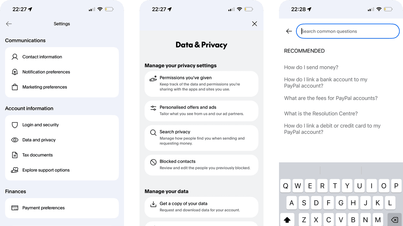
Communications, account information and payments divide the settings list into recognisable groups. The headings help people find a control without reading every row.
Close Your Account is already separated from routine settings. The remaining question is what happens after choosing it: a short consequence summary could make the entry point more predictable.
If we explain the consequence and next review step beside the already separate account-closure action, then people should be better able to find the relevant account setting because the entry point would set an expectation for the consequence and review step.

Screen 05
Notification preferences
Named categories have individual switches, allowing notification choices to be changed separately. The screen avoids reducing all communication to one global decision.
Several switches are enabled, but the capture does not establish how they became enabled. The interface should explain each purpose so people can assess the current state deliberately.
If we summarise the purpose and likely frequency beside each notification category, then people should be better able to choose which notifications to receive because the existing choice and its consequences would be visible for deliberate review.

Personal details and activity have been replaced with fictional examples.
Screen 06
Marketing preferences
Marketing has its own page with separate categories beneath the account identifier. The dedicated destination gives commercial messages a distinct place to be controlled.
Long descriptions and multiple categories increase the work of checking what is currently received. A concise summary would help the person understand the overall choice.
If we summarise active marketing channels and provide a clear route to stop optional marketing, then people should be better able to choose whether to receive marketing because fewer details need to be held in mind at once.

Screen 07
Login and security
Passkey, biometric access and a PIN have named controls in one security area. The grouping connects different ways of entering the same account.
Convenience-focused descriptions can leave recovery and device implications less clear. People need to understand what each option protects and what happens if the device is unavailable.
If we explain recovery and device requirements beside each sign-in method, then people should be better able to review login and account-security controls because the immediate benefit would be presented alongside the relevant conditions and consequences.

Screen 08
Data and privacy
Permissions, preferences, search privacy and contacts have separate destinations, each with an example of what it controls. The explanations already help distinguish account connections from offers, discoverability and blocked contacts.
The examples explain the categories but not the account’s current state. A concise scope preview could help someone decide which area needs attention without opening each one.
If we add a brief current-state summary, such as the number of connected apps, beside the existing explanations, then people should be better able to find privacy and data controls because fewer details need to be held in mind at once.

Screen 09
Manage personal data
Requesting, correcting and deleting data are presented as separate actions. The page keeps different rights and consequences visible without placing them inside one ambiguous form.
The deletion explanation already says that it also closes the account. Before starting, a person could still benefit from a concise summary of retained records and the expected timescale, rather than having to infer them from the general action.
If we summarise any retained records and the expected deletion timescale before the action, preserving the account-closure warning, then people should be better able to choose a personal-data action with understood consequences because the immediate benefit would be presented alongside the relevant conditions and consequences.

Personal details and activity have been replaced with fictional examples.
Screen 10
Connected app permissions
The list identifies connected apps and exposes Details, Remove and Manage controls. It makes past connections visible so the person can inspect or change their access.
An app name alone does not show the scope or last use of its access. Those details would make a decision to retain or revoke a connection more informed.
If we show permission scope and last use beside each connected app, then people should be better able to decide whether to retain or revoke an app's access because the available actions and their differences would be clearer at the point of choice.

Personal details and activity have been replaced with fictional examples.
Screen 11
Help centre
Help search, common questions and trending articles provide several ways to locate an answer. The mix supports both a specific query and browsing a recognisable problem.
Popular topics can dominate even when someone has an urgent account issue. Recovery and contact routes need a visible place independent of what is trending.
If we keep urgent account recovery and contact options above general trending help, then people should be better able to find help for an account problem because the information needed for the task would be easier to notice.

Screen 12
Search help
Suggested questions appear while the search field is active. They can help someone express a problem using terms that the help system recognises.
Suggestions may steer the query toward common issues that do not fit. The person should be able to continue with their own words and reach contact support if needed.
If we keep free-text search and a no-matching-answer route available alongside suggestions, then people should be better able to search for a relevant help answer because the available actions and their differences would be clearer at the point of choice.

Screen 13
Message centre
Dated message rows provide a history of account communications. Sender icons and subject lines help distinguish individual notices within the inbox.
The visible terms and policy notices have similar-looking subjects. An explicit action-needed label would make any required response easier to distinguish from information to read.
If we distinguish messages that require action from informational notices, then people should be better able to identify account messages requiring action because the information needed for the task would be easier to notice.

Screen 14
Notifications
Support options, an email-check reminder and promotional prompts share the notifications list. Separate rows make them scannable, but they represent different reasons for asking the person’s attention.
Mixed operational and promotional notices can make it harder to identify what needs attention. The list needs a clear distinction between a useful account event and a marketing prompt.
If we separate account actions from optional promotional notifications, then people should be better able to distinguish important account events from promotions because the information needed for the task would be easier to notice.
Conclusion
What this journey teaches us.
Account control depends on recognition and consequence. People should be able to predict what sits behind a label and immediately recognise which choices affect security, data, communication or everyday convenience.
The wider lesson is to make the current state visible, explain consequential actions and minimise personal data in overview pages. Control is strongest when consequences are clear, with a way to revise choices before commitment wherever possible.
Keep exploring