
Staying orientated during navigation
I followed the journey from saved places and a calendar destination for Print Club into route results, itinerary detail, walking guidance, live connections and trip sharing. The flow shows how Citymapper turns an everyday commitment into a sequence of transport decisions.
This is no longer just a route-planning case study. It is about staying orientated during navigation: preserving the destination, making the next leg dominant and helping someone recover when a departure, location or attention state changes.
Some screenshots use fictional personal details and activity. Private locations remain obscured where needed.
- Captured
- Capture date not recorded
- Published
- Last updated
- Product version
- Citymapper iOS app 11.51.1
- Source
- View reference ↗
- 17
- Screens
- 7
- Ingredients
- 34
- Applications
Business goals
What works
What the captured flow does well.
- Calendar context can reduce destination entry.
- Route cards expose repeated comparison criteria.
- Journey legs create visible progress.
- Live sharing states an expected arrival time.
What could improve
What deserves closer review.
- Saved-place and calendar sources need clearer boundaries.
- Ads appear inside time-sensitive journey views.
- Dense controls compete with the next instruction.
- Sharing does not fully explain location access.
Screen-by-screen breakdown
Follow the journey.
Each observation shows what works or what could improve, on this screen or across the wider flow. The opportunity turns one or two principles into a testable hypothesis.

Private details have been obscured.
Screen 01
Saved-place actions
Edit Home, Share Home and Save New Place are separate actions in a menu. The grouping offers ways to reuse a location without entering its address again.
Sharing a home location has a different privacy consequence from editing a label. The action needs an explicit recipient and content check before anything is sent.
If we show exactly which location will be shared and with whom before confirmation, then people should be better able to choose an action for a saved place because the immediate benefit would be presented alongside the relevant conditions and consequences.

Personal details and activity have been replaced with fictional examples. Private locations remain obscured.
Screen 02
Search destinations
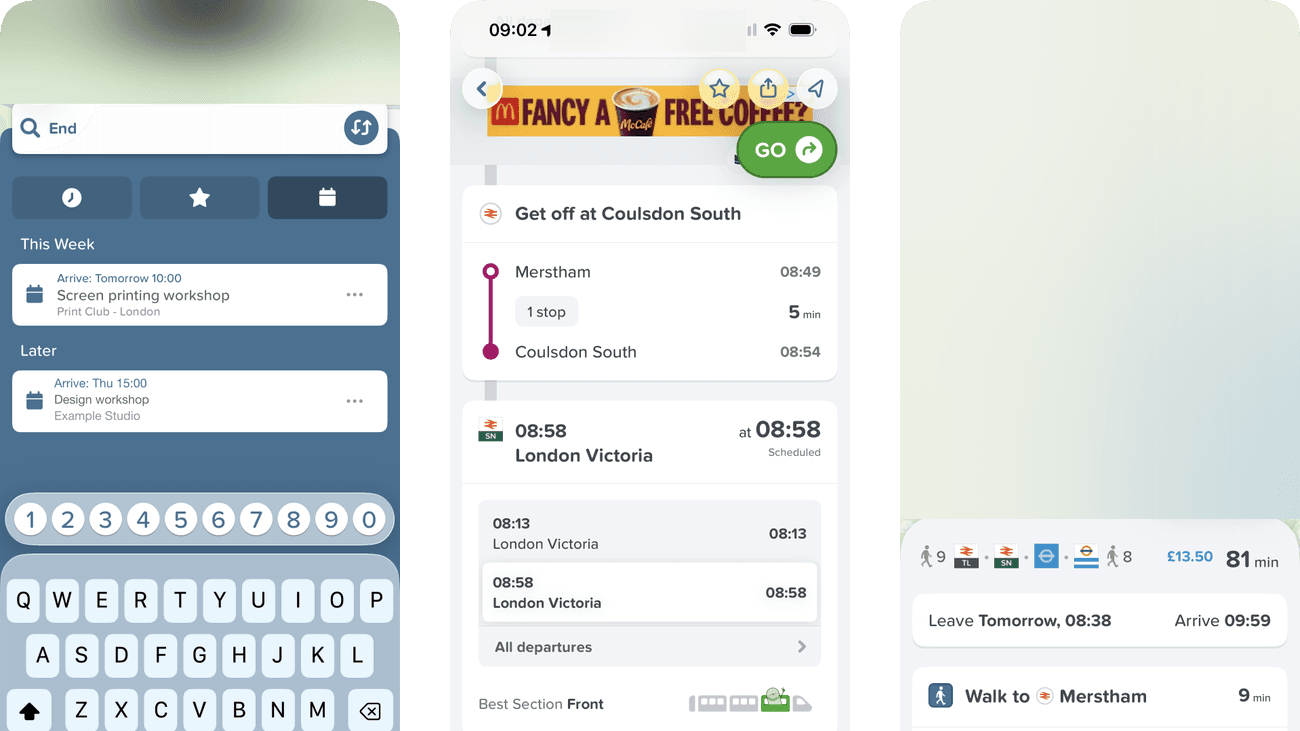
Recent destinations appear beneath the search field while the keyboard is active. The list can reduce typing when the person is travelling to a place used before.
Recent addresses expose location history and may be chosen accidentally. A remove action and clear destination confirmation help retain convenience without hiding the consequence.
If we make recent destinations removable and repeat the chosen place before planning, then people should be better able to find the intended destination because the available actions and their differences would be clearer at the point of choice.

Personal details and activity have been replaced with fictional examples. Private locations remain obscured.
Screen 03
Saved places
Home, Work and Save New Place give destination shortcuts a clear structure. The traveller can choose an existing place or deliberately add another.
A saved place is a shortcut, not a visibly preselected destination. Before reusing it, someone may need to check or update the underlying location; an easy-to-find edit route would reduce that checking effort.
If we make the saved location and edit action clear before starting a route, then people should be better able to choose or maintain a saved place because fewer details need to be held in mind at once.

Personal details and activity have been replaced with fictional examples. Private locations remain obscured.
Screen 04
Calendar destinations
The calendar section supplies the workshop at Print Club as a destination. Selecting the event removes the need to copy the address from another app before planning.
The next route view repeats Print Club as the destination, carrying the selection forward. The event’s date and target arrival time are also useful context when deciding which route fits the plan.
If we carry the event date and target arrival time into route comparison alongside the destination already shown, then people should be better able to select a calendar event as a destination because the next step would repeat and confirm the expectation established in this view.

Private details have been obscured.
Screen 05
Compare journeys
Routes to the selected Print Club destination use repeated rows with modes and journey times. Their shared structure supports comparison before opening a complete itinerary.
Several symbols and timings compete inside compact options. Arrival time, changes and walking effort need enough prominence to explain the difference behind the headline duration.
If we align arrival time, changes and walking effort across the route options, then people should be better able to compare journeys to the selected destination because the information needed for the task would be easier to notice.

Private details have been obscured.
Screen 06
Journey overview
Selecting a route opens its full map and a summary of the journey’s legs. The person can inspect the chosen option after comparing the shorter result cards.
The map covers a large area while the immediate departure sits lower in the view. The next action should stay easy to find when someone is ready to leave.
If we keep the first departure and next walking action visible beside the route overview, then people should be better able to identify the first action in the chosen journey because fewer details need to be held in mind at once.

Private details have been obscured.
Screen 07
Journey itinerary
Walking and train legs are separated into a chronological list. The itinerary turns the chosen route into actions that can be checked one stage at a time.
Repeated times can make arrival and departure easy to confuse. Consistent labels should distinguish when to leave, when to board and when a leg ends.
If we label departure and arrival consistently on each itinerary leg, then people should be better able to understand the sequence of journey legs because the information needed for the task would be easier to notice.

Private details have been obscured.
Screen 08
Train connection details
The scrolled itinerary reveals train-connection details and a Best Section recommendation of Front. These instructions add practical boarding guidance after the route has been chosen.
Service details and carriage-position advice answer different questions in the same compact area. Separating the next required action from optional boarding advice would make the transfer easier to scan.
If we separate the next connection action from optional carriage-position advice, then people should be better able to prepare for the next train connection because fewer details need to be held in mind at once.

Private details have been obscured.
Screen 09
Later journey steps
The later itinerary lists the remaining transport and walking stages before GO. It connects the selected destination to the end of the proposed journey; it does not demonstrate that a leg is currently active.
Inspecting several stages can separate the details from the overall arrival goal. Keeping the final arrival time visible would make it easier to judge the plan while scrolling between legs.
If we keep the final arrival time and event deadline visible while the traveller inspects different itinerary stages, then people should be better able to check whether the full itinerary fits the arrival deadline because the information needed for the task would be easier to notice.

Private details have been obscured.
Screen 10
Walking route map
The original walking view connects a route line and position marker with the next-stage panel. The map is obscured in the published example to protect the journey’s origin; it is not evidence here of navigation accuracy.
A traveller looking up and down from the phone has limited attention. The next turn should be easy to recover without interpreting the whole map every time.
If we pair the map with one dominant next-turn instruction and a clear route overview action, then people should be better able to find the next walking direction because fewer details need to be held in mind at once.

Private details have been obscured.
Screen 11
Walking directions
Opening walking detail exposes turn instructions beneath the current leg. It adds the local detail needed now without replacing the entire journey plan.
Several turns and distances appear together. The immediate instruction needs a clear priority over later turns so a quick glance does not select the wrong step.
If we distinguish the current turn from upcoming directions and confirm when it is completed, then people should be better able to follow the current walking instruction because the information needed for the task would be easier to notice.

Private details have been obscured.
Screen 12
Next transport leg
Departure choices are shown within the active journey rather than only in the original plan. This gives the traveller a place to recheck timing as the trip progresses.
An advertisement appears beneath the departure information. During a connection, operational changes should remain more prominent than an unrelated call to action.
If we keep the next viable departure and any delay above secondary promotional content, then people should be better able to prepare for the next transport leg because the information needed for the task would be easier to notice.

Private details have been obscured.
Screen 13
Active rail journey
The original rail-leg view combines a map with service information. Its map is obscured in this published example to protect the journey, so the visual analysis is limited to the surviving service panel.
Map detail and service information compete for attention during travel. A stable next-stop and exit instruction would reduce the work of reconstructing what to do next.
If we keep the next stop and required exit action together beside the active rail map, then people should be better able to follow progress through the active rail leg because fewer details need to be held in mind at once.

Private details have been obscured.
Screen 14
Choose a train departure
Alternative departures for the same destination are grouped together, with one selected. Below them, Best Section points to the front of the train, linking the service choice with a practical boarding cue.
Each departure time appears twice in its row, alongside arrival time and duration. That repetition adds detail to compare while the traveller is also checking where to board.
If we show each departure time once, keeping arrival, duration and the selected service clear, then people should be better able to choose a train departure and find where to board because fewer details need to be held in mind at once.

Private details have been obscured.
Screen 15
Share live progress
Follow my trip and I will arrive at introduce sharing through a practical coordination task. The channel choices make the intended handoff to another app visible.
A live-trip link may expose more than arrival time. The traveller needs to know what a recipient can see, who can open the link and when it stops working.
If we explain link access, shared location detail and expiry before a sharing channel is selected, then people should be better able to choose whether to share live trip progress because the available actions and their differences would be clearer at the point of choice.

Private details have been obscured.
Screen 16
Journey overview
The visible lower panel combines transport icons, cost, duration and leave-and-arrive times, followed by walking and platform instructions. The map and upper controls are obscured for privacy in this example.
Tomorrow appears in the departure summary, a useful distinction from a journey leaving now. It sits among several other values, so that day cue deserves attention before the traveller acts on the first instruction.
If we give the departure day a distinct label beside the leave time, keeping it visible with the first leg, then people should be better able to check the departure day and first steps of the journey because the information needed for the task would be easier to notice.

Private details have been obscured.
Screen 17
More trip options
Cab alternatives and trip controls remain available further down the active-trip view. They offer a way to reconsider travel when the current route no longer fits.
Provider options and a large advertisement occupy the continuation. The distinction between a relevant fallback and commercial content needs to remain clear during a live journey.
If we group practical fallback options separately from advertising in the active-trip view, then people should be better able to choose an additional trip action because the information needed for the task would be easier to notice.
Conclusion
What this journey teaches us.
A navigation flow succeeds when it repeatedly answers where am I, what happens next and when will I arrive. The destination source—saved place, calendar event or search—should remain understandable without crowding the live instruction.
The wider lesson is to design for interrupted attention. Keep the next action stable, reveal deeper detail on demand and explain exactly what a shared trip contains, who can open it and when access ends.
Keep exploring