
Separate account setup choices
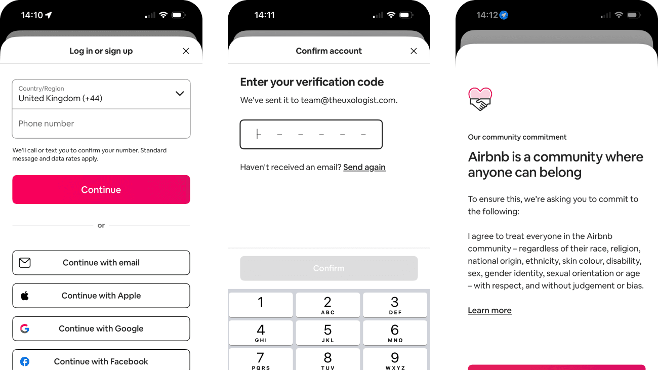
I followed Airbnb’s account journey from choosing a sign-in method through personal details, verification and the community commitment. The individual screens are straightforward, but the journey asks people to make several different kinds of decision before they have reached the product.
What stood out to me was how account creation, policy agreement and marketing sit close together. This case study looks at how Airbnb could preserve a smooth setup while making each choice easier to understand and refuse independently.
- Captured
- Capture date not recorded
- Published
- Last updated
- 5
- Screens
- 13
- Ingredients
- 20
- Applications

Common contexts
Business goals
What works
What the captured flow does well.
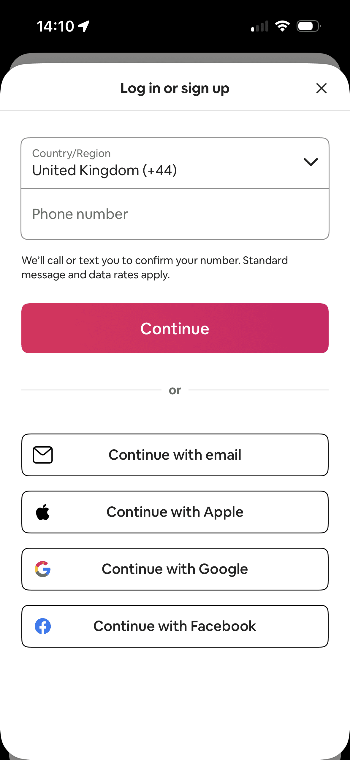
- Phone, email, Apple, Google and Facebook routes remain visible on the first screen.
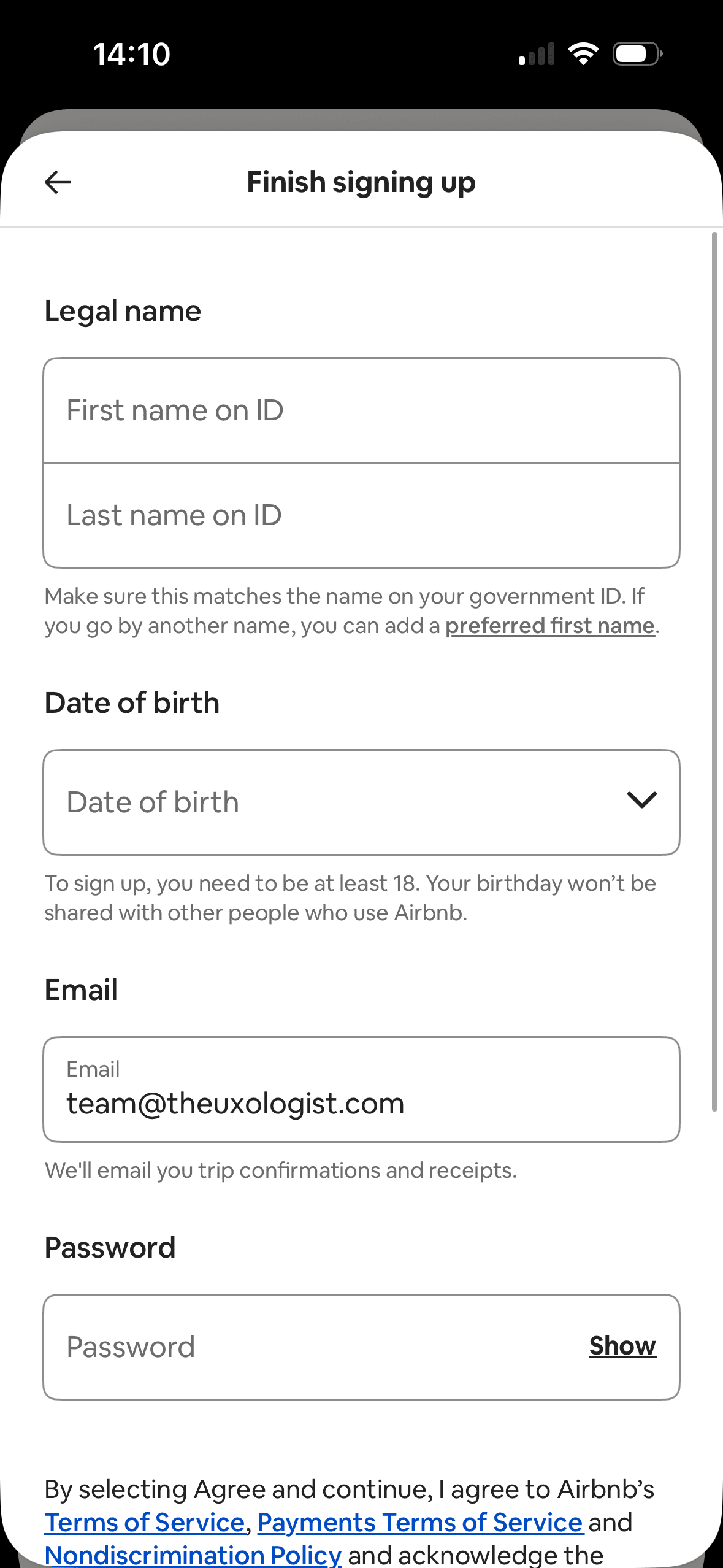
- Legal-name, date-of-birth and email fields include short explanations of purpose or use.
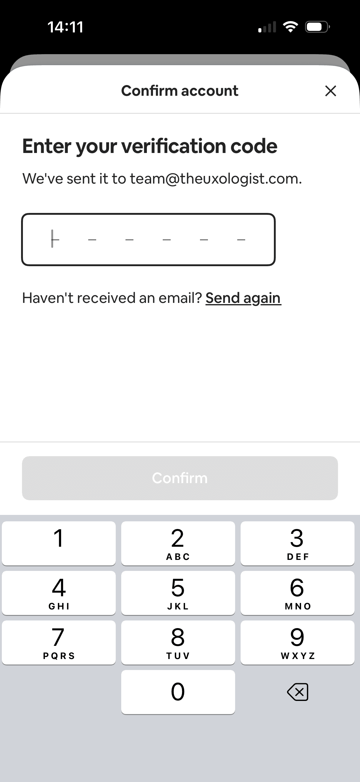
- The verification screen confirms the destination and provides a resend route.
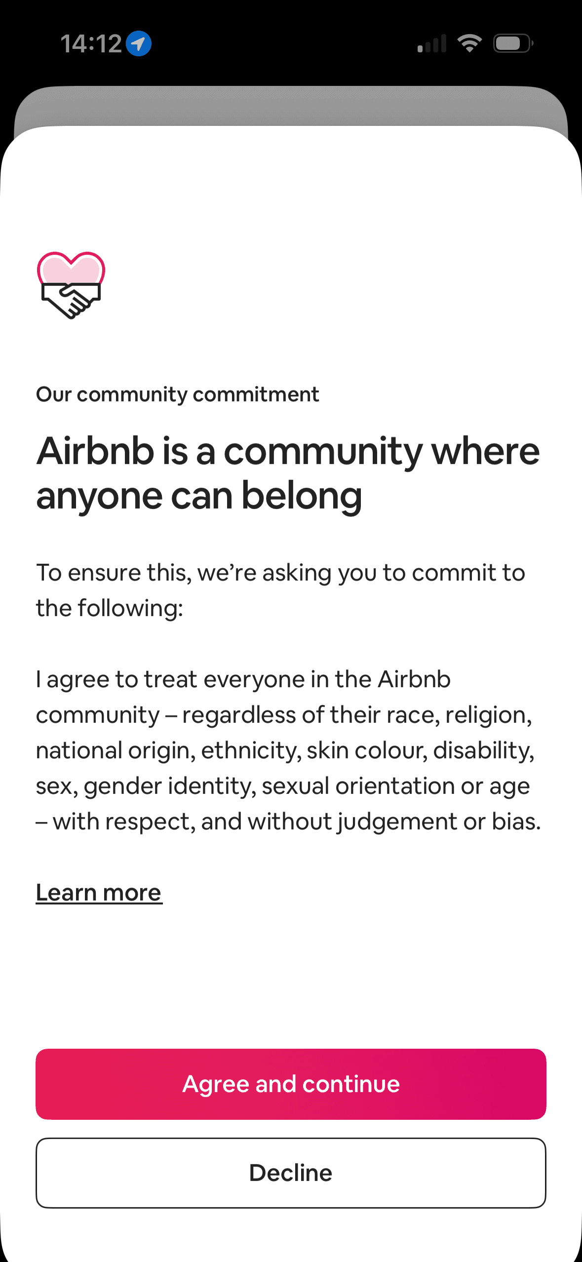
- The community commitment includes a learn-more link and a visible decline action.
What could improve
What deserves closer review.
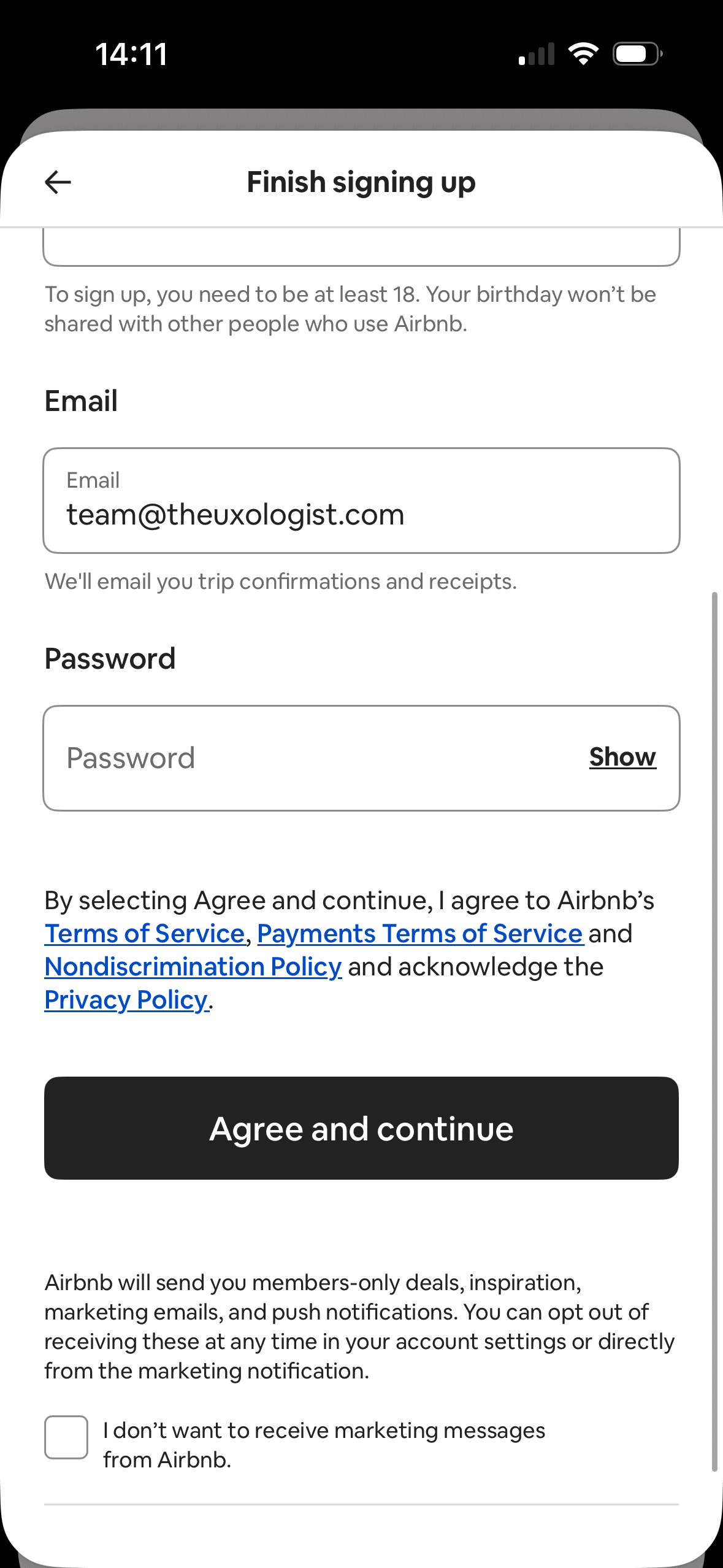
- Marketing uses an opt-out checkbox phrased as “I don’t want”, increasing the effort needed to refuse.
- Account creation, several policies and marketing messaging sit in one long form, making separate choices harder to inspect.
- The capture does not show the total number of steps or whether entered data is saved after exit.
- The phone route receives the strongest initial emphasis without explaining the privacy or recovery trade-offs between methods.
Screen-by-screen breakdown
Follow the journey.
Each observation shows what works or what could improve, on this screen or across the wider flow. The opportunity turns one or two principles into a testable hypothesis.
Screen 01
Choose an account method
Phone entry and its bright Continue button occupy the first and most prominent area; email and third-party methods remain visible below. This shows hierarchy and option arrangement, not whether the layout changed sign-up behaviour.
One account route receives the strongest visual emphasis. That salience can steer selection before Airbnb explains any meaningful privacy, recovery or data-sharing difference.
Provider names and familiar logos make the available account routes easier to recognise. They support identification, but they are not evidence that a provider is safer or more trustworthy.
Show 1 more principleShow fewer principles
The immediate task stays focused on one decision before the wider journey continues. That sequencing reduces simultaneous choices when later steps remain predictable and reversible.
If Airbnb were to keep the alternate methods equally available and explain how contact details will be used, then people should understand the next decision more clearly because its purpose and consequences are visible before they act. This would apply Choice Architecture and Salience Effect.
Screen 02
Name and date of birth
Profile information is requested in a bounded step rather than inside the first access decision. That pacing is useful when every field is necessary and the remaining journey is accurately represented.
The screen asks for personal information without always making purpose, retention and later editability equally visible. Short explanatory copy would let people interpret the request more accurately.
Keeping related profile fields together reduces switching between unrelated decisions. Optional and required fields still need explicit labels.
Show 1 more principleShow fewer principles
The arrangement of the requested profile fields and supporting explanation determines which action is easiest to see and take. The screen should keep alternatives, refusal and correction proportionate to their importance.
If Airbnb were to explain why each field is required, keep the preferred-name route visible and disclose how date of birth will be used and retained, then people should continue without unnecessary pressure because progress remains useful, flexible and easy to revise. This would apply Progressive Disclosure and Framing Effect.
Screen 03
Email, terms and marketing
Marketing messages are enabled unless the person selects the checkbox labelled “I don’t want to receive marketing messages”. Refusal therefore requires noticing and acting on a negatively worded opt-out; the screenshot does not show its effect on consent rates.
Profile information is requested in a bounded step rather than inside the first access decision. That pacing is useful when every field is necessary and the remaining journey is accurately represented.
Keeping related profile fields together reduces switching between unrelated decisions. Optional and required fields still need explicit labels.
Show 1 more principleShow fewer principles
The screen asks for personal information without always making purpose, retention and later editability equally visible. Short explanatory copy would let people interpret the request more accurately.
If Airbnb were to replace the negatively worded opt-out with a separate, unticked opt-in and channel-level choices, then people should understand the next decision more clearly because its purpose and consequences are visible before they act. This would apply Progressive Disclosure and Choice Architecture.
Screen 04
Verify your email
The destination, code-entry state and resend action show the person what happened and what they can do next. That visible response forms a useful feedback loop.
Expiry, incorrect-code and delivery recovery are not all visible beside the code field. People may have to infer how to recover when the expected email does not arrive.
Separating the verification code into a compact entry area makes the one-time task easier to scan than another full account form.
Show 1 more principleShow fewer principles
The arrangement of the code, destination and recovery actions determines which action is easiest to see and take. The screen should keep alternatives, refusal and correction proportionate to their importance.
If Airbnb were to keep resend, add an edit-destination route and explain expiry, attempt or delivery errors, then people should recover from interruption with less effort because progress, failure and the next available action remain clear. This would apply Feedback Loop and Cognitive Load.
Screen 05
Community commitment
Agree, Decline and Learn more are all present in the decision area. That keeps refusal and further inspection available instead of making agreement the only route.
Belonging language frames agreement as a statement about the kind of community member someone is. The consequence of declining should be stated without implying that acceptance proves shared values.
Learn more provides a route to inspect detail without placing the full policy in the immediate decision. The essential consequence still needs to remain visible before either action.
Show 1 more principleShow fewer principles
The filled Agree action is more visually prominent than Decline. That hierarchy can steer attention even though both responses are consequential.
If Airbnb were to keep learn more and decline visible, explain the consequence of declining before the choice and preserve a clear route to leave without implying that agreement proves belonging, then people should understand the next decision more clearly because its purpose and consequences are visible before they act. This would apply Choice Architecture and Framing Effect.
Conclusion
What this journey teaches us.
Airbnb gives people several ways to create an account and explains some of the information it requests. Back, close, resend and decline routes also keep parts of the journey recoverable.
The larger lesson is to separate access, legal agreement, marketing and community expectations. When each decision has its own purpose and consequence, a simple form can also feel like an informed choice.
Keep exploring