
Moving money with confidence
I followed the different ways PayPal lets someone send, request or split money, from choosing a recipient and entering an amount to an international transfer, QR payment and shared bill. The screens use familiar steps, but the meaning of cost, consent and recipient changes between flows.
This case study looks at whether each journey keeps the person’s intent, amount and destination stable while new choices appear. Moving money should feel deliberate, especially when the route introduces another service, fee or person.
Some screenshots use fictional personal details and activity. Private locations remain obscured where needed.
- Captured
- Capture date not recorded
- Published
- Last updated
- Product version
- PayPal iOS app 8.107.2
- Source
- View reference ↗
- 16
- Screens
- 6
- Ingredients
- 32
- Applications
Common contexts
Business goals
What works
What the captured flow does well.
- Longer transfers are divided into clear stages.
- Amounts and destinations remain visible in key decisions.
- Recipient and delivery choices use familiar language.
- Review screens create a final point of control.
What could improve
What deserves closer review.
- Fees are not always present at the comparison point.
- Cross-service consent arrives inside the payment task.
- Suggested amounts may anchor the decision.
- Shared-payment flows expose more personal information.
Screen-by-screen breakdown
Follow the journey.
Each observation shows what works or what could improve, on this screen or across the wider flow. The opportunity turns one or two principles into a testable hypothesis.

Personal details and activity have been replaced with fictional examples.
Screen 01
Pay through other apps
The modal explains the benefit of making it easier for friends to pay across supported apps. The feature is introduced before Allow and Continue.
The benefit-led heading carries more emphasis than the data-sharing detail. A voluntary choice requires a clear explanation of what information is shared and with whom.
If we summarise the data exchange beside agreement and keep a clear decline route, then people should be better able to decide whether to connect PayPal to another app because the available actions and their differences would be clearer at the point of choice.

Personal details and activity have been replaced with fictional examples.
Screen 02
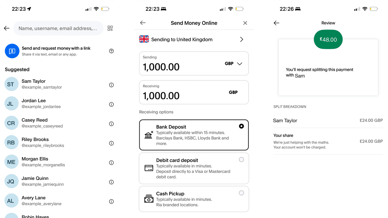
Choose a recipient
Search and suggested recipients appear together. A person can reuse a known contact or enter an identifier without first selecting a separate sending mode.
Suggested recipients increase the risk of selecting a familiar-looking but incorrect person. The next step should confirm an unambiguous recipient before an amount can be sent.
If we carry a clear recipient identifier into the amount and final confirmation screens, then people should be better able to choose the intended payment recipient because the available actions and their differences would be clearer at the point of choice.

Screen 03
Enter a payment amount
The amount is left-aligned above the numeric keypad, with Send and Request kept visible. The main input receives the strongest emphasis in the screen.
Sending and requesting have opposite consequences but share one amount-entry surface. Their labels and selected state must remain clear to prevent choosing the wrong action.
If we repeat whether money will be sent or requested beside the confirmation amount, then people should be better able to enter the amount to send because the available actions and their differences would be clearer at the point of choice.

Screen 04
International transfers
The Xoom introduction promises transfers to over 135 countries and regions and identifies itself as a PayPal service. The agreement text explains that continuing creates a Xoom account using PayPal details.
Account creation sits inside a longer agreement paragraph below a benefit-led headline. It is disclosed, but a reader scanning towards Agree and Continue could give it less attention than speed and reach.
If we give the new-account consequence its own short sentence immediately above Agree and Continue, then people should be better able to understand the international-transfer service because fewer details need to be held in mind at once.

Screen 05
Transfer service loading
A spinner and short waiting message acknowledge that the transfer service is loading. The message offers a rough expectation rather than an entirely silent pause.
A few seconds is helpful only while the wait stays brief. If it takes longer, the same message gives no clue about whether to wait, return or try again.
If we provide a safe retry or return route when loading exceeds the stated expectation, then people should be better able to know whether a transfer service is still loading because fewer details need to be held in mind at once.

Screen 06
Choose a transfer destination
Suggested countries are followed by an alphabetical list and search. This supports both quick selection of a visible destination and a deliberate search for another.
The suggested countries receive extra prominence without an explanation of why they were selected. That emphasis could distract from the intended destination.
If we keep destination search prominent and confirm the selected country on the next step, then people should be better able to choose a destination country for a transfer because the information needed for the task would be easier to notice.

Screen 07
Compare transfer methods
Sending and receiving amounts appear above bank deposit, card deposit and cash pickup choices. The structure connects the amount with the available delivery methods.
Transfer routes emphasise speed and convenience. Comparing the total fee, exchange rate and received amount together would make the financial trade-off more explicit.
If we show total cost and received amount consistently for each delivery method, then people should be better able to compare transfer methods and their costs because the immediate benefit would be presented alongside the relevant conditions and consequences.

Screen 08
Wallet behaviour notice
A system alert explains that Wallet cards and passes will not work automatically while PayPal is in use. The notice identifies a temporary change in behaviour rather than reporting that a payment has failed.
OK acknowledges the message, but the notice gives no next step for someone who wanted to use Wallet. The word automatically also leaves the practical alternative for the person to work out.
If we explain how to use Wallet deliberately or leave PayPal, without implying a failed payment, then people should be better able to understand how PayPal temporarily affects automatic Wallet use because the notice would explain both the temporary behaviour and a practical next action.

Screen 09
In-person payment modes
Scan, Seller QR code and Loyalty cards are grouped as three visible modes. The labels distinguish paying, receiving and presenting a loyalty card before a mode is opened.
The three modes serve different roles but use similarly sized icons. A brief description could help someone choose correctly before opening a scanner or payment code.
If we add a short task description beneath each in-person payment mode, then people should be better able to choose how to make an in-person payment because fewer details need to be held in mind at once.

Screen 10
Seller QR introduction
The seller QR explanation describes receiving payments through PayPal and includes a Seller Fees Apply link. It introduces the collection method before the person starts setup.
Fees are linked, but assessing them requires leaving the main explanation. A short fee summary could help a seller judge the cost before beginning setup.
If we summarise the applicable seller fee beside the setup action while preserving the full fee link, then people should be better able to understand how seller QR payments work because the seller could assess the required effort and fees before entering setup.

Screen 11
Add loyalty cards
Below the introduction, Browse all cards labels an alphabetical grid of retailers. Logos and names offer recognition cues, while search and a filter control provide alternatives to scanning the whole list.
The filter icon is very pale against its background, and several retailer names are cut short. These details make the alternatives to logo recognition harder to use, particularly for someone unfamiliar with a brand.
If we give the filter control a clear text label and stronger contrast, and let retailer names wrap rather than cut them short, then people should be better able to decide whether to add a loyalty card because the information needed for the task would be easier to notice.

Screen 12
Split a bill introduction
Split any expense, from holidays to group gifts gives concrete situations for the feature. The examples explain the task before the person enters a bill amount.
The introduction does not distinguish calculating shares from sending requests. Naming that distinction would help people understand when other people will be contacted.
If we explain that recipients are contacted only after the final request confirmation, then people should be better able to understand how to split a bill because the available actions and their differences would be clearer at the point of choice.

Screen 13
Enter the bill total
The total is the dominant element above a numeric keypad. Keeping this step focused on one amount reduces competition from the later decisions about participants.
The screen does not yet show whether the total includes the organiser’s share. A short explanation would prevent the person from entering only the amount owed by others.
If we clarify that the full bill total should be entered before choosing participants, then people should be better able to enter the bill total correctly because fewer details need to be held in mind at once.

Personal details and activity have been replaced with fictional examples.
Screen 14
Choose people for the split
Search and suggested contacts help assemble the group without retyping every recipient. Selected people can be reviewed before proceeding to the allocation screen.
Contact suggestions can expose identities and invite accidental selection. A visible selected-person summary and easy removal matter before any request is prepared.
If we keep a removable selected-person summary visible above the next action, then people should be better able to select the people sharing the bill because the available actions and their differences would be clearer at the point of choice.

Personal details and activity have been replaced with fictional examples.
Screen 15
Review split amounts
The organiser has a clearly labelled You row alongside the other participant. Each share has an edit control, and the introduction explains that the calculated amounts can be changed before review.
The equal allocation is a convenient starting point, but it may not match what each person owes. The total is visible in the heading; an edit would be easier to check with a running amount left to allocate. The unedited screen does not establish how validation behaves.
If we show the amount left to allocate as shares are edited, keeping the organiser’s row and overall total visible, then people should be better able to check each person's share before proceeding because the suggested equal split could be adjusted without mentally tracking the remaining amount.

Personal details and activity have been replaced with fictional examples.
Screen 16
Confirm the payment request
The review states that the person is requesting payment and lists the recipients and amounts. It creates a final opportunity to inspect the prepared request.
The Request now action is clear, but recipients and amounts need enough prominence to support a careful check. This is the point where another person will be contacted.
If we keep every recipient and amount beside the final Request now action, then people should be better able to verify recipients and amounts before requesting payment because the information needed for the task would be easier to notice.
Conclusion
What this journey teaches us.
A money-movement flow works when the same three facts remain easy to check: who receives it, how much leaves the account and what happens next. Each new service or delivery route should add information without changing that hierarchy.
The design opportunity is to treat fees, consent and reversibility as part of the main decision—not supporting detail—and to keep personal contacts and payment history protected throughout the flow.
Keep exploring