
Turning reading into membership
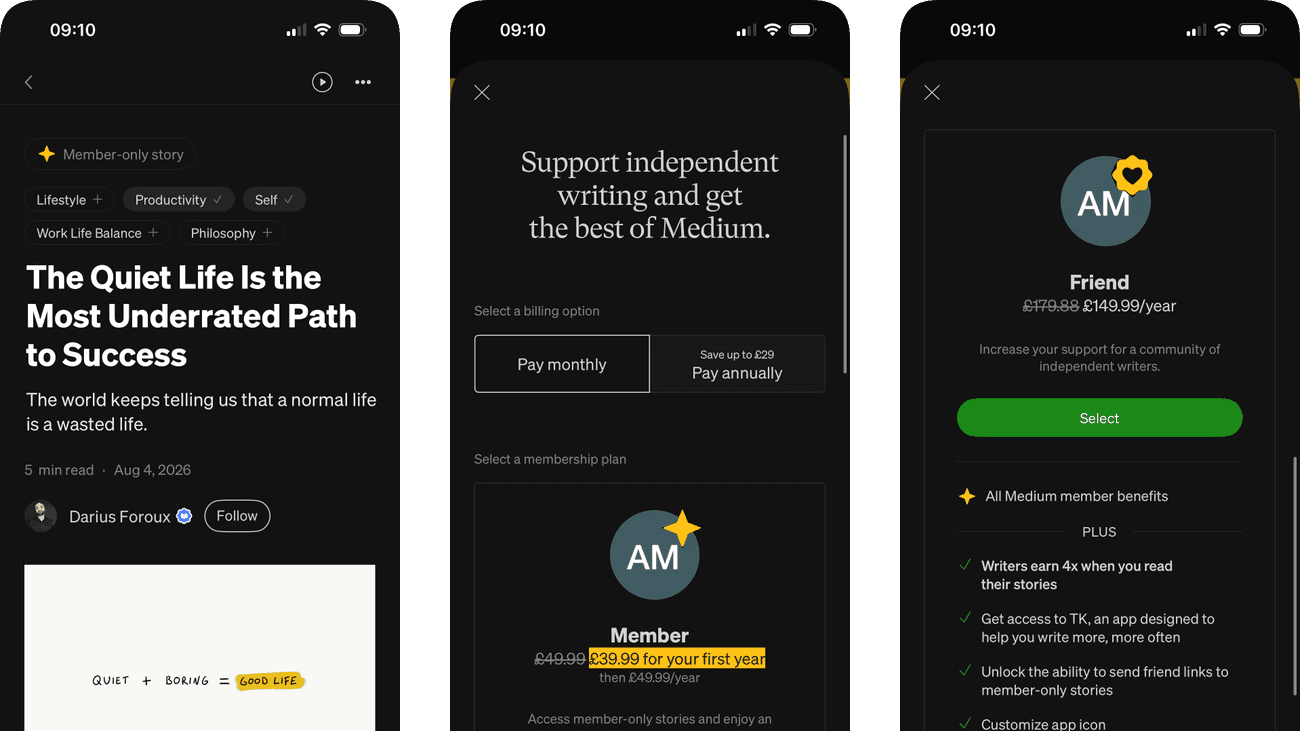
I followed a Medium story from its opening and reading controls through author responses, related work and the membership interruption. The plan screen continues into a scrolled Friend-plan view, where the benefits become visible only after the initial prices and selection controls.
This case study asks whether the paid offer arrives after enough value, keeps the reading task recoverable and supports a fair comparison between Member and Friend. The benefits, renewal terms and route back should be as easy to understand as the saving.
Some screenshots use fictional personal details and activity. Private locations remain obscured where needed.
- Captured
- Capture date not recorded
- Published
- Last updated
- Product version
- Medium iOS app 4.326.205932
- Source
- View reference ↗
- 10
- Screens
- 7
- Ingredients
- 20
- Applications
Business goals
What works
What the captured flow does well.
- The story establishes context before the upgrade decision.
- Billing options and renewal prices are visible.
- The scrolled plan view explains Friend benefits.
- Readers can inspect author and response context.
What could improve
What deserves closer review.
- The offer interrupts the article before completion.
- Plan benefits sit below the first selection actions.
- The selected interval and displayed prices do not match.
- Closing the offer is less explicit than selecting a plan.
Screen-by-screen breakdown
Follow the journey.
Each observation shows what works or what could improve, on this screen or across the wider flow. The opportunity turns one or two principles into a testable hypothesis.

Screen 01
Story opening
The headline is the largest text, followed by a short introduction, author information and reading metadata. The hierarchy gives the reader a clear starting point.
Author and publication cues help establish context, but they do not establish the quality of the argument. A clear introduction should carry enough substance for a reader to judge whether to continue.
If we keep the article’s central promise and relevant context visible before secondary actions, then people should be better able to judge whether to continue reading a story because the immediate benefit would be presented alongside the relevant conditions and consequences.

Screen 02
Repost a story
A tooltip explains that reposting will send the story to the reader’s own followers. It introduces the audience and consequence beside the story, with Okay, got it available to dismiss the explanation.
The tooltip supplies useful context, but once dismissed the small repost control still has to carry that meaning. A reader should be able to check who will see the story before taking the action.
If we keep an audience-labelled explanation available beside Repost before it shares the story, then people should be better able to understand who will see a repost before sharing it because the intended audience would remain available to check before sharing.

Screen 03
Story actions
Display, follow and mute controls open in a compact menu over the article. Secondary actions remain available without occupying the reading surface all the time.
Muting an author has a different consequence from changing display settings. Clear wording and reversible feedback help prevent a casual menu choice from unexpectedly changing future recommendations.
If we separate preference changes from author suppression and confirm how to undo a mute, then people should be better able to choose an action for the current story because the available actions and their differences would be clearer at the point of choice.

Screen 04
Reading the story
Highlighted passages stand out within the article body. They provide an immediate visual route through a long passage of otherwise similar text.
The highlighted lines can frame which ideas seem most important before the reader evaluates the surrounding argument. Their meaning should remain clear in the full paragraph.
If we make highlight controls clear and preserve the surrounding context when a passage is emphasised, then people should be better able to continue reading without losing the place because the immediate benefit would be presented alongside the relevant conditions and consequences.

Screen 05
Membership interruption
The paid offer appears within an article after some content has been shown. The reader has encountered the subject before being asked to consider membership.
Access to everything is a broad promise at the point where reading is interrupted. Price, billing terms and a predictable return to the article are needed to judge that promise.
If we show the plan commitment and preserve an obvious route back to the interrupted article, then people should be better able to decide whether to explore membership or keep reading because the immediate benefit would be presented alongside the relevant conditions and consequences.

Personal details and activity have been replaced with fictional examples.
Screen 06
Membership plans
Monthly and annual billing selectors precede the plans, which show initial and renewal prices. The controls make payment timing an explicit choice, although the displayed prices in this captured state are annual.
The monthly selector appears selected while the prices are expressed annually. Friend benefits also continue below the initial selection controls. Both details make it harder to judge the offer at the point of choice.
If we align the displayed prices with the selected interval and place distinguishing benefits and renewal terms beside each plan’s action, then people should be better able to compare membership commitments because price, benefits and commitment would be available together before selection.

Personal details and activity have been replaced with fictional examples.
Screen 07
Friend plan benefits
The scrolled continuation explains Friend membership through added benefits and support for writers. It gives substance to the higher-priced option introduced on the preceding screen.
One plan’s benefits are shown as a list rather than aligned with the other plan. A direct comparison currently depends on remembering or revisiting the preceding content.
If we align both plans’ benefits, renewal terms and prices in the same comparison, then people should be better able to decide whether Friend benefits justify the higher price because the available actions and their differences would be clearer at the point of choice.

Personal details and activity have been replaced with fictional examples.
Screen 08
Author and responses
The author block, Follow control and responses appear below the article and paywall. They offer ways to continue with the writer or discussion even when the captured reading journey has not reached the full story.
The response count makes activity around the article visible, but quantity alone does not show the quality of the discussion. Useful response context matters more than the count.
If we preview the substance and ordering of responses beside the participation count, then people should be better able to find the author and join the discussion because the substance of the available content would accompany the popularity cue.

Personal details and activity have been replaced with fictional examples.
Screen 09
Reader responses
Individual responses are displayed as separate contributions beneath a response-entry area. The layout shows how participation becomes part of the article’s discussion.
A lengthy first response can dominate the visible discussion. Sorting and author-response cues would help readers understand why that contribution appears before others.
If we make response ordering explicit and identify author replies without relying only on position, then people should be better able to read or respond to a particular comment because the information needed for the task would be easier to notice.

Screen 10
More from the writer
Related story cards remain grouped under the same writer. This offers a coherent continuation for a reader interested in the perspective they have just encountered.
Story titles already have descriptive subtitles. Large thumbnails carry more visual weight, so those useful summaries may receive less attention when someone scans for a relevant next read.
If we give the existing subtitles more visual emphasis alongside the artwork, then people should be better able to choose another relevant story from the writer because the information needed for the task would be easier to notice.
Conclusion
What this journey teaches us.
A membership offer is most persuasive when it connects to value the reader has just experienced and lets every plan answer the same questions. Price, renewal, benefits and cancellation should form one comparison, not separate stages of discovery.
The practical opportunity is to keep reading recoverable, bring the Friend-plan benefits into the initial comparison and treat support for writers as one benefit rather than a substitute for clear product terms.
Keep exploring