
Finding something worth reading
I moved from Medium’s launch and home feed into following, writer and publication suggestions, then through the full explore-and-search journey. The later screens are not separate discovery features: trending stories, recommendations, topics, search entry and results all form one route for finding something worth reading.
This case study looks at how Medium shifts between passive recommendations and active search. The key question is whether people can understand why something appears, narrow the set and keep their query or topic visible as the results change.
Some screenshots use fictional personal details and activity. Private locations remain obscured where needed.
- Captured
- Capture date not recorded
- Published
- Last updated
- Product version
- Medium iOS app 4.326.205932
- Source
- View reference ↗
- 13
- Screens
- 7
- Ingredients
- 26
- Applications
Business goals
What works
What the captured flow does well.
- Search develops from broad prompts into explicit results.
- Topics, writers and publications provide different routes.
- Loading states keep the search transition visible.
- Story cards expose useful recognition cues.
What could improve
What deserves closer review.
- Recommendation reasons are not always explained.
- Several discovery modes compete for attention.
- Search scope can become unclear between screens.
- Popularity cues may outweigh personal relevance.
Screen-by-screen breakdown
Follow the journey.
Each observation shows what works or what could improve, on this screen or across the wider flow. The opportunity turns one or two principles into a testable hypothesis.

Screen 01
Medium launch
The white Medium wordmark is the only substantial content against the dark launch screen. It identifies the product before the reading interface appears.
The static wordmark does not indicate loading progress. If this state lasts, someone has no visible way to tell whether launch is still progressing or has stalled.
If we provide a status and recovery route if the launch screen persists, then people should be better able to recognise that Medium is starting because the displayed status would explain the result of the preceding action.

Personal details and activity have been replaced with fictional examples.
Screen 02
Home feed loading
Placeholder rows indicate that the feed area is waiting for content. They preserve the space where article cards will appear as the home view loads.
The membership banner is already visible while stories remain placeholders. If loading is slow, the paid prompt can become the only complete content in the view.
If we keep a useful loading message prominent until the reading choices are available, then people should be better able to understand whether the home feed is loading because the information needed for the task would be easier to notice.

Personal details and activity have been replaced with fictional examples.
Screen 03
Home feed
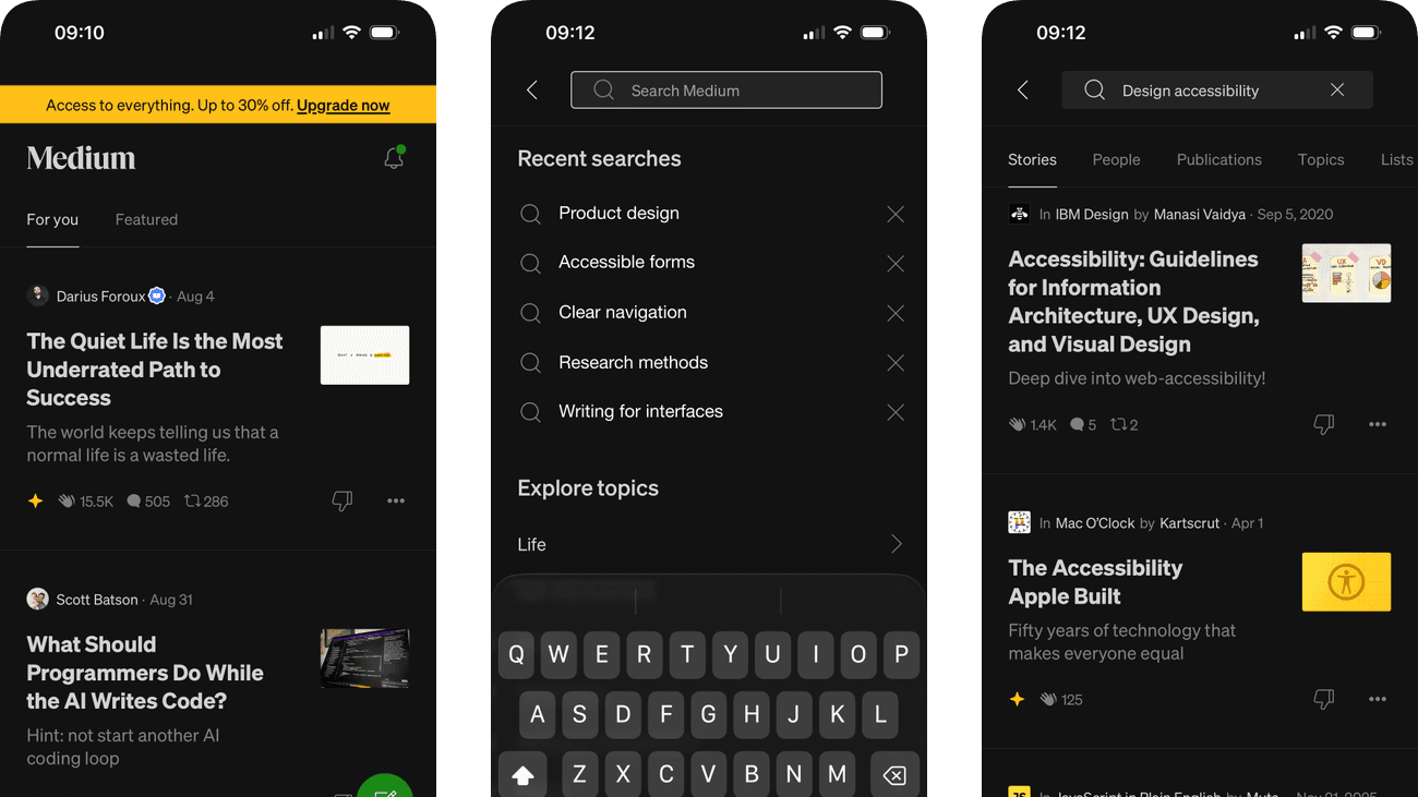
For you and Featured separate two ways of browsing stories. Article titles, author names and thumbnails give each recommendation enough context to begin assessing its relevance.
A yellow membership strip sits above the navigation and stories. It competes with the reading task before a person has chosen an article from the feed.
If we keep the first useful reading choice visually stronger than the membership promotion, then people should be better able to choose a story to read because the information needed for the task would be easier to notice.

Personal details and activity have been replaced with fictional examples.
Screen 04
Notifications
Notifications report follow, subscription and clap events in separate rows. Their descriptions already name what happened, connecting other people's actions with a visible record of recent account activity.
Several event types share the same dense list. Someone interested in only new subscribers still has to scan unrelated events, even though each one is labelled.
If we offer optional event-type filters while retaining the existing event descriptions and complete list, then people should be better able to understand recent follow, subscription and clap events because the available actions and their differences would be clearer at the point of choice.

Personal details and activity have been replaced with fictional examples.
Screen 05
Following feed
The Following view makes a chosen set of writers and publications the source of the feed. It offers an alternative to the broader recommendations on the home screen.
A row of small circular identities requires people to recognise sources quickly. Readable names and a manageable overflow pattern would help when the followed list grows.
If we keep source names accessible and provide a clear way to browse the full followed list, then people should be better able to find recent writing from followed sources because fewer details need to be held in mind at once.

Personal details and activity have been replaced with fictional examples.
Screen 06
Refine writer recommendations
Refine recommendations opens controls for writers within the broader feed experience. The person can adjust one source of future stories without leaving the reading context entirely.
Writer suggestions invite following before explaining why each person was selected. A short relevance cue would help the reader make the feed reflect a deliberate interest.
If we explain the topic or prior choice that makes each suggested writer relevant, then people should be better able to refine recommended writers because the immediate benefit would be presented alongside the relevant conditions and consequences.

Personal details and activity have been replaced with fictional examples.
Screen 07
Refine publication recommendations
Publications use separate rows with short descriptions and Follow controls. Their individual boundaries make it possible to select a source without accepting the whole suggested set.
A recognisable publication name can draw attention, but recognition does not prove that its stories will fit the reader. The description needs to communicate editorial scope.
If we give every publication a concise scope and recommendation reason beside Follow, then people should be better able to refine recommended publications because the available actions and their differences would be clearer at the point of choice.

Personal details and activity have been replaced with fictional examples.
Screen 08
Search loading
Search placeholders retain the layout beneath the Explore heading. The view signals that results or suggestions are still being prepared rather than showing an unexplained blank page.
Placeholders do not explain a prolonged wait or a failure. A time-appropriate status and retry would help someone distinguish waiting from a search that needs another action.
If we offer an explanatory status and retry when search loading takes longer than expected, then people should be better able to understand whether search is loading because fewer details need to be held in mind at once.

Personal details and activity have been replaced with fictional examples.
Screen 09
Explore search
The search field, topic chips and Trending on Medium list offer three starting points. Someone can type an interest, choose a subject or browse popular stories from the same surface.
Trending presents popularity as a reason to investigate a story. That can support discovery, but it does not explain whether the article matches this reader’s purpose.
If we distinguish popularity from personal relevance when introducing search suggestions, then people should be better able to choose a topic or begin a search because the substance of the available content would accompany the popularity cue.

Personal details and activity have been replaced with fictional examples.
Screen 10
Explore recommendations
Staff Picks and Recommended for you divide the scrolled Explore content into named groups. These continue the search experience begun by the preceding trending list.
Staff Picks identifies editorial selection, while Recommended for you implies personal relevance without stating a reason here. The different promises need different explanations.
If we state why a personalised suggestion appears alongside its recommendation label, then people should be better able to explore recommended reading within search because the immediate benefit would be presented alongside the relevant conditions and consequences.

Personal details and activity have been replaced with fictional examples.
Screen 11
Topic results
Selecting a topic from Explore opens recommended stories within that subject. The search journey narrows from broad prompts into a more focused reading choice.
Related-topic chips already offer narrower routes from Programming. They still leave readers to infer the level or depth of the stories, which matters when the same subject serves beginners and experienced practitioners.
If we offer clearly labelled level or depth choices alongside the existing related topics, then people should be better able to choose a story within the selected topic because the available actions and their differences would be clearer at the point of choice.

Personal details and activity have been replaced with fictional examples.
Screen 12
Enter a search
Recent queries appear above the keyboard so a previous search can be reused without typing. The active field also supports entering a completely new phrase.
Every recent query already has an individual removal control. A separate Clear search history action would let someone remove the whole record without repeating that action for each entry.
If we add a clearly labelled Clear search history action while keeping individual query removal, then people should be better able to search for stories or people because the available actions and their differences would be clearer at the point of choice.

Personal details and activity have been replaced with fictional examples.
Screen 13
Search results
Stories, People, Publications, Topics and Lists divide results into types while the query stays in the field. The reader can change result type without starting the search again.
Thumbnails and titles compete inside compact rows. Query relevance should remain easier to assess than visual appeal when someone is searching for a specific subject.
If we give each result a clear relevance cue alongside its title and content type, then people should be better able to choose the relevant type of search result because the information needed for the task would be easier to notice.
Conclusion
What this journey teaches us.
Medium works best when browse and search feel like connected levels of the same task. Broad prompts can help someone begin, but the interface should preserve the query, topic or source that explains why each result is there.
The lesson is to support movement between inspiration and intent without hiding the ranking logic. Clear scope, reversible filters and visible recommendation reasons help people decide what is worth their time.
Keep exploring