
Make data choices feel informed
I followed Uber’s account setup from sign-up and pre-filled details into terms, location, marketing and advertising choices. The journey provides useful explanations and several preference routes, but it also introduces a lot of data use before the person has taken a trip.
The interesting question is not whether the interface looks trustworthy. It is whether people can tell which data is necessary, which use is optional and what each choice changes.
- Captured
- Capture date not recorded
- Published
- Last updated
- 7
- Screens
- 8
- Ingredients
- 28
- Applications

Common contexts
Business goals
What works
What the captured flow does well.
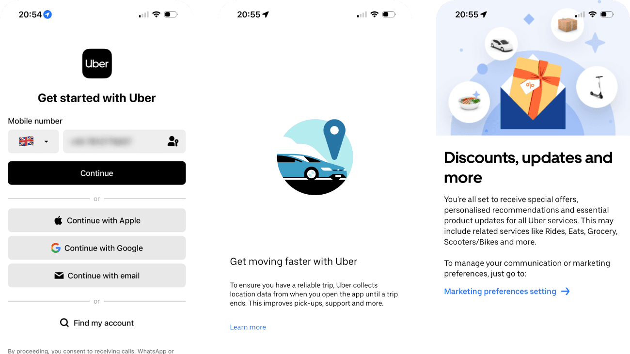
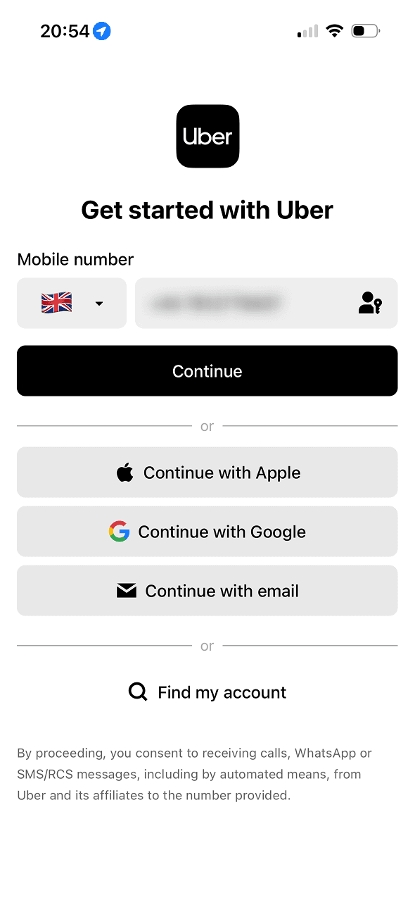
- Phone, Apple, Google, email and account-recovery routes are available on the first screen.
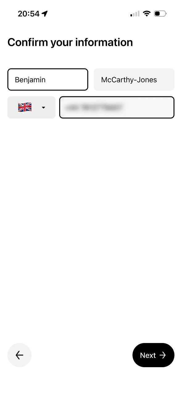
- Imported name and phone details are shown in editable fields before the next step.
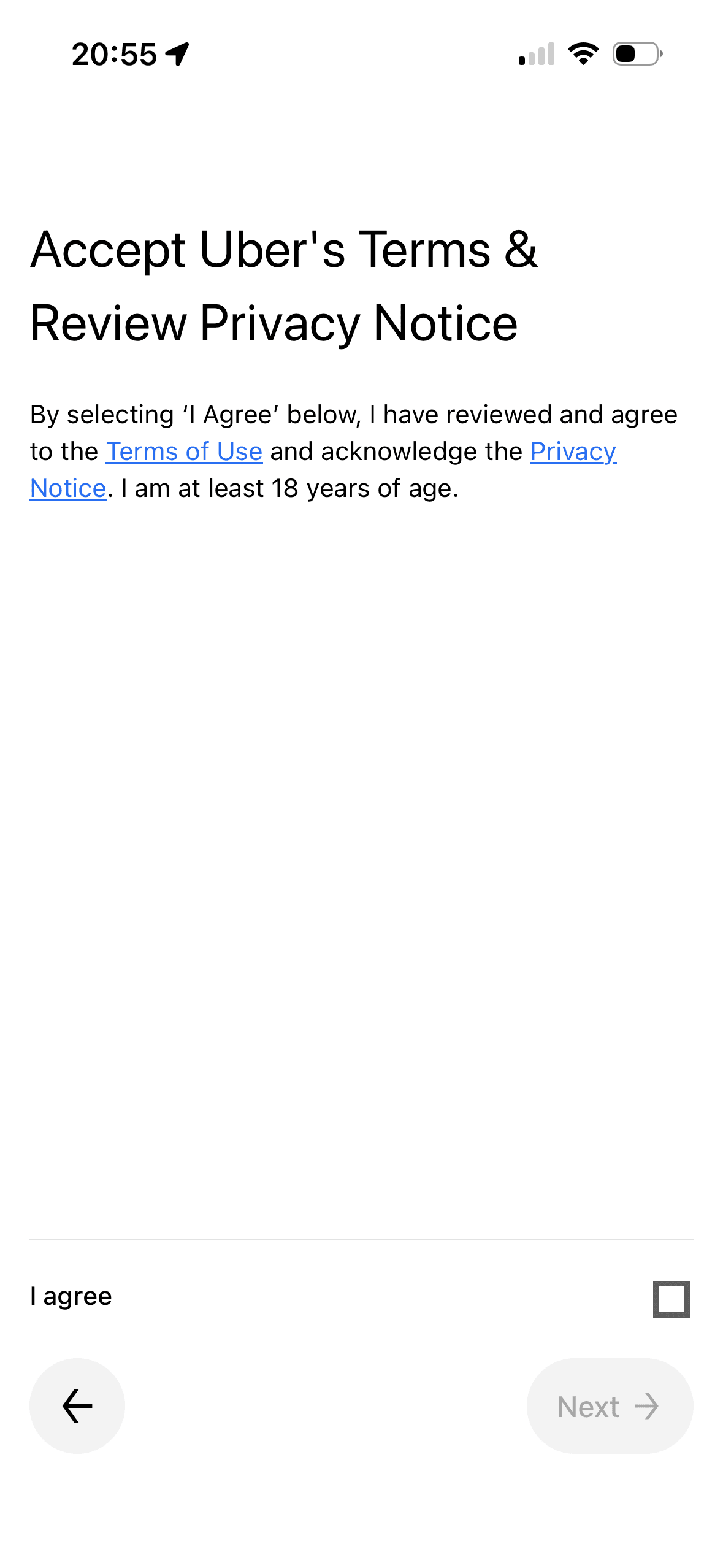
- The terms screen links directly to the Terms of Use and Privacy Notice and requires a separate agreement checkbox.
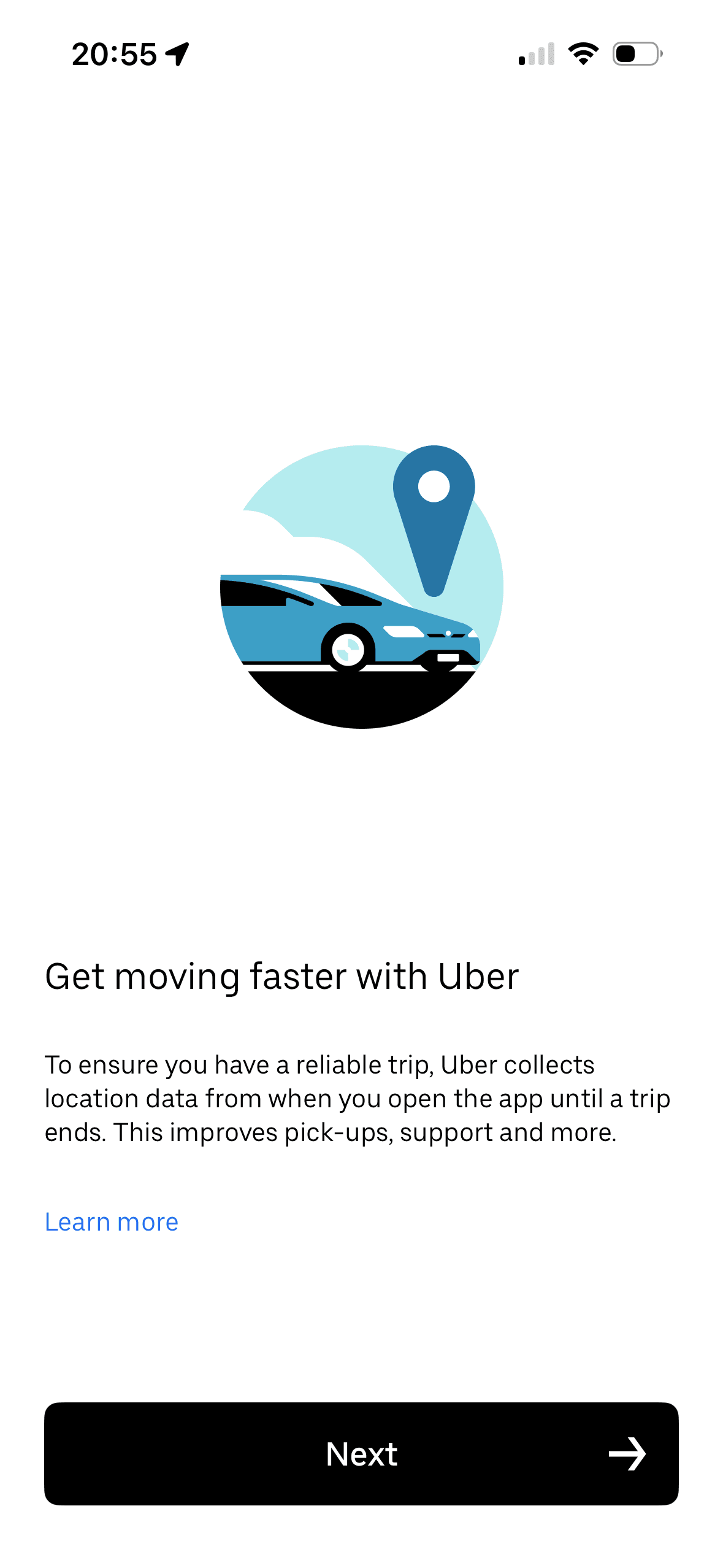
- The location explainer states a collection window, gives examples of intended use and links to more information.
What could improve
What deserves closer review.
- Continuing with a phone number also consents to automated calls or messages from Uber and affiliates, bundling communications with account creation.
- The terms screen asks the person to confirm they have reviewed full documents without a concise summary, version or effective date.
- The location explanation does not separate what is required for a trip from optional background, safety, analytics or marketing use, or show the upcoming system permission choices.
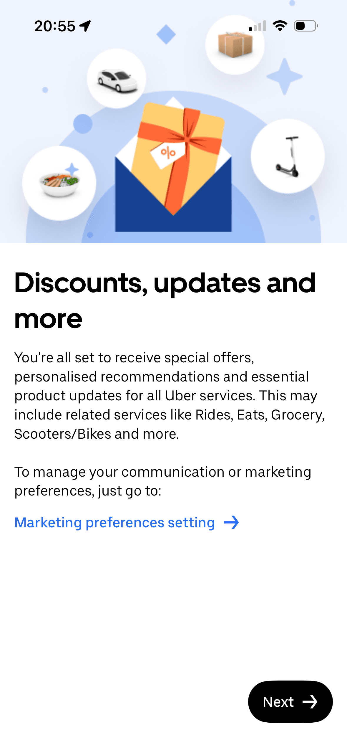
- Marketing is framed as an already completed state—“You’re all set to receive”—with change deferred to settings rather than offered as a fresh opt-in.
Screen-by-screen breakdown
Follow the journey.
Each observation shows what works or what could improve, on this screen or across the wider flow. The opportunity turns one or two principles into a testable hypothesis.
Screen 01
Choose a sign-up method
“Get started with Uber” frames account creation as a beginning rather than describing the full sequence. The screen also bundles automated calls or messages into proceeding; it does not show that the wording reduced resistance.
The screen keeps several account routes available in the same decision area. That is a useful choice structure because people can compare methods without leaving the flow.
Provider names and familiar logos make the available account routes easier to recognise. They support identification, but they are not evidence that a provider is safer or more trustworthy.
Show 1 more principleShow fewer principles
One account route receives the strongest visual emphasis. That salience can steer selection before Uber explains any meaningful privacy, recovery or data-sharing difference.
If Uber were to separate account-critical verification from optional or promotional calls and messages, then people should understand the next decision more clearly because its purpose and consequences are visible before they act. This would apply Choice Architecture and Framing Effect.
Screen 02
Review your details
Name and phone values are pre-filled while remaining editable. These values function as defaults if Next saves them unchanged; the screenshot does not show acceptance, correction or error rates.
The arrangement of the main controls, supporting information and available actions determines which action is easiest to see and take. The screen should keep alternatives, refusal and correction proportionate to their importance.
Visual hierarchy gives the main controls, supporting information and available actions a clear point of entry. Important secondary information still needs enough prominence to be found before commitment.
Show 1 more principleShow fewer principles
The immediate task stays focused on one decision before the wider journey continues. That sequencing reduces simultaneous choices when later steps remain predictable and reversible.
If Uber were to keep imported values visible and editable, identify their source and ask for confirmation before saving, then people should recover from interruption with less effort because progress, failure and the next available action remain clear. This would apply Default Effect and Choice Architecture.
Screen 03
Terms and conditions
Asking for this choice separately from basic account access can support informed consent, provided the full purpose is visible before the person acts.
The relative emphasis given to accept, refuse and manage choices can make one route feel easier than another. Button weight, wording and placement should support a voluntary decision.
Benefit-led, loss-led or negatively phrased copy changes the way people interpret the choice. The purpose, frequency and consequence should be clear without making refusal sound irresponsible.
Show 1 more principleShow fewer principles
A preselected state, completed-state message or negative opt-out would make inaction count as agreement. Optional communication and data use should begin unselected.
If Uber were to add a concise summary of material terms, version and effective date while keeping the full documents directly available, then people should make a more informed data choice because purpose, optionality and future use are clear before agreement. This would apply Progressive Disclosure and Choice Architecture.
Screen 04
Location explainer
Asking for this choice separately from basic account access can support informed consent, provided the full purpose is visible before the person acts.
The relative emphasis given to accept, refuse and manage choices can make one route feel easier than another. Button weight, wording and placement should support a voluntary decision.
Benefit-led, loss-led or negatively phrased copy changes the way people interpret the choice. The purpose, frequency and consequence should be clear without making refusal sound irresponsible.
Show 1 more principleShow fewer principles
A preselected state, completed-state message or negative opt-out would make inaction count as agreement. Optional communication and data use should begin unselected.
If Uber were to separate trip-critical location use from optional background, safety, analytics or marketing purposes, then people should make a more informed data choice because purpose, optionality and future use are clear before agreement. This would apply Progressive Disclosure and Choice Architecture.
Screen 05
Marketing preferences
The introductory message prepares people for the kind of task or benefit that follows. It is a flow-level cue because its effect depends on whether the next screens match that expectation.
“You’re all set to receive” presents marketing enrollment as a completed state and describes offers and recommendations before directing changes to settings. The screenshot does not show whether the wording changes consent or later opt-out.
The flow introduces one idea before moving to the next decision, reducing how much new information appears at once. Skip, back and reduced-motion routes determine whether that pacing stays supportive.
Show 1 more principleShow fewer principles
The arrangement of the introductory message and single next action determines which action is easiest to see and take. The screen should keep alternatives, refusal and correction proportionate to their importance.
If Uber were to replace the completed-state marketing message with a fresh, unticked choice, then people should make a more informed data choice because purpose, optionality and future use are clear before agreement. This would apply Priming and Framing Effect.
Screen 06
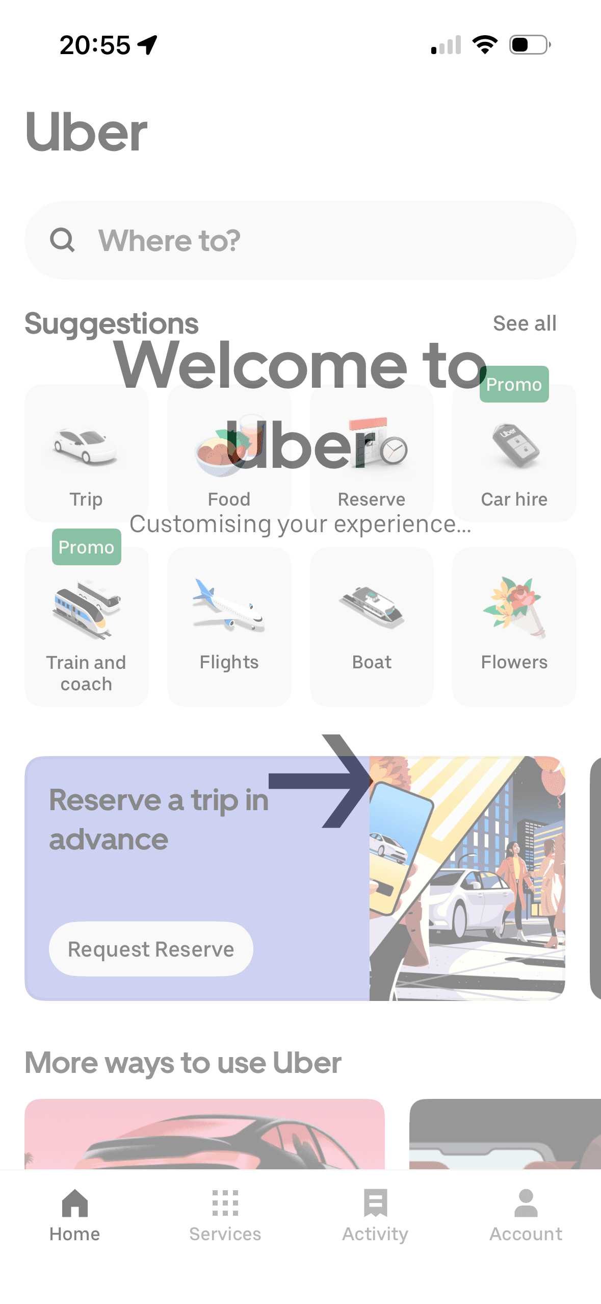
Personalisation status
The overlay labels background activity as “Customising your experience”. This frames the process as a user benefit but does not identify the data used, the resulting change or how people interpret it.
The introductory message prepares people for the kind of task or benefit that follows. It is a flow-level cue because its effect depends on whether the next screens match that expectation.
The flow introduces one idea before moving to the next decision, reducing how much new information appears at once. Skip, back and reduced-motion routes determine whether that pacing stays supportive.
Show 1 more principleShow fewer principles
The arrangement of the introductory message and single next action determines which action is easiest to see and take. The screen should keep alternatives, refusal and correction proportionate to their importance.
If Uber were to say what data is being used, what will change and how long the step will take, then people should make a more informed data choice because purpose, optionality and future use are clear before agreement. This would apply Priming and Framing Effect.
Screen 07
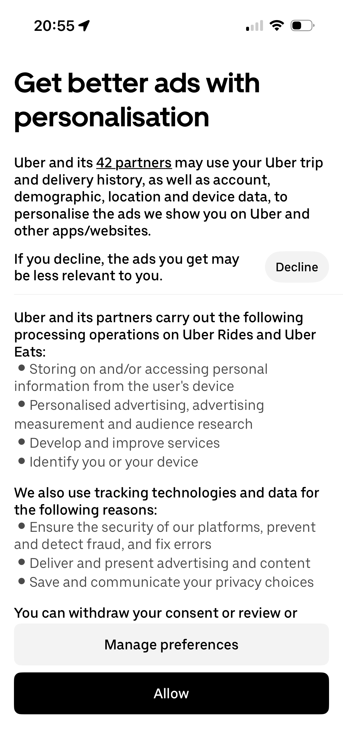
Advertising choices
Visual hierarchy gives the main controls, supporting information and available actions a clear point of entry. Important secondary information still needs enough prominence to be found before commitment.
Decline is a small light button beside explanatory text, Manage preferences spans the width lower down and Allow is the final filled dark button. This is an observable choice-architecture asymmetry, not a preselected default or proof that people opted in without deliberation.
“Get better ads with personalisation” frames the proposed processing through an advertised benefit; the same screen also names data categories, 42 partners and a possible consequence of declining. No effect on consent or ad quality is shown.
Show 1 more principleShow fewer principles
The immediate task stays focused on one decision before the wider journey continues. That sequencing reduces simultaneous choices when later steps remain predictable and reversible.
If Uber were to give Decline, Manage preferences and Allow comparable hierarchy and order, separate purposes that do not require one bundled decision and make later withdrawal as easy as consent, then people should make a more informed data choice because purpose, optionality and future use are clear before agreement. This would apply Salience Effect and Choice Architecture.
Conclusion
What this journey teaches us.
Uber does well when it names the information involved and offers separate controls, particularly on the advertising screen. Editable details and direct policy links also make the setup easier to inspect.
Confidence weakens where a completed state or stronger button makes an optional choice feel settled already. Clearer purpose, equal refusal and a preview of system permissions would make the same flow more informed.
Keep exploring