
Searching across transport modes
I searched for buses and Tube lines, then browsed rail, cab, car-rental, ferry and tram options. Citymapper supports both a known-service task and a broader what-can-I-use task, but the comparison cues change between modes.
This case study looks at how recognition, grouping and status help people move across a mixed transport network. The interface should make unlike options distinguishable without forcing someone to learn a new pattern for every mode.
Some screenshots use fictional personal details and activity. Private locations remain obscured where needed.
- Captured
- Capture date not recorded
- Published
- Last updated
- Product version
- Citymapper iOS app 11.51.1
- Source
- View reference ↗
- 14
- Screens
- 6
- Ingredients
- 28
- Applications
Business goals
What works
What the captured flow does well.
- Known route numbers and line names support recognition.
- Mode-specific pages bound large networks.
- Provider marks help distinguish unfamiliar services.
- Search and browsing remain available as separate routes.
What could improve
What deserves closer review.
- Unlike transport modes use inconsistent comparisons.
- Provider familiarity may substitute for service quality.
- Large result sets need stronger grouping.
- Status and proximity are not always equally visible.
Screen-by-screen breakdown
Follow the journey.
Each observation shows what works or what could improve, on this screen or across the wider flow. The opportunity turns one or two principles into a testable hypothesis.

Private details have been obscured.
Screen 01
Find a bus or line
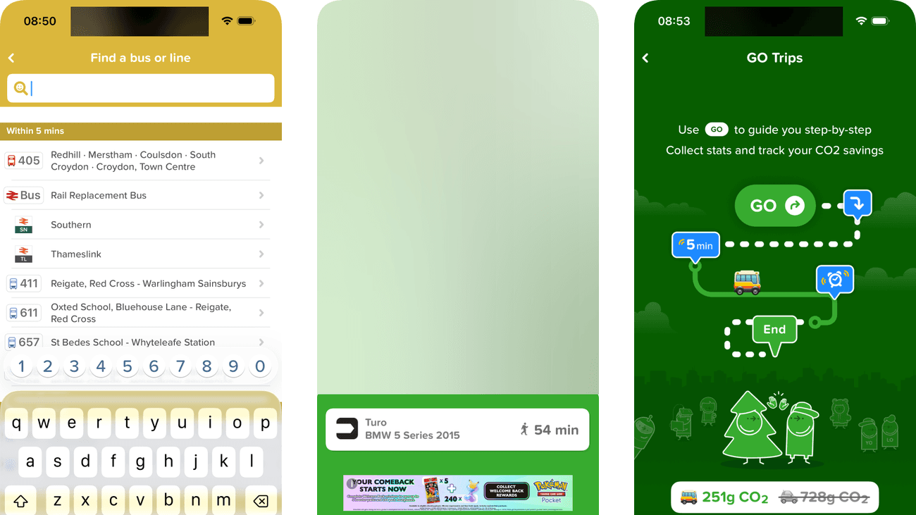
Route numbers and destinations appear while the search field is active. The traveller can recognise a service in suggestions without entering its complete formal name.
Similar route numbers may refer to different directions or operators. Suggestions should provide enough destination context to prevent selecting the wrong service.
If we show route direction and operator consistently beside suggested service numbers, then people should be better able to find the intended bus or transport line because the available actions and their differences would be clearer at the point of choice.

Private details have been obscured.
Screen 02
Browse nearby bus stops
The Bus browser is in Stops mode, keeping the transport scope visible beside a local map and stop list. This is a way to browse nearby stops rather than a set of results from a typed query.
An advertising strip interrupts the route list. In a time-sensitive search, it should not receive the same visual priority as service number, direction and departure.
If we keep route number, direction and next departure ahead of promotional content, then people should be better able to browse nearby stops within the bus network because the information needed for the task would be easier to notice.

Private details have been obscured.
Screen 03
Search within buses
The active bus search limits suggestions to a particular transport mode. It narrows the field before asking the person to distinguish individual services.
The route numbers already have place or endpoint names. The Within 5 mins and Within 15 mins grouping is less explicit about what the time means: walking reach or a service departure.
If we name what Within 5 mins and Within 15 mins measure while retaining the route names, then people should be better able to narrow bus results with a query because the time groups would have an explicit meaning rather than two plausible interpretations.

Private details have been obscured.
Screen 04
Tube station results
Station and line controls offer two ways to inspect the Tube network. The station results include walking times so the person can compare access from the selected area.
Proximity is immediately visible, but the closest station may not offer the most useful route. Connection and operating-status cues should support the decision as well.
If we show useful lines and current service status beside station proximity, then people should be better able to choose a relevant Tube station because the immediate benefit would be presented alongside the relevant conditions and consequences.

Private details have been obscured.
Screen 05
Tube lines
Named lines appear in a consistent list with their familiar route colours. A traveller who knows the line can move directly to it without searching station by station.
Colour helps distinguish lines, but names and status must carry the meaning independently. Small or low-contrast line labels would make scanning less reliable.
If we keep line names readable and express operational status in text as well as colour, then people should be better able to find the intended Tube line because the information needed for the task would be easier to notice.

Private details have been obscured.
Screen 06
Nearby rail stations
The Rail view separates stations from routes and lists the nearby station with service information. It gives rail travel a defined scope within the broader mode browser.
Walking time and departures are both present, but comparing them still leaves the traveller to account for getting onto the platform. A departure that looks close in time may not be a usable connection.
If we show whether the walk plus a stated boarding buffer reaches the selected departure, keeping the existing times visible, then people should be better able to compare nearby rail stations because the traveller would not need to calculate connection feasibility from separate timings.

Private details have been obscured.
Screen 07
Rail operators
The Routes view lists named rail operators within the selected mode. It offers a direct path for someone who already knows the service they need.
Operator names may be unfamiliar to visitors and do not necessarily state destinations. Example routes or coverage would help people choose without local knowledge.
If we show the main route or coverage area beneath each operator name, then people should be better able to inspect the relevant rail operator because fewer details need to be held in mind at once.

Private details have been obscured.
Screen 08
Choose a cab provider
Uber, Bolt, Freenow and Gett appear in one row with the selected provider highlighted. The consistent format makes provider choice a distinct step before booking.
The source capture uses a Book button with an external-link symbol. That part is obscured in the published example. In the original flow, naming the provider on the button would make the handoff more explicit.
If we name the selected provider in the external booking action, then people should be better able to compare cab providers because the immediate benefit would be presented alongside the relevant conditions and consequences.

Private details have been obscured.
Screen 09
Choose a cab type
Available vehicle types have pickup estimates, while unavailable types are explicitly labelled. The text communicates availability without relying only on muted colour.
The available options show the same pickup estimate but no fare in this view. Time alone is not enough to compare the cost and suitability of different vehicle types.
If we show comparable fare information beside pickup estimates before the provider handoff, then people should be better able to compare cab types before opening a provider because the available actions and their differences would be clearer at the point of choice.

Private details have been obscured.
Screen 10
Nearby rental cars
Turo results name individual cars and show walking times. That connects a rental option with the effort required to reach it instead of displaying only a provider logo.
The source capture offers Download, an app handoff rather than a completed rental. That control is obscured in this published example; the original flow would benefit from naming the destination and rental task before the handoff.
If we name the rental app and explain the handoff beside its download action, then people should be better able to compare nearby rental-car options because the immediate benefit would be presented alongside the relevant conditions and consequences.

Private details have been obscured.
Screen 11
Nearby ferry piers
Pier names and walking times appear below the ferry map. The layout gives each boarding location a distinct row within the selected transport mode.
Destination and next departure already accompany each pier’s walking time. The traveller still has to judge whether that walk leaves enough time to board, particularly when a boat is due soon.
If we show the walking and boarding-time comparison for the selected departure, retaining the existing destination and timetable, then people should be better able to find a suitable ferry pier because proximity and departure timing would be combined into a practical boarding check.

Private details have been obscured.
Screen 12
Ferry routes
The Routes view presents ferry services as separate entries. It gives someone who knows a route an alternative to browsing pier locations first.
Short route codes assume knowledge that a visitor may not have. Named endpoints would make the same choices easier to interpret without memorising the operator’s codes.
If we show named endpoints beside each ferry route code, then people should be better able to check the relevant ferry route because fewer details need to be held in mind at once.

Private details have been obscured.
Screen 13
Nearby tram stops
The Tram view reuses stop cards and walking-time cues from other transport modes. That consistency reduces the need to learn another browsing pattern.
A distant stop may still appear because it is the nearest in the selected mode. The interface should make the distance clear and offer a useful alternative when that mode is impractical.
If we explain when no tram stop is nearby and provide a route back to other modes, then people should be better able to find a nearby tram stop because the immediate benefit would be presented alongside the relevant conditions and consequences.

Private details have been obscured.
Screen 14
GO Trips introduction
The introduction explains step-by-step guidance before a live trip begins. Its illustrated sequence creates an expectation of what GO will help with during travel.
Collecting statistics and savings is presented alongside navigation. The traveller should understand what is recorded without treating measurement as a requirement for basic directions.
If we distinguish navigation help from optional trip recording and explain the data used, then people should be better able to understand what starting GO will record because the immediate benefit would be presented alongside the relevant conditions and consequences.
Conclusion
What this journey teaches us.
Transport search works when the interface knows whether the person is recalling a service or exploring what exists. Route numbers, mode labels, direction and proximity should help both jobs without being confused for one another.
The opportunity is to use a consistent comparison grammar across modes while preserving the cues each network requires. Familiar branding should support recognition, not replace live status or practical suitability.
Keep exploring