
Adding services without taking over
I looked at PayPal’s cross-sell, package-tracking and subscription screens to see how adjacent services enter an account experience. Each offer may be useful, but it competes with a product people often open to complete a specific financial task.
This case study focuses on timing, relevance and consent. A helpful extension should explain what changes, what data it needs and how to leave, without making the core account feel like an advertising surface.
Some screenshots use fictional personal details and activity. Private locations remain obscured where needed.
- Captured
- Capture date not recorded
- Published
- Last updated
- Product version
- PayPal iOS app 8.107.2
- Source
- View reference ↗
- 8
- Screens
- 6
- Ingredients
- 16
- Applications
Business goals
What works
What the captured flow does well.
- Features are grouped into recognisable destinations.
- Some introductions explain the service before setup.
- Linking actions remain separate from core payments.
- Optional services can be revisited later.
What could improve
What deserves closer review.
- Cross-sell cards compete with primary account tasks.
- Benefits can appear before data requirements.
- Linking another account increases privacy consequences.
- Subscription discovery may look like account maintenance.
Screen-by-screen breakdown
Follow the journey.
Each observation shows what works or what could improve, on this screen or across the wider flow. The opportunity turns one or two principles into a testable hypothesis.

Screen 01
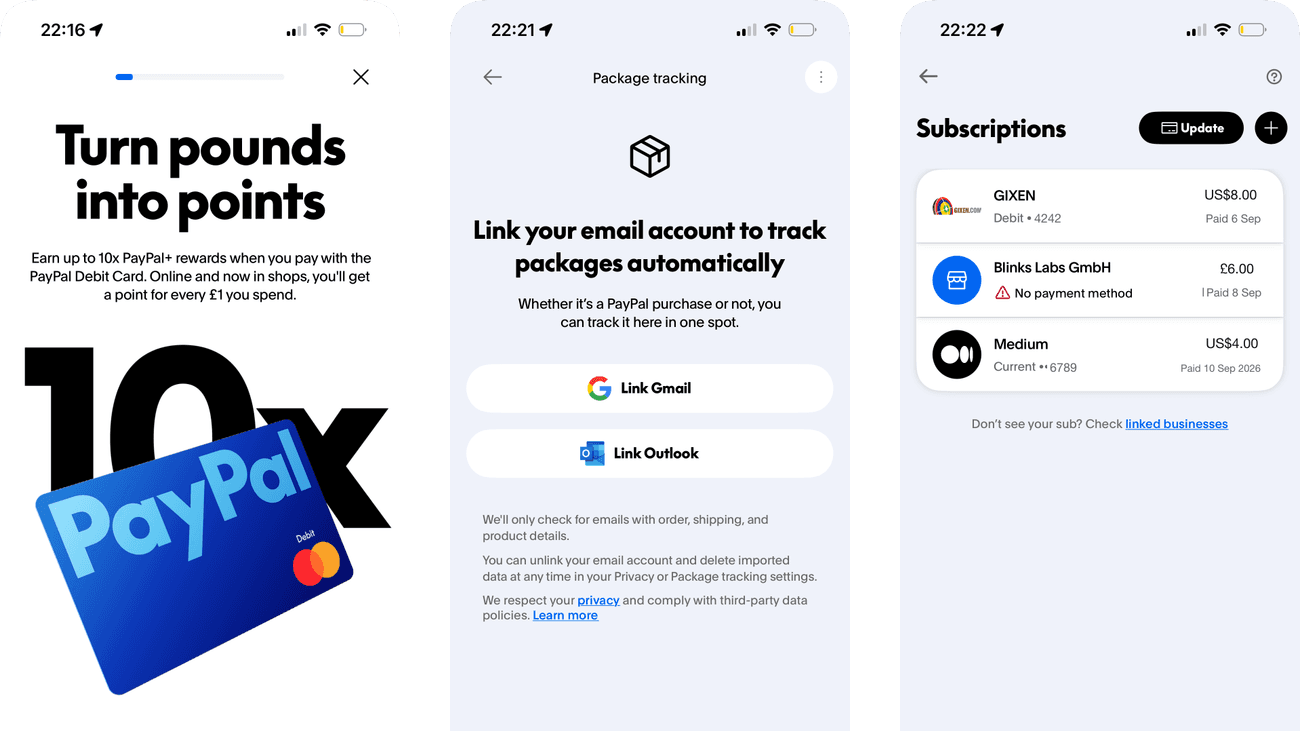
Debit card points offer
The oversized 10x claim and debit-card artwork dominate the offer. They make the reward multiplier a likely first takeaway, even though the explanatory copy appears above the artwork.
The multiplier is more prominent than the conditions behind it. Without reading those conditions, someone could overestimate the value they will receive from ordinary spending.
If we put the qualifying purchases and reward limits beside the 10x claim, then people should be better able to decide whether to activate a debit card because the immediate benefit would be presented alongside the relevant conditions and consequences.

Personal details and activity have been replaced with fictional examples.
Screen 02
Set a backup payment
The introduction explains that the backup method will be charged when the PayPal balance is insufficient. A displayed funding source and pencil icon sit above Agree and Continue, allowing that choice to be inspected before agreement.
The explanation is explicit, but changing the displayed method depends on recognising a pencil icon. A named action would make the alternative to accepting this method easier to discover.
If we label the pencil Change backup method while retaining the explanation of when that method will be charged, then people should be better able to choose a backup funding method because the alternative to accepting the displayed method would have a named action.

Screen 03
Preparing the debit card
Getting your card ready acknowledges that setup is processing. The short status message gives a purpose to the pause between funding selection and PIN creation.
The message does not identify the remaining setup step. Someone waiting here may be unsure whether the card is ready to use or whether another action will follow.
If we name PIN creation as the next step while the card is being prepared, then people should be better able to understand whether debit-card setup is progressing because fewer details need to be held in mind at once.

Screen 04
Create a card PIN
PIN creation has its own page after card preparation. The first field asks for a four-digit PIN and the second asks for confirmation, keeping this security task separate from the earlier funding choice.
The green card-ready message overlaps the heading. Its strong colour draws attention to the completed step while partly covering the task that still needs doing.
If we place the card-ready confirmation above the heading without covering the PIN instructions, then people should be better able to create and confirm a card PIN because the information needed for the task would be easier to notice.

Screen 05
Connect package tracking
The page connects email linking with automatic package tracking. It explains the benefit in terms of a task the person may already recognise.
Scope and the option to unlink and delete imported data are already explained below the provider buttons. Those useful details come after the actions, so a quick reader may reach a linking choice before reading them.
If we move a concise scope and unlinking summary immediately above the provider buttons, retaining the fuller explanation, then people should be better able to decide whether to connect package tracking because the permission scope would be encountered before choosing a provider.

Screen 06
Tracking options
A bottom sheet separates tracking settings from adding a tracking number. It offers a specific next action while retaining the package-tracking page behind it.
Manual tracking is available here after a page led by email linking. Giving both routes clear visibility earlier would help someone choose according to their privacy preference.
If we show manual tracking alongside email linking on the initial tracking page, then people should be better able to choose how to track a delivery because the available actions and their differences would be clearer at the point of choice.

Personal details and activity have been replaced with fictional examples.
Screen 07
Subscriptions overview
Subscription rows combine a service name and price, creating a compact overview of recurring commitments. The repeated layout helps a person compare what is being paid.
A list of charges is useful only if billing cadence and renewal timing are clear. Similar-looking amounts can hide very different ongoing commitments.
If we show billing cadence and next charge alongside every subscription amount, then people should be better able to compare recurring subscription commitments because the available actions and their differences would be clearer at the point of choice.

Screen 08
Link subscriptions
Three icon-led instructions explain how to link a subscription through PayPal. Breaking the process into steps makes the sequence easier to follow than a single paragraph.
The instructions describe actions to perform elsewhere rather than offering separate linking routes here. Clear separation between guidance and tappable controls would help people know where to act.
If we distinguish the instructional steps from the action that starts linking, then people should be better able to understand the steps for linking a subscription because the information needed for the task would be easier to notice.
Conclusion
What this journey teaches us.
Adjacent services earn attention when they follow a relevant need and clearly state the exchange. The person should know why PayPal is offering the feature, which account or data it connects and how to undo the link.
The practical guardrail is simple: the optional service must not obstruct the original task. Relevance, explicit consent and a reversible setup matter more than promotional prominence.
Keep exploring