
Managing reading and publishing
I reviewed Medium’s library, profile, audience statistics and settings to see how the product supports life after the first story. These screens bring together saved reading, public identity, publishing performance and app preferences.
The main design challenge is helping readers and writers understand which controls affect private organisation, public presentation or communication. Those categories should remain distinct even when they share one account area.
Some screenshots use fictional personal details and activity. Private locations remain obscured where needed.
- Captured
- Capture date not recorded
- Published
- Last updated
- Product version
- Medium iOS app 4.326.205932
- Source
- View reference ↗
- 16
- Screens
- 6
- Ingredients
- 32
- Applications
Business goals
What works
What the captured flow does well.
- Lists create a durable route back to saved reading.
- Profile and performance views use familiar groupings.
- Notification controls remain editable.
- App preferences are separated from story actions.
What could improve
What deserves closer review.
- Private and public account states can look similar.
- Recent change is harder to compare with lifetime totals.
- Long settings lists hide current values.
- Customisation can outrank higher-consequence controls.
Screen-by-screen breakdown
Follow the journey.
Each observation shows what works or what could improve, on this screen or across the wider flow. The opportunity turns one or two principles into a testable hypothesis.

Personal details and activity have been replaced with fictional examples.
Screen 01
Your reading lists
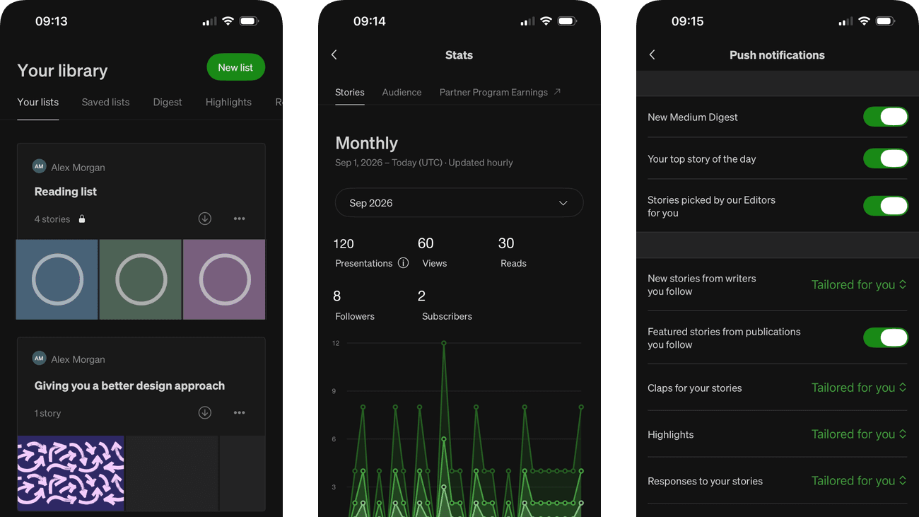
List cards combine a title, preview imagery and an item count. They give saved reading a recognisable destination beyond a single undifferentiated bookmark list.
A lock icon already signals a private list, but its preview images still reveal saved interests on this screen. An explicit Private label and optional hidden previews would make that state clearer during shared-screen use.
If we label private lists in words and let the reader conceal their previews until requested, then people should be better able to find a saved reading list while respecting its privacy because sensitive or secondary detail would appear when requested rather than by default.

Personal details and activity have been replaced with fictional examples.
Screen 02
More reading lists
Additional lists continue below the initial library view using the same card structure. The repeated pattern carries the meaning of title, preview and count through the longer collection.
As the collection grows, finding a known list requires more scrolling. Search or sorting would help without requiring the reader to remember the list’s position.
If we provide list search or sorting when the collection extends beyond the first view, then people should be better able to locate a list within a larger collection because fewer details need to be held in mind at once.

Personal details and activity have been replaced with fictional examples.
Screen 03
Saved lists empty state
No lists from others explains the empty tab, gives an instruction for saving a list and offers Explore. The screen already connects the empty state with a way to start finding material.
Explore is a broad label for the next step in a list-saving task. Naming public lists or previewing one would make the destination more predictable than a general discovery action.
If we make the existing Explore route explicitly about finding public lists, then people should be better able to understand how to begin saving lists because the available actions and their differences would be clearer at the point of choice.

Personal details and activity have been replaced with fictional examples.
Screen 04
Profile activity explanation
A small explanation draws attention to the profile’s activity area. It introduces a less obvious feature at the place where the person can use it.
Profile activity can be public-facing, unlike private reading organisation. The explanation should clarify who can see the activity before encouraging someone to explore or add to it.
If we state the visibility of profile activity within its introduction, then people should be better able to understand which profile activity is public because the immediate benefit would be presented alongside the relevant conditions and consequences.

Personal details and activity have been replaced with fictional examples.
Screen 05
Profile overview
Profile information, activity tabs and published work have distinct areas. They bring public identity and writing together in a recognisable author page.
Pinned work and profile controls appear together in this scrolled author view. A clearer distinction between public content and owner-only controls could help a writer anticipate what visitors actually see.
If we make public content and owner-only profile controls visually distinct, then people should be better able to check which profile content visitors can see because the available actions and their differences would be clearer at the point of choice.

Personal details and activity have been replaced with fictional examples. Data visualisations are reconstructed with illustrative values.
Screen 06
Monthly story statistics
The month selector and labelled totals connect recent publishing activity with a defined reporting period. The graph supplies a visual view of how activity varies across that period.
An information icon already offers an explanation beside Presentations. Views and Reads describe different stages too; a concise inline relationship would make their comparison easier without needing to open help.
If we add a short inline explanation linking Presentations, Views and Reads while retaining the existing information control, then people should be better able to interpret monthly story-performance measures because fewer details need to be held in mind at once.

Personal details and activity have been replaced with fictional examples.
Screen 07
Lifetime story statistics
Lifetime reporting groups results by article and includes publication dates. This supports checking a known story without relying on the monthly graph.
The visible dates reveal different publication ages, but lifetime totals still cover unequal exposure periods. Older work has had longer to accumulate results, complicating a direct comparison.
If we offer the same post-publication reporting window for every story alongside lifetime totals, then people should be better able to compare story performance over comparable exposure periods because each story would be compared after the same amount of time to attract readers.

Personal details and activity have been replaced with fictional examples.
Screen 08
Audience overview
Followers and subscribers have separate totals. The date range and daily update schedule are visible, and the Followers section defines who is counted. These details help a writer interpret the numbers rather than treat them as interchangeable.
Audience Growth frames this as a story of progress, but the visible lifetime totals do not show how much changed within a shorter period. A writer could mistake a large accumulated audience for strong recent growth.
If we show the net change for the selected period alongside the lifetime total, without attributing that change to a particular story, then people should be better able to understand changes in followers and subscribers because recent change would be distinguished from an accumulated total rather than implied by a growth heading.

Personal details and activity have been replaced with fictional examples. Data visualisations are reconstructed with illustrative values.
Screen 09
Subscriber statistics
The scrolled Subscribers section groups subscription counts with their graph. Its heading separates this relationship from other audience measures on the same page.
Explanatory text, totals and the graph use several different positions. Keeping the period and unit close to the plotted values would reduce interpretation work.
If we place the subscriber definition, reporting period and graph unit together, then people should be better able to interpret subscriber totals and changes because fewer details need to be held in mind at once.

Personal details and activity have been replaced with fictional examples.
Screen 10
Edit the profile
Name, pronouns and short bio are separate labelled fields. The editor exposes the main parts of a public profile without combining them into one unstructured text area.
The fields shape a public identity, but visibility is not prominent beside every input. A clear public-preview cue would help the writer understand what other readers will see.
If we show a preview and a clear public-visibility note before saving profile changes, then people should be better able to update profile details with understood visibility because the immediate benefit would be presented alongside the relevant conditions and consequences.

Personal details and activity have been replaced with fictional examples.
Screen 11
Reader settings
Account and configuration headings organise membership, stories, Restore purchase, profile and notification destinations. Restoring a purchase is an access-recovery action, not a receipt list.
A long list of destinations gives little summary of current values. Short state labels would let someone inspect a preference without repeatedly opening separate pages.
If we summarise the current value beside settings that can be checked from the list, then people should be better able to find the relevant reading or account preference because fewer details need to be held in mind at once.

Personal details and activity have been replaced with fictional examples.
Screen 12
More reader settings
Social links, app information and account exit actions appear in grouped sections. The headings help separate community discovery from maintaining the app.
Sign out sits near routine informational options. Its effect should be clear and separated enough to avoid accidental activation during an ordinary settings scan.
If we separate sign-out from informational links and confirm its destination clearly, then people should be better able to find less prominent reader settings because the information needed for the task would be easier to notice.

Personal details and activity have been replaced with fictional examples.
Screen 13
Push notification choices
Notification categories use both on/off switches and Tailored for you selectors. The mixed controls let readers distinguish a channel’s availability from how some recommendations are chosen.
Tailored for you does not itself say how often messages arrive. Existing purpose descriptions help explain the category, but a frequency preview would make the tailored choice easier to assess.
If we explain the expected frequency behind Tailored for you beside those selectors, then people should be better able to choose which push notifications to receive because the tailored choice would describe an expected frequency as well as a purpose.

Personal details and activity have been replaced with fictional examples.
Screen 14
More notification choices
The continued notification list uses switches alongside tailored selectors rather than one uniform control. Keeping each category labelled supports review across this longer settings page.
Switches and tailored choices require different interpretations, making the overall setup harder to summarise mentally. A concise summary of enabled categories and tailored frequency would support a final check.
If we summarise enabled categories and explain the expected frequency of tailored alerts, then people should be better able to review the full notification configuration because fewer details need to be held in mind at once.

Personal details and activity have been replaced with fictional examples.
Screen 15
Choose an app icon
A border indicates the current icon among visible alternatives. The preview grid makes an appearance choice concrete without requiring a verbal description.
A membership prompt appears with the customisation options. The page should distinguish included icons from paid choices before someone attempts to select one.
If we label which icons are included and which require membership before selection, then people should be better able to choose an available app icon because the immediate benefit would be presented alongside the relevant conditions and consequences.

Personal details and activity have been replaced with fictional examples.
Screen 16
App controls
Downloads, cache controls and accessibility preferences have named rows or switches. The page separates storage maintenance from reading-display behaviour.
Clearing cache has a different consequence from changing a display preference. The amount removed and what remains available should be explained before that action is taken.
If we explain what clearing the cache removes and preserves beside its action, then people should be better able to find application controls and support information because the immediate benefit would be presented alongside the relevant conditions and consequences.
Conclusion
What this journey teaches us.
Medium’s account experience supports several roles at once: reader, curator and writer. Clear labels should tell people when they are organising private material, editing a public profile or interpreting an audience measure.
The wider lesson is to preserve context and consequence. Show current settings, define statistics and keep privacy-sensitive lists or profile details protected in any reusable UI example.
Keep exploring