
Making travel feel personal
I explored Citymapper’s app-icon colours, characters and materials, then changed the location marker on the map. I also looked at news, sharing and Siri commands. These are different ways of making an everyday travel tool feel more personal or convenient.
The useful distinction is between changing how the app looks and changing what it does. An icon should be easy to preview and reverse; a voice command needs to explain its setup and the information it will use.
Some screenshots use fictional personal details and activity. Private locations remain obscured where needed.
- Captured
- Capture date not recorded
- Published
- Last updated
- Product version
- Citymapper iOS app 11.51.1
- Source
- View reference ↗
- 8
- Screens
- 6
- Ingredients
- 16
- Applications
Business goals
What works
What the captured flow does well.
- Visual options make appearance choices concrete.
- The ordinary map dot remains an option.
- Sharing has a recognisable entry point.
- Siri examples explain possible uses before setup.
What could improve
What deserves closer review.
- A mood question hides the map-marker consequence.
- Optional news can compete with travel tasks.
- Voice setup needs clearer prerequisites.
- The Siri error and next action do not match.
Screen-by-screen breakdown
Follow the journey.
Each observation shows what works or what could improve, on this screen or across the wider flow. The opportunity turns one or two principles into a testable hypothesis.

Private details have been obscured.
Screen 01
Choose an icon colour
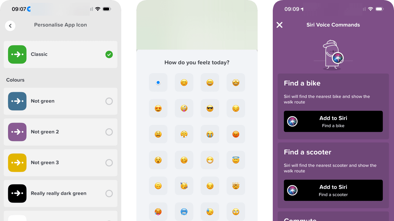
Visible icon previews and a tick clearly identify the current Classic choice. Each alternative has a label and an empty selection circle, making the current state easy to distinguish from the available options.
Playful names such as Not green and Not green 2 do not identify the colours. They add character, but someone who cannot distinguish the previews has little help understanding the difference.
If we include a plain colour name alongside each playful label, preserving the previews and selected marker, then people should be better able to choose an app-icon colour because the difference between options would not depend on recognising a colour preview.

Private details have been obscured.
Screen 02
Choose an icon character
Character previews are grouped into named collections. The structure makes a large set of playful appearance options easier to browse as smaller sets.
Many similar faces can demand repeated comparison with little functional difference. A preview and simple undo would help someone choose without over-investing in the decision.
If we offer a clear preview and reversible selection without requiring a final commitment screen, then people should be better able to choose an app-icon character because fewer details need to be held in mind at once.

Private details have been obscured.
Screen 03
Choose an icon material
The materials view shows how each icon treatment will look. Immediate visual examples connect a named material with its actual appearance on the app icon.
Material names alone may not communicate the difference between close variants. Selection feedback and a return-to-default control would make experimentation easier.
If we show the selected material clearly and provide a one-step return to the default icon, then people should be better able to choose an app-icon material because fewer details need to be held in mind at once.

Private details have been obscured.
Screen 04
Choose your map dot
A grid offers a standard location dot alongside expressive emoji. People can personalise their map marker or keep the ordinary dot without inventing a design themselves.
How do you feelz today? sounds like a mood question, although this flow changes the map marker. A direct explanation would make the effect of choosing an emoji clearer.
If we explain that the selected emoji changes the location marker and preview it on the map, then people should be better able to choose the map's location marker because the immediate benefit would be presented alongside the relevant conditions and consequences.

Private details have been obscured.
Screen 05
Citymapper news
Each visible update names a date or period and describes the travel effect, such as reduced access or busier services. Repeated image, title and summary rows make these notices straightforward to scan.
Notices from several different months use the same card treatment. Dates help, but the list gives no explicit current or past label, leaving the reader to compare each period with their travel plans.
If we separate current and upcoming notices from past notices while retaining dates and travel summaries, then people should be better able to identify relevant product news because the information needed for the task would be easier to notice.

Private details have been obscured.
Screen 06
Share the app
Share Citymapper and the iOS, Android & Web card make clear that this shares the app. Messages, Email and Copy to Clipboard offer distinct routes, with More Sharing Options underneath.
Copy to Clipboard names the destination rather than what will be copied. The app context helps, but Copy app link would make that action more specific without needing another explanation.
If we rename Copy to Clipboard as Copy app link and confirm when the link has been copied, then people should be better able to share the app intentionally because the button would name the object being copied and confirm the outcome.

Private details have been obscured.
Screen 07
Siri voice commands
Examples such as finding transport and commuting show what a voice command could do before setup. The task examples help the person anticipate the feature’s use.
Adding a command creates another way to trigger an action outside the app. The feature should explain what the command accesses and how to remove or change it.
If we explain the command’s action and removal route before adding it to Siri, then people should be better able to understand a Siri command before adding it because the available actions and their differences would be clearer at the point of choice.

Private details have been obscured.
Screen 08
Siri command preview
The preview explains that Home and Work locations must be set before Siri can give directions. It names the missing setup rather than displaying an unexplained failure.
The prominent action is Record Voice Command, but recording will not supply the missing places. A direct link to location setup would connect the error with the action needed to resolve it.
If we offer a direct route to set Home and Work before recording the commute command, then people should be better able to resolve the missing saved places before using a commute command because the available actions and their differences would be clearer at the point of choice.
Conclusion
What this journey teaches us.
Personalisation is clearest when someone can see what will change and easily undo it. Choosing an icon or map marker can make the app feel familiar without pretending to improve the route itself.
Functional shortcuts need more explanation. The Siri preview names missing saved places, but its main action asks for a recording. Matching that action to the missing setup would make the shortcut easier to get working.
Keep exploring