
Finding the right transport
I moved from Citymapper’s nearby results through bus stops, departures, timetables, station boards, walking radius, network maps and live line status. These screens form one nearby-transport journey: first understand what is around, then judge whether a specific service is useful now.
The map-and-list model is powerful, but the experience has to protect distance, direction, departure and disruption from visual competition. This case study follows the full nearby flow rather than treating each transport view as an isolated screen.
Some screenshots use fictional personal details and activity. Private locations remain obscured where needed.
- Captured
- Capture date not recorded
- Published
- Last updated
- Product version
- Citymapper iOS app 11.51.1
- Source
- View reference ↗
- 16
- Screens
- 5
- Ingredients
- 32
- Applications
Business goals
What works
What the captured flow does well.
- Maps and lists connect place with service information.
- Departure times receive clear visual weight.
- Mode views reuse familiar transport symbols.
- Disruption is expressed in operational language.
What could improve
What deserves closer review.
- Advertising interrupts time-sensitive information.
- Dense maps depend on prior network knowledge.
- Status marks need text as well as colour.
- Similar services need stronger direction cues.
Screen-by-screen breakdown
Follow the journey.
Each observation shows what works or what could improve, on this screen or across the wider flow. The opportunity turns one or two principles into a testable hypothesis.

Private details have been obscured.
Screen 01
Nearby transport
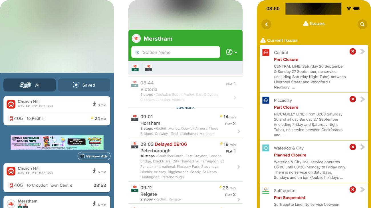
Nearby cards connect a stop or station with service information beneath the map. The traveller can move from what is around to a specific departure without entering a destination.
Advertising divides the transport cards. A traveller comparing imminent departures has to scan around a visually competing item unrelated to the current journey.
If we keep nearby departure cards together and place advertising below time-sensitive choices, then people should be better able to find a useful nearby departure because the information needed for the task would be easier to notice.

Private details have been obscured.
Screen 02
Selected bus stop
Selecting a nearby stop opens its map position and service panel. This narrows the nearby overview to one place while retaining a route to broader context.
The map occupies most of the view while the useful departure information sits near the bottom. A clearer stop summary could reduce the need to switch attention between those areas.
If we keep stop name, direction and next departure together above optional map detail, then people should be better able to check departures from the selected bus stop because fewer details need to be held in mind at once.

Private details have been obscured.
Screen 03
Bus departures
The next departure is prominent within the stop’s service list. The traveller can inspect upcoming buses without first opening the full timetable.
A minute estimate needs a clear live or scheduled status. Without that distinction, a traveller may place more confidence in the displayed time than the source supports.
If we label each departure as live or scheduled beside its estimate, then people should be better able to judge the reliability of a departure estimate because the immediate benefit would be presented alongside the relevant conditions and consequences.

Private details have been obscured.
Screen 04
Bus timetable
This continued timetable shows later departures from the preceding view. Keeping the same stop context and direction visible supports planning for a later bus without starting a new search.
The direction remains available, but a long list of similar times still needs a clear date and an indication of whether times are live or scheduled. Those cues help people interpret a later departure correctly.
If we keep the date and live-or-scheduled status visible alongside the existing direction throughout the timetable, then people should be better able to find a later bus in the correct direction because fewer details need to be held in mind at once.

Private details have been obscured.
Screen 05
Bus stop actions
The menu groups sharing, Siri and routing actions around the selected stop. It allows the same place to be reused for different tasks without re-entering it.
Get me TO and Get me FROM have opposite route meanings but similar labels. The selected stop should be repeated in the next route view so the direction can be checked.
If we name the stop in both routing actions and repeat the chosen direction in the next view, then people should be better able to choose a routing action for the selected stop because the immediate benefit would be presented alongside the relevant conditions and consequences.

Private details have been obscured.
Screen 06
Station departures
Departures are listed in time order with destination and platform details. The organisation links the next available service with where the traveller must physically go.
Several text colours and departure details compete in compact rows. Platform, destination and departure should remain a stable hierarchy when delay messages appear.
If we give platform, destination and departure a consistent order in every service row, then people should be better able to identify the next suitable station departure because the information needed for the task would be easier to notice.

Private details have been obscured.
Screen 07
Walking radius
The source capture shows a walking-time radius intended to make nearby distance more relatable than a map scale. That illustration is obscured in the published example to protect the location, so it cannot be assessed visually here.
The rings are centred on location, but actual walking routes may be constrained by roads and access. The display should make clear that a radius is an approximation.
If we label the walking radius as an estimate and offer a route-specific walking time, then people should be better able to estimate how far a place is to walk because fewer details need to be held in mind at once.

Private details have been obscured.
Screen 08
Choose a bike-share provider
All and individual bike-share providers sit in a compact selector above the results. The traveller can compare providers or narrow the view without entering a new area.
The selected provider has a stronger background than its neighbours. Repeating its name in the results heading would help maintain context while scanning the map and cards.
If we repeat the active bike-share provider in the results heading, then people should be better able to choose a bike-share provider because the information needed for the task would be easier to notice.

Private details have been obscured.
Screen 09
Nearby docking stations
The Santander view pairs docking-station locations with counts for electric bikes, bikes and spaces. Selecting a provider reveals availability relevant to that specific service.
The screen already separates finding bikes from finding spaces through an icon toggle and labels the availability counts. The toggle itself relies on recognising the icons, which may be harder for someone using the service for the first time.
If we add Find a bike and Return a bike labels to the existing task toggle, then people should be better able to find a suitable bike or return space because the task toggle could be understood without recognising its icons.

Private details have been obscured.
Screen 10
Bike-share map
Bike markers cluster around the selected area and make the service’s spatial distribution visible. The Open action provides a clear continuation to the provider.
Dense overlapping markers make individual locations difficult to select. Availability and walking distance should help distinguish the options before the handoff.
If we group overlapping locations and show availability with walking distance before opening the provider, then people should be better able to compare accessible bike-share locations because the available actions and their differences would be clearer at the point of choice.

Private details have been obscured.
Screen 11
More bike docking stations
Repeated Santander docking-station cards carry their availability counts down the list. People can inspect alternatives when the nearest dock does not have what they need.
Scanning more stations means repeatedly comparing electric bikes, ordinary bikes and spaces. A filter for the current task would make unsuitable docks easier to set aside.
If we let people filter docking stations by the bike type or return space they need, then people should be better able to find another dock with suitable availability because fewer details need to be held in mind at once.

Private details have been obscured.
Screen 12
Tube network map
The network diagram groups stations by coloured lines and connections. It provides a broader route-planning view than the nearby-station list.
The complete network is compressed into a phone screen. Legible zoom and line labels are necessary because colour and spatial memory alone will not support every traveller.
If we provide readable zoom, line names and an accessible station-search alternative, then people should be better able to understand a route through the Tube network because fewer details need to be held in mind at once.

Private details have been obscured.
Screen 13
Choose a Tube map
A short menu offers the standard map, rail view and night map from the same map area. It exposes specialist views when the person asks for them.
The options describe map variants rather than when each is useful. A short explanation would help someone choose without prior knowledge of the network’s operating patterns.
If we explain which services and times each map variant covers, then people should be better able to choose the appropriate network map because the immediate benefit would be presented alongside the relevant conditions and consequences.

Private details have been obscured.
Screen 14
Service issues
A contrasting header and warning markers distinguish disruption from ordinary transport browsing. Individual lines have their own entries so a traveller can inspect the affected service.
Several issues can fill the list with dense text. A concise severity, affected section and update time would help people judge relevance before opening an entry.
If we summarise severity, affected route section and update time for each issue, then people should be better able to identify disruptions relevant to a journey because fewer details need to be held in mind at once.

Private details have been obscured.
Screen 15
Line disruption details
Opening a line expands the issue into a description and station list. The traveller moves from a network-wide warning to the affected route’s detail.
A long disruption paragraph competes with the station sequence. The practical consequence for travel should be visible before the supporting explanation.
If we lead with the affected section and travel consequence before the full disruption text, then people should be better able to understand how a line disruption affects travel because the information needed for the task would be easier to notice.

Private details have been obscured.
Screen 16
Disrupted line map
Map and direction controls connect the line’s operational status with its geography. They let the person inspect the service in a spatial view after reading the issue.
The highlighted line and other network detail can be difficult to separate at this scale. A clear legend and affected-section label would make the warning easier to interpret.
If we label the affected section directly and provide a text alternative to the map highlight, then people should be better able to locate the affected section of a line because fewer details need to be held in mind at once.
Conclusion
What this journey teaches us.
Citymapper works well when nearby discovery narrows in stages: area, stop or station, service, then departure. Each step should preserve the place and mode that explain the next list.
The design guardrail is to keep operational information dominant. Advertising, provider branding and secondary controls should never outrank distance, disruption or the next viable departure.
Keep exploring