
Asking for access with care
I opened Citymapper as a new session, moved through cookies and tracking, saw the first home and subscription prompts, then revisited those choices through settings, account, data and notification screens. Together they show how trust is formed and maintained, not just how a single permission is worded.
The case study focuses on timing, proportionality and reversibility. Citymapper should ask for access when the travel benefit is concrete, keep refusal consequence-free and provide a recognisable route back to every choice.
Some screenshots use fictional personal details and activity. Private locations remain obscured where needed.
- Captured
- Capture date not recorded
- Published
- Last updated
- Product version
- Citymapper iOS app 11.51.1
- Source
- View reference ↗
- 14
- Screens
- 6
- Ingredients
- 28
- Applications
Common contexts
Business goals
What works
What the captured flow does well.
- The system tracking prompt preserves refusal.
- Settings provide routes back to account controls.
- CLUB prices are shown together.
- Data and notification choices remain editable.
What could improve
What deserves closer review.
- Consent arrives before travel value is established.
- Several asks appear close together.
- Commercial prompts can outweigh privacy controls.
- Current settings are not always summarised.
Screen-by-screen breakdown
Follow the journey.
Each observation shows what works or what could improve, on this screen or across the wider flow. The opportunity turns one or two principles into a testable hypothesis.

Screen 01
Citymapper launch
The central character and product name identify Citymapper against a single-colour background. There are few competing elements before the travel interface appears.
The launch image does not explain an extended wait. If startup stalls, the traveller needs a clear status or recovery route rather than a static brand screen.
If we show a status and safe retry when startup takes longer than expected, then people should be better able to recognise that Citymapper is starting because the displayed status would explain the result of the preceding action.

Private details have been obscured.
Screen 02
Cookie choices
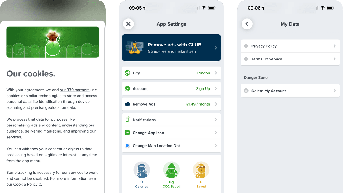
The cookie sheet separates the explanation from its available actions. Manage access offers a route to inspect choices beyond the introductory text.
The lengthy explanation pushes the main choices toward the bottom of the view. Refusal and acceptance need comparable visibility so scrolling effort does not steer the decision.
If we keep accept, refuse and manage choices equally visible alongside a short explanation, then people should be better able to choose whether to allow optional cookies because the information needed for the task would be easier to notice.

Private details have been obscured.
Screen 03
Tracking permission
The system prompt states that the permission concerns tracking across other companies’ apps and websites. It makes the scope more concrete than a generic request to improve the experience.
Tracking is requested while the person is still entering the app. The travel task should remain available after refusal so the choice does not feel like a condition of navigation.
If we ask only when the purpose can be explained and keep travel access unchanged after refusal, then people should be better able to decide whether to allow cross-app tracking because the available actions and their differences would be clearer at the point of choice.

Private details have been obscured.
Screen 04
Citymapper home
Get Me Somewhere and Get Me Home give destination entry a task-based label. Transport shortcuts offer an alternative for someone who wants to inspect a service first.
Advertising appears near the main travel controls. Its artwork can compete with the destination actions when someone opens the app to get moving quickly.
If we keep destination entry and saved-place actions visually ahead of advertising, then people should be better able to start planning a journey because the information needed for the task would be easier to notice.

Screen 05
Track travel with GO
Track CO2 savings with GO presents the feature through its potential environmental benefit. That gives the invitation a purpose beyond simply opening another tool.
The savings claim does not explain its comparison or calculation here. A short explanation would help people interpret the figure before treating it as a measure of their impact.
If we explain the comparison and limitations behind CO2 savings beside the GO invitation, then people should be better able to understand what GO's CO2 estimate represents because the immediate benefit would be presented alongside the relevant conditions and consequences.

Screen 06
CLUB membership offer
Monthly and annual prices appear together, allowing the traveller to inspect different payment commitments. The trial action sits below those options.
Make it zen frames membership as relief from advertising. Renewal price, billing timing and cancellation need similar clarity so the calmness promise does not outweigh the commitment.
If we show trial length, renewal charge and cancellation terms together beside the trial action, then people should be better able to assess the trial and renewal commitment because the immediate benefit would be presented alongside the relevant conditions and consequences.

Private details have been obscured.
Screen 07
App settings and CLUB
City, account and notification settings appear as named rows below the membership area. The labels give core configuration a predictable place within the app.
The large CLUB promotion leads a screen people may open to change a setting. Routine controls should be easy to reach without first engaging with an upgrade prompt.
If we keep essential settings immediately visible above optional membership promotion, then people should be better able to find app settings without confusing them with membership offers because the information needed for the task would be easier to notice.

Private details have been obscured.
Screen 08
More app settings
All Posts, contact, sharing, Siri and policy destinations are individually labelled. Separate cards already group several related links without adding them to the live navigation screen.
The groups have no headings, and the list mixes support, sharing, features and policies. Naming those groups would help someone locate a type of task without reading every row.
If we add headings to the existing groups for app features, support and policy links, then people should be better able to locate a feature, support or policy setting because fewer details need to be held in mind at once.

Private details have been obscured.
Screen 09
Additional app controls
Further settings continue the same row pattern as the preceding view. Less frequent controls remain accessible without occupying the home screen.
A long continuation makes the position of a known setting difficult to remember. A concise grouping or search route would make repeated maintenance less dependent on scrolling.
If we provide clear groups or settings search for controls below the first view, then people should be better able to find a less prominent app control because fewer details need to be held in mind at once.

Private details have been obscured.
Screen 10
Choose a city
Search and a list of supported cities provide two selection routes. Local service context can be changed deliberately rather than inferred solely from location.
Changing city affects which transport information is available. The current selection and the result of switching should be explicit so an old area is not mistaken for live local data.
If we confirm the active city and explain which transport views change after selection, then people should be better able to select the intended city because the displayed status would explain the result of the preceding action.

Private details have been obscured.
Screen 11
Sign up or log in
Email has its own full-width button. Apple has a labelled button below, alongside smaller Facebook and Google icons, giving four account routes with different visual emphasis.
Facebook and Google depend on logo recognition while the other routes explain their action in words. Someone less familiar with those logos has less help predicting what a tap will do.
If we give every sign-in option a visible provider name and action label, then people should be better able to choose a sign-in route because the information needed for the task would be easier to notice.

Personal details and activity have been replaced with fictional examples. Private locations remain obscured.
Screen 12
Account details
Name and email are separate labelled fields within the account page. Sign-in provider information and data controls have their own places beneath those details.
Full identity values appear even during a routine account check. Masked summaries and explicit editing would reduce unnecessary exposure while preserving account recognition.
If we mask the email in the overview and reveal full details only when editing, then people should be better able to check or edit the intended account detail because sensitive or secondary detail would appear when requested rather than by default.

Private details have been obscured.
Screen 13
My data
Privacy Policy and Terms of Service sit together above a separate Danger Zone containing Delete My Account. The spacing and heading distinguish reading information from starting a consequential action.
Danger Zone signals seriousness but does not explain what account deletion removes or retains. That detail may appear after the tap; this entry point could set a clearer expectation before someone starts.
If we add a short account-deletion scope summary and explain that the next step is a review, not immediate deletion, then people should be better able to choose how to manage personal data because the warning would explain the scope and next step before the person starts the deletion flow.

Private details have been obscured.
Screen 14
Notification settings
Every category explains its purpose. Live Activities is labelled Enabled and Line Status Alerts is Off; GO Alerts and Promotional Alerts have switches in the off position. Travel updates and marketing can be considered separately.
The first two settings use text status labels, while the last two rely on switch position. Reading the overall state requires translating between two presentations, even though the purposes are already explained.
If we add explicit On or Off labels beside the switches to match the text status used above, then people should be better able to set notification preferences because all notification states could be read in the same way.
Conclusion
What this journey teaches us.
Citymapper earns trust fastest when it helps first and asks second. A useful route, departure or saved place gives a real context for location, notifications and account choices.
Consent and subscription prompts should follow that rule: name the benefit, state the consequence, keep decline visible and make later reversal easy to find.
Keep exploring