
How Airbnb frames login and sign-up choices
Review Airbnb's login and sign-up screen: its visible option hierarchy, the limits of behavioural interpretation and practical access-flow questions to test.
- Flow
- Separate account setup choices
- Product
- Travel
Where it appears
Behavioural observations
What this screen may illustrate.
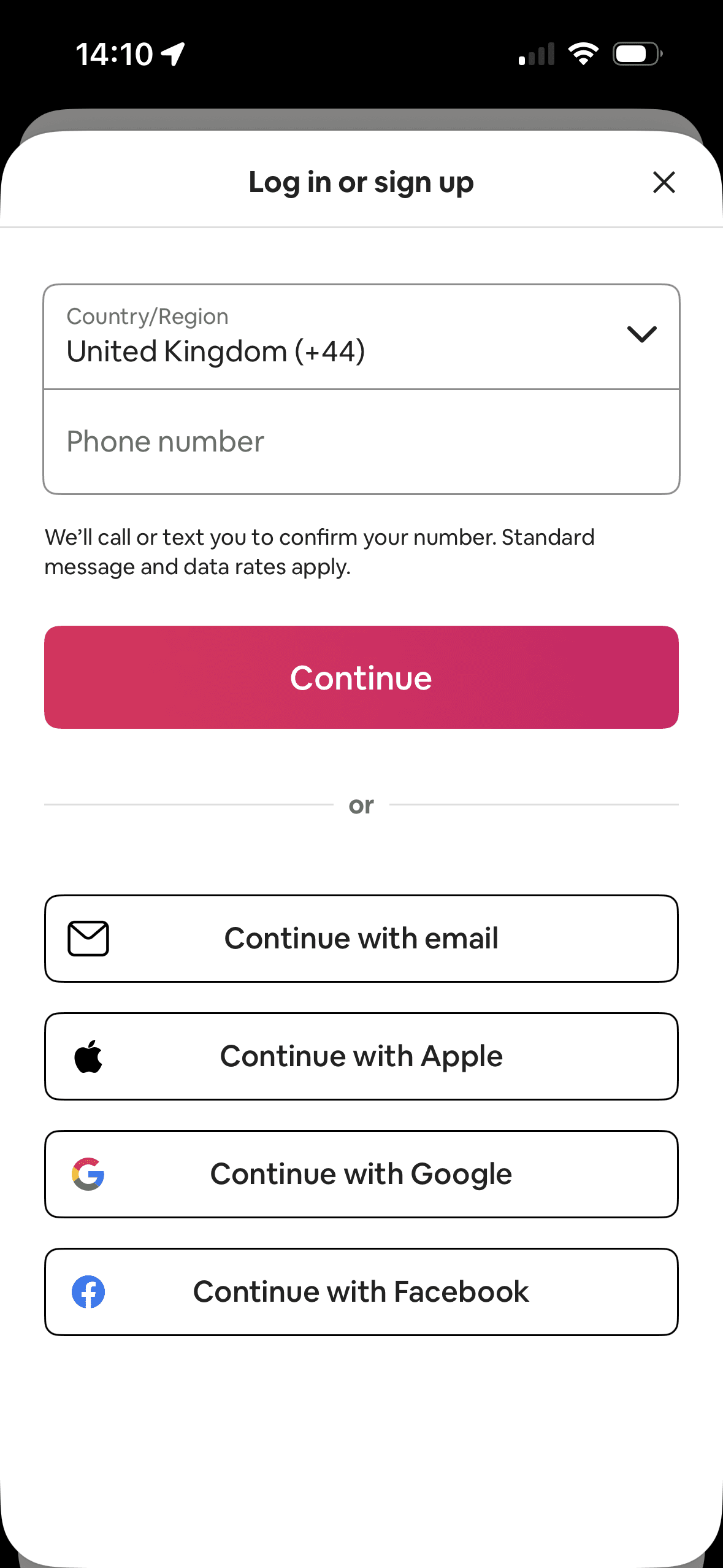
Phone entry and its bright Continue button occupy the first and most prominent area; email and third-party methods remain visible below. This shows hierarchy and option arrangement, not whether the layout changed sign-up behaviour.
One account route receives the strongest visual emphasis. That salience can steer selection before Airbnb explains any meaningful privacy, recovery or data-sharing difference.
Provider names and familiar logos make the available account routes easier to recognise. They support identification, but they are not evidence that a provider is safer or more trustworthy.
The immediate task stays focused on one decision before the wider journey continues. That sequencing reduces simultaneous choices when later steps remain predictable and reversible.