
- Flow
- Make data choices feel informed
- Product
- Travel
Where it appears
Behavioural observations
What this screen may illustrate.
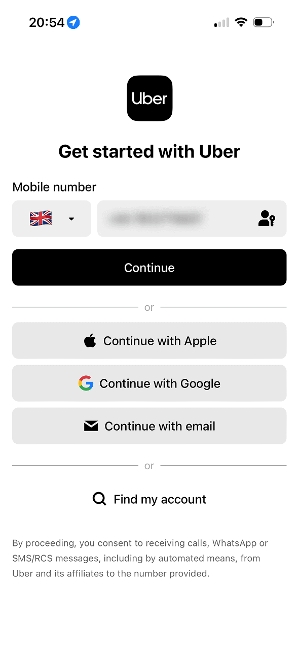
“Get started with Uber” frames account creation as a beginning rather than describing the full sequence. The screen also bundles automated calls or messages into proceeding; it does not show that the wording reduced resistance.
The screen keeps several account routes available in the same decision area. That is a useful choice structure because people can compare methods without leaving the flow.
Provider names and familiar logos make the available account routes easier to recognise. They support identification, but they are not evidence that a provider is safer or more trustworthy.
One account route receives the strongest visual emphasis. That salience can steer selection before Uber explains any meaningful privacy, recovery or data-sharing difference.