
- Flow
- Show value before more setup
- Product
- Music
Where it appears
Behavioural observations
What this screen may illustrate.
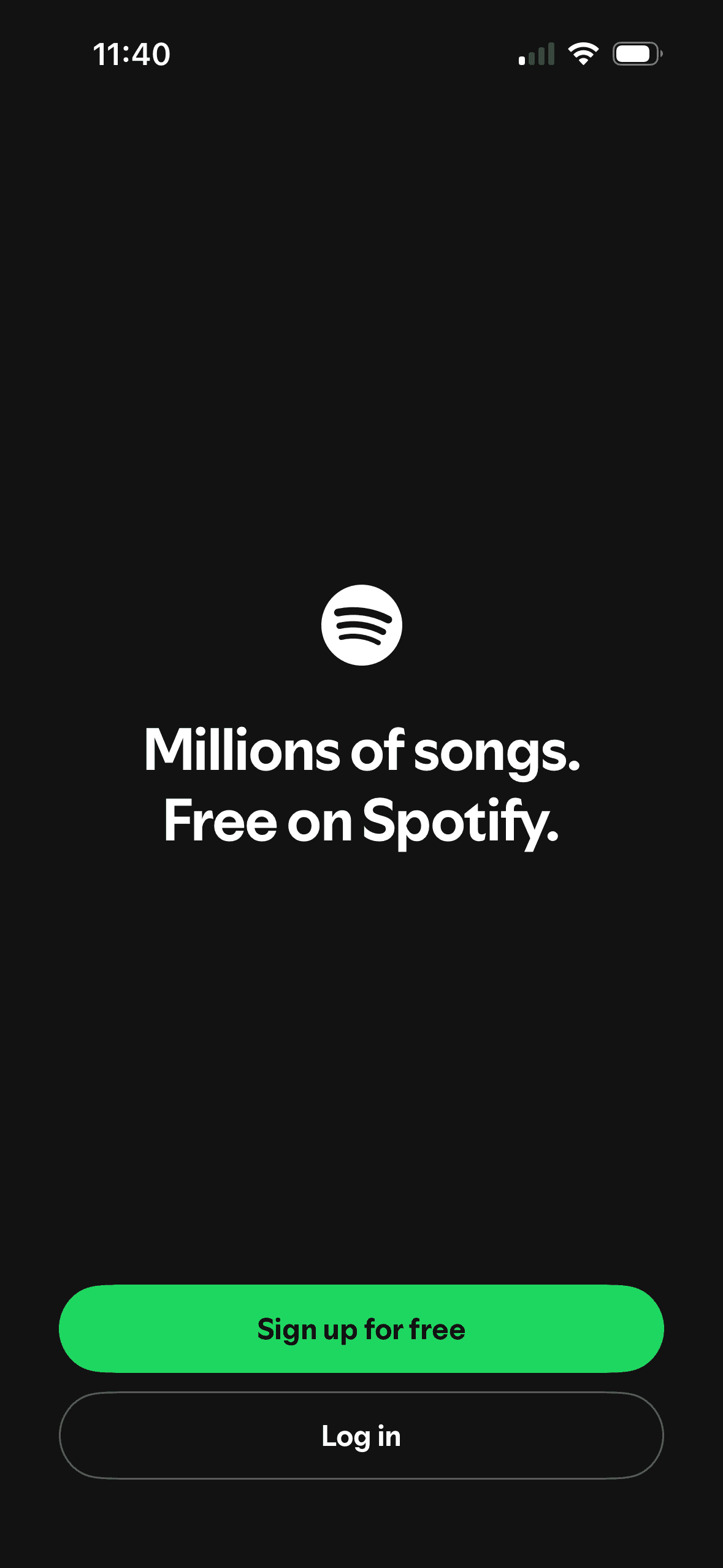
The headline pairs “Millions of songs” with “Free on Spotify”, framing catalog scale and price together. The screenshot does not show how people interpret “free” or whether the wording changes sign-up.
A filled green “Sign up for free” button receives more visual emphasis than the outlined “Log in” button. This is an observable hierarchy choice, not evidence that people were nudged or that one route improved outcomes.
The introductory message prepares people for the kind of task or benefit that follows. It is a flow-level cue because its effect depends on whether the next screens match that expectation.
The flow introduces one idea before moving to the next decision, reducing how much new information appears at once. Skip, back and reduced-motion routes determine whether that pacing stays supportive.