
- Flow
- Build momentum without pressure
- Product
- Education
Where it appears
Behavioural observations
What this screen may illustrate.
Visual hierarchy gives prices, savings or time-based offer language a clear point of entry. Important secondary information still needs enough prominence to be found before commitment.
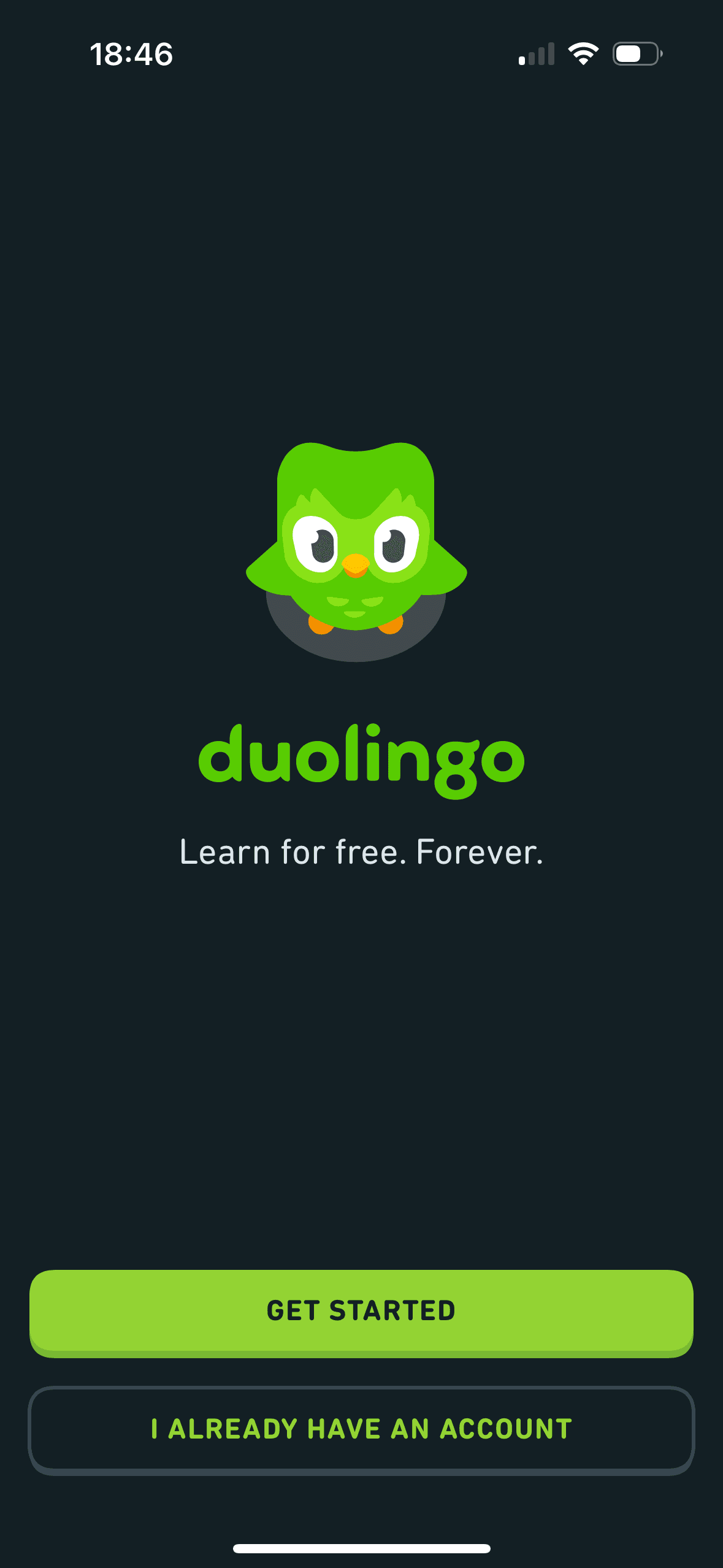
Get started is the prominent filled action while the existing-account route is outlined. This is visible choice architecture; neither route is preselected and the screenshot does not show a quicker decision or registration.
“Learn for free. Forever.” frames Duolingo around lasting free access. The statement is visible but does not describe ads, energy limits or paid features, and the screenshot does not show registration or later expectations.
Items placed first or at the top receive an attention advantage before people inspect the rest. The first position should reflect the person’s task rather than an unexplained commercial priority.