
- Flow
- Help people narrow mixed results
- Product
- Music
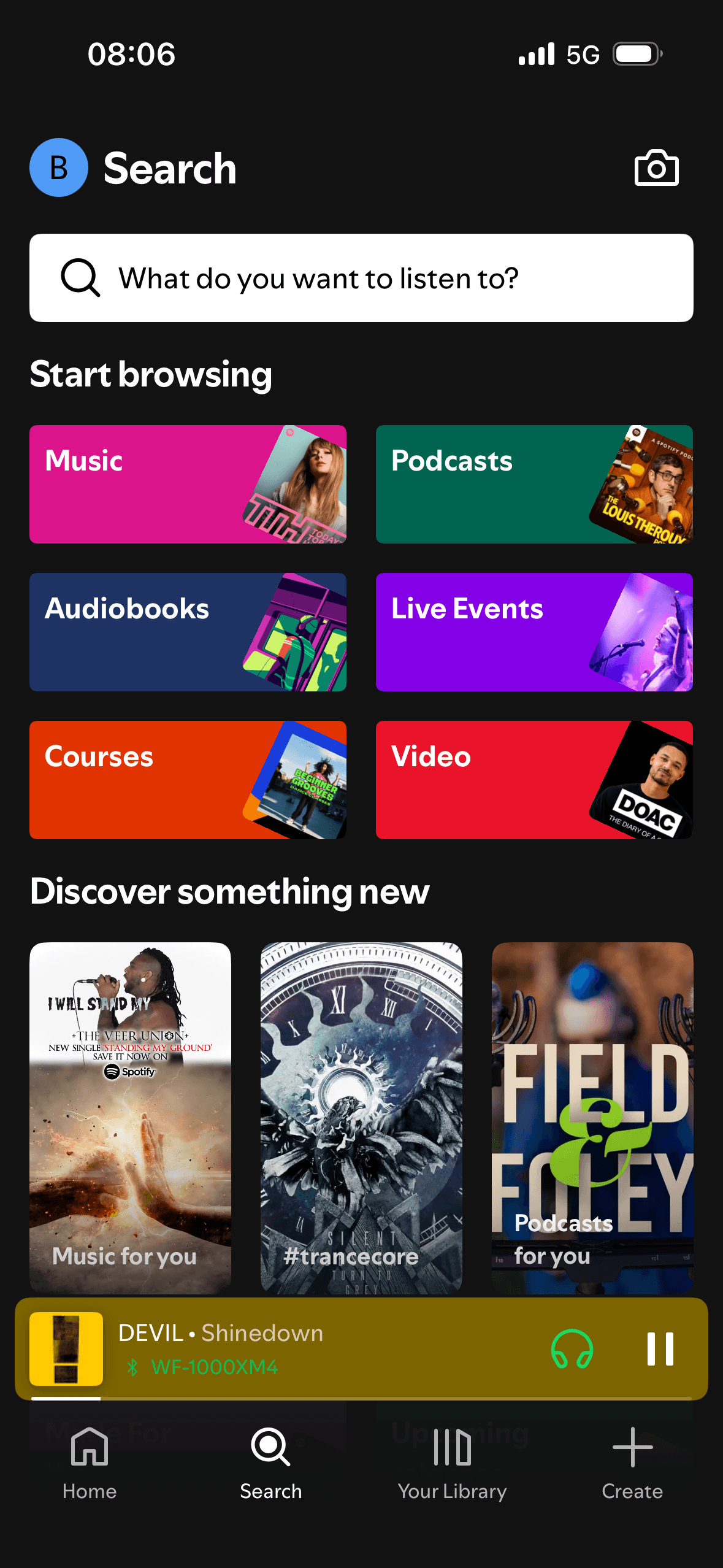
Where it appears
Behavioural observations
What this screen may illustrate.
Choice Architecture ↗
The screen turns the query, suggestions and result controls into explicit options rather than asking people to recall a hidden command or category.
Cognitive Load ↗
The number, order or overlap of options can still make comparison demanding. Search, grouping, a clear reset and an explanation of what changes would reduce avoidable cognitive load.
Chunking ↗
Labels, rows or chips group the query, suggestions and result controls into recognisable units, helping people scan a larger set without reading it as one block.
Recognition Heuristic ↗
Names, icons, artwork or previous queries let people recognise a likely option instead of reconstructing it from memory. The cue still needs a text label and clear source.