
- Flow
- Personalise before asking for payment
- Product
- Education
Where it appears
Behavioural observations
What this screen may illustrate.
Visual hierarchy gives the available choices and selected state a clear point of entry. Important secondary information still needs enough prominence to be found before commitment.
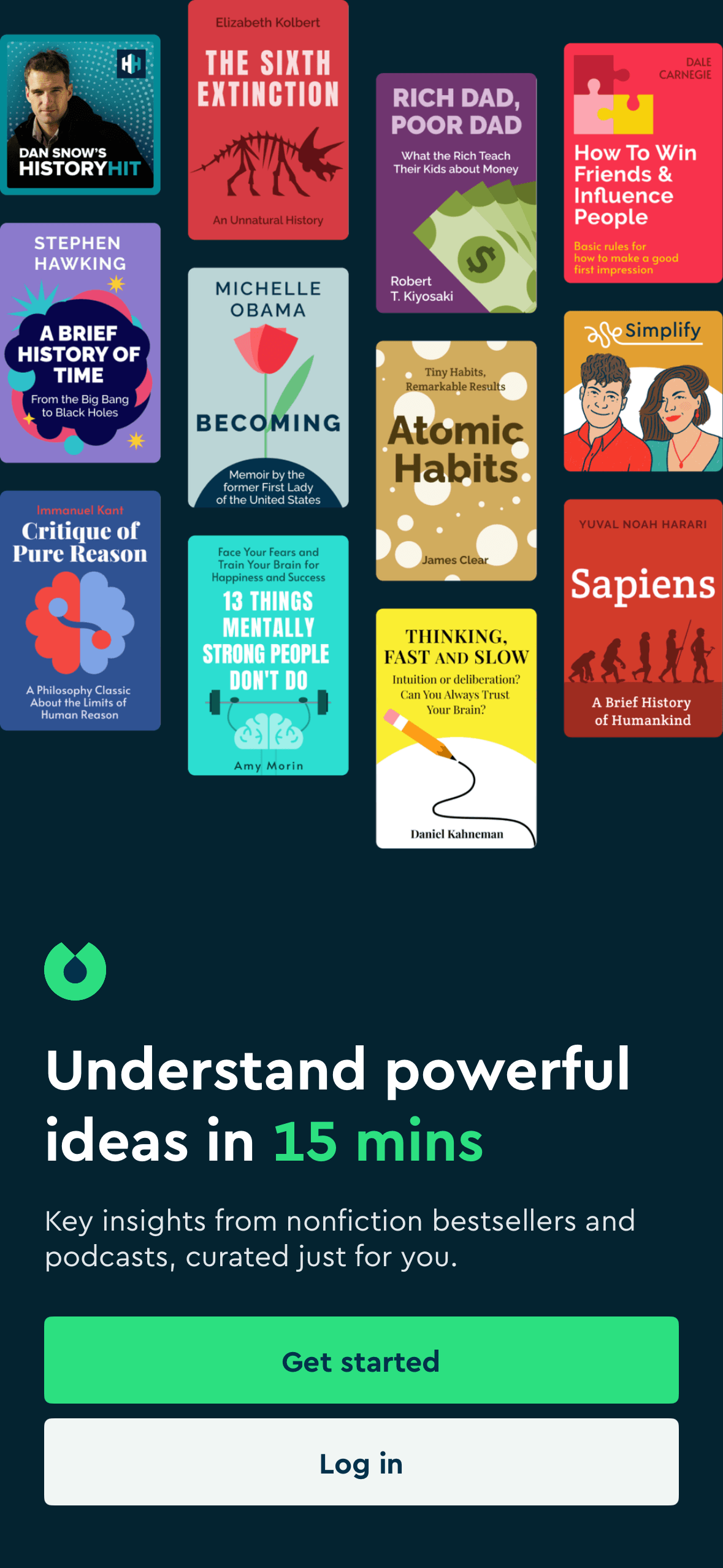
“Understand powerful ideas in 15 mins” frames Blinkist around speed and personal value before Get started. The time claim is visible, but the screenshot does not show positive emotion, understanding or engagement.
Items placed first or at the top receive an attention advantage before people inspect the rest. The first position should reflect the person’s task rather than an unexplained commercial priority.
The arrangement of the main controls, supporting information and available actions determines which action is easiest to see and take. The screen should keep alternatives, refusal and correction proportionate to their importance.