
Recovering when travel goes wrong
I followed Citymapper’s help and issue-reporting screens from the main help menu into journey, stop and station problems and the contact form. The flow asks people to classify what went wrong before they can explain it.
That structure can produce useful reports, but it must also work when someone is delayed, uncertain or frustrated. The categories should feel recognisable, allow correction and make clear what information will be sent.
Some screenshots use fictional personal details and activity. Private locations remain obscured where needed.
- Captured
- Capture date not recorded
- Published
- Last updated
- Product version
- Citymapper iOS app 11.51.1
- Source
- View reference ↗
- 5
- Screens
- 4
- Ingredients
- 10
- Applications
Business goals
What works
What the captured flow does well.
- Problem types narrow the reporting task.
- Journey and infrastructure issues remain distinct.
- The contact form creates a clear escalation route.
- Help remains available outside an active trip.
What could improve
What deserves closer review.
- People may not know which system caused the issue.
- Category-first reporting can block unusual problems.
- The form needs clear data and response expectations.
- Recovery guidance is less visible than reporting.
Screen-by-screen breakdown
Follow the journey.
Each observation shows what works or what could improve, on this screen or across the wider flow. The opportunity turns one or two principles into a testable hypothesis.

Private details have been obscured.
Screen 01
Journey help
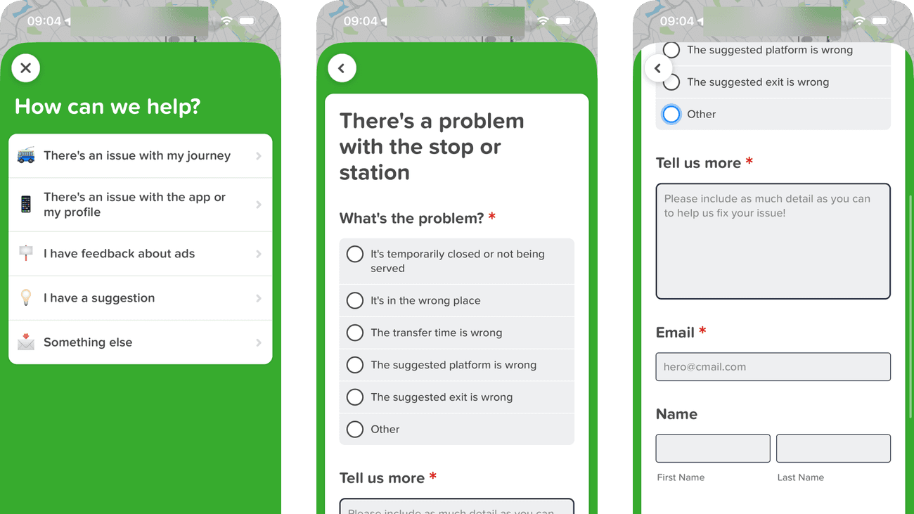
Help choices distinguish a journey issue, an app problem, feedback and a suggestion. The categories narrow the reporting task before asking for a full explanation.
A delayed traveller may not know whether the cause is the app or the transport service. A route for uncertain reports prevents category knowledge becoming a barrier.
If we include an easy unsure route that carries the current journey into the report, then people should be better able to find help for the current journey because fewer details need to be held in mind at once.

Private details have been obscured.
Screen 02
Choose a journey issue
The list names problems with departure times, routes, walking or cycling, stops and disruptions. A query or complaint and Something else remain available, so people are not limited to the transport faults anticipated by the menu.
Several categories could fit the same experience. A missed connection might involve a departure time, a stop or a disruption, leaving the traveller to decide how the system would classify it.
If we add a short example to overlapping categories and allow the category to be changed after describing the issue, then people should be better able to choose the relevant type of journey issue because examples would reduce the effort of matching an experience to a reporting category.

Private details have been obscured.
Screen 03
Stop or station problem
Selecting a stop problem opens more specific choices: closure, location, transfer time, platform or exit. Other remains available before the required description, narrowing the report without showing every journey issue at once.
The description asks for as much detail as possible, but gives no example of what would help with the selected problem. Someone reporting an incorrect exit may not know which details are useful.
If we tailor the description prompt to the selected issue with one concrete example, while keeping Other available, then people should be better able to identify the stop or station problem because fewer details need to be held in mind at once.

Private details have been obscured.
Screen 04
Contact support
The scrolled form keeps the selected Other category above the description and contact fields. Asterisks mark the description and email as required, while the name fields have no asterisk.
Submit completes the form without explaining here how the email will be used or whether a reply should be expected. That uncertainty matters when someone is sharing contact details about a travel problem.
If we explain how the email is used and what response to expect beside Submit, then people should be better able to submit a support report with understood data use because the immediate benefit would be presented alongside the relevant conditions and consequences.

Private details have been obscured.
Screen 05
General help
Separate routes cover suggestions, app or profile issues, journey issues and advertising feedback. Something else leaves room for a problem that does not fit the listed categories.
An issue during travel might concern the journey or the app itself. Brief examples would help someone choose a useful support route without needing to diagnose the cause first.
If we give an example beside the app and journey issue categories, then people should be better able to choose the right support or feedback route because fewer details need to be held in mind at once.
Conclusion
What this journey teaches us.
A support flow should help someone recover before it asks them to diagnose the product. Categories are useful when they guide the next action, but they should not make the person identify the responsible transport system under pressure.
The practical opportunity is to pair reporting with immediate alternatives, preserve the journey context automatically and explain what happens after submission.
Keep exploring